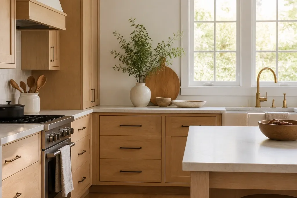
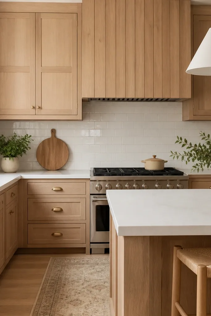
1. Natural white oak shaker with brushed brass pulls
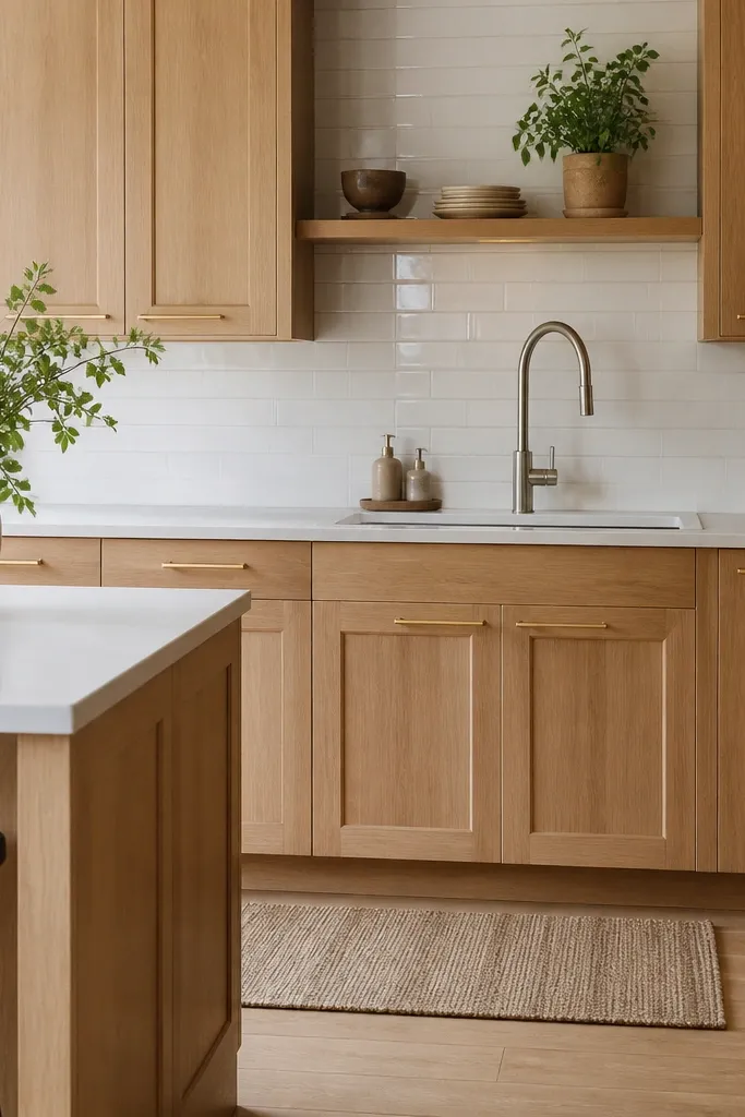
This look works because the shaker door hides grain chaos while the clear natural finish keeps oak warm. Brushed brass adds a soft glow without turning the cabinets orange. White quartz keeps the whole room bright, so the oak reads like a light wood, not a honey color. Matte sheen is the key — it makes the grain look intentional instead of shiny and busy.
Use 1/4-inch reveals around doors and keep hardware centered on drawer fronts for a clean rhythm. Pair with a white quartz slab that has subtle gray veining, not bold movement. In a typical layout, I’d do 36-inch uppers on the perimeter and add a 42-inch hood surround in the same cabinet finish so the oak tone stays consistent.
Pro tipBuy cabinet hardware in the same finish family as your faucet, then match the undertone in lighting (warm bulbs at 2700K look best with natural oak).
Watch outAvoid pairing clear natural oak with high-gloss black hardware — the contrast can look harsh and cheap fast.
2. White-washed oak cabinets with matte black bar pulls
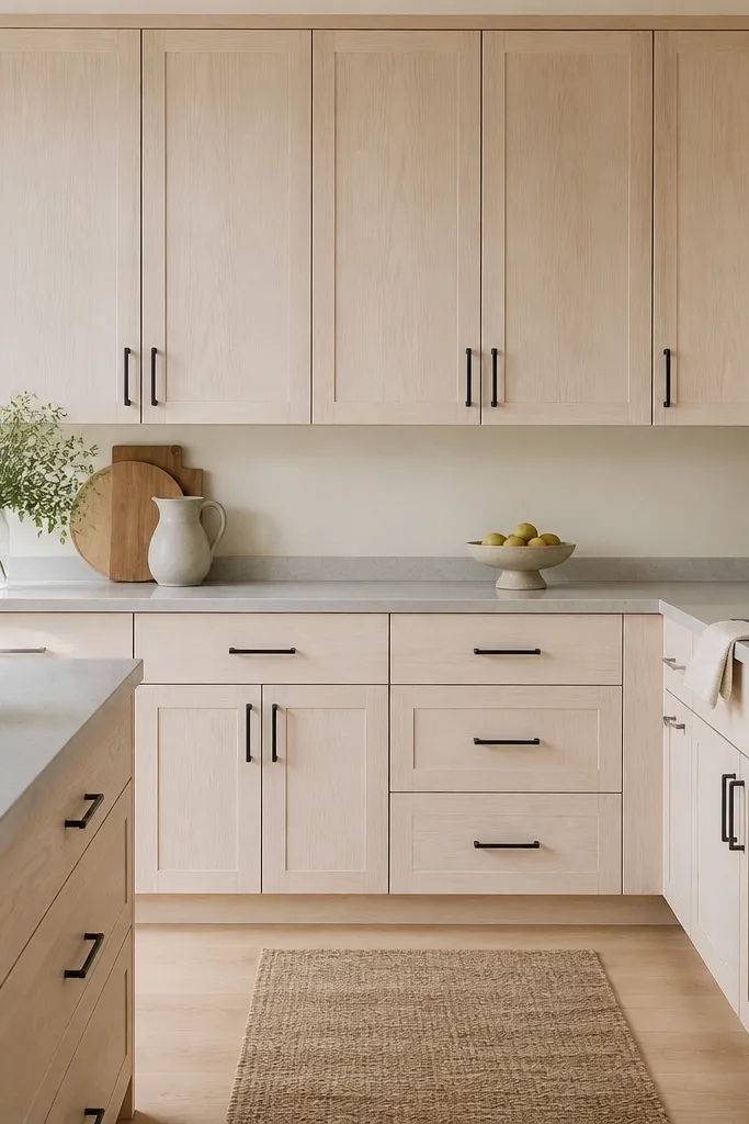
White-washed oak tones down the grain and pushes the cabinet color closer to off-white. Matte black hardware adds crisp definition without needing dark cabinets. The gray countertop is important — it prevents the white-wash from looking pink or stark. This combo gives you that airy, modern farmhouse vibe without going full distressed.
Ask for a white-wash finish that still shows grain lines, not one that fully fills them. Keep pulls long enough for the drawer — I like 4-6 inches on 24-inch drawers so they sit comfortably. Use a warm white wall color with a slight beige undertone so the white-wash looks clean, not icy.
Test your cabinet finish sample against your wall paint in daylight and at night; white-wash shifts under warm bulbs.
Don’t use a pure cool white wall paint — it can make white-washed oak look gray and tired.
3. Two-tone lower cabinets in natural oak, upper cabinets in soft white
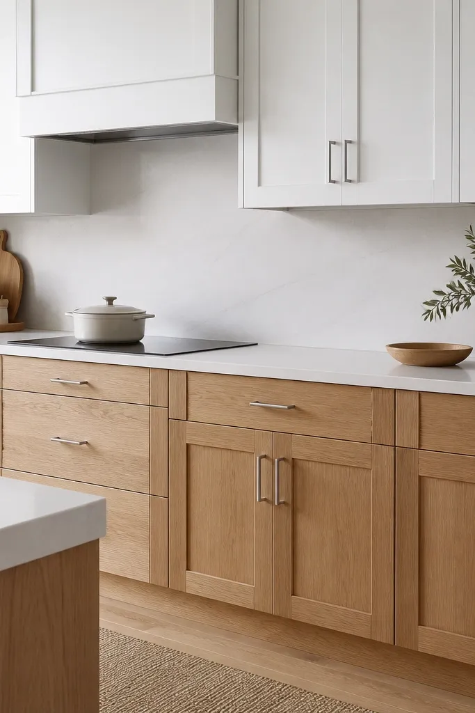
Two-tone kitchens work because the eye gets a clear “anchor” at counter level, where you see the most cabinet surface. Natural oak on the bottom keeps the room warm and practical, while the soft white uppers keep it light. Brushed nickel ties the two finishes together so nothing looks mismatched. The effect is especially good in open-plan spaces where you need definition.
Keep the door style identical across both sets — same shaker profile and same panel thickness. Choose a soft white upper that is not blue-based, then pick a natural oak lower with a satin or matte topcoat. Layout-wise, I like toe-kick drawers or a slightly deeper drawer stack under the counter to make the oak feel “built-in,” not just placed.
Pro tipUse the same hardware spacing on uppers and lowers, even if the finishes differ — your brain reads that as intentional design.
Watch outAvoid switching door styles between uppers and lowers — it makes the two-tone look like a patchwork job.
4. Flat-panel white oak cabinets with unlacquered brass
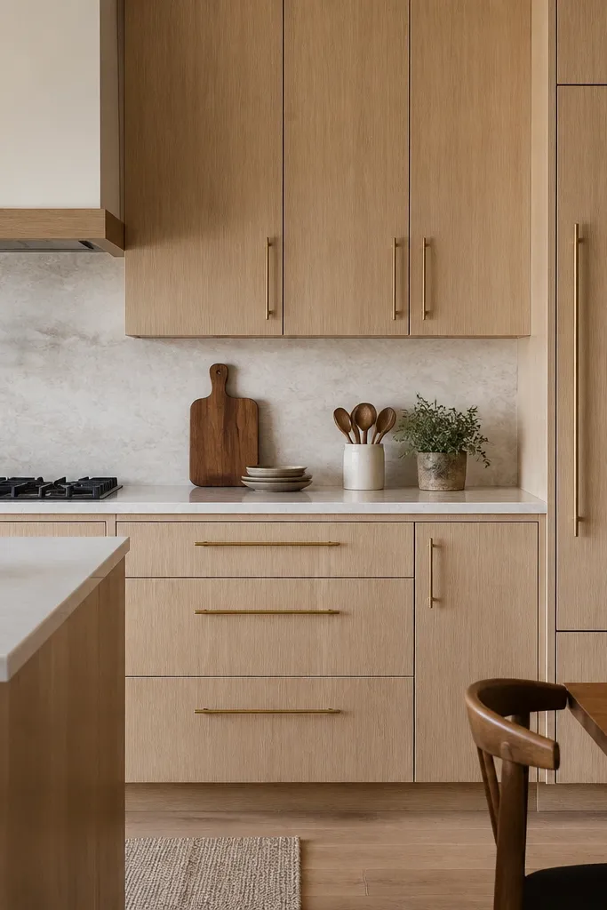
Flat-panel doors make oak look contemporary because there’s less visual interruption from profiles. Unlacquered brass brings warmth and patina over time, which looks great with natural oak grain. Keep the countertop and backsplash simple so the cabinet grain stays the star. This is a “quiet luxury” look without the fuss.
Choose a clear finish with a satin sheen so the panel edges don’t glare. Use long pulls on drawers and cupboards — I like 6-8 inches on 30-inch wide drawers for proportion. If you add a backsplash, pick a large-format tile or a smooth slab so you don’t compete with the flat-panel geometry.
Pro tipOrder a single drawer sample and live with it for a day — flat-panel finishes show fingerprints more than shaker in my experience.
Watch outAvoid pairing flat-panel oak with busy patterned tile — the door lines and tile pattern fight.
5. Raised-panel white oak cabinets for a warm traditional kitchen
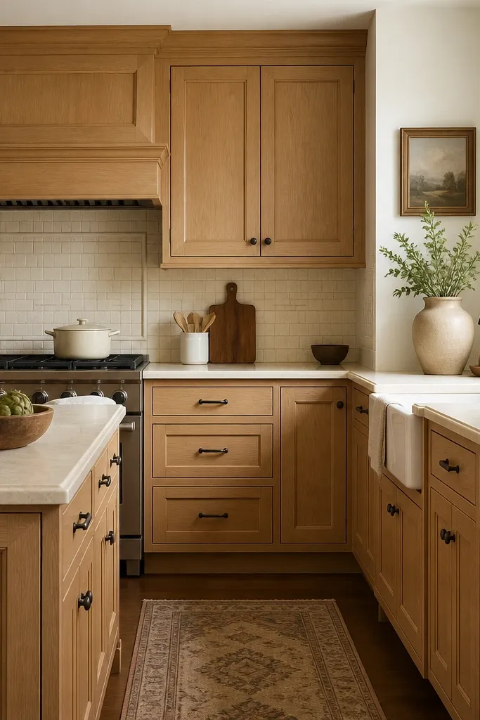
Raised-panel doors add depth and shadow, which makes light oak feel richer without going dark. Oil-rubbed bronze hardware grounds the warmth and keeps it from looking too “catalog modern.” Creamy backsplash tones soften the look so oak doesn’t feel too bright. If your home has older trim details, this cabinet style matches that architecture.
Keep the raised panels clean, not heavily carved. I like a natural oak finish with a matte topcoat so the shadows read soft. For proportions, don’t go too oversized on the hardware — use smaller knobs on upper doors and longer pulls on drawers for balance.
Pro tipMatch your cabinet finish to your window trim color; even a 1-step difference looks off in raised-panel kitchens.
Watch outAvoid pairing raised panels with super thin, delicate hardware — it can look toy-like.
6. White oak cabinets with a sage-green island
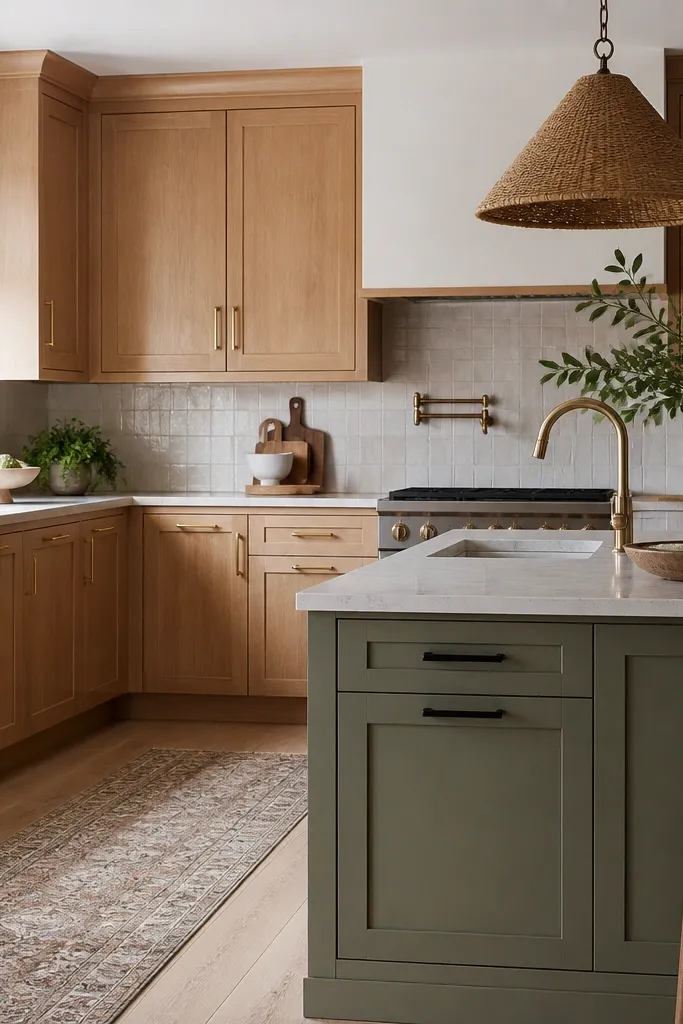
This works because the sage island gives you color without fighting the oak grain. Keep perimeter cabinets in natural white oak so the color stays focused on one zone. Mixing hardware finishes can work when the metal is used in separate zones (brass on oak, black on island). The result feels collected rather than matchy.
Paint the island doors and drawer fronts in a satin cabinet paint, not a wall paint. Use a sage that leans gray-green, not neon. If you want the look to stay cohesive, choose one countertop material for both zones or use a stone with repeated gray tones.
Pro tipBring your sage paint swatch to the cabinet finish sample under kitchen lighting; oak can make some greens look muddy.
Watch outAvoid using a bright mint green — it makes the oak look yellow.
7. White oak cabinets with a honed quartzite countertop
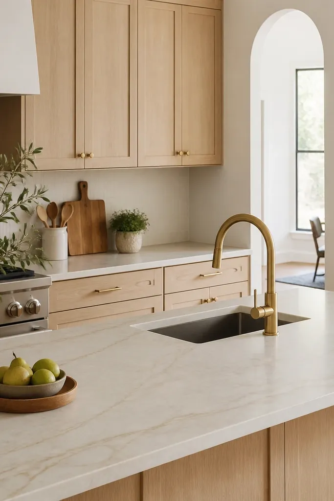
Honed quartzite is the secret weapon for oak because it doesn’t reflect light the way polished stone does. That matte surface keeps the wood grain from looking shiny and loud. The slight warmth in quartzite veining makes the oak look intentional, not random. This combo is especially flattering in kitchens with large windows.
Choose quartzite with warm undertones (creamy or tan veining), not icy white. Keep the backsplash simple — either large-format tile or a thin grout line with a soft off-white. Hardware in brushed brass or champagne bronze looks best with honed stone.
Ask the fabricator for the honed finish on samples; some slabs look “dry” and others look creamy even when the color names match.
Avoid glossy countertops if you’re already using a clear, satin oak finish — the reflections can make the whole kitchen feel busy.
8. All-white walls and white oak cabinets with chrome hardware
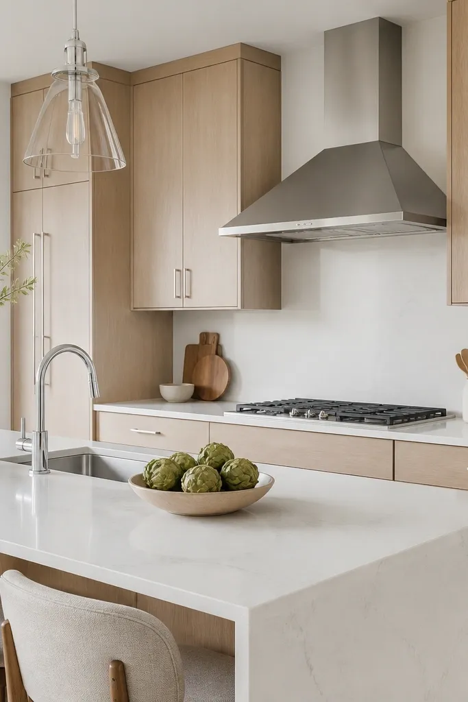
If your oak finish reads neutral (not yellow-orange), chrome hardware can look clean and modern. The bright wall color keeps everything crisp, and white quartz makes the kitchen feel larger. This look works when your lighting is cool-warm balanced so the oak doesn’t turn yellow at night. It’s a great option for people who dislike “warm honey” tones.
Use a white oak finish that’s labeled natural or neutral, and confirm with a sample in your home. Install under-cabinet lighting with a neutral color temperature around 3000K. Keep backsplash tile simple, like a uniform white subway with a tight grout line.
Pro tipUse the same cabinet hardware finish on all doors, then repeat the metal on the faucet and hood for cohesion.
Watch outAvoid mixing chrome with brass in the same sight line — it looks like two different kitchens.
9. White oak cabinets with glass-front uppers and interior lighting
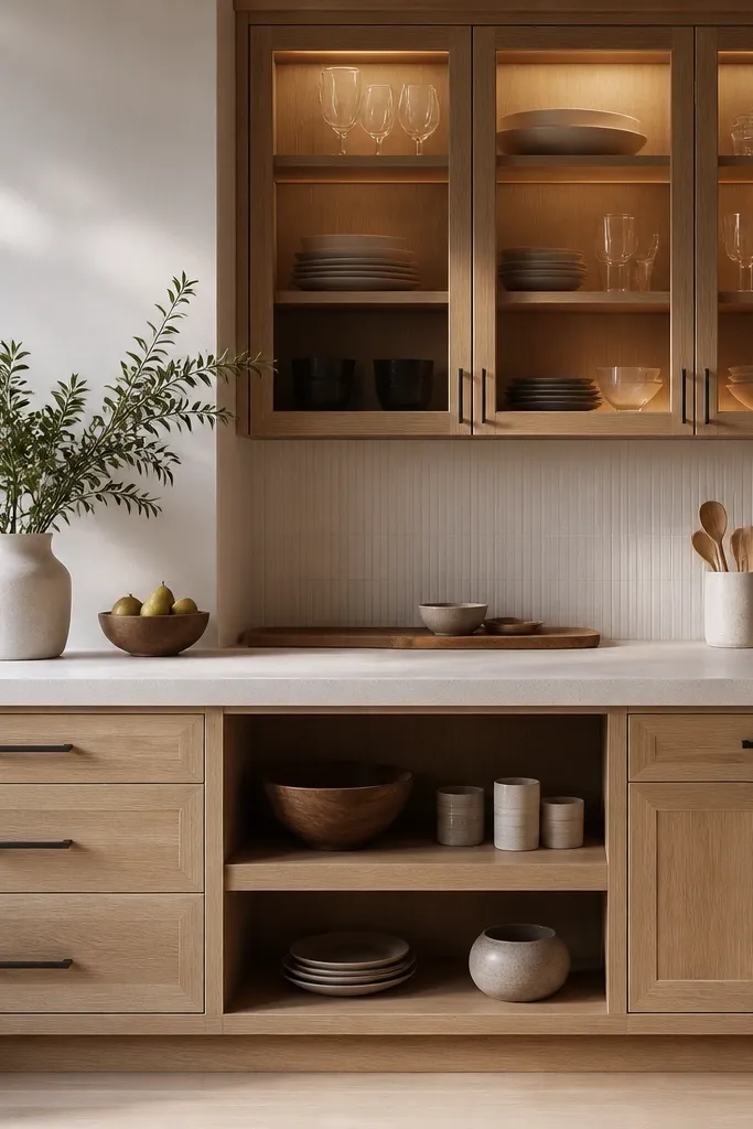
Glass-front uppers make the wood feel lighter because you see brightness and shadow behind the oak. Interior lighting warms the glass so the cabinets look inviting, not heavy. This is a beginner-friendly way to add “designer” interest without changing your whole kitchen layout. Oak stays timeless, and glass adds a curated look to daily items.
Pick clear glass with a slight reflection, not heavy tinted glass. Use warm LED strips around 2700K inside the cabinets. Style the shelves with matching canisters or a small stack of white bowls so the light has something to land on.
Pro tipPlan your glass cabinet contents before you install; empty glass looks like a mistake.
Watch outAvoid cluttering the glass shelves — uneven stacks make the oak look messy.
10. White oak cabinets with a full-height backsplash slab
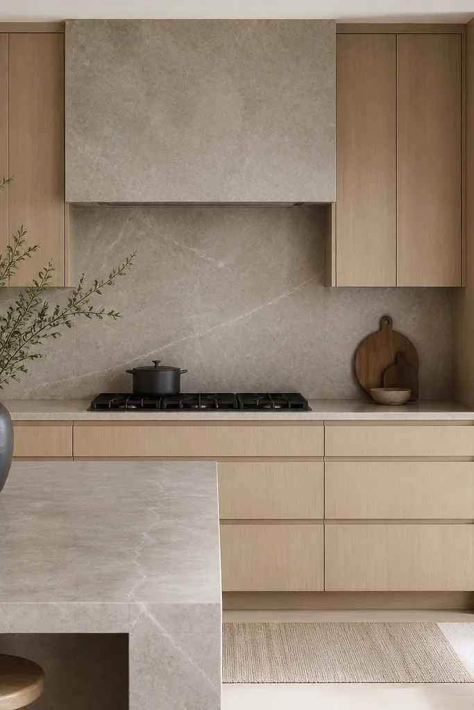
A full-height backsplash makes the cabinet finish look more expensive because it removes visual breaks. With white oak, the goal is continuity: wood grain at the cabinets, then stone calm behind. When the slab matches the countertop, your kitchen reads like a single material story. This also hides messy wall junctions that happen in older homes.
Choose a slab with subtle, consistent movement, not dramatic veining. Keep grout lines minimal or eliminate them by using slab installation. Use a simple bar pull so the slab and wood don’t compete for attention.
Pro tipBring your cabinet sample to the stone yard and ask for slabs with enough contrast that the oak doesn’t blend into the stone.
Watch outAvoid using a busy backsplash pattern with natural oak — it makes the kitchen feel loud.
11. White oak cabinets with a dark walnut desk area in the corner
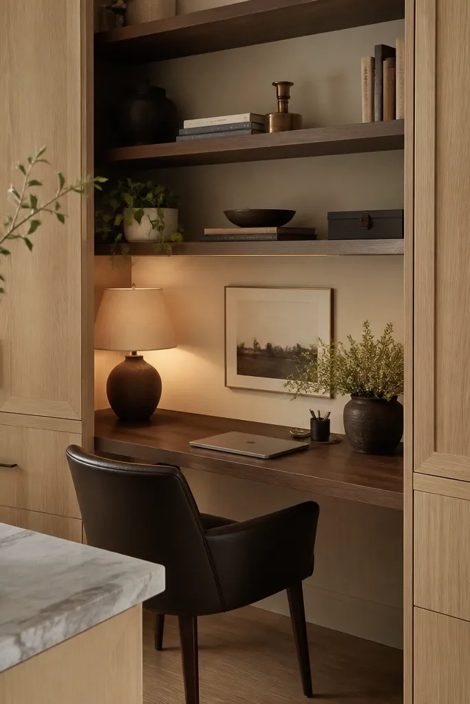
I like mixing oak with darker wood because it makes the oak look intentional, not pale. Walnut adds depth near the corner where your eye naturally rests. The combo works best when the white oak finish is clear and matte, so it doesn’t look washed out next to walnut. It also helps the kitchen feel lived-in without adding clutter.
Use walnut only on one zone: the desk top and maybe one open shelf run. Keep the rest of the cabinets strictly white oak so the wood types don’t feel random. Match the metal tone on hardware to the walnut’s warmth — brushed brass works well here.
Pro tipAdd a small cable tray or hidden outlet in the desk nook so the area stays clean and doesn’t ruin the look.
Watch outAvoid matching walnut and oak in the same cabinet face — it reads like a repair job.
12. White oak cabinets with a light gray backsplash and white grout
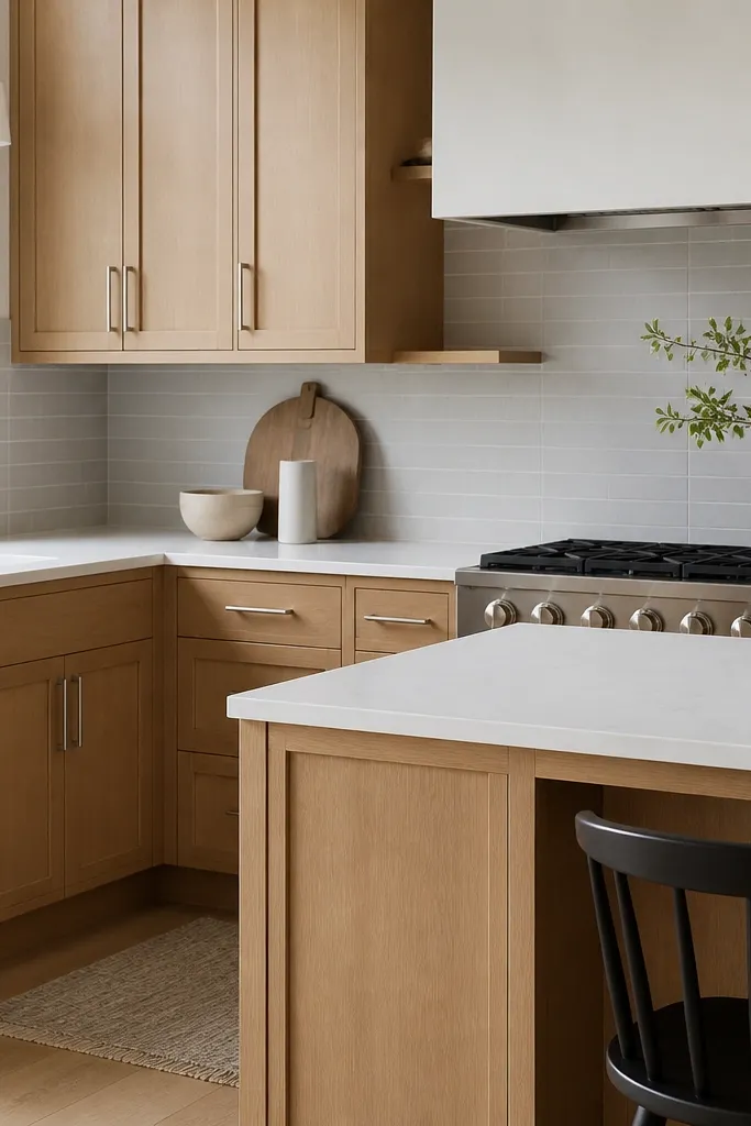
This pairing keeps the kitchen from feeling sterile. White grout with light gray tile gives a crisp frame around the oak grain. Brushed nickel keeps things neutral and clean, especially when the oak finish isn’t too warm. It’s a solid choice if you want modern but not cold.
Choose a light gray tile with small variation so it doesn’t look flat. Keep grout bright white, not soft off-white, so it contrasts the gray. Hardware should match faucet finish so the metal doesn’t look like a second palette.
Pro tipConfirm grout color in the tile shop; gray tiles can look darker after grout is applied.
Watch outAvoid black grout with natural oak — it makes the cabinet grain look dirty.