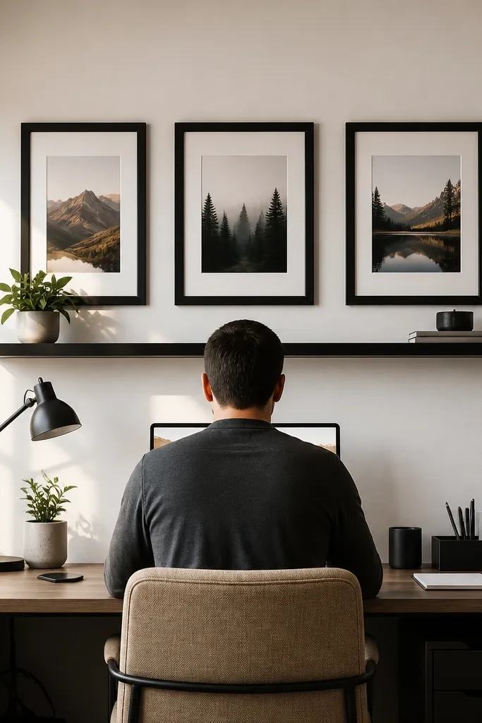
1. Two-tone floating shelf with a book spine "stack"
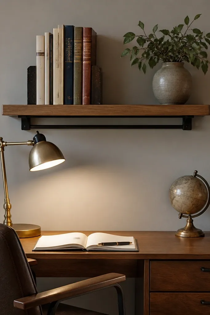
A front wall shelf works because it turns your study area into a styled reading zone, not a random storage zone. Choose a shelf that’s 24-36 inches wide so it anchors the table without overpowering the wall. For the luxury look, do wood on the shelf surface and a matte black bracket or rail. Keep the book spines facing out, but don’t line up every book — use 6-10 spines with 1-2 vertical books to create rhythm. Add one small lamp or ceramic object on the right side so the wall has a light source and a clear “end point” for the eye.
Pro tipUse bookends with the same finish as your shelf brackets — it makes the whole arrangement look designed, not accidental.
Measure the wall space above the table and pick a shelf that leaves 3-6 inches of margin on both sides. Mount the shelf so the bottom edge sits about 10-14 inches above the table surface, then place 6-10 books with their spines facing forward, leaving a 1-2 inch gap between clusters. Finish by adding one warm-toned lamp or a small matte ceramic piece on the far right, and keep all other items off the shelf so it stays photogenic and clean.
Watch outAvoid mixing glossy black, chrome, and shiny brass all on one wall — it reads messy fast.
2. Grid photo ledge with 5 aligned mini prints
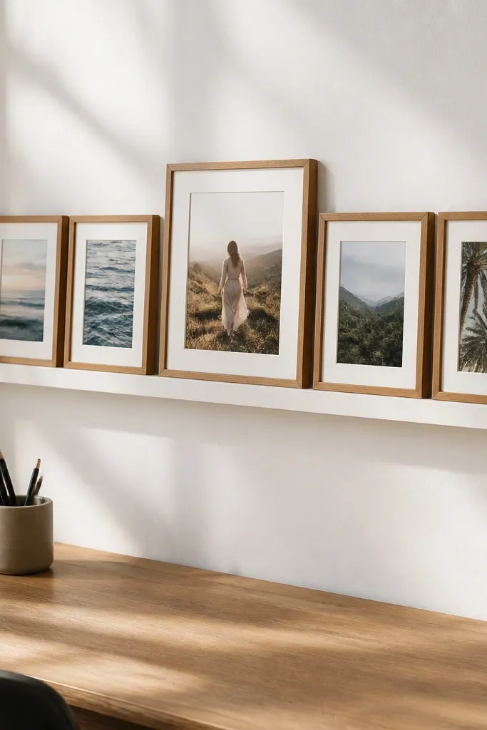
A mini print grid is motivating because it gives your brain a neat visual target while you work. Use five frames instead of ten so the wall stays airy. Stick to one frame color — matte oak, white, or black — and keep the print sizes consistent, like 8x10 or 9x12. Arrange them in a tight grid: one center frame and two pairs on each side at equal vertical spacing. This style is especially good for small rooms because it adds personality without eating wall space.
Pick frames in one color and size, then lay them on the floor to test spacing before mounting. Mark a center point above the table and set the middle frame first, then place the other four frames so the gaps between frames are 2-3 inches. Mount the frames directly or on a narrow photo ledge, but keep the top of the grid around 60-66 inches from the floor for most study setups.
Choose prints with one repeating color tone (like warm neutrals or muted blues) so the grid feels calm even when you add notes.
Skip mismatched frame sizes and random heights — the wall looks like a bulletin board instead of decor.
3. Cork board with a clean "front row" of pinned cards
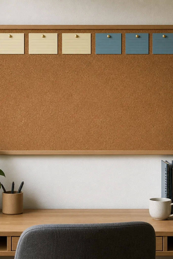
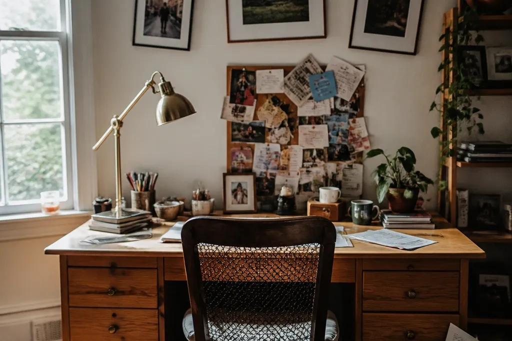
Cork board decor works because it’s functional and looks intentional when you control the layout. Use a cork board that’s 18x24 or 24x30 inches so it covers enough wall to matter but doesn’t dominate. Keep the top 6-10 inches of the board for a single row of pinned cards, like weekly goals or a reading list. Then use the rest for fewer items — 6-12 pins total — so the board doesn’t become a paper storm. For color, go for natural cork with a slim wood frame, and keep push pins the same color family.
Mount the cork board so its center aligns with your sight line from the chair, then add a straight top row of 3-5 pinned cards with equal spacing. Use small binder clips or thin clips for any papers you swap weekly, and keep the rest of the board mostly blank. Finally, add one small decorative element — like a narrow wood tray or a single pen holder — along the bottom edge, not scattered across the board.
Use labels or consistent paper sizes for pinned cards; variation looks “busy,” even when the content is organized.
Avoid covering the entire cork board with overlapping papers — it looks cluttered and kills motivation.
4. Peg rail with two hanging organizers and one "landing" tray
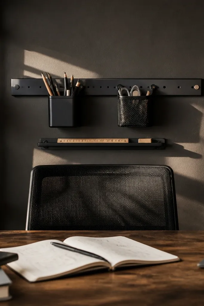
A peg rail gives you that sleek workshop look, and it stays motivating because tools are visible and easy to grab. Choose a peg rail in matte black or warm brass and mount it above the table, centered with your chair. Hang two organizers only — one for stationery and one for small study supplies — then add one shallow tray underneath for sticky notes or a planner. Keep hanging items at the same height so the rail looks orderly. This idea looks great in offices and bedrooms because it adds structure without using a lot of fabric or paper.
Find your wall center above the table and mount the peg rail so the bottom row of holes sits about 6-10 inches above the tabletop. Install two hanging organizers on opposite sides of the center and keep them level, then add a small tray directly beneath the center line. Use hooks for pens only if you can match the finish; otherwise, keep pens inside the organizer so the wall stays clean.
Hang organizers symmetrically even if your supplies aren’t — symmetry makes the setup look calmer.
Don’t hang five different items at random heights — the rail becomes a clutter magnet.
5. Oversized framed linen board for notes and inspiration
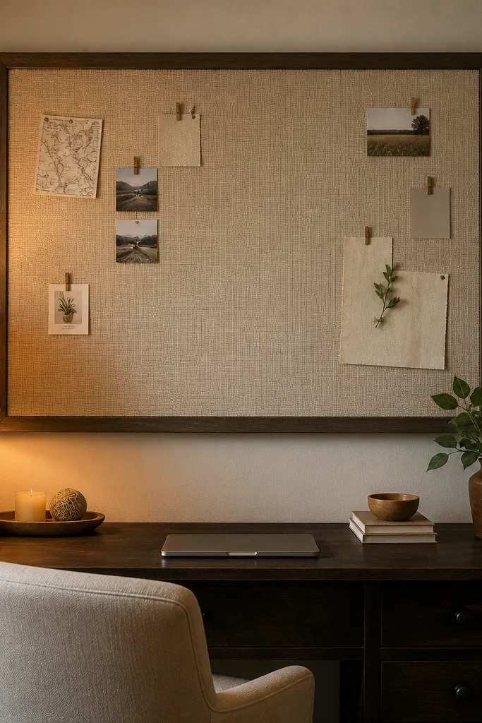
Linen boards look expensive and soften the study space, which matters when you’re staring at the wall for hours. Go oversized: 24x36 or 30x40 inches so it reads as a single panel, not a small accessory. Use a slim frame in black, espresso wood, or natural oak. Pin notes using fabric clips or flat push pins so the texture stays smooth. The beauty here is negative space — leave much of the linen visible, and place only 8-15 items total, grouped in a couple of clusters.
Pro tipUse clips for paper that you change often — it keeps edges from looking crumpled over time.
Mount the framed linen board so its top sits around 72-76 inches from the floor, then keep the bottom edge roughly level with your shoulders when seated. Cluster pinned items into two groups: one for weekly tasks and one for a small inspiration card or quote card. Add one small framed print to the side only if it matches the frame finish; otherwise, keep the linen board alone for the cleanest look.
Watch outSkip tiny boards with too many pins — small linen + lots of clutter still looks messy.
6. Woven wall baskets in a vertical stack
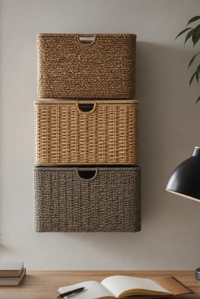
Woven baskets add texture that paper and paint can’t, and they look great even when you store simple items. Choose two to three baskets in the same material but slightly different sizes, stacked vertically above the table. Keep the palette cohesive: natural jute, light rattan, or a muted grey weave. For a motivating setup, store only one category per basket, like reading materials in one and stationery in another. This decor works best when your wall is otherwise bare, because texture becomes the “hero.”
Mount the largest basket first, centered above the table, with the bottom edge about 4-6 inches above the tabletop. Add the next basket above it with 2-3 inches of gap, then place a slim third basket to the side if you have width for it. Use wall-mount basket hooks or a small wood rail behind them so they hang straight and don’t twist.
Line the baskets with a thin neutral liner (off-white or beige) so items inside don’t show through in a messy way.
Avoid mixed basket colors and materials — different weaves on one wall reads random.
7. Statement mirror panel behind the chair line
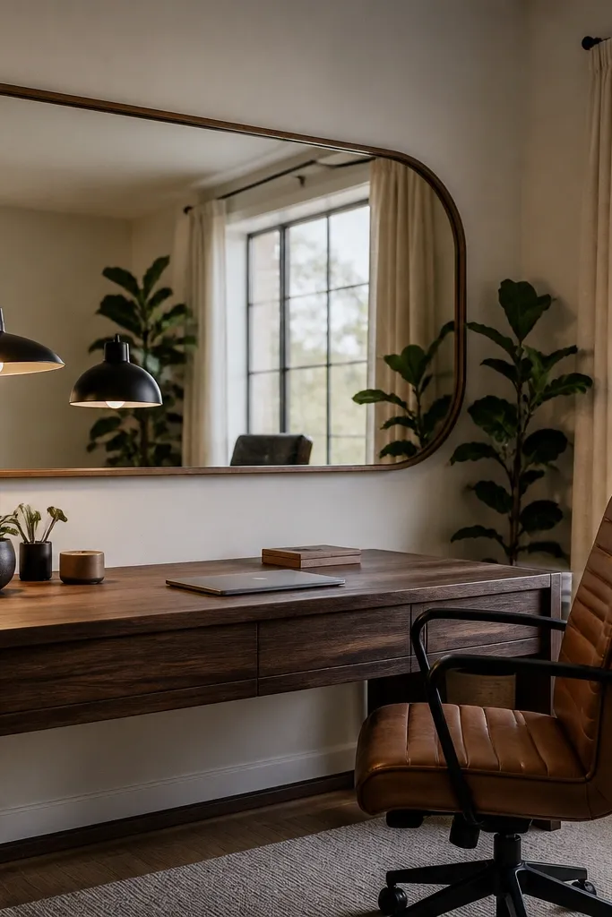
A mirror behind the table makes the whole setup feel bigger and brighter, which helps when your room is dim. Use one statement mirror with a slim frame in black or warm wood, placed on the front wall so it reflects your lamp or window light. An oval or rounded rectangle looks softer than a sharp rectangle, especially above a study desk. Keep decor minimal: one small tray below with a pen cup and one tidy stack of notebooks. This is a strong choice if your wall feels empty and your study area needs light and depth.
Pro tipUse a warm bulb in your lamp near the mirror — cool light makes reflections look harsh and clinical.
Choose a mirror size around 18-24 inches tall, then mount it so the center sits around eye level when seated. Place the mirror so it catches your lamp glow or the daylight source, not a random blank wall. Add a single tray below the mirror at least 6 inches from the mirror frame, and keep everything on the tray the same color family for a clean look.
Watch outSkip tiny mirrors — they look like an afterthought and don’t create the depth effect.
8. Oversized wall clock with a clean typography print strip
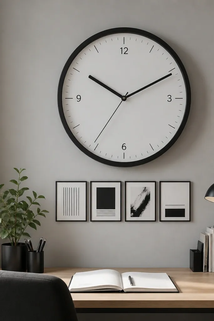
Timing decor is motivating because it turns “time passing” into something you can see while you work. Choose an oversized clock with minimal numbers, matte frame, and a quiet second hand style. Pair it with a small typography strip — 3 to 4 mini prints or cut vinyl words — aligned horizontally. Keep the typography consistent, like one font family and one color for text. This setup looks intentional because it mixes one functional hero (the clock) with one controlled accent line.
Pro tipUse a clock frame finish that matches your lamp base or chair hardware to tie the room together.
Mount the clock first, centered above the table, with the clock face top around 66-72 inches from the floor. Add the typography strip to the left or right of the clock, not below, and keep the strip height within 10 inches. Use a spacing check: the gap between clock and strip should be about 2-3 inches. Keep the rest of the wall empty so the clock doesn’t fight for attention with clutter.
Watch outAvoid busy clocks with heavy patterns — they steal focus from studying.
9. Peg + floating magazine rack for textbooks and notebooks
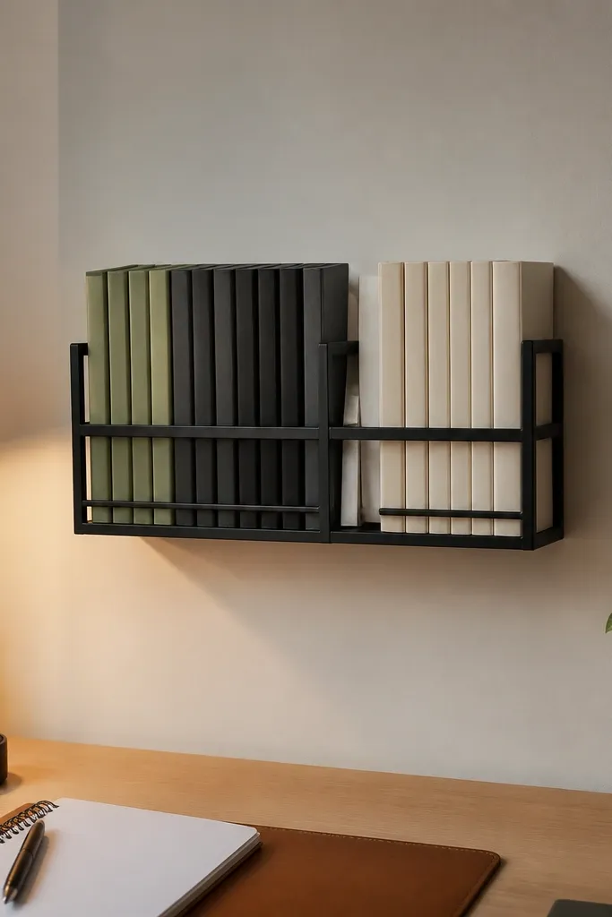
A wall magazine rack looks clean because it keeps paper goods vertical and off the table. Use a floating rack with a simple front, ideally in black metal or light wood. Arrange notebooks with spines out so the wall becomes a color block of your own subject choices. Keep it to 2-3 stacks, not a full wall of books, so the display stays sleek. This is a smart choice when you hate clutter on the desk surface but still want supplies visible.
Mount the rack so its top is about 56-60 inches from the floor, then keep the bottom edge around 8-12 inches above the tabletop. Place two stacks of notebooks on one side and one stack on the other, using bookends or thin folder dividers to prevent slumping. If your rack doesn’t have dividers, add a slim acrylic or wood divider insert behind the books to create straight lines.
Color-block your spines by subject — even a simple two-color scheme looks styled and calm.
Skip overfilling — if books spill past the rack edges, the wall looks messy immediately.
10. Laminated study poster strip in a frame rail
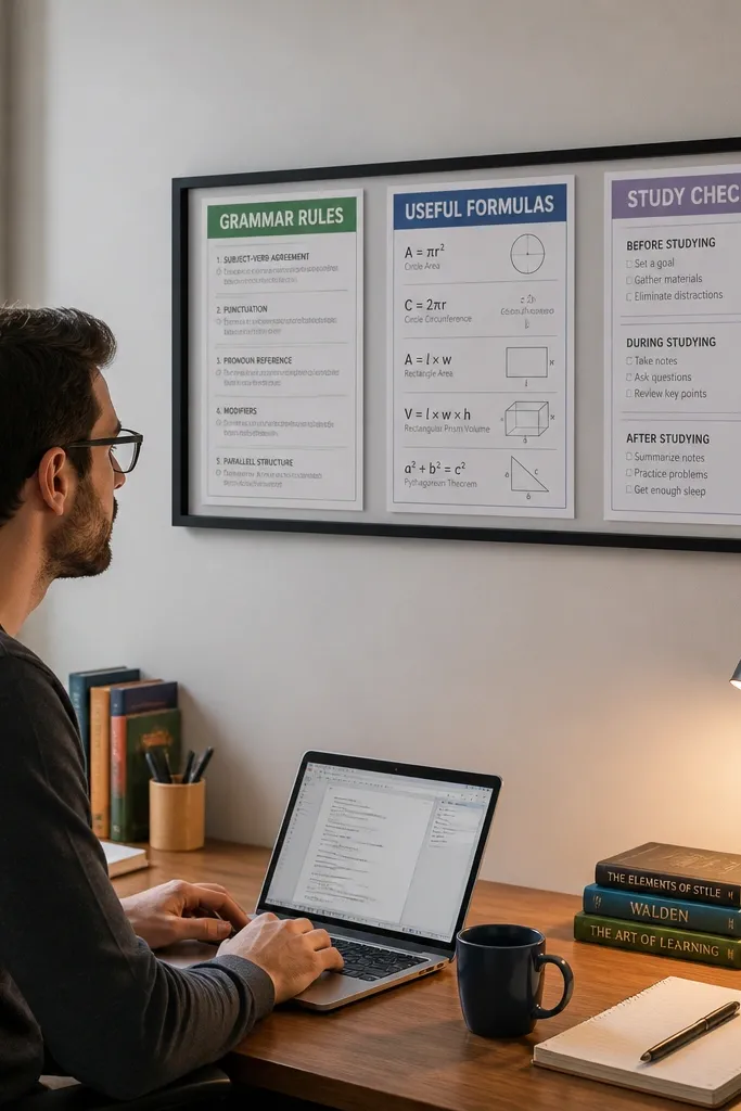
A framed poster strip adds motivation because it puts your reference material in a neat, readable location. Use three laminated posters sized like 8x16 or 11x14, arranged in a horizontal row inside one long frame rail or three matching frames. Choose content that supports your work — grammar rules, formula cheat sheet, or vocabulary themes — so it’s not decorative-only. Keep the color palette limited: one background tone and two accent colors. This decor is photogenic because it looks like a designed learning wall, not a random pinboard.
Pick poster sizes that match your wall width above the table, then choose either one long frame or three identical frames. Mount the rail so the center of the middle poster sits around 62-64 inches from the floor. Use spacers between posters of 1-2 inches so the row looks crisp. Place the content you use most in the center frame so your eyes hit it first while studying.
Laminate with a matte finish so glare doesn’t wash out text in daylight.
Don’t use mixed poster sizes and mixed frame colors — it turns into a collage.
11. Floating dowel with hanging tassel bookmarks and a note pouch
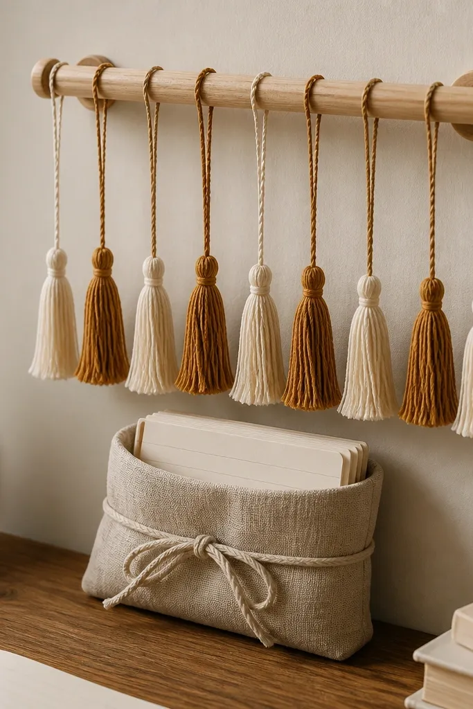
This one is for people who want decor that looks artsy but still supports study. A small floating dowel holds tassel bookmarks or ribbon markers that visually signal “reading mode.” Add a fabric note pouch below the dowel for index cards or quick task notes. Use a dowel in light wood and a pouch in linen or cotton, tied in neutral tones like cream, sand, or charcoal. Keep it compact: 18-26 inches wide. The beauty is the movement: tassels sway slightly with air, which makes the wall feel alive without adding clutter.
Pro tipChoose tassels in one color family and vary only the length — it looks intentional, not random.
Mount the dowel 4-8 inches above the table height line, centered on the wall. Hang 6-10 tassel bookmarks evenly across the dowel so they form a gentle fan, then attach the note pouch directly below using two small screws or a hook-and-strap method. Fill the pouch with index cards so it looks purposeful, not empty. Keep the rest of the wall bare to keep the composition clean.
Watch outSkip bright neon ribbons — they look like costume decor next to study materials.
12. Wall panel with fabric-covered foam and a single color-blocked checklist
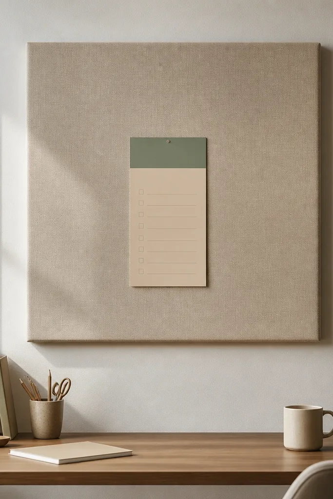
A fabric-covered foam panel is a soft, premium look that hides the “functional” vibe. It’s also forgiving: it makes the wall look smooth even if your wall paint isn’t perfect. Use a panel about 24x24 inches, upholstered in linen or textured cotton in a calm neutral. Then place one color-blocked checklist card (like a single large card with 7-10 rows) centered. This setup motivates because it limits decision-making — you look at one checklist, not ten overlapping notes. It’s ideal for anyone who gets overwhelmed by paper piles.
Cut a foam board to 24x24 inches and wrap it tightly with fabric, stapling the back so corners stay crisp. Mount it with picture hooks or French cleat hardware so it sits flat. Print or buy one checklist card and use removable adhesive corners or a small clip frame so you can swap it weekly. Keep the checklist card as the only paper element on the panel for a clean, photogenic look.
Use fabric in a texture you can see up close — matte linen makes the panel look expensive even from a distance.
Avoid adding multiple cards of different sizes — the panel becomes a crowded corkboard.
13. Artful desk gallery with two frames + one shadow-box object
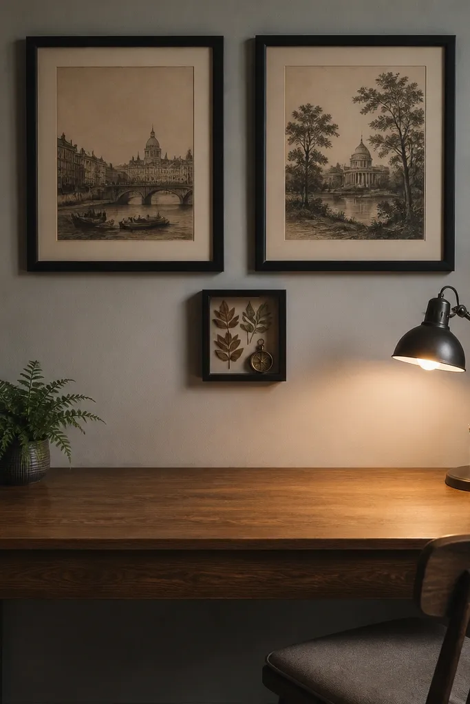
A tiny gallery works when it’s restrained. Use two matching frames side by side and a shadow-box object in the center under or between them, forming a clean triangle. The shadow box can hold something study-related and beautiful — a small compass, a neat set of stamps, pressed leaves from a bookish collection, or a slim notebook cover display. Keep colors muted and consistent: black, warm wood, and one accent color like deep green or terracotta. This idea is motivating because it gives your wall a composed focal point while still feeling personal.
Pro tipPick one accent color and repeat it once elsewhere on the desk (like a notebook or pen cup) so the gallery feels tied to your routine.
Choose two frames in the same finish, sized 8x10 or 10x12, and a shadow box sized about 6x10 inches. Mount the frames with equal spacing, then center the shadow box below the midpoint so the triangle reads balanced. Keep the wall around the gallery empty and add only one small object in the shadow box — fewer things look more intentional.
Watch outSkip three different frame finishes — the gallery loses its “designed” look.