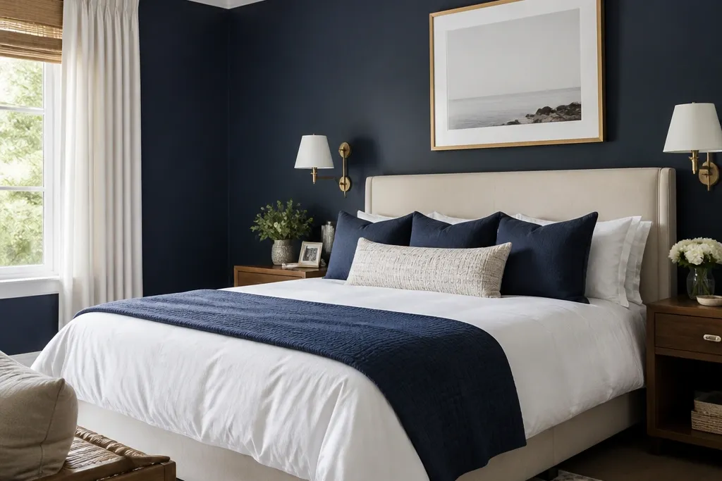
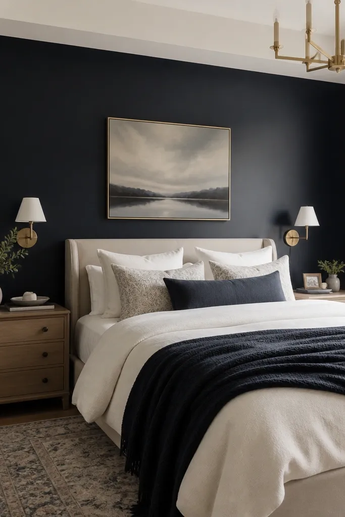
1. Matte navy wall with crisp ivory bedding
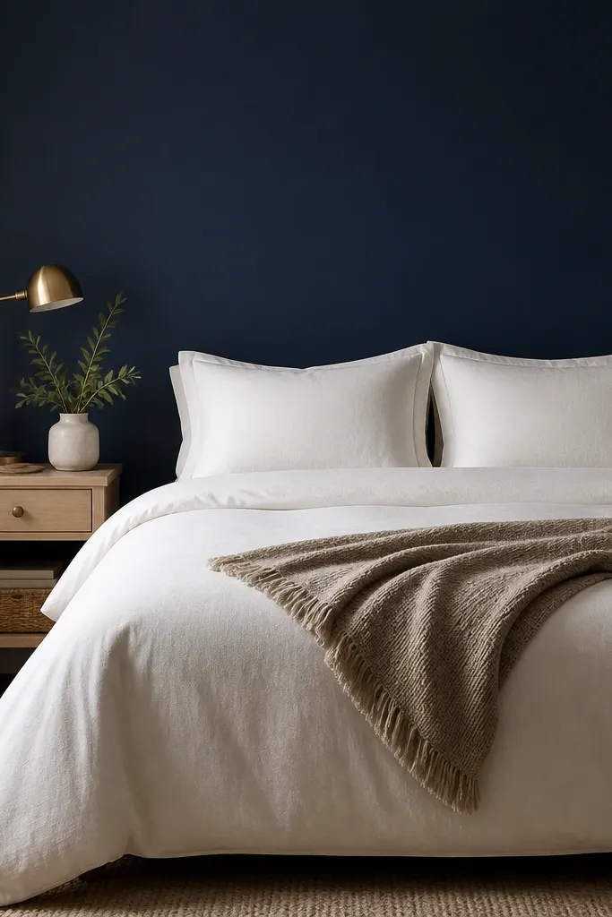
Matte navy absorbs light and turns the wall into a soft backdrop, which makes the bed look cleaner and more styled. Ivory bedding creates a sharp contrast that still feels warm, especially when the wall is not glossy. The brushed brass lamp warms the blue so it doesn’t feel like a dark office. Keep the pattern minimal — navy already gives you the “statement,” so your textiles should look intentional and smooth.
Paint the wall with a true matte or flat finish, then use two coats after priming. Choose an off-white duvet (ivory, not icy white) and add one oatmeal throw for texture. If you have a light wood floor, keep the nightstand in oak or whitewashed walnut so the colors stay cohesive.
Hold a white sheet up to the wall at night — if the navy looks too heavy, switch to a slightly warmer ivory duvet and add a cream rug near the bed.
Avoid mixing navy with bright white bedding and chrome fixtures — the contrast turns harsh and cheap-looking fast.
2. Navy + warm white ceiling for a taller look
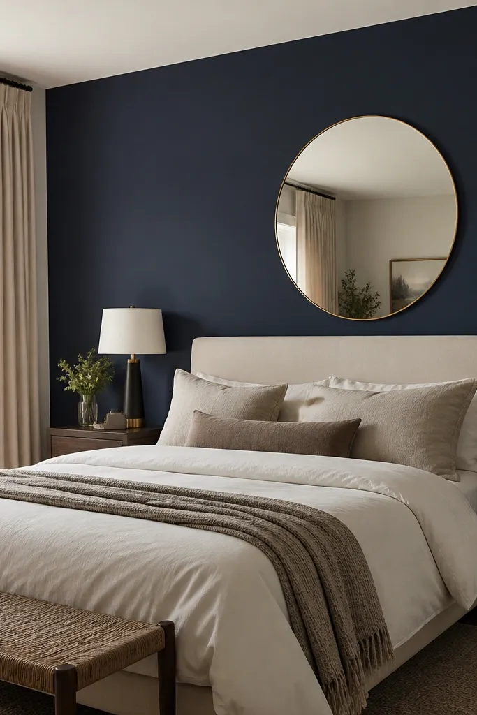
When navy stops at the ceiling and the ceiling stays warm white, your eye reads more height. The key is the ceiling paint tone — warm white keeps the navy from looking like a void. A headboard in cream upholstery softens the hard edge of the wall. A round mirror adds light bounce and makes the navy feel less heavy.
Use painter’s tape for a straight cut line at the ceiling, then roll the wall with a foam roller for a smooth finish. Paint the ceiling in warm white (the kind that looks creamy, not blue). Hang curtains higher than the window trim so the navy wall doesn’t “box in” the room.
If your ceilings are under 8 feet, choose a mirror at least 24 inches wide so it reflects more of the wall and bed lighting.
Don’t paint the ceiling bright pure white if your navy swatch looks too dark — it makes the wall feel even heavier.
3. Navy paneling effect with simple trim frames
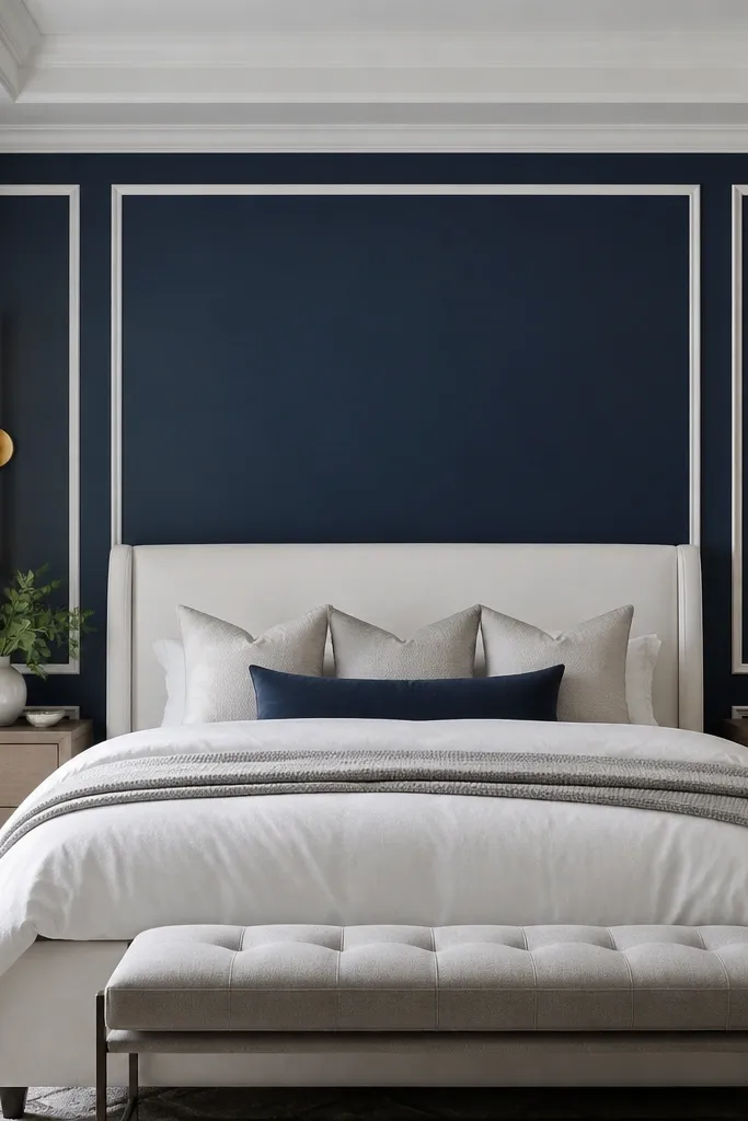
Trim frames turn a flat wall into “architectural” without needing real wood paneling. Navy inside the frames looks crisp when the trim is bright white or soft off-white. This works especially well if your bed has a clean-lined headboard — it matches the geometry. Adding sconces makes the wall feel finished even if you don’t hang art.
Plan frames that are about 18-24 inches wide depending on your wall size. Use 1x2 primed trim boards (or similar) and paint navy between the trim lines, then paint the trim in a satin or semi-gloss white for easy wipeability. Keep the bottom edge of frames roughly aligned with the top of the bed’s headboard so it looks intentional.
Use a laser level to mark the trim grid. I’ve eyeballed it once and the wall never looked straight again.
Skip chunky trim that’s too thick — it fights a modern bed and can look like a rental upgrade.
4. Navy grasscloth-style wallpaper behind the bed
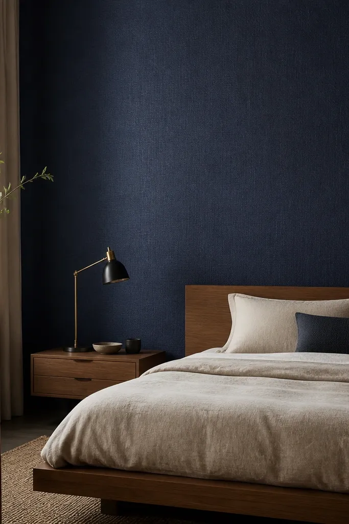
Texture makes navy feel richer without turning the room into a dark cave. Grasscloth-style wallpaper reads soft and tactile, so even simple bedding looks styled. The woven look also hides small wall imperfections better than paint. Pair it with linen textures and warm metals to keep the vibe calm.
Choose a wallpaper with a subtle texture pattern scale (not bold stripes) so it doesn’t clash with pillows. Install behind the bed so it’s the first thing you see when you wake up. Use a wallpaper primer if the wall is uneven or has old paint sheen.
Pro tipPress a sample under your lamp at night. If the texture looks flat in your lighting, pick a navy with slightly more depth rather than adding more pattern.
Watch outAvoid high-sheen wallpaper — it flashes highlights and makes navy look cheap and plasticky.
5. Navy mural with oversized botanical line art
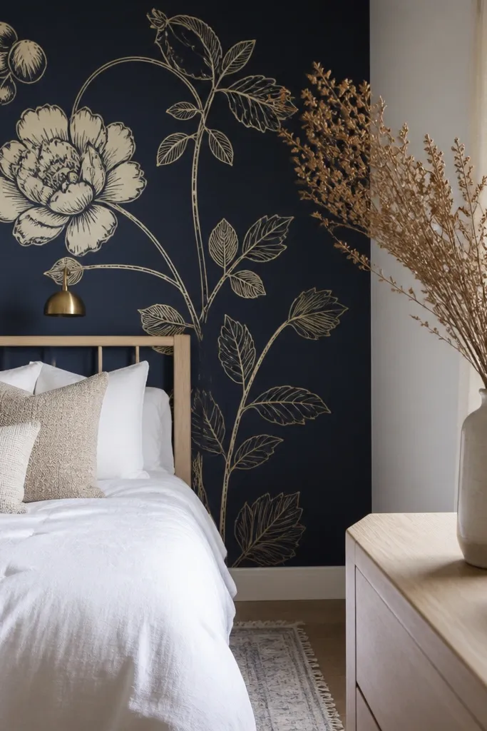
A mural works when you keep the rest of the room quiet. Navy is the perfect canvas for line art because it makes thin cream lines pop without needing bright colors. Oversized botanical shapes add movement and softness, so the room doesn’t feel like a single block of color. This is great if you want “statement” but still want a soothing bedroom mood.
Use a mural panel or wallpaper with a repeat designed for full-wall placement. Place the main botanical cluster at headboard height so it frames your face when you’re lying down. Keep bedding solid and let the wall art do the work.
Pro tipMeasure from floor to the top of your headboard and position the densest part of the mural there, not at the ceiling.
Watch outDon’t add multiple bold prints elsewhere — line art plus patterns everywhere reads cluttered.
6. Navy and white half-wall with open shelving
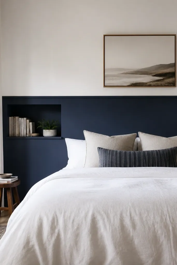
Half-wall color breaks up the darkness and gives you a more “designed” look. Navy on the bottom hides scuffs and makes the wall feel grounded. Keeping the top white keeps the room airy, especially if you have a lot of window light. Open shelving adds a functional layer, so the wall isn’t just paint.
Paint the lower half with matte navy and the upper half in a satin or eggshell white. Mark the split line with painter’s tape so it’s straight. Use shelves in light wood or white to keep the contrast clean.
Pro tipIf you have wainscoting already, align the navy split with the existing trim height so it looks built-in.
Watch outAvoid a split line that sits too high — it makes the room feel top-heavy.
7. Navy ombre wall from floor to bed height
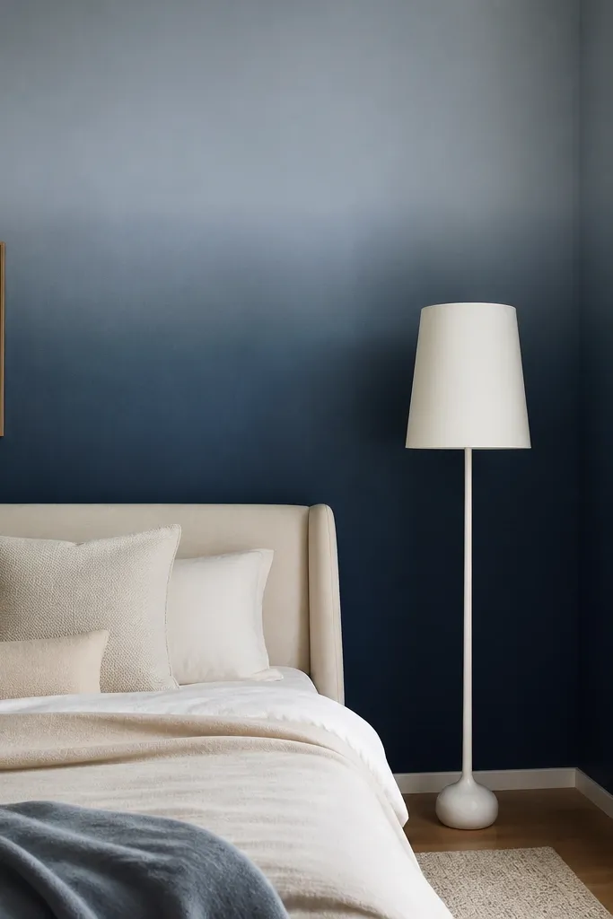
Ombre gives you depth without the heavy, flat block of color. The darker zone near the floor grounds the room, and the lighter top keeps the wall from swallowing light. This looks best with solid bedding and minimal pattern. It also hides uneven lighting since the color transitions gently.
Use a navy paint blended with a lighter blue-gray in a controlled gradient. Start with navy at the bottom third and blend upward with a clean dry roller or sponge in light passes. Keep the bed centered so the gradient lines up with your eye level.
Pro tipTape a straight line at the height you want the strongest navy to end, then blend upward from that point.
Watch outSkip harsh banding. If you see stripes, blend sooner with a damp roller while paint is still workable.
8. Navy lacquer-like paint with warm lighting

A slightly higher-sheen navy looks dramatic and smooth, especially under warm lamps. The wall catches light and makes everything near it look more expensive — the bedding, the frames, the wood. The trick is to keep the rest of the color palette warm and grounded so the shine doesn’t feel cold.
Choose an eggshell or satin finish, not full gloss. Use two coats and allow proper dry time between coats. Pair with warm metals like brushed brass or antique gold and keep textiles in wool, cotton, or linen.
Pro tipIf your wall has dents or patch marks, fix them first. Sheen shows flaws more than matte paint.
Watch outAvoid mixing this sheen with cool white lighting — it makes navy look bluish and harsh.
9. Navy wallpaper stripe with off-white bedding
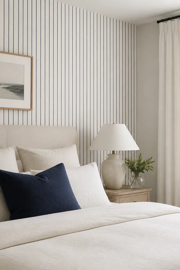
Vertical stripes make the room feel taller while keeping the statement tied to navy. Because the stripe background is off-white, it doesn’t feel heavy like a fully navy wall can. This works when you want a clean, tailored look without trim carpentry. Keep bedding simple so the stripes don’t compete with prints.
Pick stripe widths around 1-3 inches so it reads refined, not playful. Hang curtains higher to amplify the vertical effect. If you have a tall headboard, align the stripe lines so they look centered behind it.
Use a seam roller and keep pattern alignment tight at the headboard height — visible misalignment screams cheap wallpaper work.
Don’t choose super thick stripes if your room is small. It can feel visually loud.
10. Navy and white chevron wall with a neutral rug
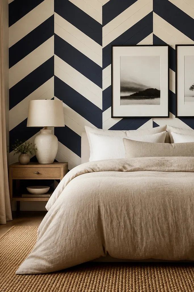
Chevron adds movement and energy, but navy keeps it from looking childish. Off-white chevrons add enough light to prevent the wall from closing in. This setup looks best with a neutral rug and solid bedding so the pattern stays the focus. The thin black frames tie the chevron to your accessories.
Choose a chevron wallpaper with a moderate contrast so it doesn’t look like a sports team logo. Center the pattern behind the headboard and use a plumb line for first strip placement. Add a rug in jute, wool, or flatweave beige to soften the pattern.
Pro tipKeep your pillows solid (tan, cream, or navy) and skip extra prints.
Watch outAvoid adding patterned curtains. Chevron on the wall plus patterned window treatments usually looks messy.
11. Navy board-and-batten accent wall

Board-and-batten makes navy feel custom-built. The white battens break the darkness into vertical sections, which makes the wall look taller and more structured. This style works beautifully with farmhouse-leaning bedrooms, but it also looks clean with modern beds when you keep the lines crisp. Warm lighting and natural wood keep it from feeling stiff.
Use MDF or primed wood battens spaced about 12-16 inches apart depending on your wall width. Paint the wall navy first, then attach battens and paint them white. Finish with caulk at edges so the lines look tight.
Measure batten spacing from the centerline behind the bed. Symmetry looks intentional even if the rest of the room isn’t perfectly matched.
Don’t skip caulk. Small gaps around battens make the wall look like rushed DIY.
12. Navy textured paint with subtle plaster effect
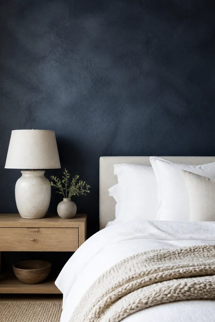
Textured plaster finishes make navy feel more organic and less flat. The slight variation in tone adds depth, so it looks good even when the lights are off. Pair this with chunky knits and linen shades — the textures match. This is my go-to when walls have minor imperfections and you want them to disappear.
Use a plaster-effect decorative paint system or a textured coating meant for walls, not a cheap spackle texture. Apply with a trowel in thin passes and keep the direction consistent for a calm look. Seal and topcoat if the product calls for it so it’s cleanable.
Do a 2x2 test patch. Navy texture can look darker once it cures, and you want to know before you coat the whole wall.
Avoid heavy texture that creates deep ridges. It collects dust and looks rough fast.