

1. Warm Sand Walls with Ink Navy Bedding

This setup works because the wall color has warmth built in, so ink navy stays blue instead of turning smoky. The beige isn’t all the same — you’re layering warm sand on the walls with creamy linen on the bed. Jute underfoot adds texture so the navy doesn’t feel like paint on a white box. Brass lamps add a soft glow that flatters skin tones at night.
Use a warm sand paint on walls (look for words like “sand” or “oat” in the sample names). Choose a navy duvet in ink or near-black navy, then add two cream pillows in linen or cotton-linen. Keep nightstands light oak or bleached walnut so the navy doesn’t fight dark furniture.
Pro tipSwap one pillow cover to “slub” linen texture — the little uneven threads make navy look richer without adding more color.
Watch outDon’t pair ink navy with cool gray-beige walls, or the whole room reads dingy.
2. Cream Upholstered Headboard with Navy Accent Wall Strip

The cream headboard gives you a soft “buffer” between navy and the rest of the room. A narrow navy wall stripe instead of a full accent wall keeps the room lighter while still giving that designer rhythm. Navy in the art mat ties everything together at eye level. Floor-to-ceiling beige curtains make the stripe look intentional, not accidental.
Paint a vertical stripe about 18-24 inches wide behind the headboard, or use removable peel-and-stick wallpaper for a trial. Choose a headboard in a matte cream fabric like linen-look or woven cotton. Hang curtains so they just kiss the floor with a slight break, not puddles.
Pro tipUse navy in small repeat spots: one framed print mat or a navy stitched throw, then stop. Too many navy items spread the color thin.
Watch outAvoid a stripe that’s too wide — wider than the headboard width makes the wall feel smaller.
3. Navy Wool Rug Anchoring a Beige Bed

If your bed is already beige, bring navy in through the rug. A navy wool rug reads warm because wool has depth and tiny fibers that catch light. Beige bedding stays the main event, and navy becomes grounding instead of heavy. Knit throws add a cozy layer that makes the palette feel lived-in.
Pick a rug that’s at least large enough for the front legs of the bed to sit on it — aim for 6x9 or 8x10 depending on room size. Choose navy with a slightly heathered or mottled look, not flat solid navy. Keep bedding in oatmeal, cream, or stone beige with one navy throw and one navy pillow.
Pro tipMatch one hardware detail to the rug tone — for example, choose matte black picture frames or antique brass lamp bases.
Watch outDon’t use a shiny synthetic navy rug — it looks like a dark sticker under a soft bed.
4. Navy and Beige Striped Duvet with Neutral Texture Mix

Stripes give you movement without adding new colors. Navy stripes keep the palette crisp, while beige stripes keep it warm and soft. The trick is texture mixing: add a quilted coverlet or waffle-weave throw so the striped duvet doesn’t look flat. A wicker basket adds a casual, natural counterpoint.
Choose stripes where navy is the thicker line and beige is thinner, or the pattern feels balanced. Add one solid cream pillow and one textured pillow in “oat” or “camel” tones. Style the foot of the bed with a quilted coverlet in cream so the navy stripe doesn’t dominate the lower half.
Pro tipIf your stripes are bold, keep wall art simple: one large frame with a navy mat and cream paper.
Watch outAvoid matching stripes in curtains too — two stripe directions makes the room busy.
5. Beige Linen Curtains with Navy Sheer-Shadow Layers

Layered window treatments make navy feel intentional instead of random accents. Beige linen brings softness and hides dust well, and the navy sheer adds a subtle shadow tone when the sun hits. That shadow makes navy look deeper without adding more furniture pieces. The room feels finished because the window frames the palette.
Use beige linen curtains with a natural weave and a weight that drapes, not stiff. Add a navy sheer behind them, mounted on the same rod or a second rod if you want a clean separation. Keep curtain length to the floor with a small puddle only if the fabric is heavy enough not to look messy.
Iron linen lightly on low heat — linen that looks wrinkled on purpose still needs straight edges.
Don’t hang curtains too high — if the rod sits low, the navy shadow effect looks like a mistake.
6. Navy Nightstands with Beige Bedding and Black Accents

This approach flips the usual pattern: navy is in the furniture, while the bedding stays mostly beige. It works because nightstands are smaller visual blocks than a full navy wall or duvet, so the color lands cleanly. Black accents add definition, but keep them matte so the room stays cozy. Beige bedding softens the contrast so the navy doesn’t feel harsh.
Pick navy nightstands with a matte finish or hand-rubbed look. Match them with a beige rug in wool blend or low-pile for a smooth transition. Use black metal frames and a black sconce, and keep the brass to zero so finishes don’t fight.
Choose one lamp shade color: hard-off-white or oatmeal. A bright white shade can make black accents look stark.
Avoid mixing navy furniture with glossy black lacquer — it looks like a showroom piece.
7. Beige Quilted Coverlet with Navy Decorative Pillows

Quilting adds dimension even when your color palette stays simple. Beige quilted texture makes navy pillows look more saturated because the background is softly broken up, not flat. Velvet navy pillow covers bring that luxe feel without changing the whole room. This setup is perfect when you already own a beige bed frame or headboard and want a fast upgrade.
Use a quilted coverlet in oatmeal or cream with visible stitching, not thin decorative batting. Layer two navy pillows in different fabrics — one velvet and one cotton — plus one cream pillow in plain weave. Keep the throw at the foot in a light fabric like boucle or chunky knit.
If your navy pillows are too dark against your walls, add one pillow cover in “washed navy” that looks slightly faded.
Don’t mix velvet and silky satin in multiple colors — it reads chaotic fast.
8. Navy and Beige Geometric Wallpaper Behind the Dresser

Wallpaper behind the dresser pulls navy into the room without taking over the whole bedroom. The geometric pattern gives structure, so you can keep furniture shapes simple. Beige in the wallpaper prevents navy from feeling like a dark void. A brass mirror frame warms everything up and bounces light from the window.
Pick a wallpaper pattern with beige lines or negative space so the design feels airy. Keep the dresser hardware in the same finish family as the mirror frame — brushed brass or antique gold. Style the dresser with one tall object in warm wood and one ceramic piece in cream.
Pro tipUse a flat paint color for the rest of the room — eggshell or matte — so the wallpaper remains the only texture on the walls.
Watch outAvoid busy patterns on both dresser wall and headboard wall — two statements make the palette feel cluttered.
9. Navy Throw Blanket in Chunky Knit Over a Beige Base
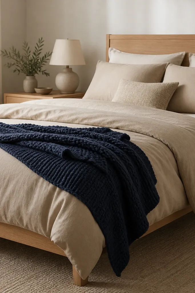
A chunky knit throw is the quickest way to add navy while keeping the room soft. The knit shadows create depth, so navy looks dimensional instead of flat. Beige base linens keep the look calm, and the oversized knit gives cozy texture without extra patterns. This is also easy to change seasonally — swap the throw color instead of everything else.
Choose a navy throw with visible loops or thick yarn, not a thin blanket that lies smooth. Drape it so it covers the side of the bed and spills about 10-14 inches down. Keep pillows in cream or oatmeal with one navy pillow for balance.
Pro tipWash the throw once before styling — chunky knits relax after a wash and drape better.
Watch outDon’t fold the throw into a tight rectangle. Crisp folds make chunky knit look stiff and cheap.
10. Greige Walls, Navy Bedding, and a Linen-Covered Bench

Greige walls sit right between beige and gray, so navy stays balanced instead of too stark. The linen-covered bench adds a soft horizontal line at the foot, which makes the bed look more styled. Woven baskets keep the natural texture theme going. A chandelier with warm bulbs makes navy look like it’s glowing, not absorbing light.
Pick greige that leans warm — test samples on a north-facing wall if you can. Use a navy duvet with a matte finish and add beige linen pillows. Choose a bench in natural linen or light oat fabric and keep it centered with enough space around it.
Pro tipPlace the bench about 6-12 inches away from the bed frame so it looks intentional, not shoved.
Watch outAvoid cool gray walls with navy bedding; it turns the navy flat and brings out a gray cast.
11. Antique Brass Lamps with Navy and Beige Nightstand Styling
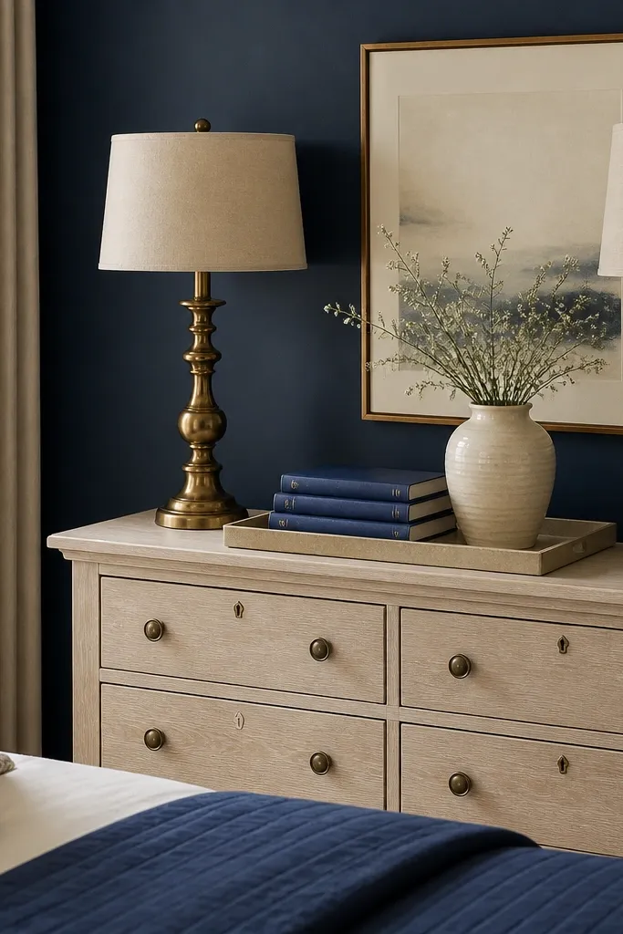
Lighting finishes do more work than people think. Antique brass around navy makes the room feel warm and lived-in because it reflects light with a honey tone. The beige tray keeps the styling from looking cluttered, and navy books bring the palette into the details. This setup is great if your bedding is already done and you want the room to feel finished.
Use two lamps with warm shades in off-white or oatmeal, not bright white. Style one nightstand with a beige tray, a small cream ceramic, and one navy object like a book spine or small box. Keep cables hidden and use a dimmer if you can; navy looks best at lower light levels.
Pro tipMatch lamp heights: the top of both shades should land within 1 inch of each other.
Watch outDon’t mix brass and silver on the same nightstand. The room looks assembled from leftovers.
12. Navy and Beige Bedding with a Stone-Tan Rug Border

A rug border gives you a “frame” around the bed area, so the navy feels controlled. The stone-tan border acts like a visual transition between the rug and your beige furniture. This is the type of rug that makes a room look designed even if your walls are plain. It also helps if you have mixed wood tones — the tan border ties them together.
Choose a rug where the border is clearly lighter than the navy field, like stone-tan or oatmeal. Keep bedding mostly beige and bring navy in through pillows and one throw. For wall art, use neutrals with navy accents instead of full navy prints.
If the rug border is busy, keep pillows solid. Let the rug do the pattern work.
Avoid tiny rugs that sit only under the center of the bed. The border needs space to read.