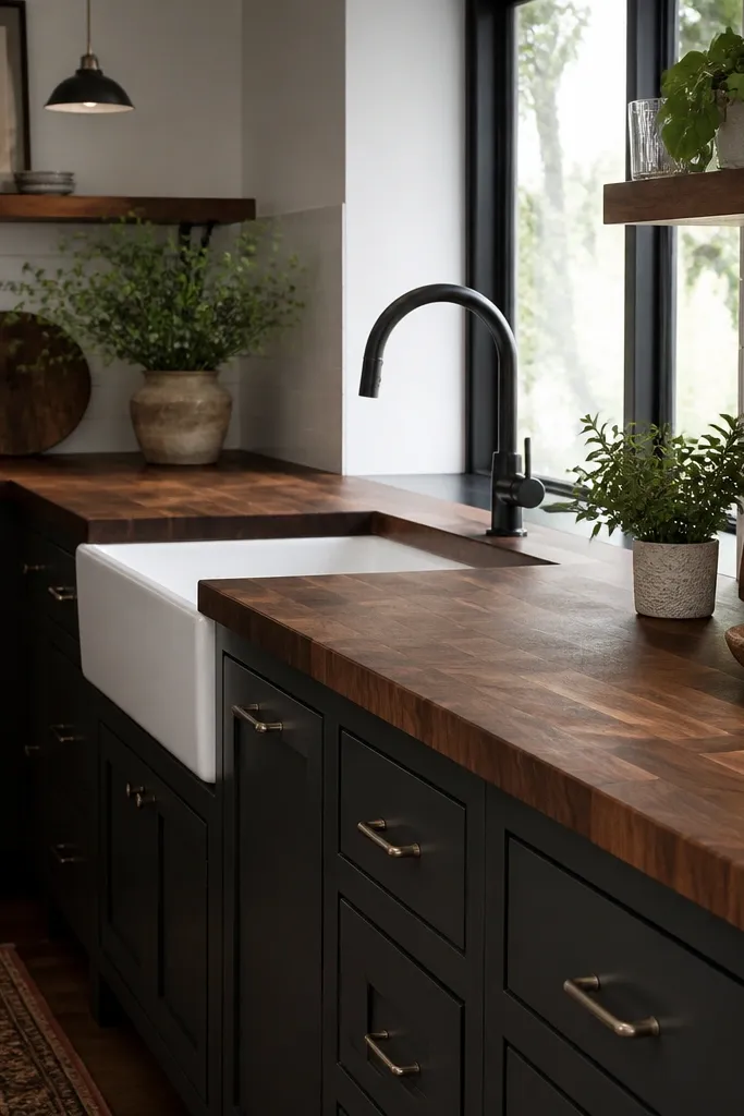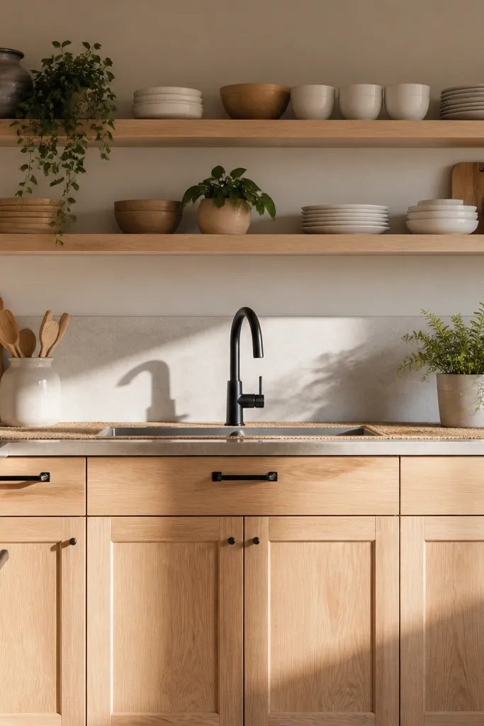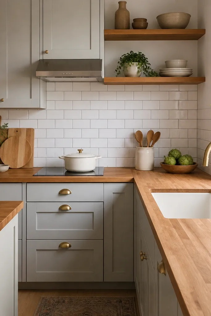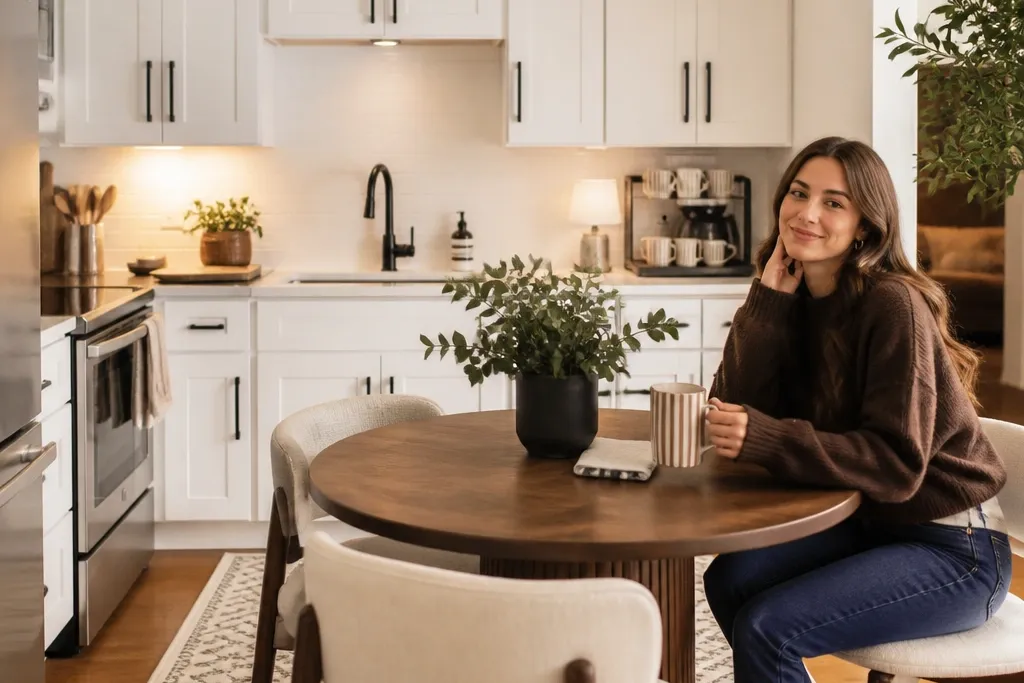

1. Scandi white counters with warm wood shelf and black accents
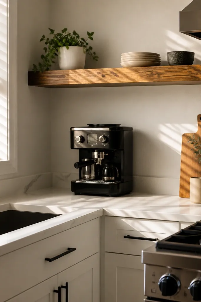
This look works because it gives you high-contrast clarity in a small Bloxburg kitchen. Use bright white counters and cabinet fronts so the room reads clean in screenshots, then add a single warm wood shelf above the coffee station or near the fridge. Keep black limited to one place — stove knobs, a faucet, or a small black rack — so it doesn’t overwhelm the space. The warm shelf makes the white feel lived-in, not sterile, and it gives you a surface for photogenic decor like jars and folded dish towels. Pair it with a dining table in the same wood tone to tie kitchen and dining together.
Place your sink under a clean backsplash wall and run white counters along at least 6-8 blocks of wall. Add a warm wood open shelf above the counter area, about 2 blocks above the countertop edge. Put a matching wood dining table nearby and choose dining chairs in a light neutral or wood finish. Keep black items to one cluster: a black faucet or a black utensil holder on the counter. Decor order: jars first, then a small tray, then one hanging or standing towel.
Use matching jar colors (clear glass with light labels) so the shelf looks styled instead of crowded.
Don’t mix three different wood tones; it makes the white cabinets look messy.
2. Galley kitchen with a narrow runner and matching pendant lights
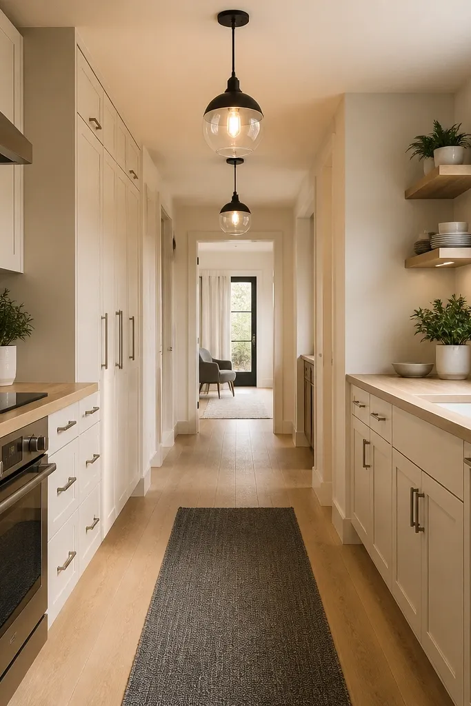
A galley layout looks best when you guide the eye down the hallway. This idea uses a narrow floor runner to create a “path” that makes the space feel longer and more intentional. Keep both sides of the galley visually consistent: same cabinet color, similar counter heights, and matching hardware. Add two pendants in a line over the center portion of the counters so the whole kitchen looks lit like a set. The runner adds warmth and texture, which is what your counters can’t do alone. It also improves dining vibes if your dining table sits at the end of the galley.
Align cabinets on both sides so the counter run is continuous for at least 10 blocks total. Place a runner in the center aisle with a width of about 1 block, leaving side clearances for walking. Install two pendant lights centered over the galley — space them about 3-4 blocks apart. Match hardware and fixtures on both sides (same color faucet and same cabinet knobs). Finish by placing one small decor tray per side near the middle, not at the ends.
Pick pendants with the same shape and color; mismatched pendants make the galley feel cluttered.
Don’t put decor on every cabinet corner; it breaks the clean, photo-ready line.
3. Dark moody counters with brass hardware and a glowing backsplash
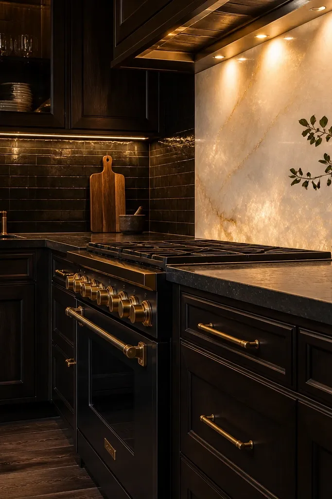
If your kitchen looks flat in screenshots, go darker on purpose. Dark counters and a deeper cabinet tone give you contrast, and brass-colored hardware adds warmth without needing tons of decor. Use a backsplash area with light reflection or a brighter panel behind the stove so the dark surfaces don’t swallow the room. The dining side should match the mood: choose a darker table top and chairs with warm tones so the whole area reads cohesive. This works especially well for evening lighting builds or houses with lots of window shadows. It also hides small clutter because dark surfaces visually absorb it.
Pro tipUse one gold tray on the counter to pull the brass theme into a single focal point.
Choose a dark counter color and keep cabinets either charcoal or a slightly lighter dark shade. Put the stove and sink on the same wall line so the backsplash can be a single continuous feature about 6-7 blocks long. Add brass hardware: faucet and cabinet pulls, spaced consistently. Place a warm light source directly behind or above the backsplash area so it brightens the center of the frame. For dining, use a table top that matches the counter darkness and keep chair cushions in tan or caramel colors.
Watch outDon’t add bright white decor everywhere; it fights the moody palette.
4. Tiny kitchen corner U-shape with a built-in breakfast nook
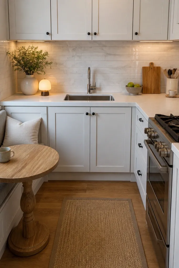
This is for the beginner-friendly bloxburg kitchen ideas crowd who has a small kitchen and wants it to feel bigger. A U-shape in the corner creates storage and counter space without needing a full wall run. Put your sink in the middle of the U and keep the stove on one side, so cooking actions feel grouped. Then add a breakfast nook right outside the U — a compact table with two chairs — so dining doesn’t steal counter space. The nook makes the kitchen feel like a real lived-in home, and it gives you a photogenic corner that reads clearly. Use light colors on the nook seats and a simple table finish so it stays airy.
Build the U-shape with two counter runs each about 4-5 blocks and one back run about 3-4 blocks. Keep an aisle of at least 2 blocks so you can walk past the nook area. Place a small breakfast table near the open side of the U and keep chair backs visible in the camera angle. Add a wall shelf or two above the U for jars and a small plant. Lighting: one pendant above the nook plus one overhead light for the counters.
Keep the nook chairs the same color as your kitchen accents (like cabinet trim) for instant cohesion.
Don’t place the nook too close to the U counters; crowding kills the “functional” look.
5. Two-tone cabinets with a blue-gray lower and cream upper
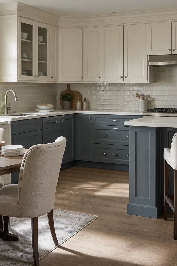
Two-tone cabinets look styled because they create a natural visual separation line. Cream upper cabinets brighten the room and make the ceiling feel higher, while blue-gray lowers ground the kitchen and hide scuffs. Add a simple neutral backsplash so the colors stay the focus. Keep your dining chairs in a light fabric tone that matches cream, and use a table in a wood or white finish. This idea is great for beginners because you only need two cabinet colors plus one neutral element. The result reads modern and intentional even when your decor is minimal.
Pro tipUse the same blue-gray on one small item — a utensil holder or a small rug — so the palette feels locked in.
Set upper cabinets to cream and lower cabinets to blue-gray, covering a single continuous run of at least 7-9 blocks. Place your backsplash in a light neutral panel or tile look so it doesn’t add extra colors. Put the stove and sink centered on the blue-gray lower run for a clean visual line. Add one accent color through decor: small blue items or light gray textiles on the dining chairs. Finish with an overhead light plus a small pendant over the dining area.
Watch outDon’t add a third cabinet color; two-tone already does the heavy lifting.
6. Farmhouse kitchen with beadboard backsplash and open wood racks
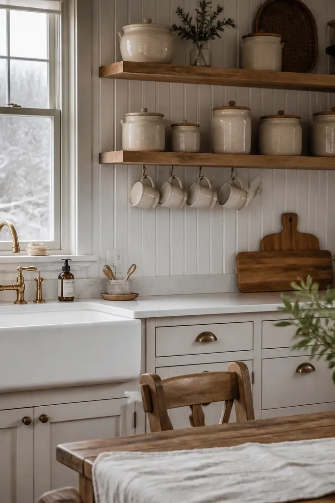
Farmhouse looks good in Bloxburg when the texture is controlled. Beadboard backsplash gives you vertical detail that reads well in screenshots, and it makes plain white counters look rich without needing fancy lighting. Open wood racks over the counter add usable storage and a warm, lived-in vibe. Keep your dining table in a weathered or honey wood tone and choose chairs with light cushions. This build is great if your kitchen needs personality but you don’t want clutter. The rack creates “busy” in a tidy way because items line up visually.
Use white cabinets and counters, then apply a beadboard-style backsplash behind the stove and sink area about 6 blocks long. Install open wood racks above the counter run, with rack height about 2 blocks above the countertop. Place matching wood cutting boards and a few jars on the rack, keeping to 4-6 items per rack. Add a farmhouse dining table and place it so the rack lines up visually with the dining wall. Lighting: a pendant over the table plus a bright overhead light to keep beadboard crisp.
Use one patterned item only — like a striped towel — so the beadboard texture stays the star.
Don’t stack too many hanging items under the rack; it turns into visual noise.
7. Modern black-and-white kitchen with marble-look counters
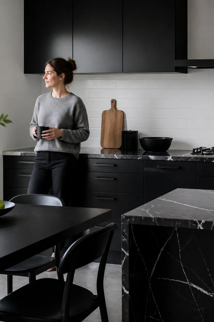
High-contrast black-and-white kitchens photograph clean and feel “designed” even with basic props. Use black cabinets or a black base, then add marble-look counters or a counter surface with subtle gray veining. Keep the backsplash simple and bright to avoid making the room too heavy. For dining, go with a black table and white or light-gray chairs so the dining area matches the kitchen’s crisp theme. This is a good choice for beginners because the palette is strict: two colors plus one neutral metal finish. The room looks tidy because the surfaces read instantly.
Set cabinets to black along a counter run of at least 8 blocks and keep the counters light gray/white. Place the stove and sink on the same wall so the marble-look surface spans a continuous area. Add a bright backsplash panel behind the stove — about 3-4 blocks wide. Choose black dining table and light chairs, placing the table centered so it shows in front camera angles. Add a single metal accent like a silver faucet and one silver light fixture.
Pick one countertop edge style (straight or rounded) and don’t mix similar shapes elsewhere; it keeps the modern look tight.
Don’t add colorful decor like bright reds; it breaks the black-and-white discipline.
8. Warm tan kitchen with textured rattan bar stools and a light wood table
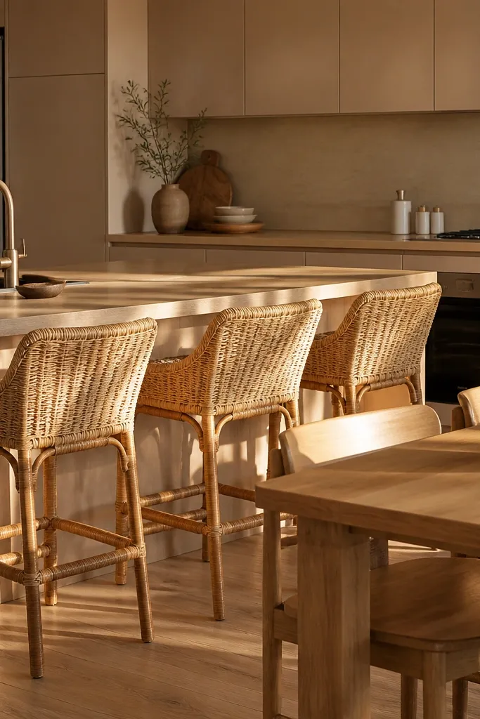
Warm tan kitchens look expensive because they create softness without needing dark moody lighting. Tan cabinets and light wood counters give you a cozy base, and rattan-style seating adds texture that reads in still images. Put a breakfast bar or peninsula between kitchen and dining so you get an extra “layer” of interest. The bar makes the space feel functional for casual meals, and the rattan texture keeps it from looking flat. Use a light wood dining table with matching warm tones so the kitchen and dining look like one plan. Keep wall decor minimal: a single framed piece or a small plant near the window.
Pro tipUse matching cushion color on the dining chairs to tie the tan palette together visually.
Build a peninsula or bar counter about 3-4 blocks long extending from your counter run. Place 2-3 bar stools spaced evenly, leaving about 1 block of clearance between stool and counter edge. Use tan cabinets with light wood counters and keep the backsplash in a neutral white or beige. Add a light wood dining table near the bar, positioned so the chairs are visible from the kitchen angle. Lighting: one pendant over the bar and one overhead light for counters.
Watch outDon’t put bright neon decor in the tan space; it will look out of place instantly.
9. Kitchen island with waterfall counter edge and 3-piece dining set
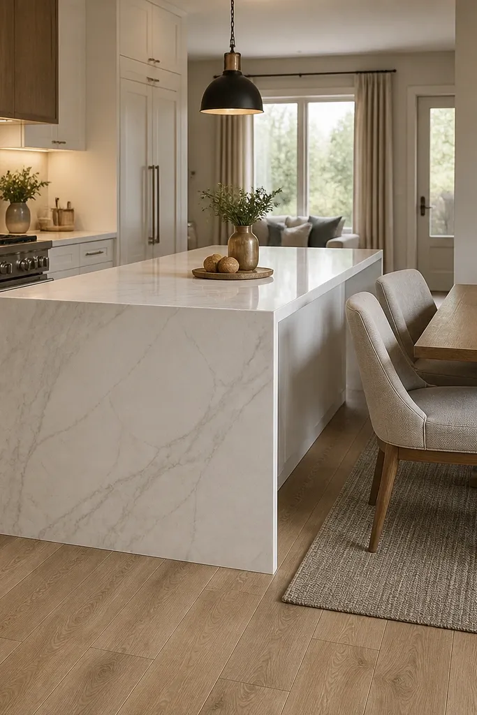
An island is the fastest way to make a beginner build look high-effort. Choose an island with a clean waterfall edge or a double-depth counter so it shows depth in screenshots. Place it so it frames the kitchen’s center — usually between the counter run and the dining area. Then use a 3-piece dining setup: one table plus two chairs or a bench style, matched to the island’s wood or color. This idea solves the common problem where dining looks tacked on. When the island and dining share the same material tone, the whole room reads cohesive. Keep decor off the island except for one tray and one small plant so it stays photogenic.
Place the island so it leaves an aisle of at least 2 blocks around it. Make the island counter run about 5-7 blocks long, and keep the dining table within 3-4 blocks of the island edge. Match the island finish to your dining table finish (same wood tone or same cabinet color). Add one pendant light centered above the island with a clear gap to the counter. Finish with a single tray on the island and a small bowl or vase.
Center your camera-friendly focal point: island pendant + dining table line should form one visual axis.
Don’t clutter the island with more than one decor group; it makes the room feel cramped.
10. Corner pantry wall with glass jars and a small dining buffet table
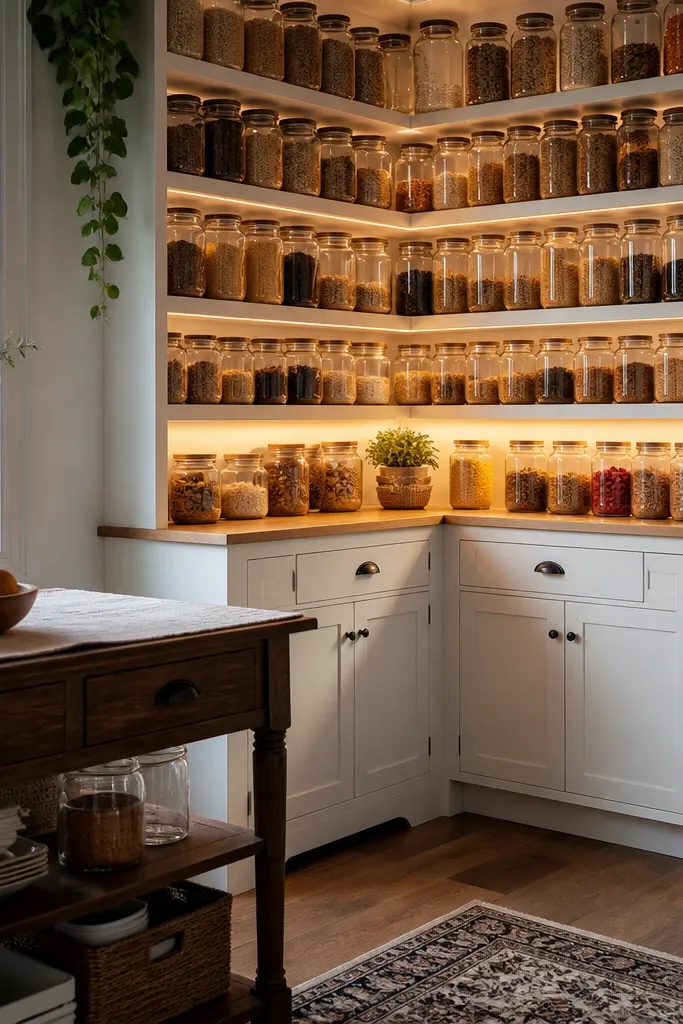
This build makes a kitchen look organized because it gives you a reason for wall decor. Put your pantry items on a dedicated corner wall: a couple of cabinets plus open shelving with glass jars. Glass jars look clean and uniform, so even beginners can style without overthinking. Add a small buffet table near the dining area to create a “serving zone” that ties kitchen and dining together. Use matching linens in neutral tones and keep the jar labels within a similar color family. The result is a kitchen that looks like it has storage and systems, not random decorations.
Pick a corner and install open shelving on one wall and closed cabinets on the adjacent wall, spanning about 5-6 blocks total width. Add 6-10 glass jars evenly spaced across the shelf levels, leaving 1 jar width of empty space between groups. Place a buffet table 2-3 blocks from the dining chairs so it doesn’t block movement. Style the buffet with a tray and one tall item like a vase or candle stand. Lighting: a wall light near the pantry shelf plus an overhead light for the dining zone.
Use jar heights to create rhythm: 3 short, 4 medium, 2 tall, not all the same height.
Don’t mix jar styles and lid colors wildly; it ruins the tidy look.
11. Window-seat dining nook with a curtain and a built-in storage bench
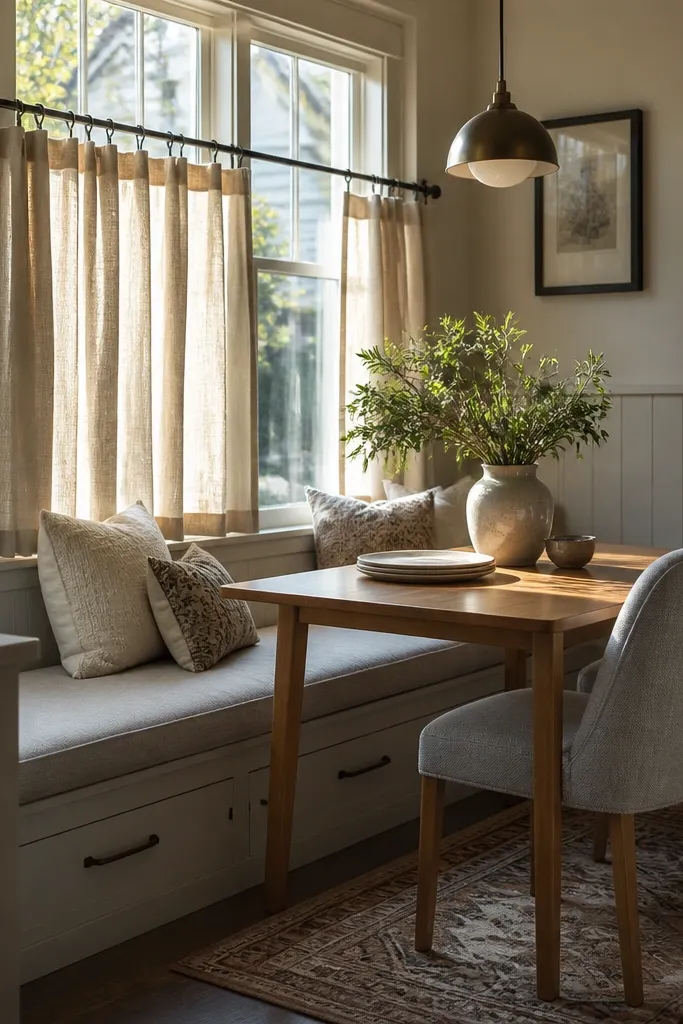
If your dining area feels like a separate room, a window-seat nook fixes it. Put the dining table right next to a window and add a built-in storage bench or seating under the window line. Add a curtain that hits to the bench height so the corner looks framed. This makes the kitchen-dining transition feel natural because the window becomes the common visual anchor. Choose a light table finish and cushions in one consistent neutral color, then add one small centerpiece tray. This idea is beginner-friendly because you can keep the kitchen counters simple; the nook does the styling work.
Pro tipHang the curtain so it touches the bench or floats just above it; it looks intentional instead of random.
Place a window on one wall that’s visible from the kitchen. Set a dining table so it sits 1 block away from the window seat area, with chair placement aligned to the window frame. Add a storage bench under the window and put cushions sized to cover the bench surface. Style with one tray centerpiece and a small vase. In the kitchen, keep the counter run and backsplash simple so the nook remains the focal point.
Watch outDon’t choose patterned cushions and patterned curtains at the same time.
12. Monochrome sage kitchen with soft lighting and rounded decor shapes
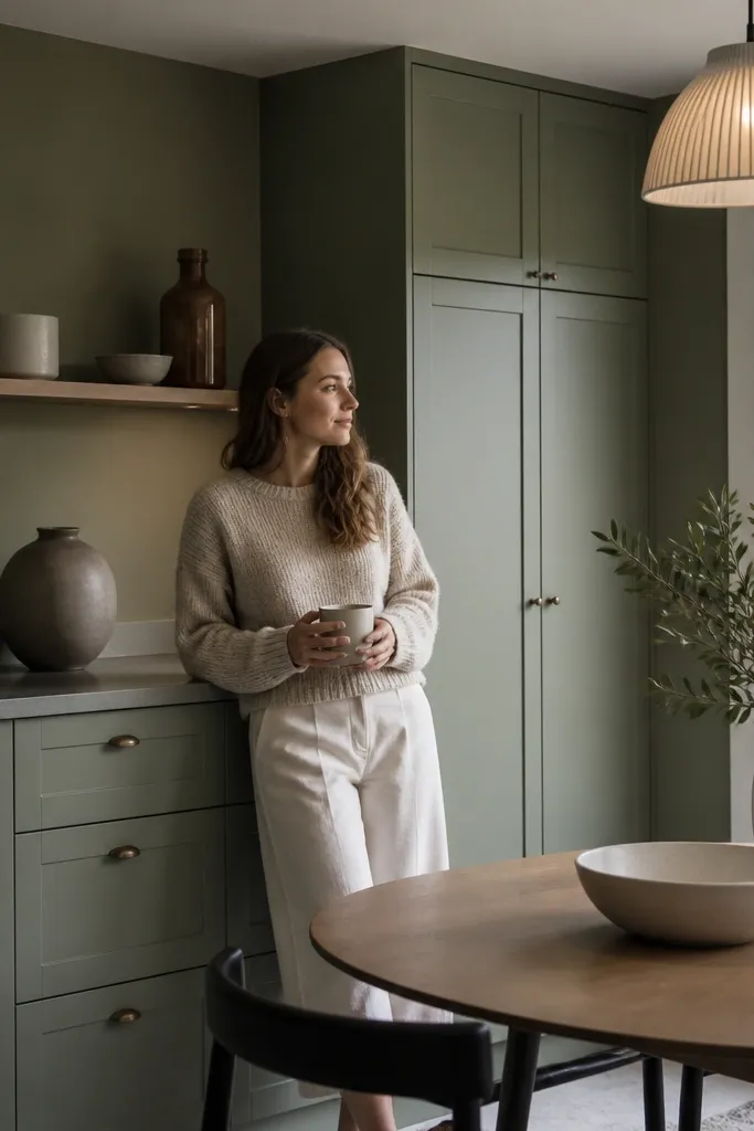
Sage is the color that reads calm and stylish without needing a complicated build. Use monochrome sage across cabinets and accent walls, then bring in rounded decor shapes like rounded vases and smooth bowls to keep it cozy. Soft lighting matters here: place warm overhead light and add a pendant over the dining or breakfast counter so the sage looks flattering. Keep countertops in a light neutral to prevent the room from turning dull. This kitchen idea works well when you want beginner-friendly bloxburg kitchen ideas that still look cohesive. Dining chairs should match the sage or be a light cream so everything blends.
Pro tipPick one shade of sage and stick to it; mixing olive and gray-sage makes the palette look muddy.
Set cabinets and any accent wall to sage and keep countertops in a white or light cream tone. Install backsplash in a simple neutral panel so it doesn’t compete with the sage. Add a pendant over the dining table or breakfast counter and space it centered above the seating area. Choose rounded decor items in white, cream, or light gray for contrast. For dining, keep chair backs the same color family as the kitchen cabinets.
Watch outDon’t add strong black accents everywhere; use one small black item max.
13. Red accent kitchen with cream counters and a matching dining runner
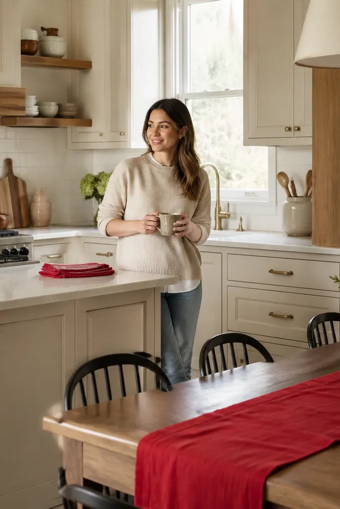
A single strong red accent gives your kitchen a clear personality in screenshots. Use cream counters and light cabinets as the base, then add red only in a few places: a red kettle or decor item, red dish towels, and a dining runner. That’s enough for the room to feel styled without making it look chaotic. The dining runner is key because it ties the kitchen palette into the dining area, which many beginner builds miss. Keep the rest neutral: wood table, light chair cushions, and a simple backsplash. The result is bright, friendly, and photogenic.
Set your kitchen cabinets and counters to cream and keep backsplash in a light neutral. Add red accents in a cluster on the counter near the sink or coffee corner, using 2-3 red items max. Place a dining table in light wood and add a runner under the table or along the dining floor area. Choose dining chairs with light cushions so the red pops. Lighting: one overhead light plus a pendant over the dining table so the runner looks crisp.
Repeat red in the same visual scale: small towel + medium runner, not oversized decor everywhere.
Don’t scatter red across the entire kitchen; keep it in one zone.
14. Industrial loft kitchen with gray concrete counters and wire shelving

Industrial kitchens look best when you lean into structure — exposed shelving, simple fixtures, and gray concrete-like counters. Use gray counters and a darker metal palette for sink and stove area. Wire shelving gives you storage and visual lines, and it looks good even with few items because the shelf itself is the decoration. For dining, choose a simple dark table and chairs with minimal color so the kitchen textures stay the focus. This is a great option if you want a stylish look without relying on lots of wall art. The industrial theme also hides uneven decor spacing better than bright farmhouse styles.
Pro tipMatch shelf items by color family (clear glass + gray) to keep the wire shelves from looking cluttered.
Use gray counters across a main wall run of 7-9 blocks and keep cabinets either dark gray or black. Install wire shelving above the counter area and place 5-7 items total: jars, a small pot, and a couple of utensils. Keep backsplash simple and matte so it looks like concrete. Place a dark dining table near the kitchen wall and add chairs in gray, black, or metal tones. Add one pendant light with a dark shade over the dining table and a bright overhead light for counter readability.
Watch outDon’t use glossy decor against matte counters; it looks mismatched in screenshots.
15. Classic coastal kitchen with white tile floor look and light blue dish decor
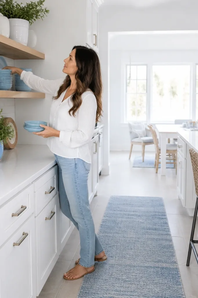
Coastal kitchens are beginner-friendly because they follow a simple rule: keep the base bright and use blue in small, repeatable doses. Use bright white counters and a light backsplash, then add light blue through dish decor, a runner, and maybe a small plant pot. The trick is to keep everything airy: no heavy dark wood everywhere, and no bold patterns on multiple surfaces. Pair it with a light wood or white dining table so the whole room feels open. This build works well for kitchens with windows, because the light blue accents catch the daylight and look fresh in photos.
Choose bright white counters and cabinets and keep the backsplash light and simple. Add a light blue runner or mat near the dining area and place 2-3 light blue decor items on the counter (towel, dish set, or small vase). For dining, use a light wood table and chairs in white or pale blue cushion tones. Keep your countertop decor limited to one tray group so it doesn’t look busy. Lighting: use overhead light and add a pendant over the dining table for a clean focal point.
Use the same light blue on at least two surfaces — counter decor and dining runner — so it feels connected.
Don’t add dark navy accents; it fights the airy coastal look.