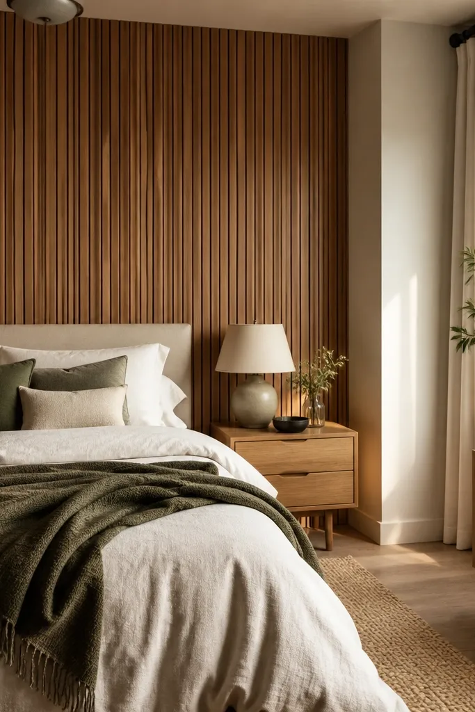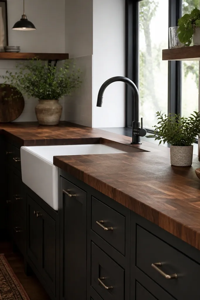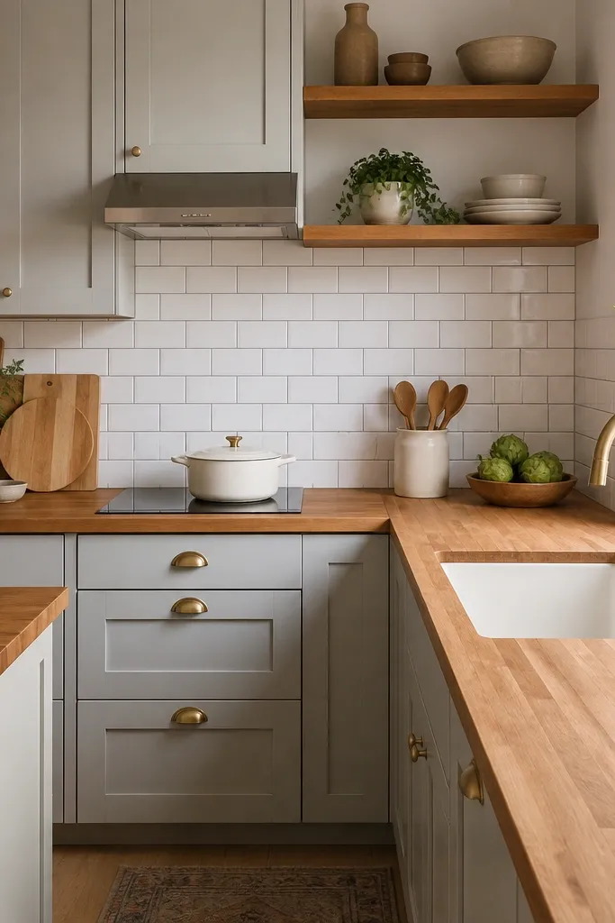
1. Two-Tone Cabinet Line with a Light Counter Break
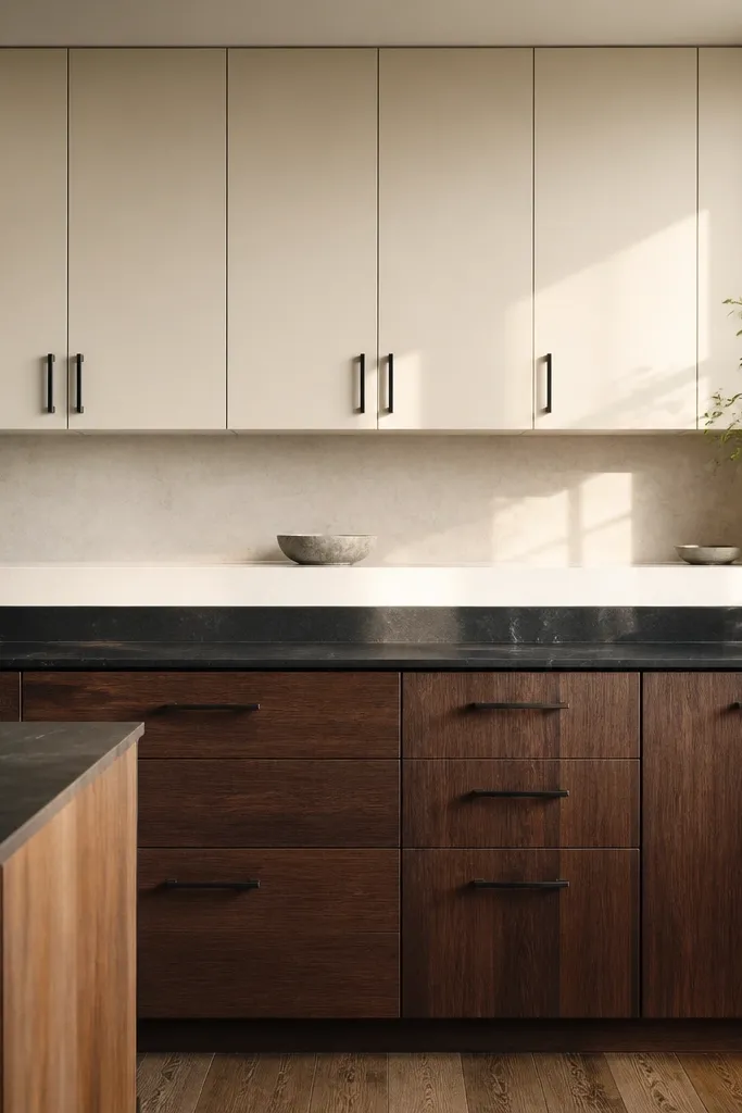
This is the fastest way to make a Bloxburg kitchen look planned. Keep your upper cabinets light (cream, off-white, or pale oak) and make the lower cabinets one shade deeper (walnut, espresso, or charcoal). The light counter break visually lifts the room and stops the “blocky” look from stacking everything at one height. It also gives you a clear horizontal line that reads well in screenshots, especially from the dining side looking toward the kitchen wall.
Start by selecting one upper cabinet color and one lower cabinet color that sit in the same warmth level (both warm or both cool). Place the lower cabinets first, then align the counter so it spans the entire run with no gaps. Finally, add a matching pale countertop surface right above the darker base cabinets, then repeat the darker tone in one small element like a black faucet or dark cabinet handles.
Pro tipRepeat the lower cabinet color in your dining chairs or a small barstool so the whole kitchen feels connected.
Watch outDon’t mix warm wood cabinets with cool gray countertops; it makes the whole kitchen look like separate rooms.
2. Backsplash Tile Strip That Frames the Sink
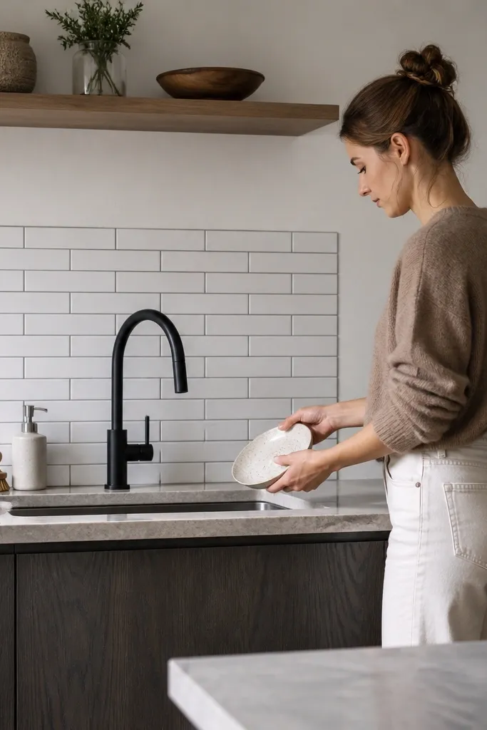
A backsplash strip is the budget move that makes the kitchen look finished. Put a tile pattern only behind the sink and part of the counter run, then stop it cleanly so it looks intentional. Choose a light tile base (white, chalk, or pale beige) and add a thin darker grout line so it catches light instead of blending into cabinets. This is especially good if your sink area looks flat or if the wall behind your faucet looks empty in photos.
Place your sink first, centered on the wall run. Then build the backsplash strip to cover from about one cabinet width to either side of the faucet, and extend upward to just below the upper cabinet bottoms. Finish by adding a narrow border line (a darker trim or a second tile shade) so the backsplash reads like a framed rectangle.
Pro tipKeep the backsplash pattern small; large tile graphics make screenshots look busy in small kitchens.
Watch outDon’t cover the entire kitchen wall with a loud pattern; one framed area looks sharper.
3. Undercabinet Warm Light Glow for Instant Depth
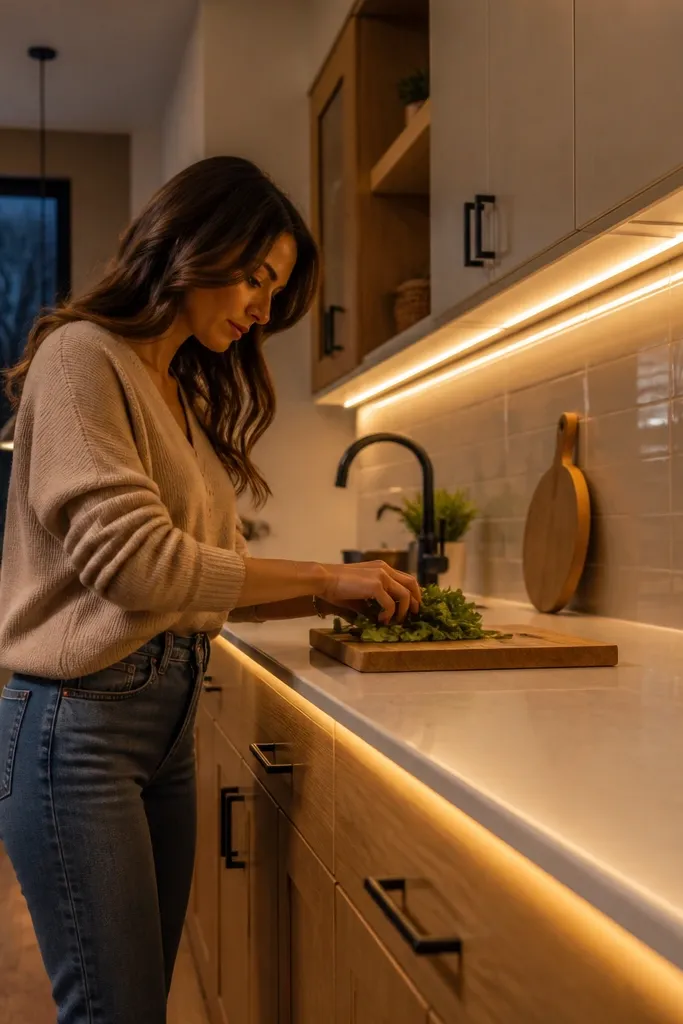
Lighting is the difference between “cheap” and “photogenic” in Bloxburg kitchens. Undercabinet warm light makes your countertops look like they have depth and reduces the gray cast that kills wood tones. Put the glow along the front edge of your counters under upper cabinets so it highlights the counter line in every angle. This upgrade makes your sink area and food prep surfaces look styled even if your furniture budget is tight.
Turn on undercabinet lights and place them directly under each upper cabinet segment, not floating in the middle of the wall. Space the fixtures evenly so the glow band looks continuous along the counter run. Then check two angles: one facing the kitchen from the dining side and one from the counter side, and adjust the light intensity so countertops look warm, not orange.
Pro tipIf your cabinets are dark, use slightly brighter under-lighting; dark doors swallow light fast.
Watch outDon’t rely on ceiling lights alone; it flattens counters and makes everything look the same tone.
4. Black Faucet + Matching Hardware Consistency
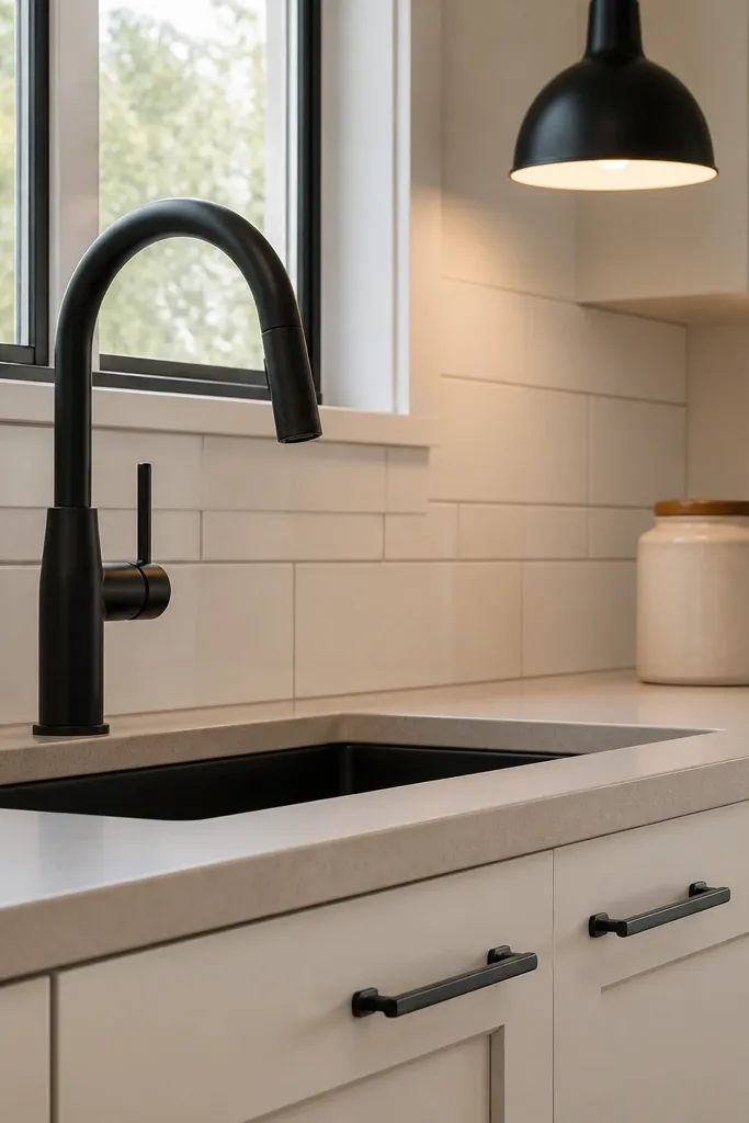
A kitchen looks expensive when metal finishes match. Choose one metal tone — black — and repeat it in at least two spots: faucet and cabinet pulls, or faucet and light fixtures. Black hardware creates crisp contrast against light cabinets and makes the sink wall pop in screenshots. It also fixes a common budget kitchen bloxburg ideas problem: mixed metals that look like random items placed on top of each other.
Pick your cabinet pull style first. Swap every visible handle or knob to the same black tone, then choose a black faucet that matches the pull. Place a small black detail near the sink like a soap dispenser or a utensil holder so the black reads as a theme, not just one object.
Pro tipKeep your fridge and microwave hardware in the same direction (dark or neutral) so the black doesn’t fight other shine.
Watch outDon’t mix chrome faucets with matte-black handles; it reads messy in kitchen close-ups.
5. Narrow Open Shelf Instead of Full Wall Cabinets
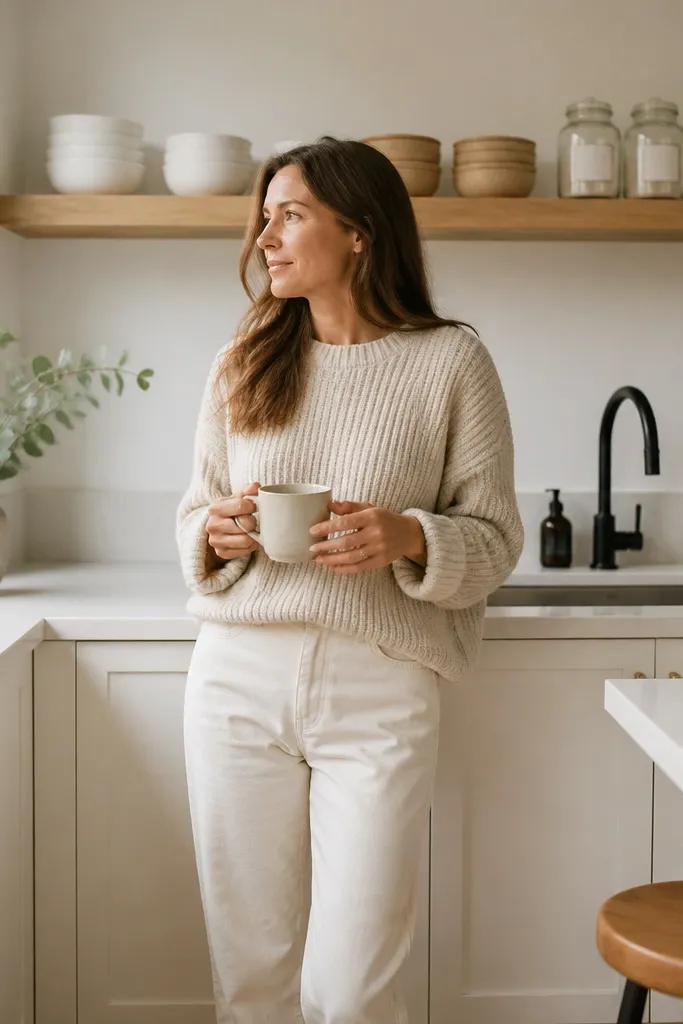
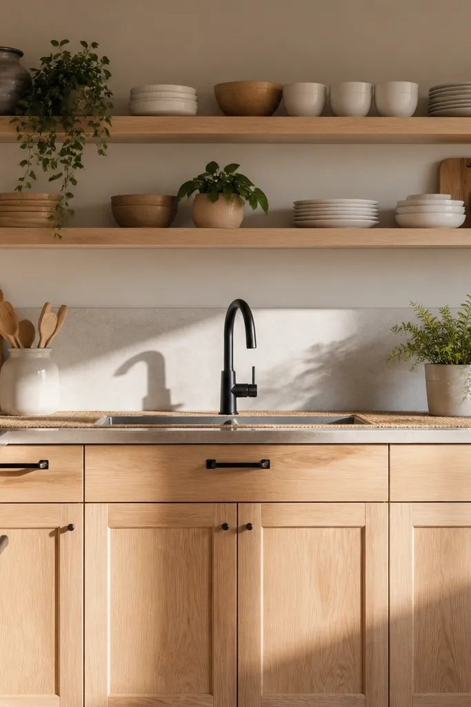
Open shelving is the cleanest budget way to add styling without crowding. A single narrow shelf above the counter breaks up big cabinet blocks and gives you a place for a few matching items. Stick to one wood tone shelf and keep the items grouped by color — white dishes, tan bowls, or one set of matching jars. This makes the kitchen look curated, not empty, and it photographs well because it adds vertical interest without clutter.
Select a shelf length that covers about half the counter run, not the whole wall. Place it where upper cabinets would normally sit, aligned with your backsplash edge so everything feels straight. Then add 3-6 items total: two stacks of plates, one utensil crock, and one bowl or jar group so the shelf looks styled but not busy.
Pro tipLeave space between items; the negative space makes the shelf look intentional.
Watch outDon’t fill the shelf completely; full shelves look chaotic in screenshots.
6. Countertop Runner in a Single Color Block
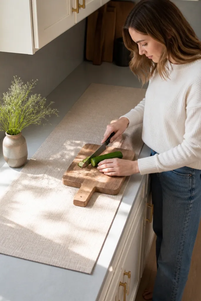
A runner is a cheap trick that makes your counter feel like a real room, not just furniture placed on a grid. Use a single fabric color that matches your cabinet undertone: warm beige for warm wood, cool gray for painted cabinets. Place it along the main prep counter section, not across the whole kitchen. The runner also hides small visual clutter from appliances and makes food-prep zones look defined.
Choose a runner that covers about one third to half of the counter length, leaving clear space near the sink and stove. Lay it straight with the edge aligned to the counter front so it reads clean. Add one small styling item on top like a cutting board or a ceramic tray in the same tone family as your runner.
Pro tipPick one accessory color that repeats in dining — like tan wood or white ceramics — to tie the kitchen together.
Watch outDon’t use multiple patterns; one solid block looks more expensive than mixed prints.
7. Island or Peninsula with a Clear Staging Side
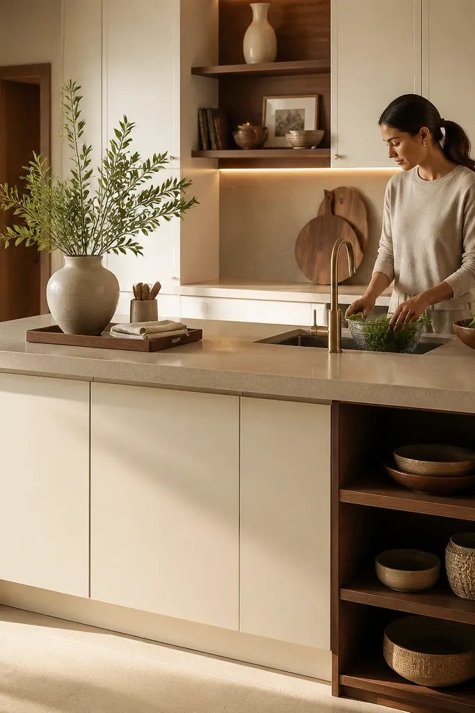
If you have an island, don’t decorate both sides equally. Make one side the “staging side” with a minimal setup: a tray, a vase, and one small utensil holder. Keep the other side more functional, with the sink or prep items placed neatly. This creates a strong visual hierarchy and stops the common problem where islands look cluttered and flat in photos. It also helps your kitchen look larger because there’s a clear empty area for the eye to rest on.
Decide which side faces the dining area or the main camera angle. Place your main decor cluster on that side only, keeping it within a rectangle about 2-3 studs wide and 4-6 studs long. Then place functional items on the opposite side, but keep them aligned in a line so the edge of the island still reads crisp.
Use one tray color and keep everything on it — that’s the easiest way to look styled fast.
Don’t scatter decor across the whole island; it kills the clean, upscale look.
8. Dining Corner Built from One Table + Two Visual Heights
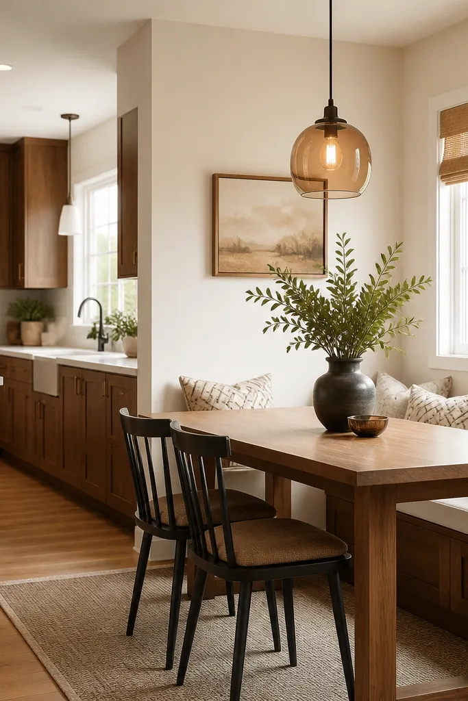
A kitchen upgrade is incomplete if the dining corner looks disconnected. Pick a dining table that matches your cabinet undertone and add two visual heights: a wall light or pendant above the table, and a taller plant or vase at one side of the seating. This frames the dining area and makes it feel like a real adjoining space, not a random add-on. In screenshots, this is what gives your kitchen a “designed” look.
Place the dining table so it sits parallel to the main kitchen wall and leaves 2-3 studs of walkway space around the chairs. Add a hanging pendant or wall light centered over the table, then place a plant or tall vase on the side that faces the kitchen. Keep the chair color consistent with your hardware or runner color so the dining and kitchen feel linked.
Pro tipChoose one chair type with a visible back shape; flat chairs blend into the floor.
Watch outDon’t put a dining set right against the kitchen counter run; it makes the whole area feel cramped.
9. Open Pantry Wall with Staggered Jars
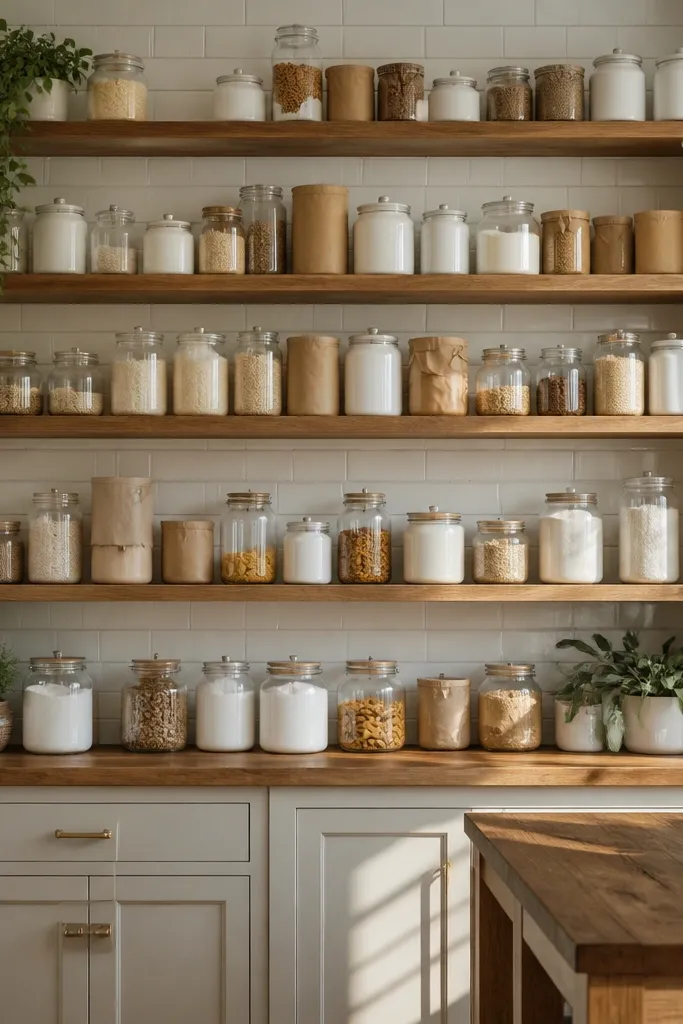
Pantry styling is one of the most photogenic budget kitchen bloxburg ideas because it adds color without taking floor space. Build an open pantry wall section with shelves and place jars in a staggered pattern. Use 2-3 jar colors max so the wall reads cohesive: clear + white + tan, or white + light blue + beige. The staggered stacks create depth and make the pantry look lived-in instead of empty.
Pick a wall section near the kitchen prep area and dedicate about one cabinet-width to the pantry. Place shelves at two heights so jars can stack without touching the top shelf. Then add 9-15 jars total in staggered rows, keeping the biggest jars on the bottom shelf and smaller ones above.
Pro tipLeave one shelf partially empty; the gaps make the jar wall look intentional.
Watch outDon’t use too many jar colors; variety looks cheap when it turns into a patchwork.
10. Stove Wall Styling with a Matching Hood or Shelf
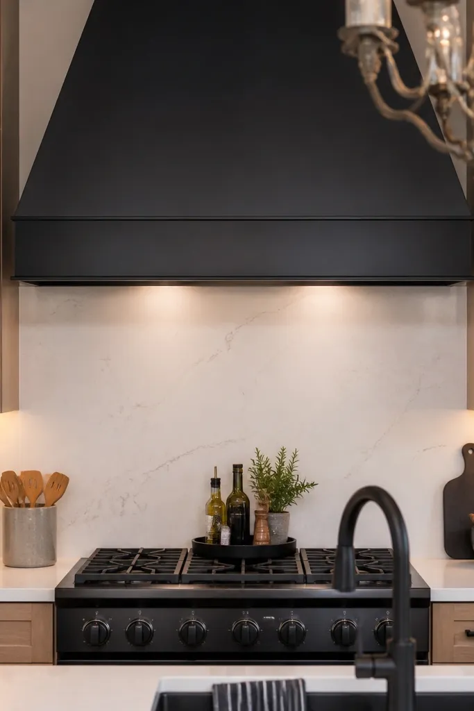
Your stove wall is the first thing people notice in kitchen screenshots. Create a focal frame by adding a hood-like element or a centered shelf above the stove area, then keep counter items tidy and aligned. Choose a neutral hood color that matches your faucet metal (black) or your cabinet hardware tone. This makes the stove area look built-in, which is the visual difference between “placed appliances” and a designed kitchen.
Center your stove on the wall run, then place a hood or shelf directly above it with a matching metal tone. Keep 1-2 counter items near the stove — like a utensil crock and a cutting board — and align them to the same side edge. Finally, check the line of sight from the dining corner to ensure the stove and shelf are centered and not off-angle.
Pro tipUse one vertical element near the stove wall, like a tall utensil holder, to add height without clutter.
Watch outDon’t cram the stove counter with random appliances; keep the area clean and symmetrical.
11. Glass-Front Cabinet with One Color Theme Inside
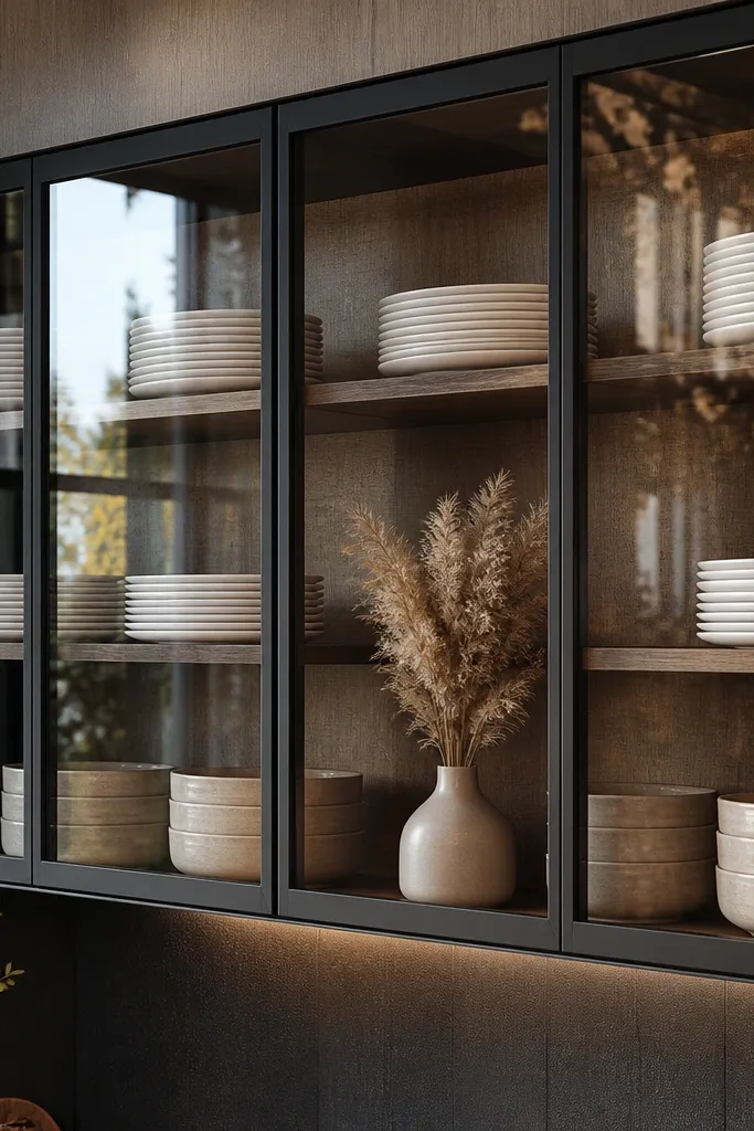
Glass-front cabinets make kitchens look higher-end because they add depth and “display” without extra floor clutter. Put glass doors on one upper run only, not everywhere, so it stays a feature. Fill the inside with one theme: white plates, beige bowls, or a stack of books and a vase. The visual rhythm of repeated dishes makes the cabinet area look styled even when the rest of your kitchen is simple.
Choose one upper cabinet segment near the sink or dining-facing wall and swap it to glass-front. Place items inside so they form two stacks and one accent group — aim for 8-12 items total. Then repeat one of the inside colors in a nearby accessory like a runner or tray so the display and the room match.
Pro tipKeep the display slightly uneven — one taller stack — for a natural look that still reads organized.
Watch outDon’t fill every glass cabinet slot; empty shelves and a clean arrangement look more realistic.
12. Corner Breakfast Nook with a Bench and a Round Accent
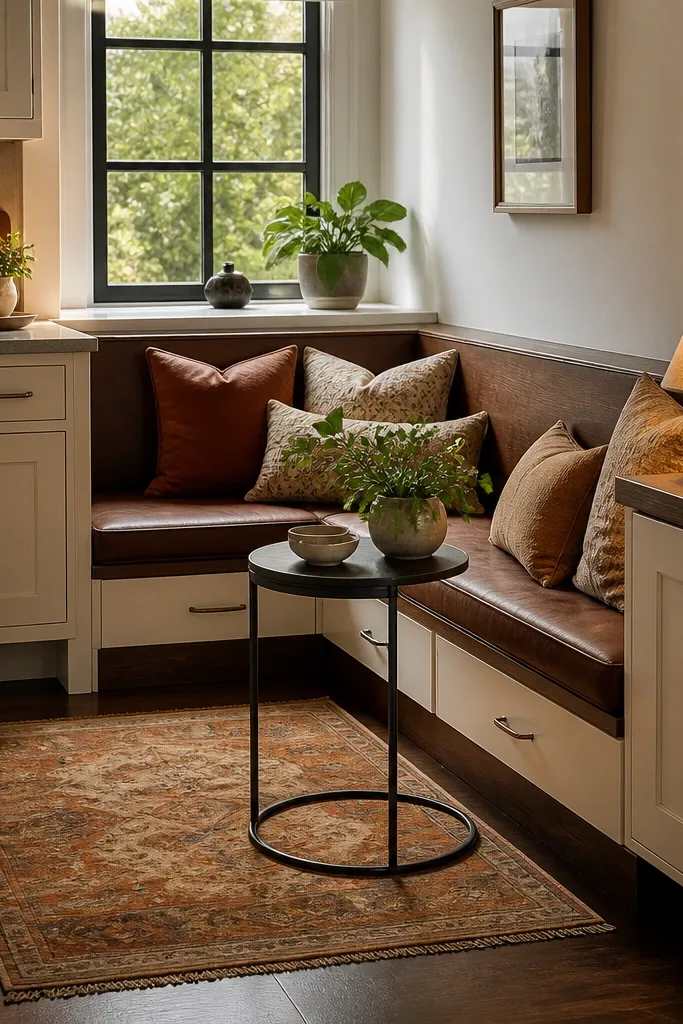
A corner breakfast nook solves two visual problems at once: it gives your kitchen a cozy dining zone and it keeps the main counter wall from being the only focal point. Use a bench or two-seat corner arrangement and add a small round side table with a lamp. Choose warm tones that match your cabinets and add a small rug under the seating area to define the nook visually. This looks great in screenshots because it frames the kitchen with soft shapes instead of harsh rectangles.
Place the bench in the corner with at least 2 studs of clearance from any nearby counters. Add a small round side table between the bench and the closest wall so it doesn’t block the walkway. Then add a compact lamp and one small tray on the table, using the same metal finish you chose for the faucet.
Pro tipUse a rug under the bench even if it’s plain; it makes the seating feel anchored.
Watch outDon’t choose a dining set with sharp, oversized legs that overlap the bench in the corner.
13. Wall Art + Clock Cluster Above the Coffee Station
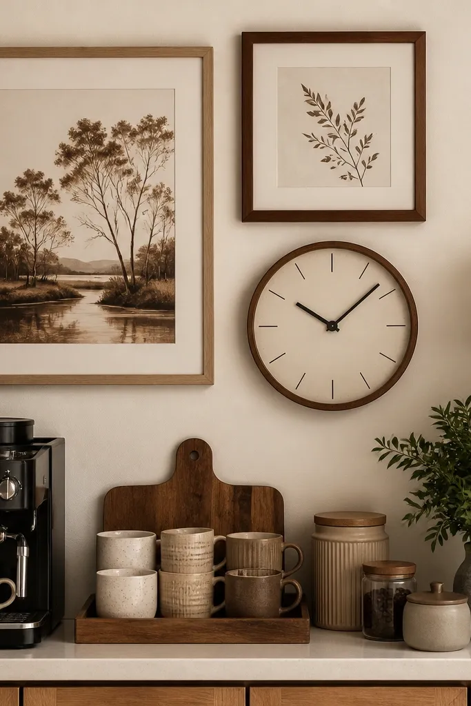
If your kitchen feels like it has “no personality,” the wall above your coffee station is usually the blank spot. Create a tight cluster: one small framed art piece plus a clock or second frame, all centered above a coffee counter. Use colors that match your kitchen palette — cream, warm wood, and one darker accent like black. This upgrade is cheap, adds strong visual structure, and makes your counter look like a designed corner rather than random appliances.
Pick a coffee station spot with a clear wall above it, ideally near the dining-facing side. Center the cluster so the total width matches the counter width, then place it just above eye level in your camera angle. Finish by adding a coffee tray on the counter with 2-3 items max so the wall art and the counter feel like one set.
Use one darker frame tone to repeat your faucet or hardware finish.
Don’t scatter frames across the wall; clusters look intentional and read better in photos.
14. Ceiling-Height Curtains for the Window Wall
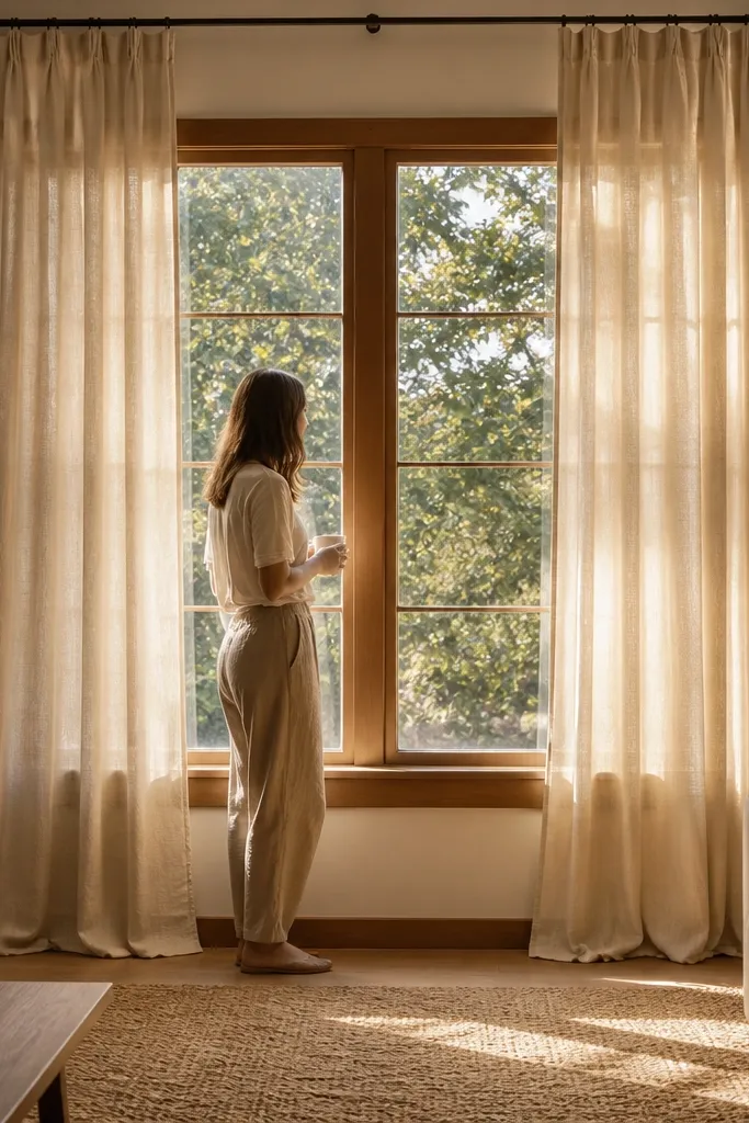
A window wall is where kitchen bloxburg rooms usually feel unfinished. Ceiling-height curtains fix that fast because they change the whole height of the space — your eye reads the room as taller and more styled. Go for a light, warm fabric like linen-look sand or cream, and keep the rod close to the ceiling so the drape looks intentional. Add a slim valance or a gathered top panel in the same color family to frame the window without blocking your backsplash details. This works best in budget kitchen bloxburg ideas when you want a big visual upgrade without redoing cabinets or counters.
Step 1. Place a curtain rod 6-10 blocks above the window top (or as close to the ceiling as your layout allows), and hang two panels so they land about 1-2 blocks beyond each window side. Choose linen-look cream or sand, and keep the fabric matte so it doesn’t glare in bright game lighting. Step 2. Add tiebacks at the window sides using a narrow ribbon or cord in the same tone as your hardware (black for black faucets, warm brown for brass-toned accents). Step 3. If you want extra polish, add a simple valance band behind the rod — keep it 2-3 blocks tall so it reads like a built-in trim instead of a separate decor piece. Effort is low and the cost is mostly the curtain set and a rod; you can do it in an afternoon.
Pro tipMatch curtain color to your counter or hardware, not your wall paint. A cream curtain paired with a warm wood or light countertop makes the whole kitchen look “put together” even with basic pieces.
Watch outAvoid sheer curtains without a valance or tiebacks — they look flat and unfinished against kitchen lighting.