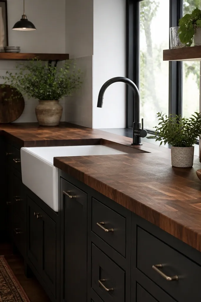
1. Espresso + Brushed Brass: the warm-lux combo
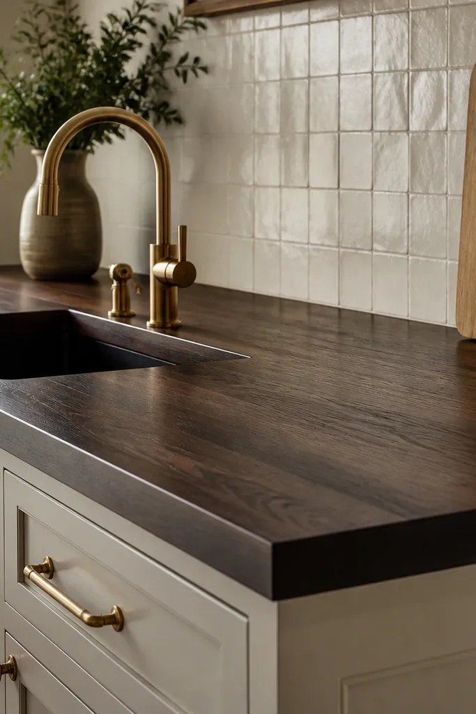
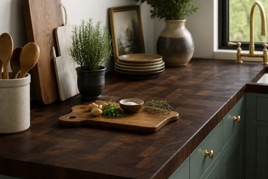
This look works because espresso-dark butcher block reads warm brown, and brushed brass brings golden highlights without going yellow. The grain shows just enough to keep it from looking like paint. I’ve seen this pairing make white cabinets feel richer and make dark floors look intentional instead of heavy.
Use a satin topcoat so brass doesn’t look harsh next to a mirror finish. Keep the edge profile simple: a rounded 1/4 inch edge or a gentle bevel looks best with butcher block. Style with a soap dispenser and a small tray in the same metal tone to keep the visual noise low.
Hold a brass cabinet pull up next to your sample stain in daylight. If the brass turns too yellow, switch to oil-rubbed bronze or choose a stain that leans cooler brown.
Avoid pairing espresso counters with bright chrome — it makes the wood look dull and gray.
2. Near-Black Butcher Block + Matte Black Hardware
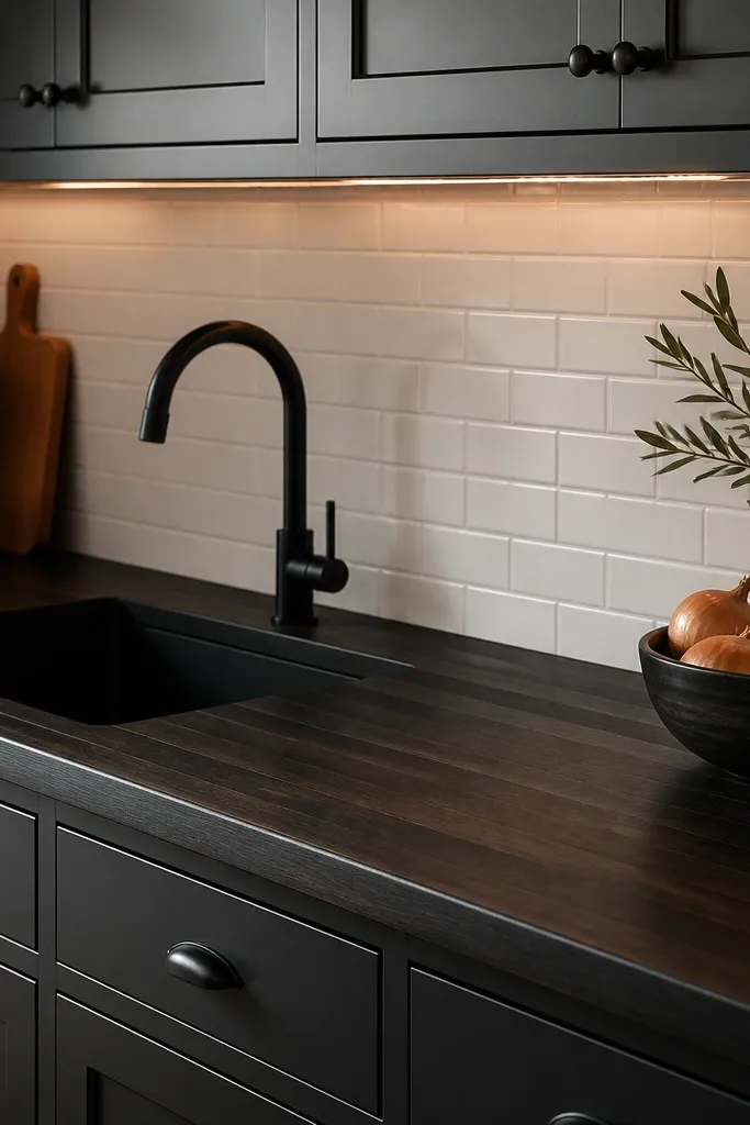
Near-black butcher block gives you that high-end “statement counter” effect, and matte black hardware keeps the look cohesive. Subtle grain stops it from looking like a flat laminate. Warm under-cabinet lighting is key - cool lighting makes the wood look like stained plywood.
Pick a stain described as black-brown or espresso-black, then seal with a low-sheen or satin finish. Keep the backsplash light so the counter doesn’t swallow the room. If your cabinets are gray, choose warm-white grout so the whole scene stays grounded.
Pro tipTest the stain on the same wood species and sample board thickness. Black tones can blot if the wood absorbs unevenly.
Watch outAvoid glossy clear coats — they show streaks from daily use and ruin the expensive matte vibe.
3. Walnut-Brown Stain + White Oak Accents
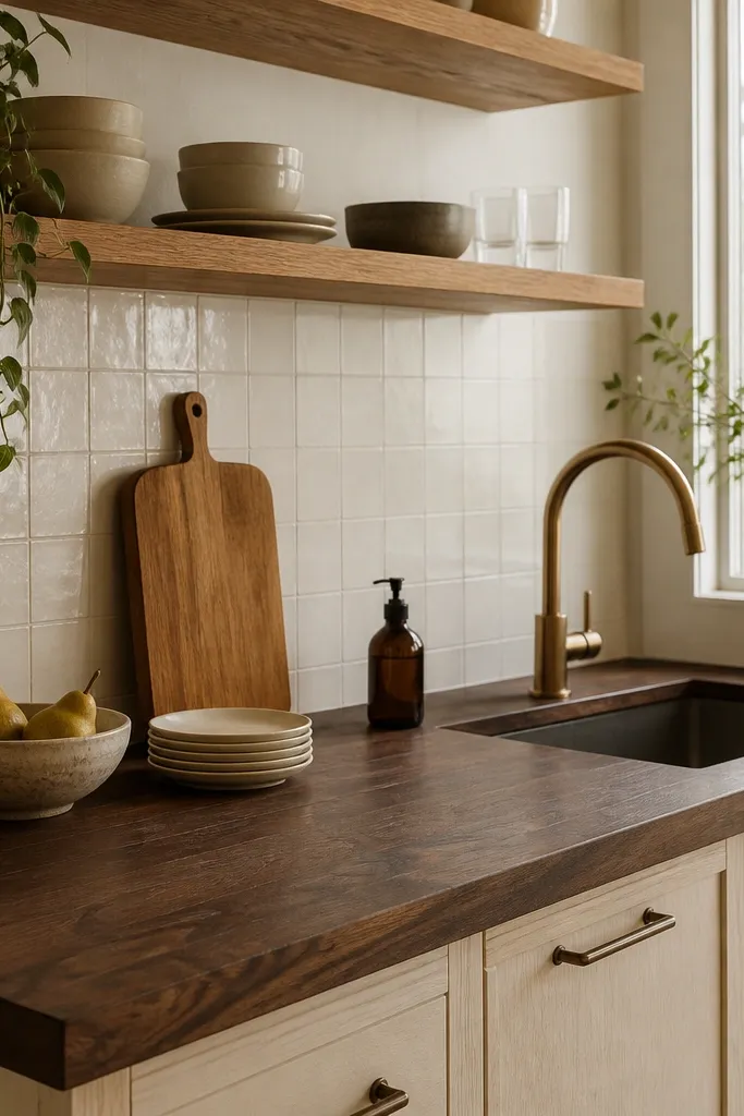
This is the “warm rich” version of dark butcher block without going near-black. Walnut-brown stain blends with light woods, so shelves and open shelving look curated instead of mismatched. The grain pattern stays readable, which helps the kitchen feel lived-in but still polished.
Match your oak shelves to the same undertone as the stain. If your oak is more yellow, choose a walnut stain with warm brown notes, not cool gray-brown. For protection, use satin so the counter doesn’t look like a finished table while you’re still cooking.
Pro tipAdd one wood element in the same tone as the stain — a utensil crock or a small shelf tray — so the colors lock together.
Watch outAvoid mixing cool gray-brown counters with very yellow oak — it looks off under warm bulbs.
4. Dark Counters + Soft Green Tile Backsplash
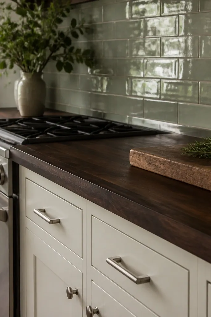
Muted green makes dark butcher block feel like a boutique kitchen. The green adds color depth without competing with the wood grain. I like glossy tile here because it reflects the warm tones from the stain and makes the counters look richer.
Choose a green that reads sage, not neon. Use brushed nickel or aged nickel hardware so the metal doesn’t clash with the warm wood. Keep grout light gray or warm white so it doesn’t pull the green toward dirty tones.
Pro tipBring home two backsplash swatches and hold them next to the wood sample at night with the same bulbs you use at home.
Watch outAvoid bright mint green — it makes the dark counter look heavy and dated.
5. Charcoal Butcher Block + Light Marble Look
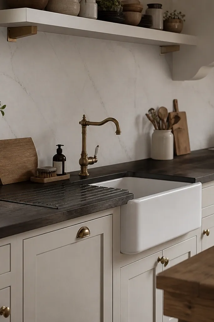
Charcoal counters plus a light marble-look backsplash creates a clean contrast that still feels cozy. The wood brings warmth; the stone look adds crispness. I’ve used this combo in kitchens where the cabinets were already gray and needed a warmer center.
Keep the backsplash pattern subtle. If the veining is too bold, it fights the grain. Choose a satin finish so the wood looks like crafted material, not like a floor that got waxed.
Pro tipUse a dark soap bottle and a matching dish rack — the sink area ties the whole palette together.
Watch outAvoid pairing charcoal counters with highly polished chrome — it makes the kitchen look colder than you want.
6. Dark Butcher Block + Terrazzo Floor Repeat
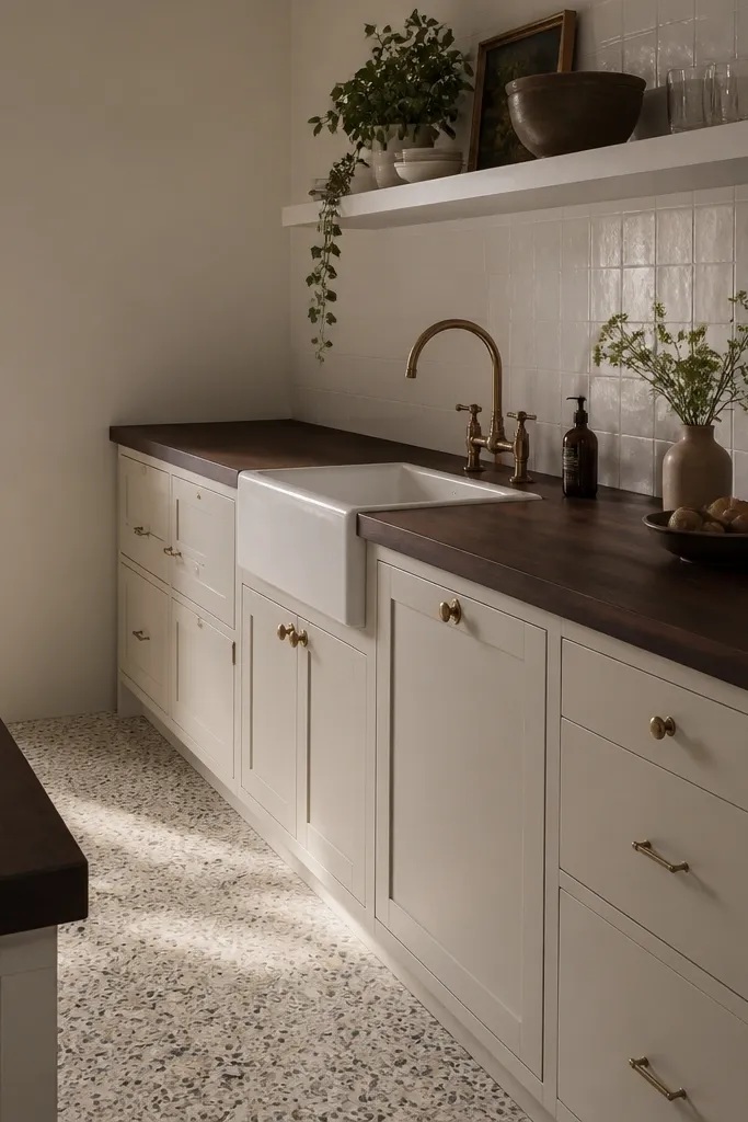
If you have a terrazzo floor, dark butcher block makes it feel intentional instead of busy. The wood’s grain adds organic movement that plays nicely with the speckled pattern. Keep the rest simple so the floor and counters are the two main textures.
Use a dark brown stain that isn’t pure black — terrazzo already has black flecks, so a true black top can look too heavy. Choose a backsplash in a single tone like warm white. Add a runner or rug in a neutral that matches the lighter specks in the floor.
Place a 12x12 inch swatch of the floor next to your wood sample under the same lighting. If the undertones clash, adjust the stain warmth.
Avoid patterned cabinet fronts here — it makes the room feel crowded fast.
7. Sapele-Like Warm Dark + Soft Taupe Walls
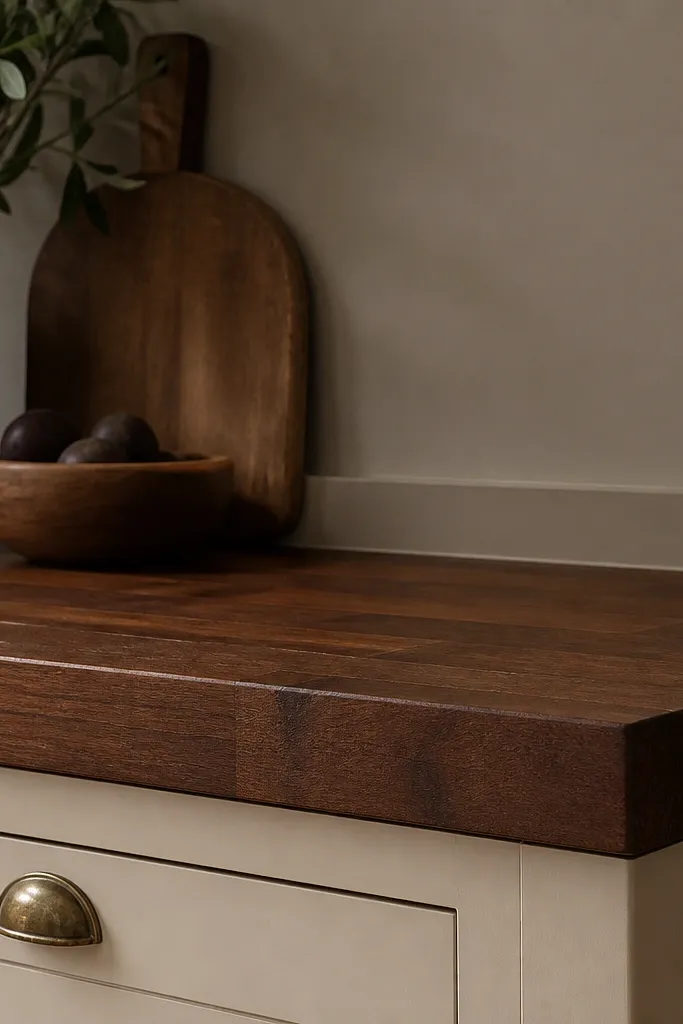
Warm dark with a subtle reddish undertone looks rich against taupe walls. It feels cozy without turning the kitchen into a dark cave. This is the option I use when the walls are already warm and you want the counters to match the mood.
Ask for a stain sample that leans sapele or mahogany-ish rather than strictly espresso. Keep the finish satin so the wood doesn’t go shiny and red-orange. Choose warm white tile or a simple ceramic subway in cream to calm the palette.
Pro tipIf you see red pooling on the sample, wipe it back sooner during staining and do a lighter second pass.
Watch outAvoid cool gray walls with reddish-dark stains — it creates a muddy look.
8. Dark Block + Vertical Shiplap Paneling
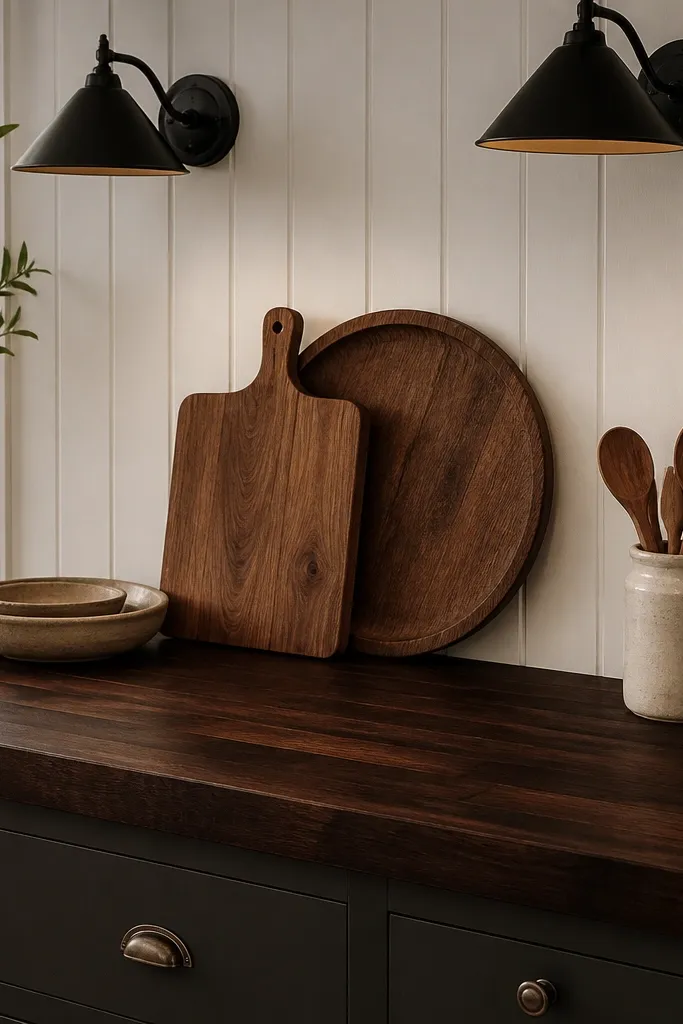
Vertical shiplap adds height and texture, and dark butcher block gives it weight. Together they look like a cabin kitchen done right. The key is keeping the wood undertone warm and the finish matte-to-satin so the scene doesn’t look glossy and staged.
Use a simple edge and a thicker counter presence — a 1.5 inch thick slab look. Keep hardware black or oil-rubbed bronze and avoid shiny chrome. If you do open shelves, keep them simple and leave space between items.
Pro tipPaint the shiplap one shade warmer than your cabinets so the counter stays the main star.
Watch outAvoid heavy dark trim around the whole kitchen — it makes the shiplap and counters blend into one big dark wall.
9. Dark Butcher Block + White Cabinet Shaker with Brass Accent
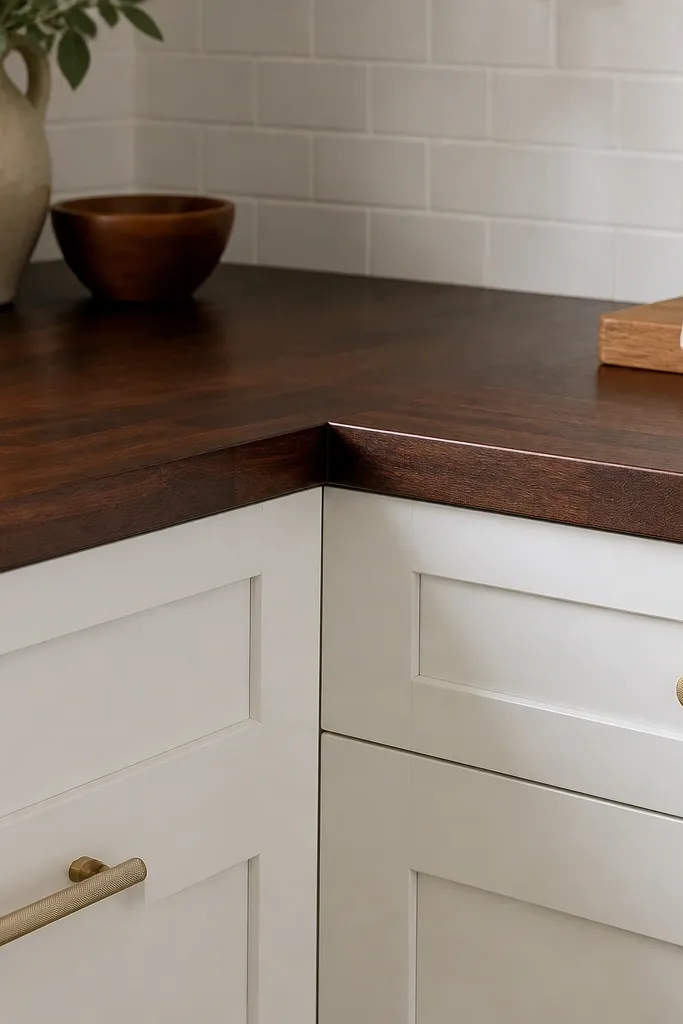
Shaker doors already give structure, and dark butcher block adds warmth to that crisp design. Brass pulls bring just enough shine to keep the wood from looking flat. This combo is clean enough for a small kitchen and still feels rich.
Choose brass pulls about 3 to 5 inches apart vertically for a consistent rhythm. Keep your backsplash white with minimal pattern so the grain stays visible. For the counter, seal all sides and the underside if it’s exposed so color stays even.
Pro tipUse a 1/8 inch consistent caulk line between backsplash and counter so it looks built, not patched.
Watch outAvoid mixing brushed brass with antique brass faucets — the tones clash.
10. Two-Tone Kitchen: Dark Counter + Light Oak Island Top
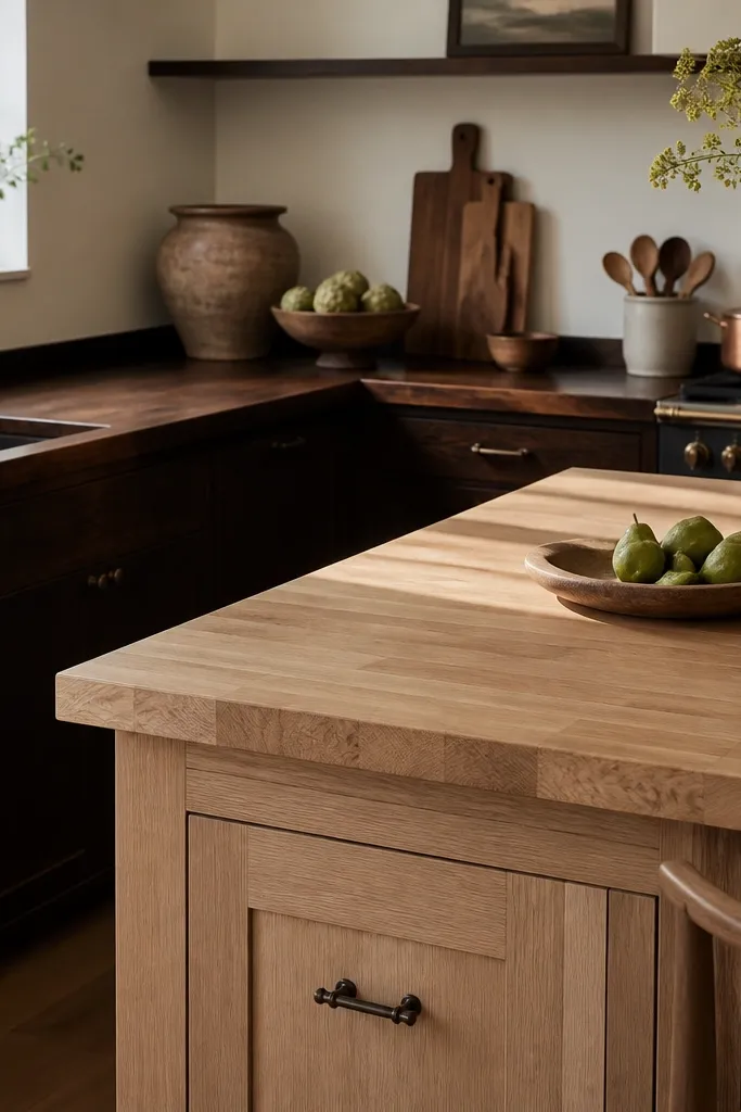
Two-tone kitchens look expensive because the eye has a focal path. Dark counters on the perimeter ground the room, while a lighter island keeps the space from feeling heavy. I’ve done this when the kitchen gets lots of natural light — the contrast turns into a feature instead of a mistake.
Keep both tops the same thickness and edge profile so the kitchen looks intentional. Make sure the undertones match: if the dark is warm espresso, the light island should be warm oak, not cool birch. Use consistent metal hardware across both zones.
Repeat the lighter wood once more — like a stool seat or cutting board — so the island doesn’t look random.
Avoid different sheen levels between tops — a glossy island next to matte counters screams DIY.
11. Dark Block + Black Frame Windows and Warm Lighting
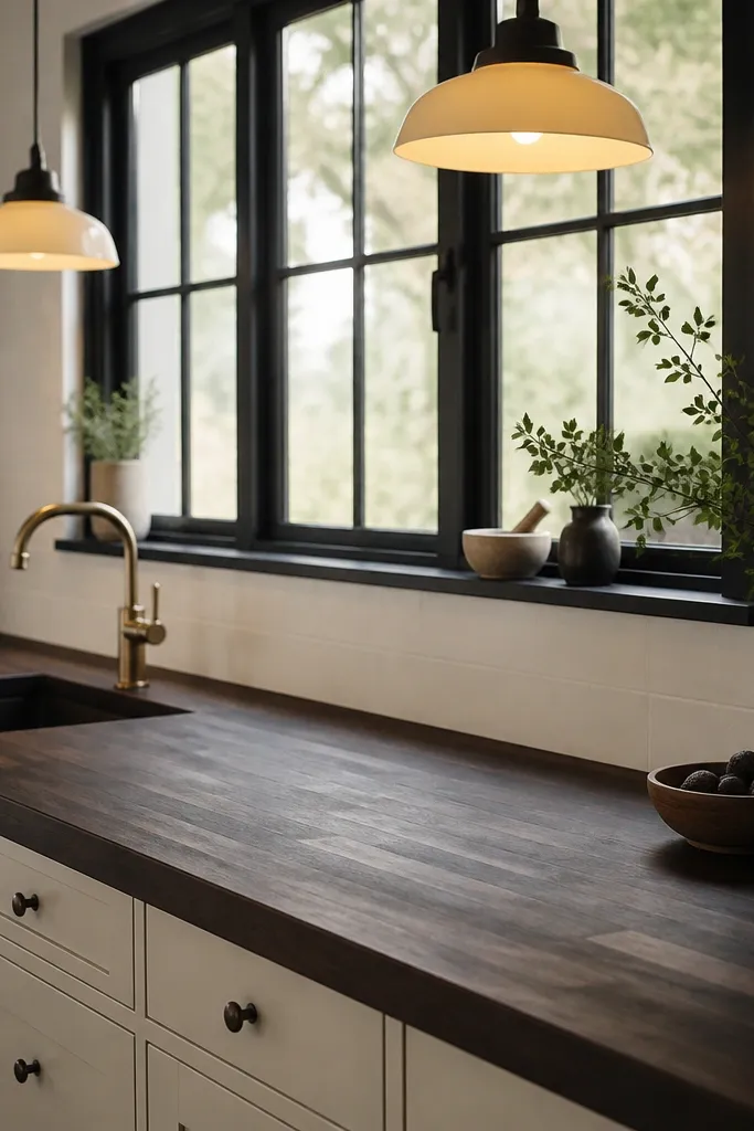
Black-framed windows already create strong lines, so dark butcher block makes the kitchen feel cohesive. Warm lighting turns the grain into a soft pattern instead of just dark color. This is one of the easiest ways to get a “rich” look without changing cabinets.
Use a satin finish and avoid heavy gloss. If your windows are cool-toned, choose a stain that reads warm brown, not gray-black. Keep the backsplash and walls light so the windows and counters both have breathing room.
Pro tipReplace bulbs with 2700K or 3000K. The wrong temperature makes dark wood look flat and gray.
Watch outAvoid cool white 4000K bulbs — they make butcher block look like stained plywood.
12. Dark Counter + Stone-Colored Quartz Sink Surround (Budget-Friendly)
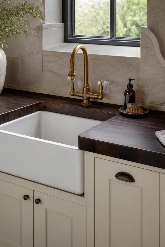
This look works because the sink area gets a visual frame, and butcher block stays the hero. A stone-colored surround (not too white, not too gray) keeps the palette calm and makes the dark counter feel more finished. It’s also practical if you want a cohesive kitchen without doing a full stone backsplash.
Pick a sink surround color that matches the undertone of your stain. If your butcher block is warm espresso, choose a warm off-white or light greige surround. Seal the countertop well around the sink cutout since water exposure is highest there.
Use a sink mat and dry the rim after big tasks. You’ll prevent edge swelling and keep the color even.
Avoid leaving raw butcher block edges around the sink — it looks unfinished and ages fast.