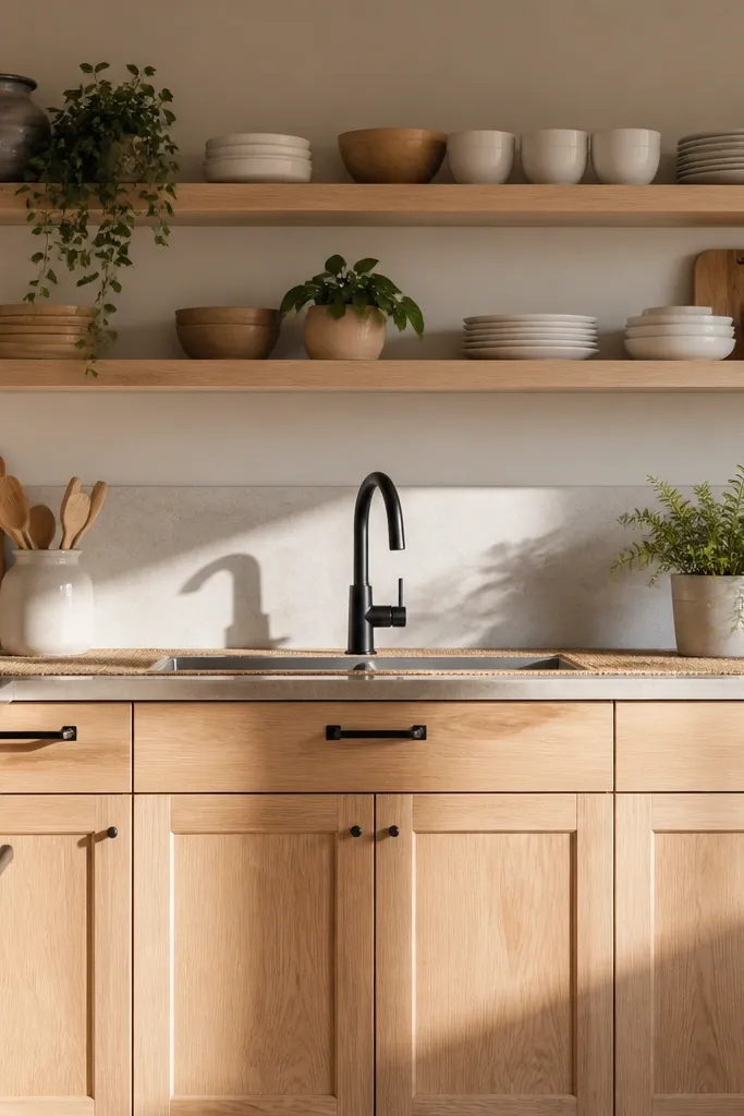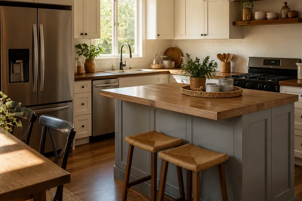
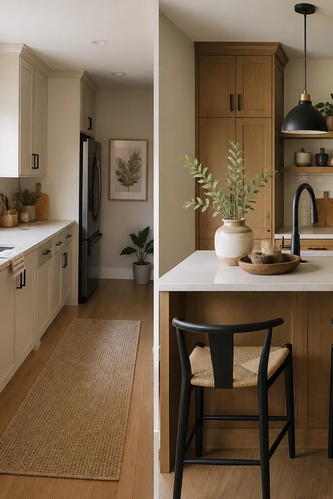
1. Warm Oak + Cream Cabinets with a Soft-Gray Counter Run
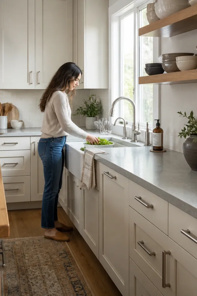
This look works because it gives you contrast without harsh color fights. Cream cabinets keep the kitchen bright in screenshots, while a soft-gray counter tone adds a calm, modern edge. Add warm oak shelves or a wood-toned island top so the room feels cozy instead of sterile. Keep hardware consistent — choose one metal finish and stick to it on cabinet handles, faucet, and small decor. In a Bloxburg kitchen, the easiest way to make it look “complete” is to style one shelf strip and one counter corner, not the whole room at once.
Start by setting cabinets to a cream tone and matching the island or main counter with a soft-gray surface. Add one warm oak element: either open shelving or a wood island top, placed where it catches the light. Then place a landing zone on the dining-adjacent counter: a small tray or cutting board prop, one utensil holder, and a compact centerpiece. Finally, add layered lighting — a bright overhead light and one warm lamp or pendant near the dining side so the wood reads golden instead of dull. Budget is low if you already have the main furniture; the real cost is buying the right consistent finishes and one or two decor clusters.
Hang one simple wall sign or framed art above the breakfast corner so your eyes land on something instead of empty wall space.
Don’t mix cream cabinets with dark counters and three different metals — it makes the room look patchy.
2. Jet-Black Cabinets with Brushed Brass Accents and White Marble Counters
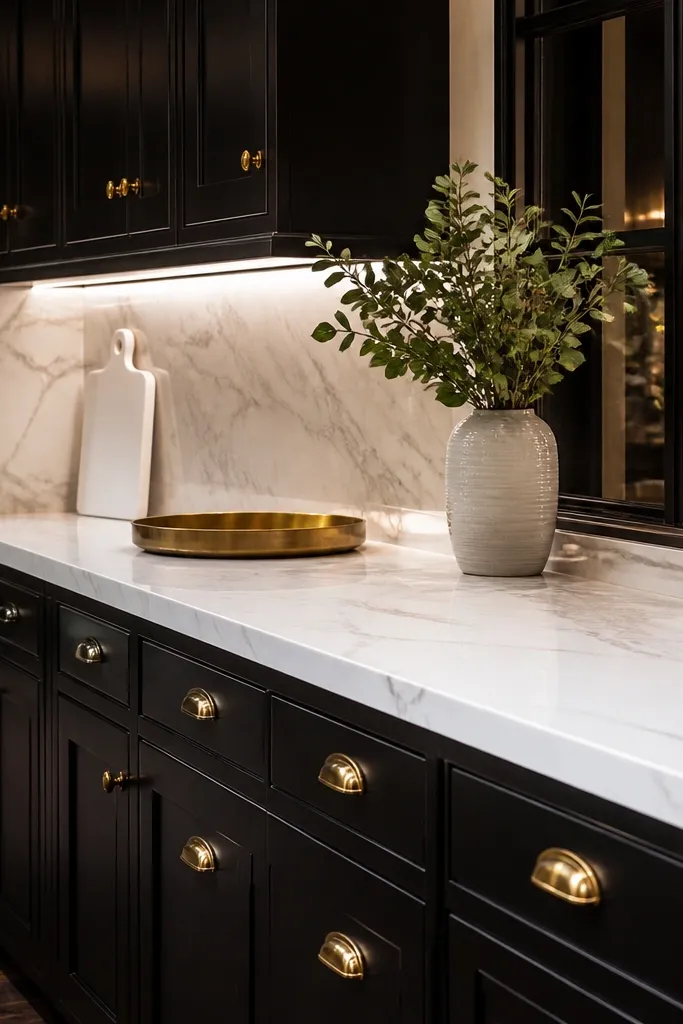
If your kitchen feels boring, black cabinets plus white counters is the fastest “wow” combo in Bloxburg. The dark cabinetry frames everything and makes lighting look richer, while white marble-style counters give you texture that photographs well. Brushed brass accents add warmth and prevent the room from feeling cold. For a complete interior upgrade, keep the backsplash area clean and repeat the brass in at least two places: faucet or sink hardware and one decor item like a wall sconce or pendant. This style looks best in kitchens with enough wall space for a noticeable cabinet run and a dining area that can hold a statement light.
Pro tipUse a white dish rack or light-colored plates near the sink so your counters don’t look like a void next to black cabinetry.
Choose jet-black cabinets for the main run and match the island or secondary counter to a white marble-style surface. Add brass accents in a controlled way: handles, faucet, and one pendant over the dining side. Style the counters with restraint — one tray and a single tall item (like a vase prop) on the main counter, then clear the rest. Place a small bar cart or coffee corner near the dining side so the dark cabinets don’t make the space feel empty. Cost is moderate because black cabinets and brass props tend to be higher-ticket, but you don’t need many decor items to get the look.
Watch outAvoid adding too many dark decor pieces — black on black kills contrast.
3. Sage Green Cabinets with Light Wood Shelves and Honey-Toned Dining
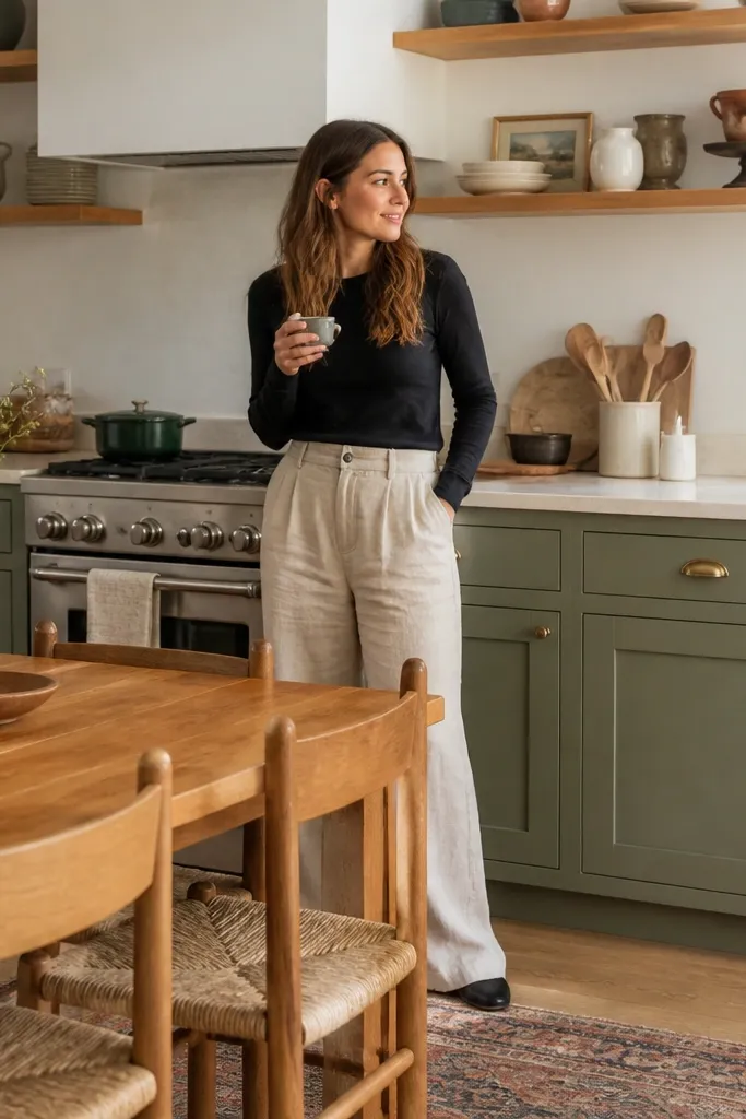
Sage green is the sweet spot between trendy and calming. It brings color without screaming, and it pairs beautifully with light wood shelves and honey-toned dining pieces. This makes your kitchen feel lived-in, not staged, which is exactly what makes it look better in screenshots. Keep the countertop neutral — a creamy white or pale beige — so the green stays the hero. For a complete upgrade, you also need matching dining decor: warm wood chair tones, a soft centerpiece, and one coordinated rug under the dining table area if you have space.
Pro tipUse a single repeating item color for decor — like cream ceramics — so the shelf and dining table look like the same “set.”
Set your cabinet color to sage green and add light wood open shelving above or beside the main counter. Use a pale countertop tone so the shelf wood stands out. Next, build a dining match by choosing chairs or a table with honey warmth and placing a small runner or centerpiece on the table edge closest to the kitchen camera. Add one wall decor piece that repeats the green (a small sign or framed print) so the room stops looking like two separate areas. Effort is moderate: you’re mainly selecting color-matched furniture and a shelf styling kit.
Watch outDon’t pair sage with cool gray furniture all over — it makes the green look muddy.
4. Two-Tone Kitchen: Navy Lower Cabinets with White Upper Cabinets
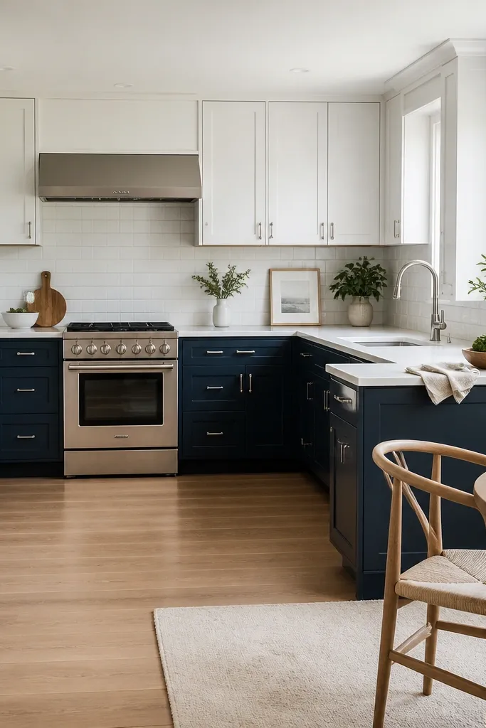
Two-tone kitchens look more expensive because your eye gets a built-in design break. White upper cabinets keep the room light and help the ceiling area feel taller, while navy lowers add depth and definition. This also solves a common Bloxburg problem: if you only go one dark color, your kitchen can feel heavy. Keep the counters lighter — white or pale gray — so the navy doesn’t swallow the workspace. Style the backsplash with simple, repeating props, and make sure your dining side picks up navy in one place like chair legs or a wall piece.
Start with white upper cabinets and navy lower cabinets, keeping the same door style throughout so it reads intentional. Choose a pale countertop and keep the sink area centered so the two-tone line looks symmetrical from the doorway. Add a pendant light over the dining side and select one decor item in navy (a small sign, utensil holder, or vase). Finally, place a short countertop display in the kitchen: one tray plus a utensil jar, then leave the rest clear for a clean look. Cost is usually low to moderate since you’re buying color sets rather than lots of additional furniture.
If your kitchen is narrow, put the two-tone split on the long wall so the color break guides the eye down the room.
Don’t add a third dominant color through rugs, curtains, and random decor — two-tone kitchens already have enough going on.
5. All-White Kitchen with Matte Cabinets and a Dark Dining Anchor
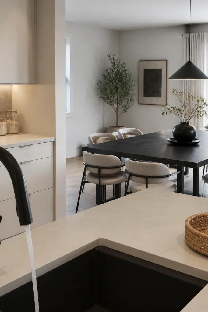
An all-white kitchen can look stunning, but only if you add contrast in the right places. Matte white cabinets hide clutter and keep the room airy, while a dark dining anchor stops the whole kitchen from turning into one flat blob in screenshots. Use a slightly warmer white for counters, or add a light texture like a speckled counter prop so the room has depth. This setup also makes it easier to style because you can keep decor minimal and let the dark dining piece do the heavy lifting. It’s ideal when your kitchen has lots of windows or bright lighting and you want a clean, modern look.
Choose matte white cabinets and keep the countertop in the same family — white or warm-white. Add a dark dining table and chairs in one consistent finish, then place the table so it’s visible from the kitchen side. On the kitchen counter, style one small cluster near the sink: a dish rack prop, one tray, and one utensil holder. Add one light-colored pendant or ceiling fixture so the white doesn’t feel dim. Effort is moderate because you’re selecting furniture finishes, but the decor amount stays small.
Use a light dish set or a pale cutting board so the sink area looks styled even when the rest of the counter stays mostly clear.
Avoid glossy white on glossy white — it can look washed out and flat.
6. Red Accent Kitchen with Neutral Cabinets and a Dramatic Wall Shelf
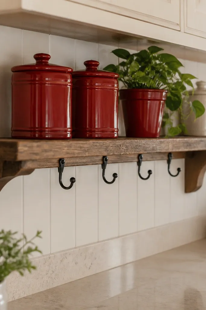
Red accents look great in Bloxburg because they create a focal point fast. Keep cabinets neutral — off-white, beige, or light gray — then add red in two controlled zones. The easiest photogenic move is a dramatic wall shelf: line up red decor items, a small plant, and one contrasting neutral piece like a cream jar. This gives you a clear “designed” moment without repainting the entire kitchen. Pair it with a simple counter styling so the red doesn’t compete with clutter. This works especially well if your kitchen is open-plan and needs one strong visual identity.
Pro tipPick one red shade — brick red or cherry red — and stick to it across shelf and counter for a cleaner read.
Start by choosing neutral cabinets and a neutral countertop so the red stays the hero. Add a wall shelf or floating shelf strip on the most visible wall, then place a tight grouping of red items: one tall vase prop, one jar or container, and one plant or greenery piece. Style the counter near dining with a small tray that repeats the red color, but keep it to one cluster. Add warm lighting so red decor doesn’t look harsh; a pendant or warm lamp does more than bright white ceiling light. Cost is low to moderate since you’re mostly buying an accent set and a shelf prop.
Watch outDon’t scatter red across five different spots — it looks accidental instead of intentional.
7. Industrial Loft Kitchen with Weathered Wood, Black Metal, and Concrete-Look Counters
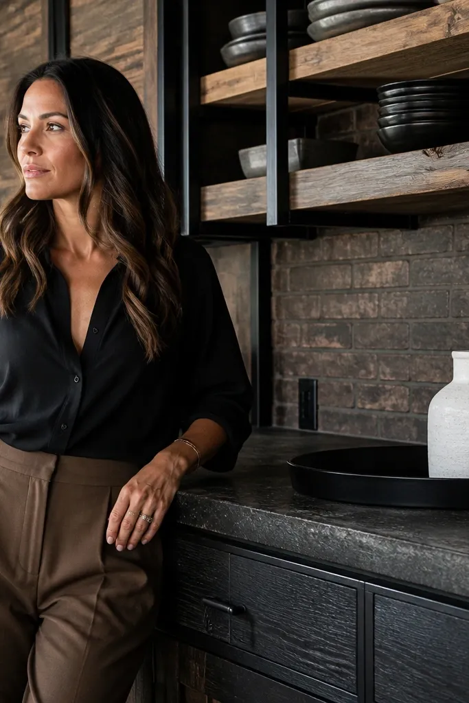
Industrial kitchens look best when they feel textured, not just dark. Weathered wood shelves add grain and warmth, while black metal accents give the room structure. Concrete-look counters (dark gray or speckled gray props) add that gritty surface that reads well in screenshots. Keep the backsplash and upper cabinets simpler, because industrial style already brings visual detail through wood and metal. For the complete upgrade, add one statement light above the dining area and keep the kitchen counter styling tight, like a workshop setup.
Choose weathered wood for one main element — shelving or an island edge — and pair it with black metal props for handles, faucet, or a hanging rack. Set counters to a dark gray or concrete-look tone and keep cabinet colors muted. Place the dining table so the overhead industrial light is visible, then style the dining side with one metal-toned decor piece and a neutral centerpiece. On the main counter, add a tray with utensils and one plant, then leave the rest clear. Effort is moderate because you’re curating finishes, not filling every inch with decor.
Use a dark rug under the dining table area if you have room — it anchors the industrial look and reduces “floating furniture” vibes.
Avoid bright white cabinets with heavy wood everywhere — it breaks the industrial mood fast.
8. Coastal Kitchen with Light Blue Walls, White Cabinets, and Woven Texture Dining
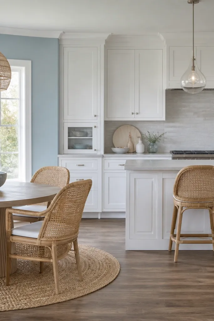
Coastal kitchens feel instantly more “finished” because they use softness: pale blues, light neutrals, and woven textures. White cabinets keep the kitchen crisp, while light blue wall accents or decor items give it that beachy color cue without making the room look childish. Woven dining chairs or a woven-style rug add texture that makes the dining area photograph well. Keep countertops pale and clean with one or two natural-looking decor pieces like a small plant or shell-themed prop. This is a strong choice if your kitchen is smaller, because light colors make it read bigger.
Set cabinets to white and add light blue through wall decor, a small backsplash accent area, or a couple of decor items. Choose a pale countertop and keep the sink area bright with a light dish rack and cream or white dish props. For dining, use woven-texture chairs or a table setup with warm light wood so it matches the coastal vibe. Add one airy pendant or a soft overhead light so shadows stay gentle in screenshots. Cost stays reasonable since you’re not buying a lot of furniture, just picking the right colors and texture props.
Put a small plant on the counter near the dining side — it ties the whole coastal palette together.
Don’t add dark brown wood everywhere — it makes coastal look like a cabin instead of airy.
9. Moody Brown Kitchen with Black Hardware and a Gallery Wall Above the Dining
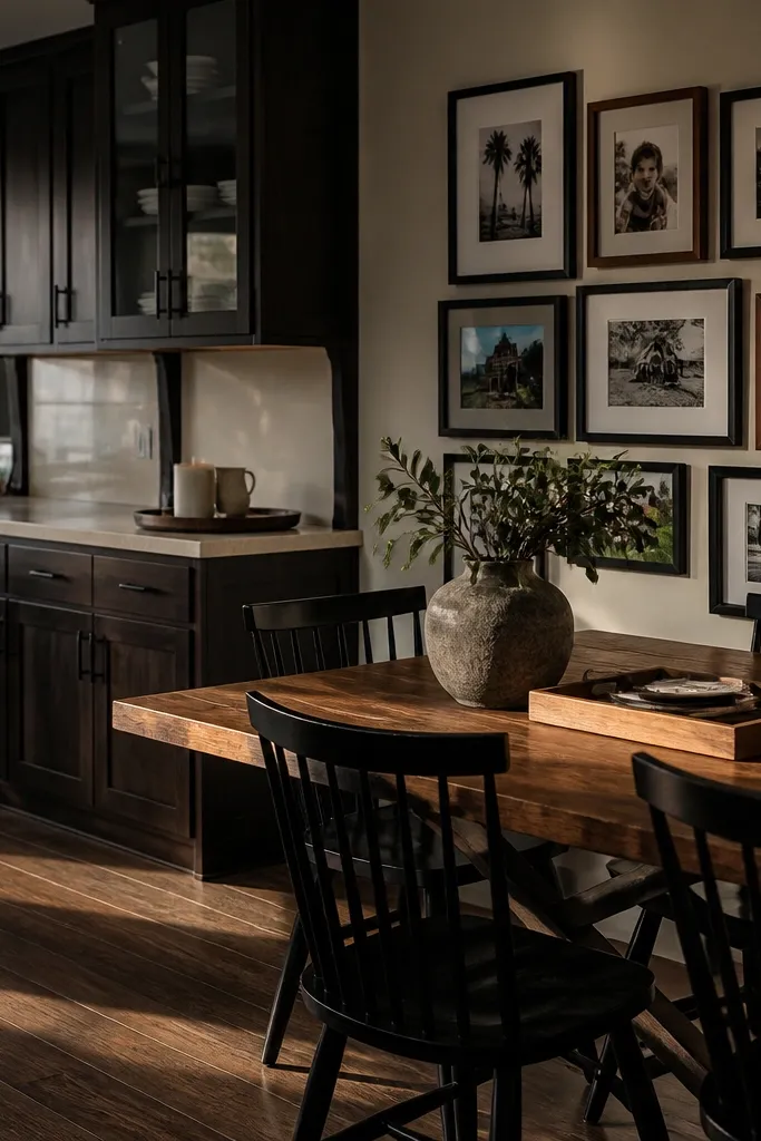
Moody brown kitchens look expensive because they add warmth and contrast. Deep brown cabinets feel grounded, and black hardware makes the details pop. The key to keeping it photogenic is balancing the darkness with lighter counter tones or lighter decor highlights. Add a gallery wall above the dining area so the wall isn’t empty — empty walls are what make kitchens look unfinished. This style also helps if your kitchen/dining space is open: the art becomes the “room boundary” your eyes need.
Pick deep brown cabinets for the main run and keep black hardware consistent across sink, handles, and any small racks. Use a darker but not black countertop tone so the room doesn’t turn into one block. Above the dining area, place 3-5 framed art props in a tight grid, then keep the dining table decor simple: one centerpiece and a matching dish set. On the kitchen counter, style only two zones — near the sink and one near the corner — so the rest stays clean. Effort is moderate because art placement matters more than extra furniture.
Keep the frames the same color (black or warm wood) so the gallery wall reads clean instead of random.
Avoid leaving the dining wall blank — moody kitchens need an intentional wall feature.
10. Scandi Kitchen with Light Cabinets, Slim Black Fixtures, and a Long Center Runner
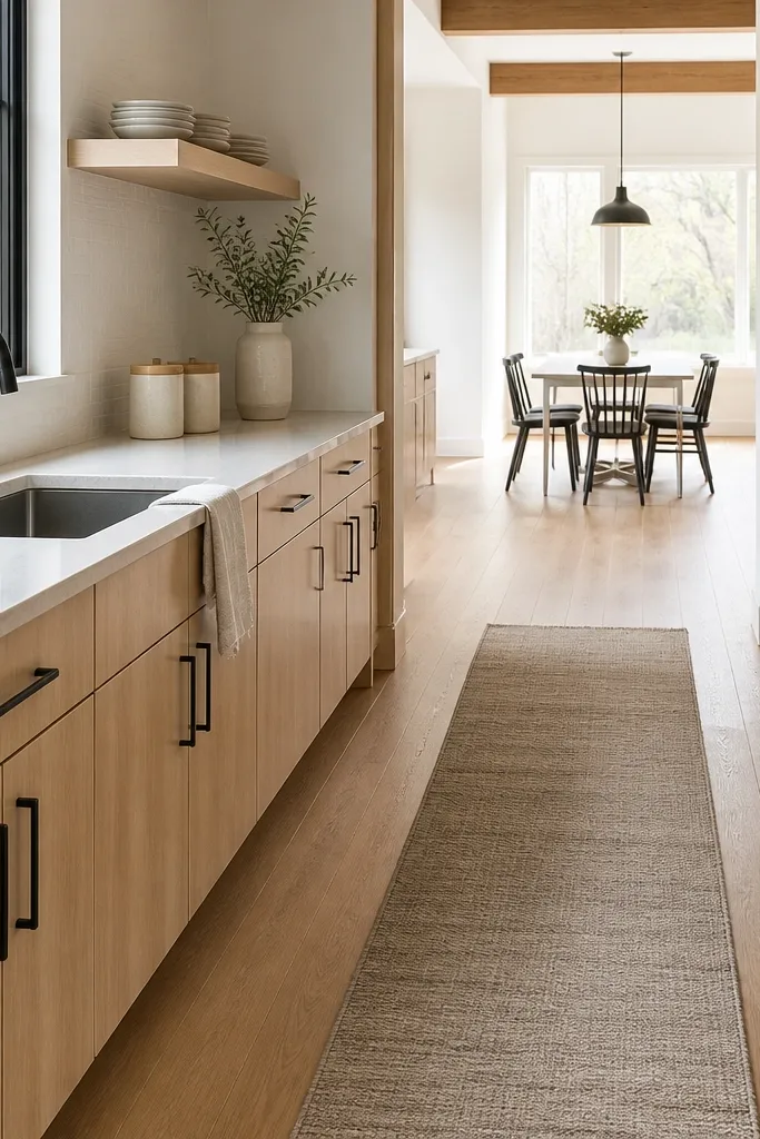
Scandi kitchens look good because they use clean lines and lots of negative space. Light cabinets brighten the room, slim black fixtures add contrast without making it heavy, and a long runner near the dining area visually stretches the space. The counter should look organized, not crowded. If you want a complete interior upgrade, focus on symmetry: keep the main counter styling balanced on both sides and place a matching set of decor on one shelf. This setup is especially flattering in kitchens that are long or narrow because it guides the eye down the room.
Pro tipUse one plant type and one container color across shelf and dining table so the room looks styled as a set.
Choose light cabinets and keep the counters pale, then add slim black accents at the sink and one other visible spot. Style the main counter with two matching items on one side of the sink and a single small plant or container on the other. Add a long runner under the dining table area if your layout allows, and choose dining chairs that match the slim black theme. Finish with one overhead light that spreads evenly plus a small lamp near the dining side for depth. Cost is low if you already have light wood or neutral furniture; the runner and matching chairs do most of the work.
Watch outDon’t pile decor on every open surface — Scandi kitchens need air.
11. Glam Kitchen with Champagne Gold Details, Mirrored Decor, and Soft Pink Accents

Glam kitchens in Bloxburg look best when gold is controlled and mirrored props are used like highlights, not clutter. Start with a light base — cream or light gray cabinets — then add champagne gold details on hardware, lighting, and one statement decor piece. Soft pink accents (a vase, small tray, or a couple of decor items) keep it from feeling too cold. Mirrored decor near the dining side makes the room look brighter and more layered in screenshots. This idea is perfect if you want your kitchen to feel like a “designed” interior, not a basic build.
Pro tipUse one reflective surface only in the most visible corner — too many mirrors make it look messy fast.
Pick cream or light gray cabinets and a pale countertop so gold reflects nicely. Add champagne gold in at least three points: faucet/handles, pendant lighting over the dining side, and one gold-framed or mirrored decor item on a wall. Place a small mirrored prop near the kitchen counter or dining corner and keep the rest of the counters tidy with one tray and one centerpiece. Add soft pink through one accessory cluster so it reads like accent color, not a second main palette. Effort is moderate because lighting and decor selection matter more than layout changes.
Watch outAvoid mixing silver and gold at the same time — glam reads cleaner with one metal family.
12. Modern Monochrome Kitchen with Charcoal Cabinets, Warm White Light, and Floating Shelf Styling
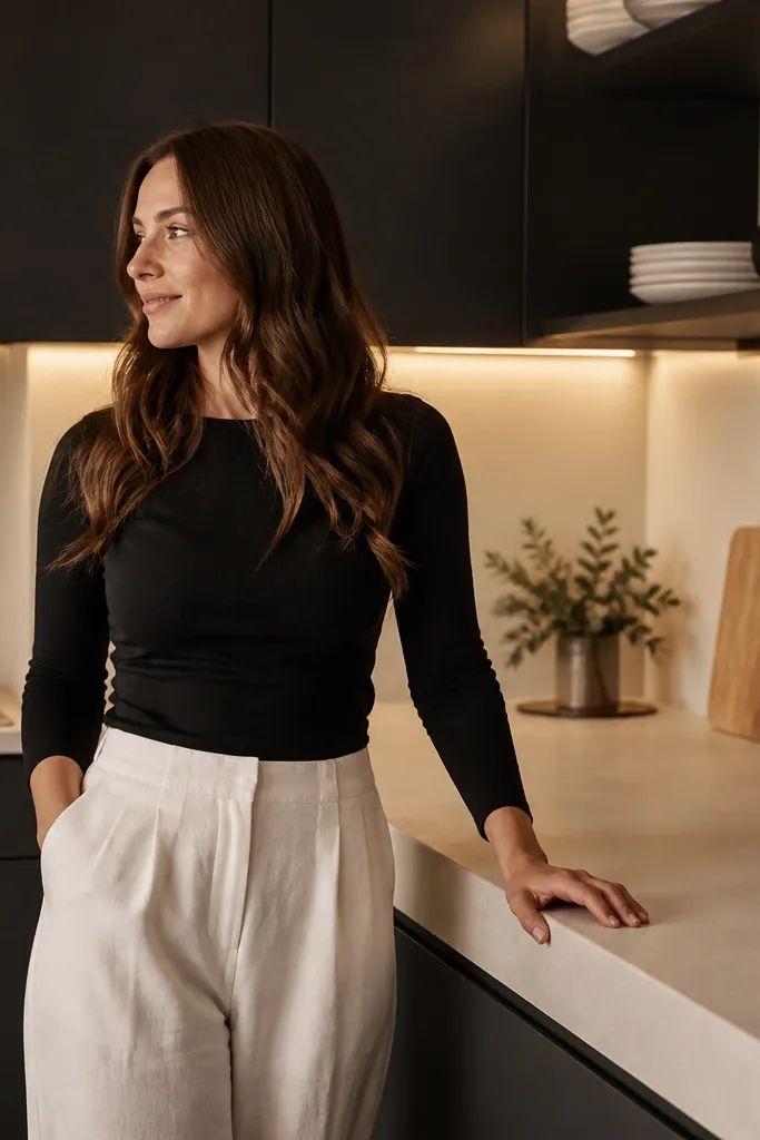
Monochrome kitchens look polished when you add warmth and texture. Charcoal cabinets give you a modern base, but you need warm white lighting so the room doesn’t look gray and flat. Use a warm countertop tone like creamy white or light beige to keep contrast. Floating shelves are where this look wins: style them with a tight, repeated set of neutral decor pieces so the kitchen looks curated. Pair the dining area with simple black or charcoal furniture and one warm wood element to stop the monochrome palette from feeling cold.
Choose charcoal cabinets for the main run and keep countertops in warm white or light beige. Install or place floating shelves on one visible wall and style them with 3-6 items in a repeating pattern: one tall piece, two medium, and one plant or small jar. Add warm lighting — a ceiling fixture plus a pendant or lamp near the dining side. For dining, use a charcoal or black table with neutral placemats or a light centerpiece so the dining area doesn’t disappear against dark cabinets. Cost is moderate if you need shelf props and lighting, but the decor count stays small.
Keep shelf item heights varied by only one step — a big height jump makes the shelf look random in Bloxburg screenshots.
Avoid using cool-blue lighting with charcoal cabinets — the whole kitchen turns ashy.