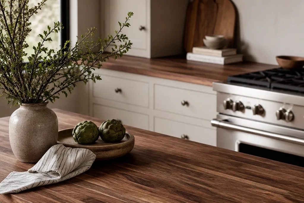
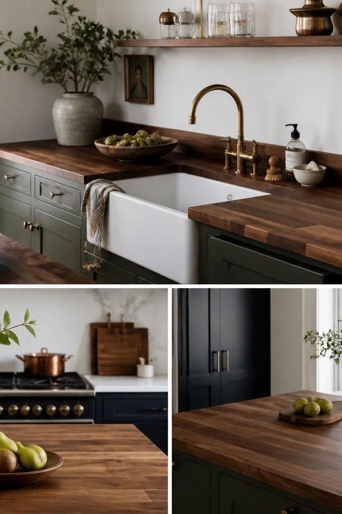
1. Cream shaker cabinets with satin brass + walnut veining front and center
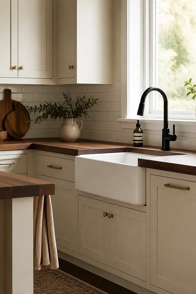
Use a 1.5-inch butcher block with a subtle eased front edge, not a chunky bullnose. Choose a backsplash with mostly flat faces (no heavy texture) and grout in warm white or light cream. Keep the faucet and sink hardware matte black if you want contrast, but repeat black in one small place like a towel bar.
Cream shaker cabinets keep the room bright without turning cold, and satin brass makes the walnut’s warm undertone look deliberate. Walnut butcher block has natural color variation, and with a clear or lightly tinted finish, the grain shows depth instead of looking uniform. White subway tile is busy enough to look clean, but the warm grout tone keeps it from fighting the wood.
Watch outAvoid bright white cabinets with blue undertones and chrome hardware; the walnut will look dull.
Pro tipSwap in warm 2700K bulbs — the walnut glow looks muted under cool lighting.
2. Greige flat-panel cabinets with a light sand backsplash and walnut edge framing
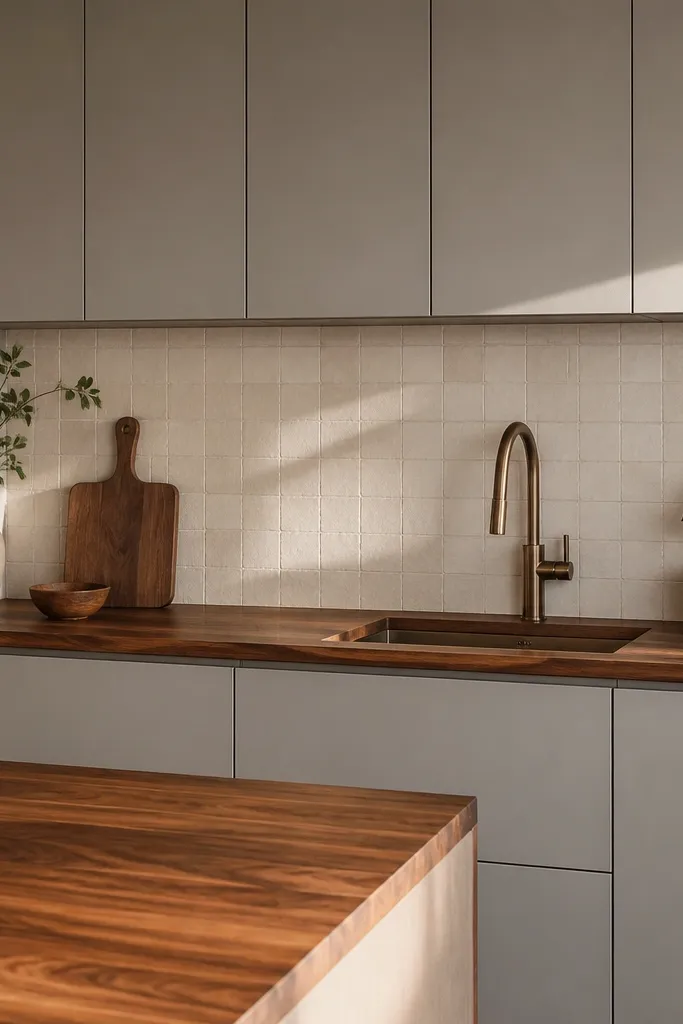
Flat-panel cabinets make the walnut look more architectural, especially when the countertop edge is crisp and consistent. Greige gives you a neutral base that doesn’t steal the show, while the sand tile echoes the wood’s tan highlights. This combo reads modern without losing warmth, and it photographs well because there’s less visual clutter.
Go for a butcher block with consistent board layout and a clear finish that lets the grain read. Keep the backsplash grout close in tone to the tile so the backsplash stays calm. Use minimal pulls or a simple bar handle in brushed nickel with warm lighting.
Frame the countertop with a 1x2 trim piece under the toe-kick area in the same greige paint to make the whole run look built-in.
Avoid high-contrast white grout lines on the backsplash; it can make the wood look less premium.
3. Deep olive cabinets with walnut and a natural linen runner on the island
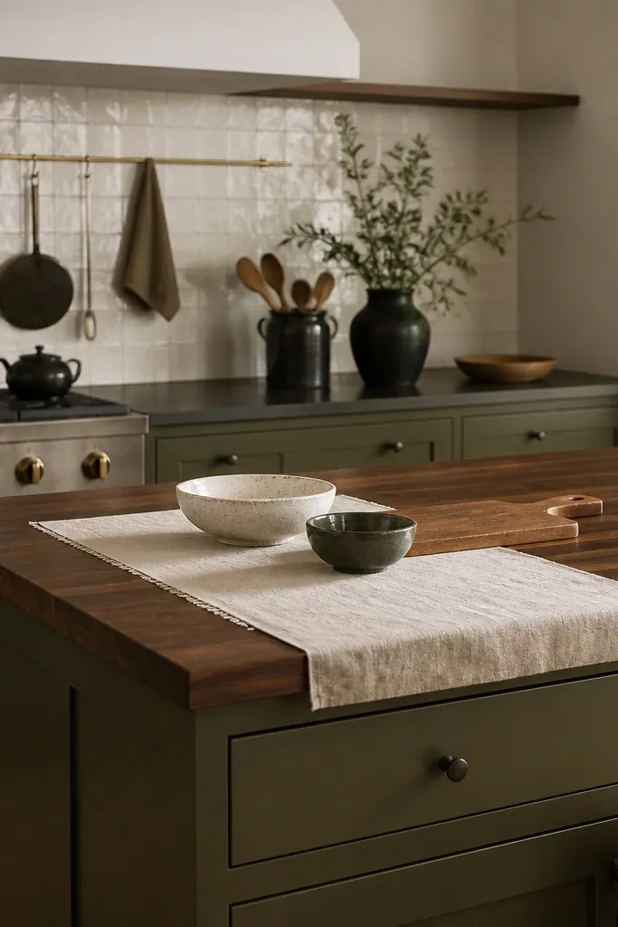
Use a matte olive paint finish and keep the hardware in aged brass or bronze. Pair with an off-white backsplash that has slight warmth (not stark white). For the island, leave 2 to 4 inches of open counter space at the edges so the wood grain isn’t visually crowded.
Olive is one of the best cabinet colors for walnut because it’s warm, not icy. The wood’s red-brown flecks show up more clearly against olive, and the whole kitchen looks cozy without going farmhouse-rustic. A natural linen runner adds texture and softens the hard surfaces, making the countertop feel lived-in.
Watch outAvoid gray-green cabinets; the undertone is colder and the walnut starts looking muddy.
Pro tipPick one warm metal to repeat — if you choose aged brass, keep it consistent on faucet, hardware, and lighting.
4. Charcoal lower cabinets with walnut uppers for a two-tone butcher block moment
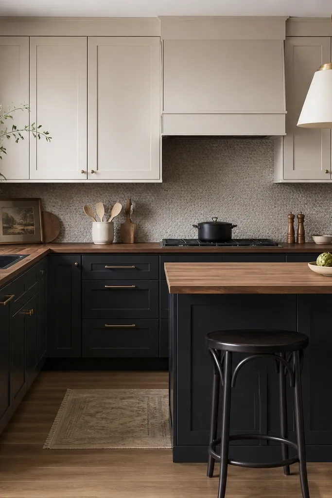
Keep the walnut finish consistent across the entire run, not one spot more glossy than the rest. Choose a backsplash with muted patterning and low contrast — think small repeats, not bold black-and-white. If you use bar stools, match their metal tone to your faucet hardware.
Two-tone cabinetry lets walnut feel intentional instead of “just a countertop.” Charcoal bases anchor the room, and warm white uppers keep it from feeling heavy. The butcher block sits in the middle, tying the dark and light together through warmth and grain texture.
Watch outAvoid a high-contrast black backsplash with charcoal; it makes the wood grain look washed out.
Pro tipUse a darker caulk line at the countertop seam if you have a visible joint — it hides the transition better than white caulk.
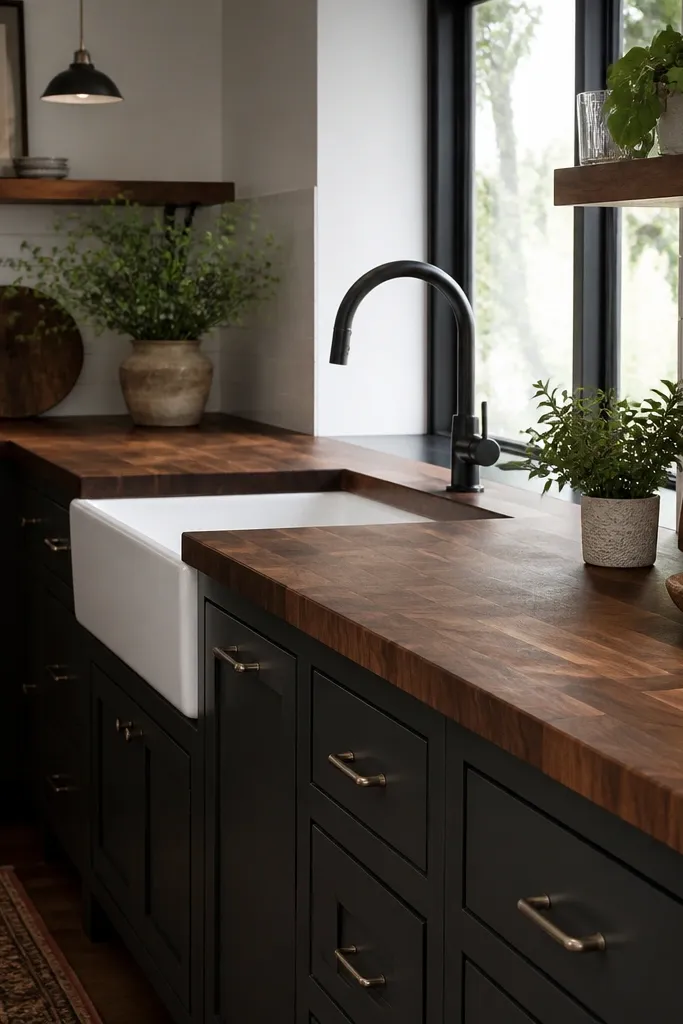
5. Rusty terracotta backsplash + walnut with a white farmhouse apron sink
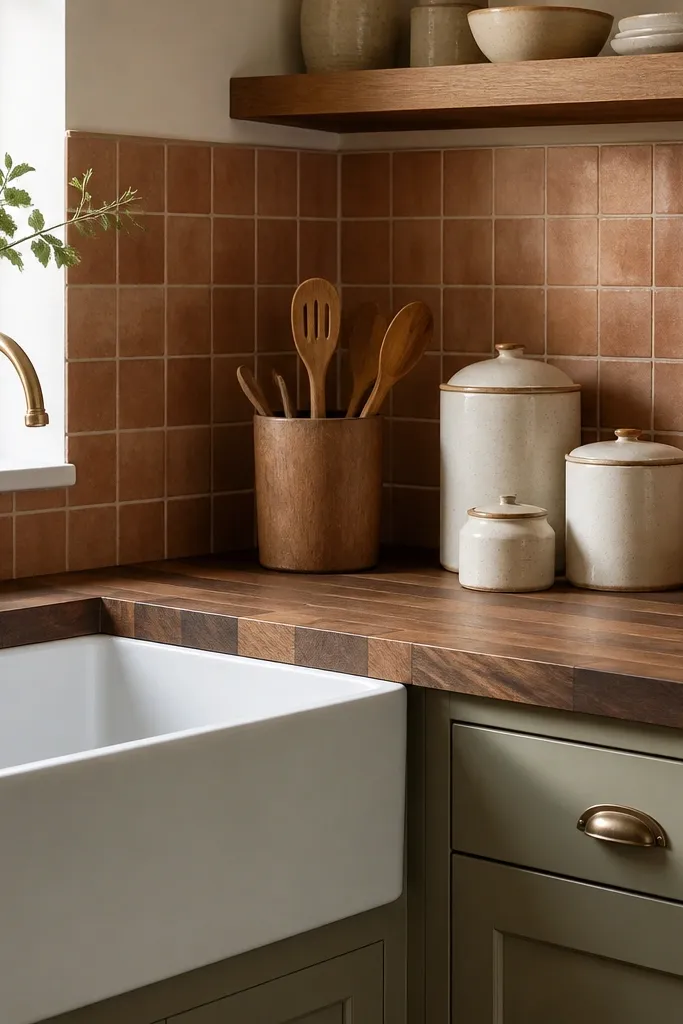
Choose butcher block with a finish that doesn’t go amber-orange — walnut already has warmth. Use warm white grout so the terracotta tile doesn’t look harsh. Keep counter accessories in cream, brown, and off-white so the wood remains the main texture.
Terracotta makes walnut look richer because both share warm earth tones. A white farmhouse sink pulls the palette back so it doesn’t tip into red-heavy. This is the setup that makes walnut feel handmade, even if your cabinets are store-bought and painted.
Watch outAvoid glossy terracotta tile; it can glare and flatten the countertop in photos.
Pro tipAdd a thin cutting board ledge (even a simple board holder) near the prep zone to keep knives and boards in the same visual line.
6. All-warm neutral kitchen with walnut, honeyed oak floors, and matte black accents
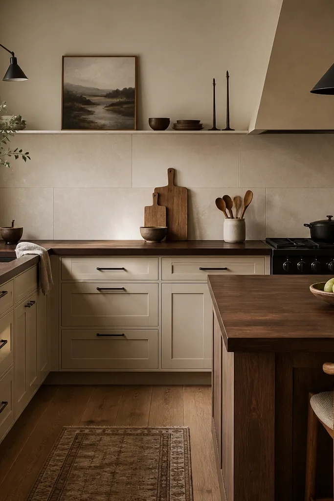
Use a backsplash in large format with minimal grout lines so the wood grain stays the main texture. Pick a matte black faucet and one cabinet pull style in black. If your floors are honeyed, avoid overly dark walnut stains — go for natural or lightly tinted clear.
This is the “everything reads warm” combo, and walnut thrives in it. Matching warm oak floors to warm-beige cabinets makes the countertop feel like it belongs. Matte black accents give you contrast without making the wood look gray.
Watch outAvoid cool gray backsplashes with warm floors; the mismatch shows up fast.
Pro tipMatch your countertop finish sheen to your cabinet paint sheen; satin-on-satin looks built-in.
7. Walnut butcher block desk-style kitchen with open shelving and ceramic mugs
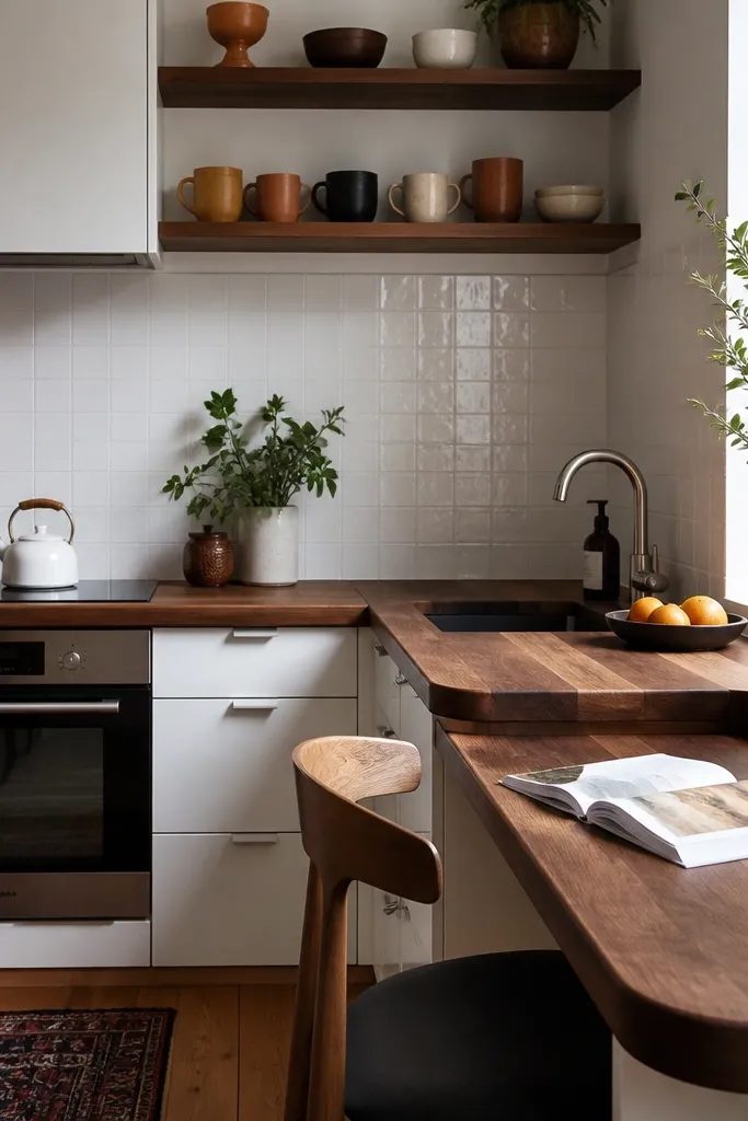
When open shelving is part of the plan, walnut becomes the “base layer” that keeps the visual noise under control. The wood’s grain gives your eye a steady texture so mugs, bowls, and cookbooks don’t feel scattered. Plain white tile keeps the background quiet while the countertop does the work.
Use a butcher block thickness that feels substantial for a desk-like surface — 1.75 inches is a good target if you’re extending an overhang. Keep open shelves simple and limit color to cream, tan, and rust. Add a clear edge seal so the surface wipes clean after coffee spills.
Use shelf spacing that matches mug height — leave 9 to 10 inches between shelves so mugs sit cleanly and look intentional.
Avoid mixing too many bright mug colors; walnut already has movement.
8. White and light wood kitchen with walnut butcher block in a coastal palette
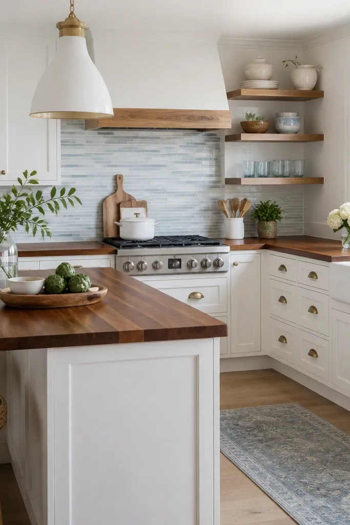
Pick a finish that keeps walnut from going too dark; clear hardwax oil is a good look. Use brass hardware and a warm pendant bulb so the wood reads golden. Limit blue accents to the backsplash only, and keep textiles (if any) in sand, cream, and oatmeal.
Walnut can fit coastal if you keep the palette airy and the metal warm. White cabinets and light wood accents make the walnut feel like part of a sunlit story instead of a heavy centerpiece. The subtle glass backsplash strip adds sparkle without turning the whole kitchen cold.
Watch outAvoid navy-heavy accents; they make walnut look darker and less coastal.
Pro tipAdd a thin clear backsplash strip or runner behind the cooktop to protect from splashes while keeping the visual line clean.
9. Walnut butcher block with a blackened steel backsplash behind the stove
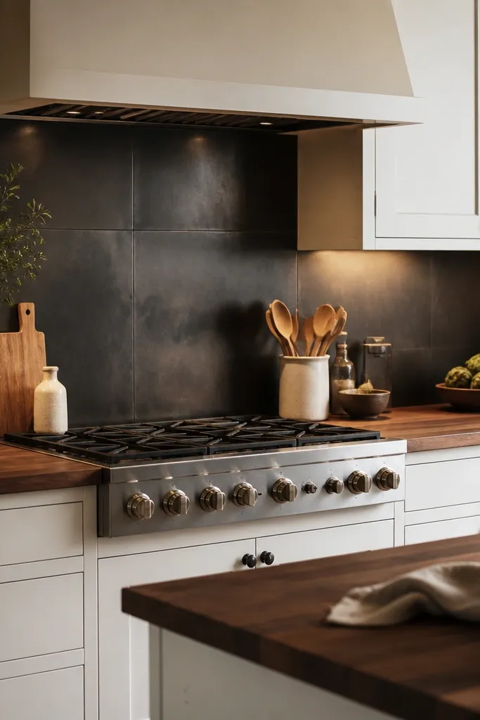
Dark metal behind the stove gives you a “chef zone” and makes the walnut glow stand out. The contrast is clean because both surfaces share matte finishes — no shine fights the grain. Warm under-cabinet lighting is what turns this from harsh to cozy.
Keep the rest of the backsplash simple so the dark metal panel stays focused. Use a matte black range hood and black faucet, but keep cabinet hardware in brass if you want extra warmth. Seal the butcher block edges carefully; stove splatter hits the front lip and corners.
Install a small splash guard or backsplash panel that reaches 18 to 20 inches above the cooktop so the countertop edge stays cleaner.
Avoid glossy dark backsplashes; they reflect light and make the wood look uneven.
10. Smoked-glass pendant lighting + walnut for a moody dining-kitchen feel
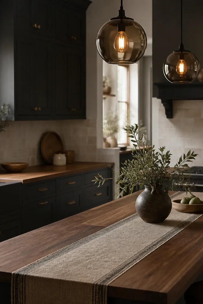
Walnut can handle mood lighting, but you need the right finish. A satin hardwax oil keeps the grain warm without looking shiny. Smoked-glass pendants add drama overhead, while a light stone-look backsplash keeps the room from feeling closed in.
Use a lighter grout on the stone-look tile so the backsplash doesn’t become too busy. Keep the countertop edge profile simple and consistent. If you have dark cabinets, choose warm bulbs at 2700K and place under-cabinet lighting so the walnut stays readable.
Add a small tray to the island with a single wood tone (like a lighter beech tray) so the walnut doesn’t swallow every object.
Avoid super dark walnut stains in a dark cabinet kitchen; it turns into a flat brown block.
11. Walnut butcher block on a waterfall island with light quartz backsplash and brass trim
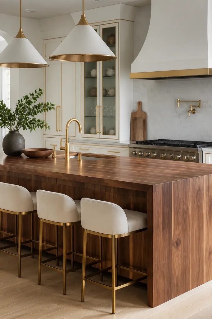
A waterfall island makes walnut look custom because the grain runs uninterrupted down the sides. With a light stone-look backsplash, the walnut becomes the warm focal point and the rest of the kitchen stays bright. Brass trim ties the metals together so the island doesn’t feel isolated.
Ask for a waterfall cut that keeps the grain direction consistent across the front and sides. Use a finish that resists water marks on the vertical faces — hardwax oil is great but you need a good initial coat and periodic recoat. Keep the countertop thickness looking chunky; 2 inches reads best for waterfall.
Use felt pads on stools and chairs so legs don’t scuff the waterfall edges over time.
Avoid leaving waterfall edges unsealed; vertical butcher block shows water marks faster than flat tops.
12. Walnut butcher block with white tile backsplash and a built-in utensil rail
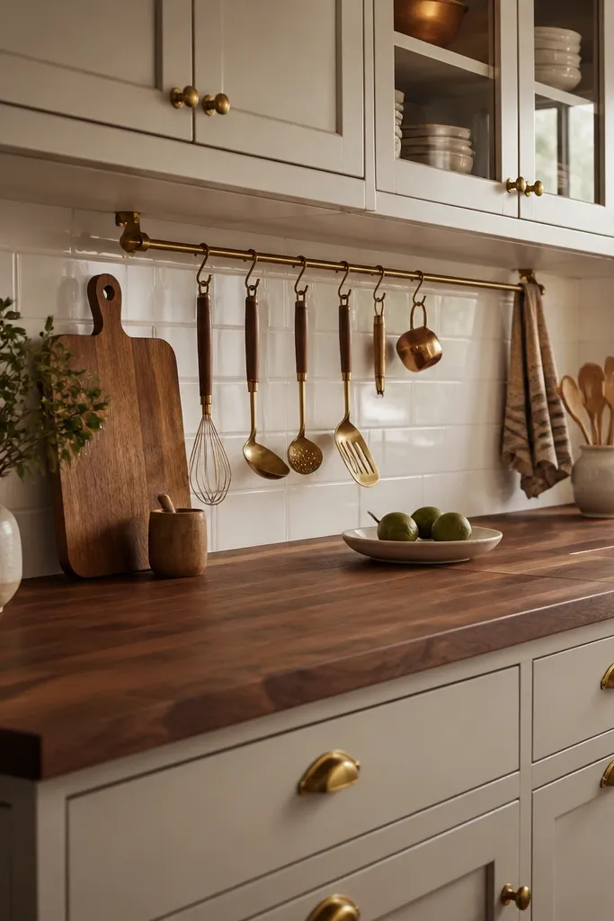
Install the rail so the lowest hanging utensil sits about 2 to 3 inches above the countertop surface. Use rail brackets in brass and match your faucet or cabinet pulls. Choose a butcher block finish that wipes clean — I like hardwax oil for the look, then I maintain it on a schedule.
Utensil rails add function and make the countertop feel planned. Walnut’s warmth balances the crisp white tile so the kitchen doesn’t look like a showroom. Keeping the backsplash tile simple makes the rail and walnut grain the main visual anchors.
Watch outAvoid lining the rail with shiny chrome utensils; it pulls attention away from the wood grain.
Pro tipHang only the utensils you use weekly; a rail full of random tools makes walnut look cluttered.