1. Shaker White Cabinets with Sand-Colored Backsplash
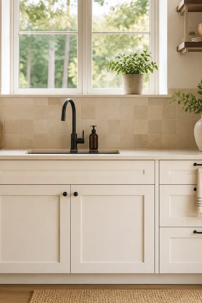
This look works because shaker doors keep lines clean, and a sand-toned backsplash adds coastal warmth without turning the kitchen dark. Choose a soft off-white for cabinets, not a bluish white, so it reads sunny in Bloxborg lighting. Pair it with light counters that look creamy (think warm white) so the backsplash feels intentional, not accidental. The key is contrast control: the backsplash should be one shade warmer than the cabinets. Put your decor on the ends of counters, not across the middle, so the bright surfaces stay visible.
Start by placing shaker-style cabinets in a full run on your longest wall, keeping the top and bottom cabinets the same color. Then add a backsplash strip behind the sink and stove area in a sandy beige tone, sized to match the counter width. Finally, set counters to a warm white and add only two matching items on the counter corners (for example, a light ceramic canister and a small tray). Keep cabinet hardware brushed silver or champagne and repeat it on every door and drawer. Cost-wise, this is mostly a color and placement pass, so it stays low effort compared with rebuilding the layout.
If your kitchen feels gray, swap any cool-gray accents for warm beige accessories like baskets or cloths.
Avoid painting cabinets and backsplash the same exact shade — it kills the coastal contrast.
2. Light Oak Floor with White Countertops and a Blue Runner
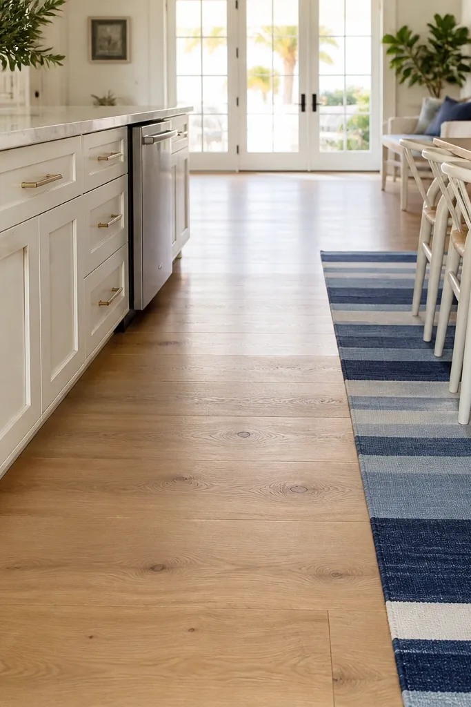
Coastal kitchens look bright when warm wood exists under the light surfaces. A light oak floor gives you that sun-warmed base, and white countertops bounce light upward so the room feels open. Add a blue striped runner near the dining path to bring in the ocean vibe without covering the entire floor. Keep the runner pattern thin and consistent; big high-contrast patterns make the space feel busy. This is great for builds where the kitchen and dining are visible from the same angle.
Start by using a light wood floor tone across the kitchen footprint, then choose white (warm) counters to keep reflections clean. Place the dining area so you have a clear walking line from kitchen to table, then lay a blue striped runner along that path. Next, keep your cabinet and wall colors neutral and add blue only in the runner and one small accessory set (like a vase or dish towel). If your walls are dark, lighten them first; flooring alone will not fix a gloomy wall. This idea is medium effort because it depends on floor and placement, but it’s still simpler than changing every surface.
Repeat the blue once more: a small blue dish rack or napkin holder makes the runner feel “planned.”
Don’t add multiple blue rugs or patterned mats — one runner is enough.
3. Open Shelving with Matching Woven Baskets
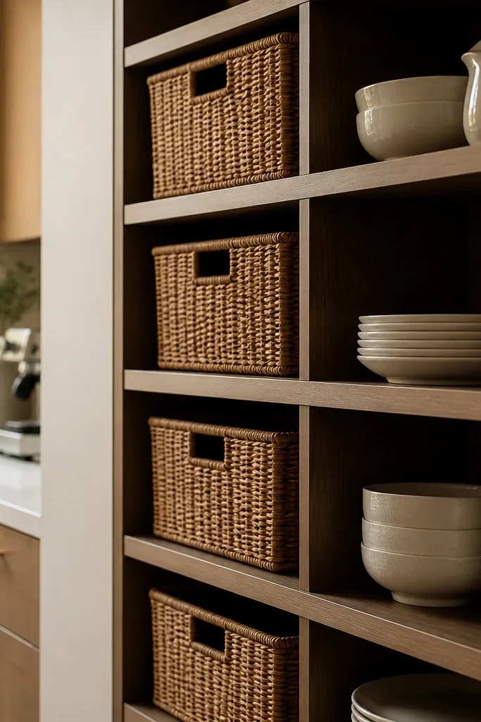
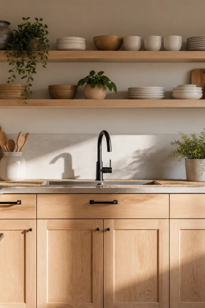
Open shelving reads coastal when it’s controlled. Woven baskets add texture without heavy darkness, and matching dish sets make the shelf look curated instead of chaotic. Use shelving in a narrow band near the dining corner or above a coffee station so the eye has a place to rest. Keep the shelf contents light — white plates, beige cups, and one or two small blue accents. This works especially well if your kitchen is small because open shelves keep the walls from feeling boxed in.
Start by placing open shelves on one wall only, preferably the wall that faces your dining table. Then fill the top shelf with a consistent dish color (white or cream) and add woven baskets on the lower shelf for storage or display. Finally, limit your shelf decor to three groups: stacked plates, cups, and one basket cluster. Keep basket sizes consistent so they align visually. You’ll spend most of your effort on arranging items to match heights; that’s what makes it look bright and intentional in screenshots.
Use one basket style across all shelves. Mixing weaves makes it look messy fast.
Avoid filling every shelf slot — leave negative space so the room stays airy.
4. Blue-White Tile Backsplash with Dark Bronze Faucet
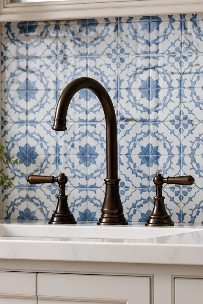
A blue-white tile backsplash gives instant coastal character, but the trick is pairing it with a single darker metal so it doesn’t look flat. A bronze faucet adds warm depth and makes the blue tiles look brighter. Keep the rest of the kitchen light: white counters, light cabinets, and minimal dark decor. This is a strong choice for builds where you want your backsplash to be the photo focal point without adding extra clutter elsewhere. It also helps if your lighting is a bit dim because the tile pattern reflects light.
Start by selecting a blue-white tile backsplash and install it behind the sink and stove, not across the entire kitchen if your room is small. Choose a bronze faucet tone and match it with cabinet hardware so the darker metal feels intentional. Then set your counters to a warm white and keep the wall paint neutral so the tile stays the star. Add one small coastal accent near the backsplash — a single framed print or a small bowl — placed at counter height. Keep the rest of the counter clear. Effort is low to medium since it’s mostly color and placement, not a full rebuild.
Make the tile area tall enough to frame the sink — if it’s too short, it looks unfinished.
Don’t add dark wood wall decor near the tile — it fights the blue and makes the backsplash feel crowded.
5. Coastal Coffee Nook with Curved Window Seat

A coffee nook makes your kitchen feel lived-in without turning it into a clutter pile. The curved window seat adds softness, which is exactly what coastal interiors need — less sharp, more relaxed lines. Use light upholstery tones (cream or pale sand) and add a small tray with a coffee maker and cups in matching colors. Keep the wall behind it light and add one small plant or dried grass bundle for texture. This works best in kitchens with a corner or window wall where you can build a mini “moment.”
Start by dedicating one corner near a window or open wall to a compact counter or cabinet run. Place a curved seat in front of it and set a small side table or shelf to hold cups. Then style the coffee area with one tray, two mugs of the same color, and a small canister set. Add a woven throw blanket on the seat edge to make it feel coastal. Keep the rest of the kitchen counters mostly empty so this nook becomes the cozy focal point.
Match the seat fabric tone to your backsplash or rug so the nook looks integrated.
Avoid placing the coffee nook in the middle of your prep path — it blocks flow and kills the airy look.
6. Tall Pantry Wall in Seafoam with Gold Pulls
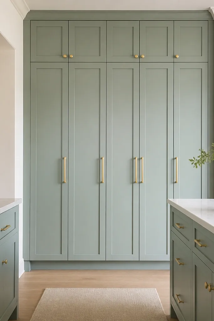
Start by choosing a seafoam cabinet color for a tall pantry run, ideally spanning most of one wall. Add gold pulls consistently across every door and drawer so the wall looks cohesive. Next, keep the counter area near the pantry mostly clear and use the pantry for appliances and extra decor storage. Finally, style only one open shelf section (if you have it) with two to three items in light colors. This idea is medium effort because you’re committing to a full wall, but it pays off immediately in how clean the kitchen looks.
A tall pantry wall gives you vertical storage, which is how you avoid the biggest kitchen mistake in Bloxburg: counters full of stuff. Seafoam is coastal without being too loud, and gold pulls add warmth that keeps the room from looking sterile. Put this on a full wall so it reads like a design feature, not a random cabinet patch. Keep the surrounding walls white or soft cream so seafoam pops in photos. This is ideal for kitchens that need more storage but still want a bright, uncluttered look.
Watch outAvoid seafoam on multiple cabinet sections — it spreads color and makes the kitchen feel smaller.
Pro tipUse seafoam only on the pantry wall and keep the rest of the cabinets white — it keeps the palette tight.
7. White Marble-Look Countertop with Rope-Edge Tray Styling
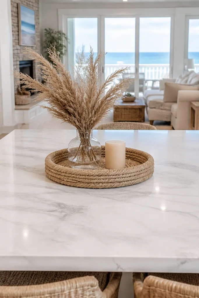
Start by selecting a white marble-look counter tone and set it on your main run, especially near the sink. Then place a single rope-edged tray on one corner or along the dining side, not centered on the whole counter. Add two items on the tray: a small vase with pale stems and a light ceramic container. Keep any other countertop items minimal — a cutting board only if it’s light wood and stays near the sink. This is low effort because it’s styling and surface choice rather than major structural changes.
Marble-look counters brighten a kitchen because they read as reflective and clean, and coastal styling looks better on smooth surfaces. The rope-edged tray adds a nautical detail that doesn’t look heavy. Place this styling on one counter only, usually the dining-facing side, so it becomes the photo moment. Keep the rest of the counters clear so the marble-look doesn’t feel busy. This is perfect when you want coastal vibes but your kitchen is already crowded with cabinets.
Watch outAvoid stacking multiple trays or mixing rope with metal decor — it looks like a theme overload.
Pro tipIf you use marble-look counters, avoid dark wood cutting boards that contrast too hard.
8. Rattan Pendant Lights Over the Island
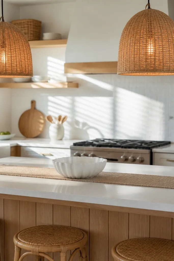
Pendant lighting is how you get that bright, airy coastal feel even when your walls are plain. Rattan pendants add texture and warm shadows, which makes everything look softer in photos. Hang them directly over the island or main prep surface so the light concentrates where you want attention. Keep island counters light so the pendant glow doesn’t darken the workspace. This is a smart pick for kitchens with open-plan dining where you want the lighting to guide the eye.
Start by placing an island or a central counter run with at least enough space for two pendant placements. Then position two rattan pendants evenly spaced above the island, centered left-to-right. Next, set bulbs to a warm yellow tone, not bright white, so the room reads cozy and coastal. Keep the ceiling area uncluttered; don’t add extra ceiling fixtures that compete with the pendants. This idea is medium effort because lighting placement is picky, but it’s worth it for aesthetics.
Keep pendants the same size. One big and one small pendant makes the island look off-balance.
Avoid hanging pendants too high — the texture becomes invisible and the kitchen looks flat.
9. Blue Accent Wall Behind the Dining Table
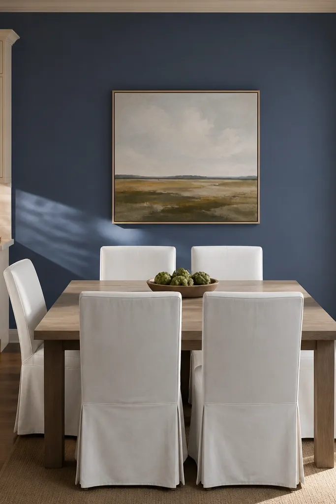
An accent wall behind the dining table is the easiest way to make a kitchen feel coastal without changing every surface. Soft blue adds that ocean atmosphere, and it makes white dining chairs pop in screenshots. Keep the rest of the kitchen light so the accent wall becomes the only strong color block. This works best when your dining area is visible from the kitchen. If you can frame the table and chairs against the wall, you’ll get that bright airy shot every time.
Start by painting or paneling the wall behind the dining table in a soft blue shade. Choose dining chairs in white or off-white and keep any centerpiece light — a small bowl or vase in pale colors. Then place a wall shelf or two small framed prints on either side of the table at consistent height. Keep the kitchen cabinets nearby neutral so the accent wall stays the focal point. This is low to medium effort because you’re changing one wall and styling the dining area.
Add a light rug under the dining table in warm white so the blue doesn’t feel cold.
Avoid repeating blue in too many places. One accent wall and one accessory set is enough.
10. Glass-Front Cabinets with White Dish Sets
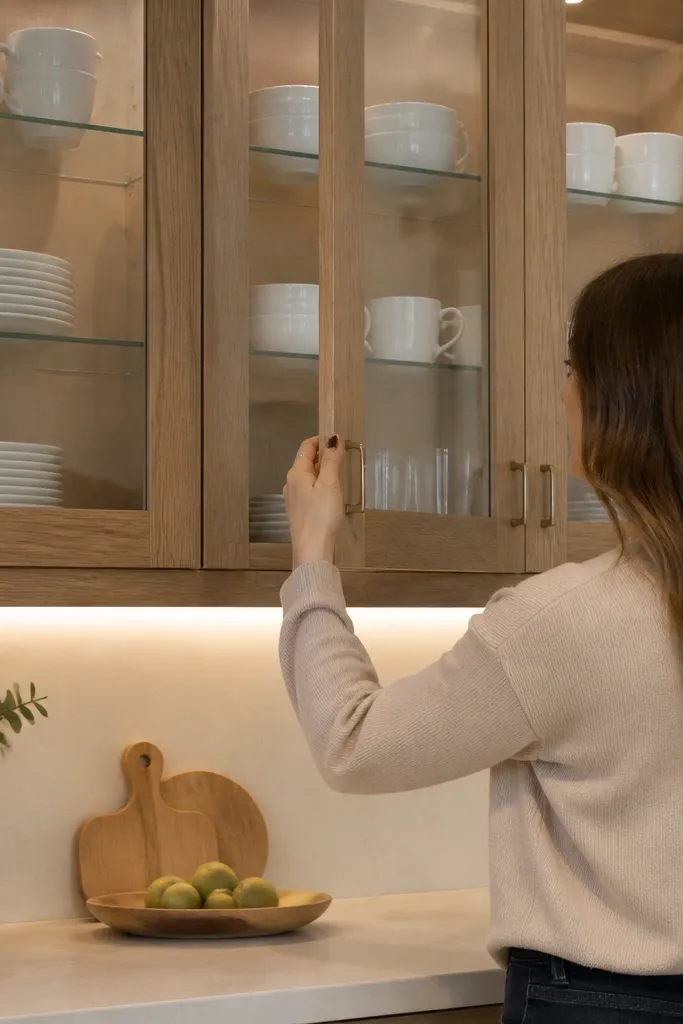
Glass-front cabinets make a kitchen feel lighter because they visually break up cabinet bulk. When you fill them with white dish sets, you create a bright display that reads coastal and clean. This is a strong choice if your kitchen has a lot of cabinet coverage and you worry it will feel heavy. Keep the dishes neatly stacked and avoid random colored items. The goal is controlled repetition: same color, similar heights, and a few small coastal accents.
Start by replacing or selecting glass-front cabinets for the upper run, especially above the dining-facing side. Then arrange white plates and bowls inside so the stacks align and don’t spill across shelves. Add two small items per cabinet — a pale ceramic canister and a folded napkin or small tray — then stop. Keep the lower cabinets solid and light to ground the look. This is medium effort because it’s mostly arrangement, not new building pieces.
Leave one shelf half-empty in each cabinet to create visual breathing room.
Avoid mixing too many colors inside the glass cabinets. It reads messy through the glass.
11. Corner Breakfast Nook with Light Cushions and a Round Table
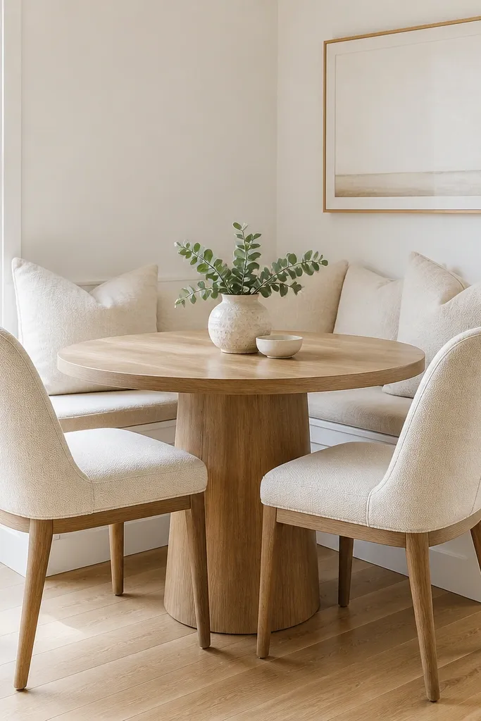
Start by placing a round table in the corner where the kitchen opens to dining, leaving a clear walkway on the main path. Add a bench or two cushioned seats in light cream or pale sand tones on the sides facing away from the kitchen. Then place a small rug under the nook in warm white or very light beige to anchor it visually. Finish with a simple centerpiece like a small vase and one tray on the table. Keep wall decor minimal — one framed print or one mirror.
A round table in a breakfast nook softens the room and keeps the space feeling open, not boxy. Light cushions add comfort and keep the palette airy, while the corner placement saves wall space. This idea is especially good for small kitchens where you can’t fit a big dining setup. Style the nook with a single centerpiece and minimal wall decor so the nook feels bright and calm. Coastal kitchens look best when seating creates a cozy “corner moment,” not a cluttered dining wall.
Watch outAvoid placing the nook too close to cabinets. If the chairs overlap cabinet edges, it looks cramped.
Pro tipUse matching cushion tones across the bench and chairs so the corner reads cohesive.
12. Nautical Blue Stripe Wallpaper Only on the Pantry Door Area
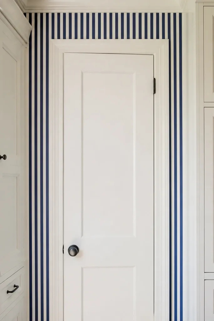
Stripe wallpaper can go coastal fast, but most people overdo it and make the kitchen feel busy. The clean approach is to restrict the stripes to a small panel area — behind a pantry door run or a single cabinet section. Blue stripes add energy and height without taking over the whole room. Pair with plain white cabinets and light counters so the stripes feel like a design accent. This is great when your kitchen needs personality but you want to keep the overall look bright and airy.
Start by selecting a blue stripe wall panel and place it only behind the pantry or a narrow cabinet segment. Keep the surrounding walls plain off-white so the stripes don’t compete with other patterns. Then style the area with simple hardware and one small decor item at counter height, like a white bowl or small plant. Avoid adding patterned rugs that match the stripes; one pattern is enough. This idea is low effort because the impact comes from restricting the pattern to a small zone.
Match the stripe blue to your rug or runner blue so everything looks intentional.
Avoid stripes on two separate walls. Two patterned walls make the kitchen feel smaller.
13. Coastal Sink Wall with Light Curtain Panels and Open Towel Hooks
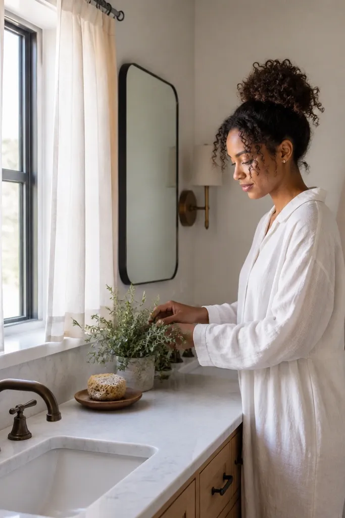
Start by placing your sink against the wall you want to frame, then add light curtain panels on either side of a window if you have one. If there’s no window, place the curtain panels on the wall above a lower cabinet section so it looks like a window treatment. Next, add open towel hooks near the sink and hang one folded towel in a pale beige tone. Finally, keep the counter clear except for a soap dispenser and one tray. This idea is low effort and high impact because it adds softness without heavy decor.
The sink wall is where kitchens feel lived-in, and coastal kitchens should look soft there. Light curtain panels add movement and soften hard cabinet lines, while open towel hooks keep the look practical and tidy. Choose a light counter and a simple backsplash so the curtain and towel details become the focal point. Keep the colors pale and warm — cream curtains and beige towels — and add one small coastal item like a small framed print or a simple vase. This works well for builds where your sink is near a window or where you want the front of the kitchen to feel airy.
Watch outAvoid piling dish racks and extra bottles on the sink ledge. Keep it minimal so the curtains can breathe.
Pro tipUse one towel set color across hooks. Mixed towels look like clutter.
14. Dining Wall Gallery with White Frames and One Sea Glass Color
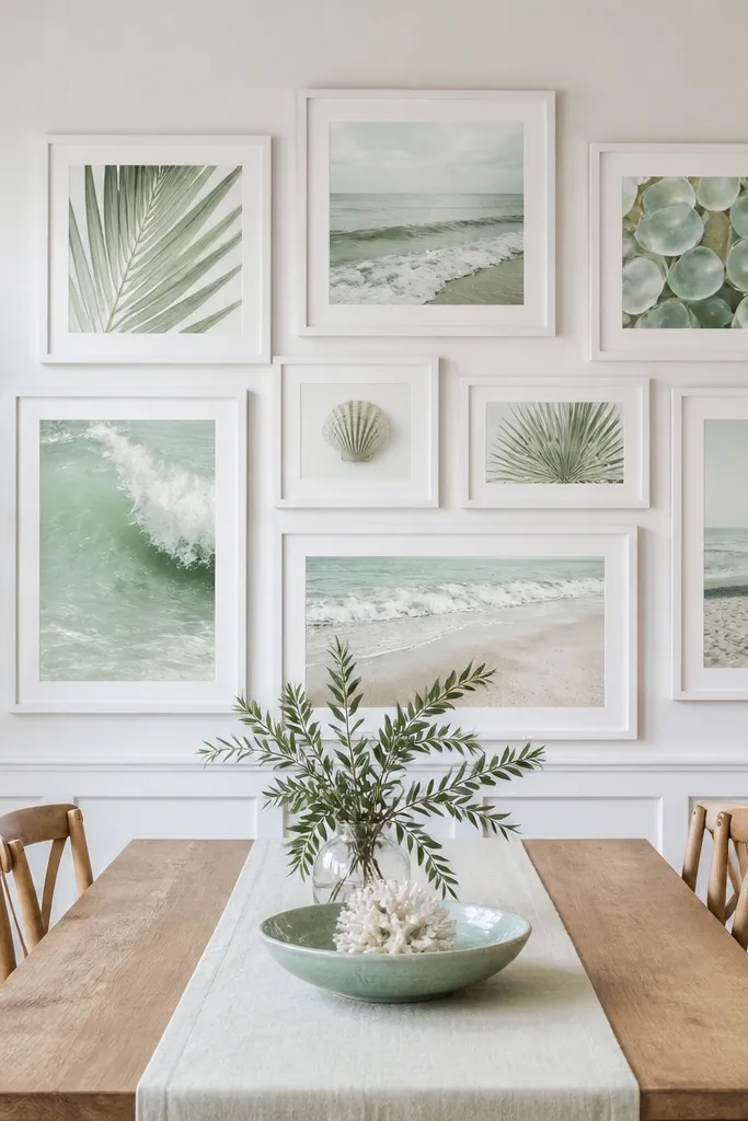
A photo-ready dining wall gallery makes your kitchen feel designed instead of unfinished. White frames keep the look bright, and adding only one sea glass color keeps it coastal without turning it into a rainbow. Hang the frames around table height so they show up in screenshots without stealing attention from the food space. Use simple coastal prints or plain textures that look airy. This is the best choice when your kitchen already has good cabinets and counters, but the dining side feels flat.
Start by choosing 3 to 5 white frames and deciding on one sea glass accent color for small elements inside the frames or mats. Then hang the frames in a tight grid centered above the dining table, keeping the top and bottom edges aligned. Next, add a small matching accessory on the table, like a sea glass colored vase or candle holder. Keep other wall decor off the kitchen walls so the gallery stays the only strong visual feature. This idea is medium effort because spacing matters, but it’s cheap since frames are basic pieces.
Use consistent spacing between frames. Uneven gaps look sloppy in Bloxburg screenshots.
Avoid adding more than one wall of decor. Two busy walls cancel each other out.