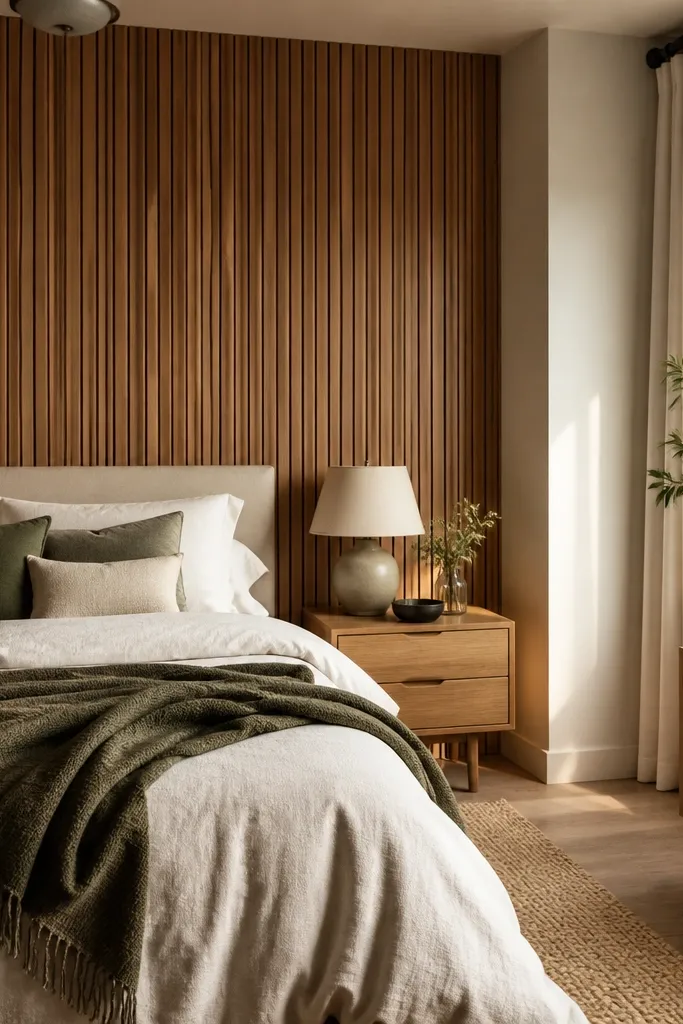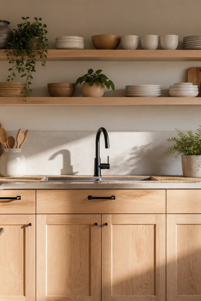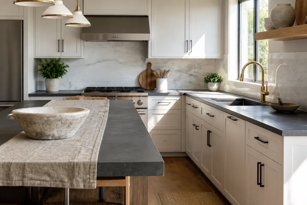
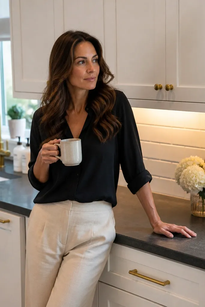
1. Warm Oak + Matte White L-Shape with Black Hardware
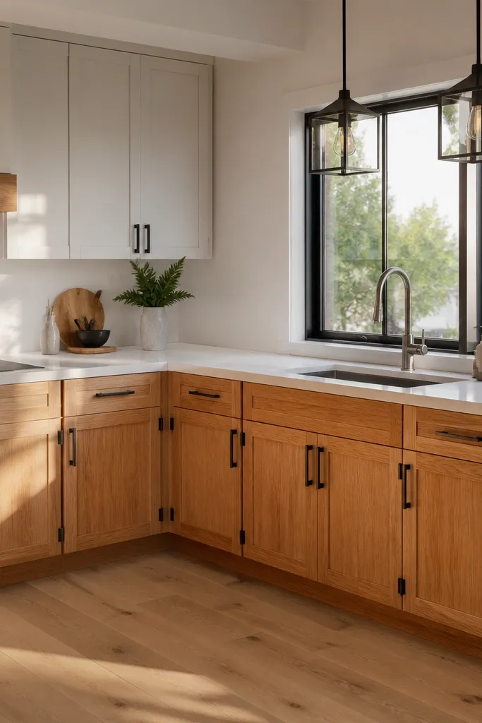
This setup looks real because it creates clear contrast without clowning the color palette. Warm oak lowers add grain-like warmth, while matte white uppers make the room feel brighter and more modern. Black hardware ties everything together and makes the cabinet doors read as separate pieces, not one flat block. Keep the counters in a light stone color so you get a soft highlight under warm lighting. It works best in an L-shaped kitchen where you want a clean work zone and a tidy dining corner nearby.
Start by placing the base cabinets in warm oak along the longest wall, then add matte white uppers on the same run. Next, keep the counters light stone and place the sink under a backsplash line that matches the counter color temperature. Finally, add black handles on every cabinet door and drawer so the hardware reads consistent across both arms of the L.
Put a small runner or placemat on the dining table that repeats the oak tone so the whole kitchen feels like one set.
Don’t mix three cabinet colors; it breaks the “real kitchen” layering.
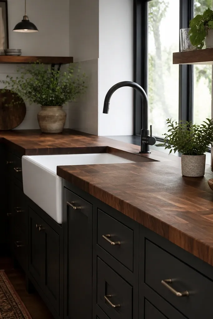
2. Charcoal Cabinets with Light Marble Counter and Gold Accents
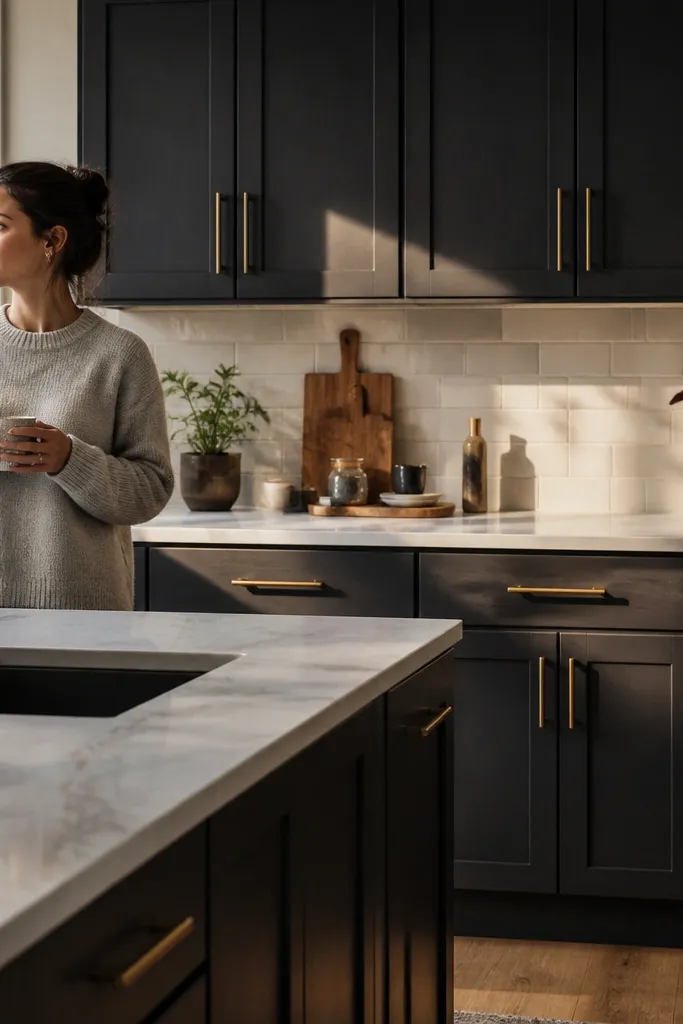
Place charcoal base cabinets first, then add matching charcoal uppers but keep the counter surface light stone or marble-look. Install the faucet in gold and use gold accents on any cabinet hardware you add. Finish by aligning the backsplash so it forms a straight horizontal band from counter to cabinet bottom.
Charcoal gives you that modern, moody look, but it only stays realistic when you lighten the counters. Light marble counters create the illusion of a high-end surface, and the gold faucet/fixtures add warmth without making the room feel too dark. Use a simple backsplash that matches the marble vibe rather than a busy pattern. This idea is great for kitchens that need to feel stylish in photos, especially if your dining area is bright and you want the kitchen to be the focal point.
Watch outAvoid black-on-black everywhere; the marble counter needs to be light to keep it readable.
Pro tipAdd one plant or herb jar on the counter in a neutral ceramic so the gold doesn’t look random.
3. Two-Toned Galley Kitchen with White Subway Back Splash
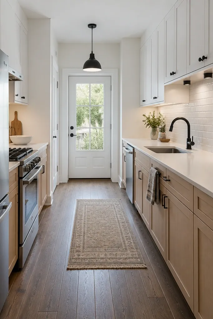
Build your cabinets in a straight line with uppers in white and lowers in warm wood or greige. Add a white subway backsplash directly behind the sink and stove zone so the texture sits where the eye lands. Finish with a light countertop and place a narrow bar or two stools at the end of the galley.
A galley kitchen looks best when the walls don’t fight each other. This design uses two tones to keep depth: white cabinets plus a contrasting lower tone (warm wood or soft greige) so the counter line has structure. The white subway backsplash is a strong realism cue because it creates a repeating texture that reads like real tile. Pair it with a simple faucet and a light countertop so your narrow space doesn’t feel cramped. Put a slim dining bar at the end so the kitchen also serves the meal area.
Watch outDon’t add a second backsplash style on the other wall; pick one tile look and repeat it.
Pro tipKeep decor minimal on the counter; in a galley, clutter makes the backsplash and cabinet lines disappear.
4. Modern Farmhouse Corner Kitchen with Open Shelving
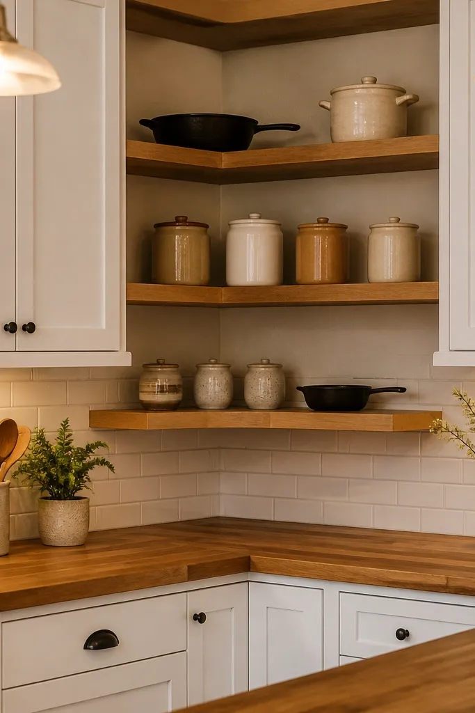
Place closed cabinets on both sides of the corner, then swap the upper section on the corner wall to open shelves. Use warm wood counters and keep the backsplash simple, light, and clean. Style the shelves with 3-5 matching containers in a tight color set and keep the rest of the counter clear.
Corner kitchens can look messy in Bloxburg because the eye doesn’t know where to stop. Open shelving solves that by giving you a visual “pause” at the corner — it reads like real storage. Use white cabinets for the closed storage and warm wood or butcher-block style counters for the grounded farmhouse feel. Put matching jars or simple canisters on the open shelves so the shelves look intentional, not random clutter. This works especially well when you’re trying to make a dining nook feel cozy without making the kitchen too heavy.
Watch outDon’t mix dark wood counters with dark open shelves; it makes the corner feel closed in.
Pro tipUse one shelf height for everything on the open section so it looks like a planned built-in.
5. Sleek White Kitchen with Deep Gray Counter and Under-Cabinet Glow
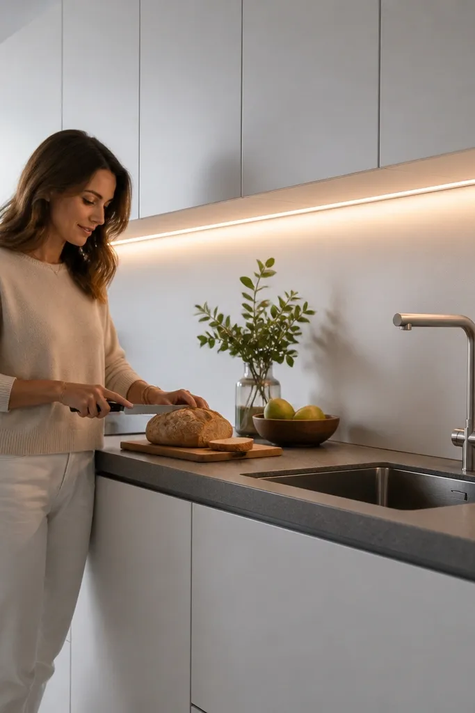
This is for the clean, modern look where everything feels crisp. White cabinets make the room look larger, and a deep gray counter gives you contrast so the counter line shows clearly in screenshots. Under-cabinet glow is the realism move: it creates a light band that makes the space feel built-in, not floating. Keep the backsplash minimal and light so the gray counter stays the star. This works well in kitchens next to bright dining spaces where you want the whole area to feel airy.
Place white cabinets across the main wall and choose deep gray counters so the countertop edge is obvious. Add under-cabinet lighting along the counter run, placing the glow slightly above the counter surface line. Finish with a light backsplash and a simple faucet that matches the hardware tone.
Keep the dining table wood tone light so your gray counter doesn’t look too heavy next to it.
Avoid bright white counters with white cabinets; you lose the separation lines.
6. Black-and-Wood Kitchen with Statement Range Wall
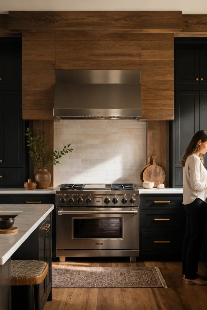
Make one wall the hero. This setup uses black cabinets for a strong modern base, then adds warm wood accents around the stove zone so it doesn’t feel like a cave. A statement range wall looks realistic when the backsplash is clean and the cabinet spacing around the stove feels symmetrical. Keep the stove area framed with consistent materials: same backsplash color, same hardware finish, and a matching hood piece if you’re placing one. It’s a great choice when your kitchen is visible from the dining area and you want a focal point.
Build black base cabinets on the range wall, then add a warm wood section above or beside the stove zone. Keep the backsplash uniform and place it so it aligns with the stove height and counter line. Use matching black hardware across the whole wall and add a small counter item like a utensil crock right next to the stove for realism.
Add a small spice rack look on the side of the range zone so the wall has a believable “use” point.
Don’t scatter different counter colors on the range wall; symmetry reads more realistic.
7. Cream Cabinets with Terracotta Backsplash and Brass Fixtures
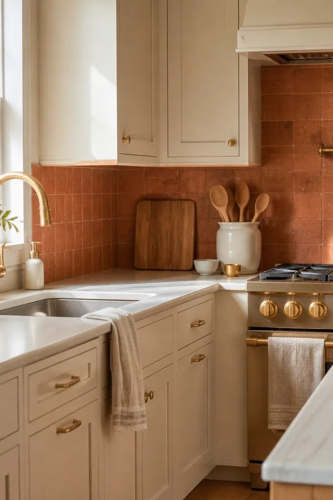
Put cream cabinets on the main run and choose a light counter surface that doesn’t compete with terracotta. Place the terracotta backsplash behind the sink and continue it at least along the stove side so it looks like real tile coverage. Finish with brass faucet and matching hardware, then keep the counter decor to 2-3 items max.
Terracotta backsplash brings warmth fast, and cream cabinets keep it from looking too heavy. Brass fixtures add that sunlit feel that reads modern when paired with clean cabinet lines. The key is to keep the rest of the kitchen simple: light counters, minimal decor, and a consistent brass tone. This idea is best for kitchens that feel too cold or too gray — the terracotta adds color without requiring a full remodel of furniture and flooring.
Watch outSkip patterned dish towels or mixed prints; keep the color story clean.
Pro tipUse a cream or beige dining chair color so the terracotta doesn’t clash with your dining seating.
8. Matte Sage Cabinets with White Counter and Slim Black Shelf
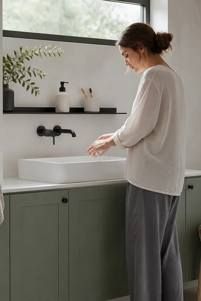
Sage looks modern when it’s matte and paired with crisp white. This idea uses matte sage cabinets for a soft color hit, then keeps the counter and backsplash in white so the room stays bright. A slim black shelf above the sink creates a realistic “wall storage” moment and gives you a place for a soap dispenser and a couple of cups. It’s perfect for smaller kitchens because the shelf adds interest without eating floor space. The look is clean, calm, and photo-friendly.
Place matte sage cabinets along your main wall and keep counters white or off-white. Add a slim black shelf above the sink area and style it with 2-4 matching items in white or neutral tones. Keep the rest of the backsplash simple so the shelf and sink zone stand out.
Match the shelf items to your faucet finish so they read as one set, not random decor.
Don’t add a full open shelving unit; the slim shelf is what keeps the space light.
9. Teak Cabinets with White Upper Doors and Glass-Front Details
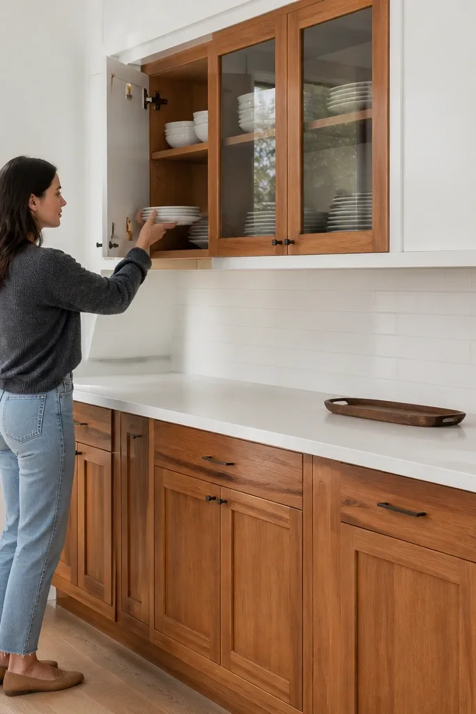
Start with teak base cabinets and keep the counters a light neutral. Add white upper doors and include glass-front sections in the upper run — place them above the most visible counter area. Style glass shelves with a tight set of cups or bowls so the glass reads intentional rather than empty or chaotic.
Glass-front details add realism because they create depth and show “storage inside,” even in a game environment. Teak base cabinets ground the room with warmth, while white upper doors keep the look modern and airy. Use glass-front sections only in the upper area so the counter stays clean and uncluttered. This works best in kitchens that connect to a dining table where you want the kitchen to feel styled but not busy.
Pro tipKeep the glass-front section to one stretch of cabinets; too much glass looks like a display case.
10. Gray Concrete-Look Counter with White Cabinets and Black Pendant Lights
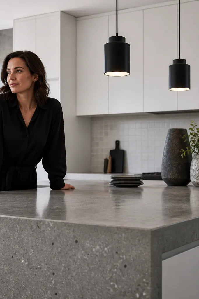
Install white cabinets along the main wall and choose a gray concrete-look counter that has visible texture. Add black pendant lights above the seating area or the counter section you want to highlight, spacing them evenly so the light falls in a line. Use a simple backsplash that stays light and neutral, then keep small decor near the sink and under the pendants.
Concrete-look counters are one of the fastest ways to make a Bloxburg kitchen feel modern, because they have that stone texture look. Pair it with white cabinets so the counter doesn’t dominate the whole scene. Black pendant lights add a strong, realistic silhouette and make the overhead lighting feel designed. Place pendants over a breakfast area or the counter run where you have seating, so the light lands on the dining surface in screenshots. This setup is best when you want a modern kitchen that still looks cozy and lived-in.
Watch outDon’t put pendants over empty floor; the light needs a surface to make it believable.
Pro tipIf your dining table is near the kitchen, match its chair color to the pendant finish for a cleaner photo.
11. All-White Kitchen with Blue Accent Tile and Stacked Open-To-Close Storage
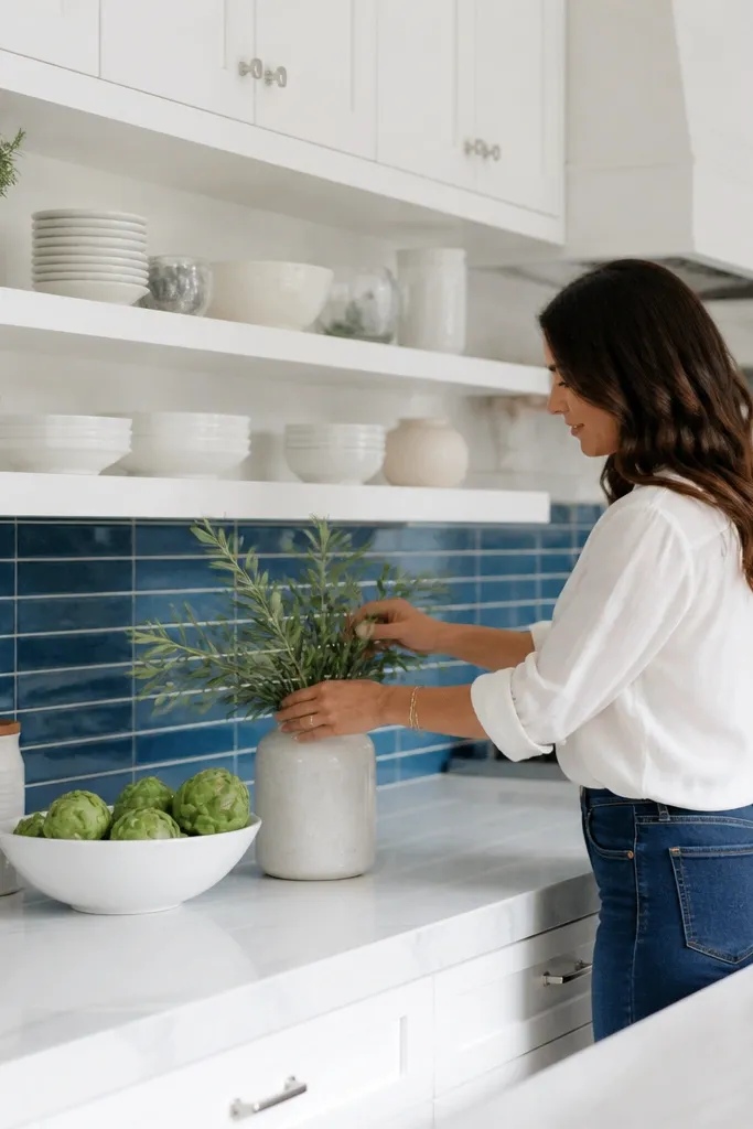
Place all-white cabinets and choose a light counter surface. Add a blue accent tile strip on the backsplash — keep it narrow and straight so it reads like a designed feature, not random color. Add open shelves in one section at eye level and keep the rest closed with simple doors.
This idea is about a small color moment done right. All-white cabinets give you a clean base, then a blue accent tile strip behind the counter adds a realistic “tile feature” without turning the kitchen into a themed room. Stacked open-to-close storage creates depth: open shelves at eye level, closed cabinets above or below so the wall doesn’t look cluttered. Keep the counter light and matte so it doesn’t fight the tile. It’s ideal for people who want good-looking bloxburg kitchen ideas but hate dark cabinets.
Watch outDon’t stack multiple accent colors; one strip is enough.
Pro tipUse only one blue shade across backsplash and dining accessories so it stays modern.
12. Two-Color Kitchen with Black Frame Glass Hood and Matching Dining Bar
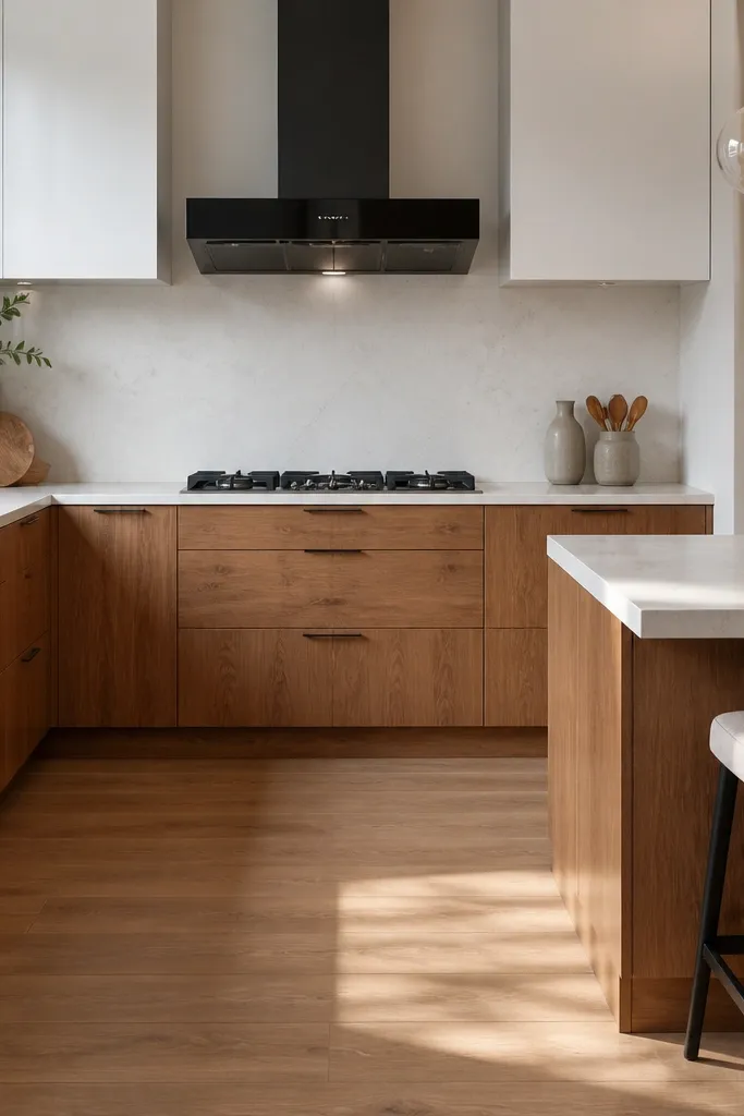
Build the kitchen run with warm wood base cabinets and white uppers, then place the stove centered under the black frame glass hood. Match the dining bar counter finish to your kitchen counter so the horizontal surfaces line up visually. Style the bar with two stools and keep the counter decor tight: one tray or bowl, one small plant.
A hood detail makes the kitchen look built and intentional. Use a two-color cabinet scheme like white uppers and warm wood lowers, then add a black frame glass hood above the stove zone. The black frame anchors the look, and the glass front adds a modern “real appliance” cue. For the dining area, add a matching dining bar or counter with the same counter finish so the kitchen and dining feel like one design. This is a strong pick when your kitchen is visible from the dining table and you want it to look cohesive.
Watch outDon’t place the hood off-center; the eye catches it instantly in screenshots.
Pro tipCenter the hood over the stove and keep the cabinet spacing symmetrical for a cleaner, more realistic look.