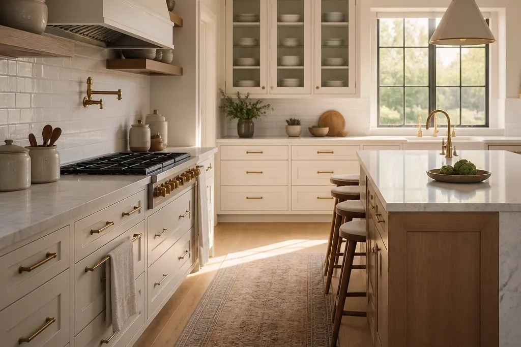
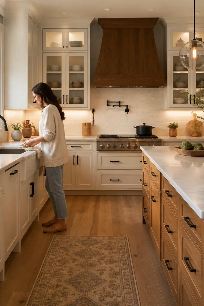
1. White shaker cabinets with a warm wood "island spine"
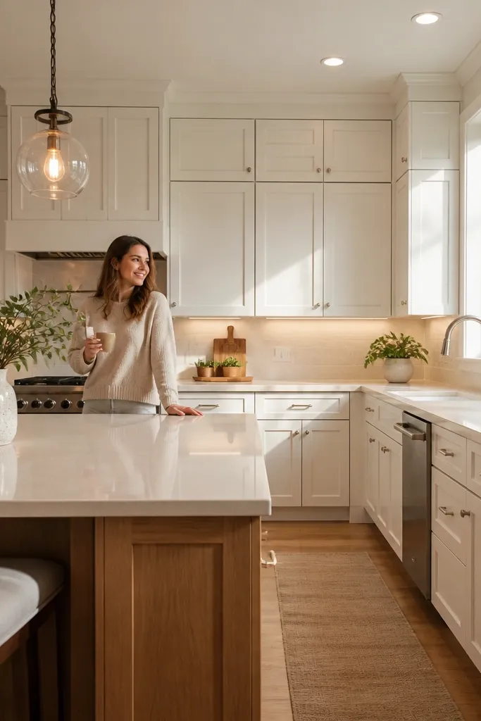
Step 1: Place your main cabinet run first, then set the island so there is at least one clear walkway edge all the way around it. Step 2: Use white shaker cabinets on the perimeter and match the island base to the warm wood tone you want, then repeat that wood in one small detail like a utensil rail or stool seats. Step 3: Finish the island with a light countertop color so it reflects light and reads “expensive” even with default lighting.
This is the cleanest path to high-end bloxburg kitchen ideas because the contrast does the work for you. White shaker cabinets give you crisp lines and a bright base, while a warm wood island adds warmth so the room doesn’t look like a blank office. Keep the island top in a light wood tone or a white/cream surface that matches your cabinets' undertone. The look stays functional because your island becomes the prep hub and the storage center, so you’re not spreading tasks across random counters. Put this in a medium kitchen where you can fit an island without squeezing the edges.
Watch outAvoid mixing three cabinet colors on the same wall — it kills the crisp, high-end look.
Pro tipKeep hardware consistent: one metal tone across all cabinets and the fridge area makes the whole build look intentional.
2. Black range wall with a glossy subway backsplash
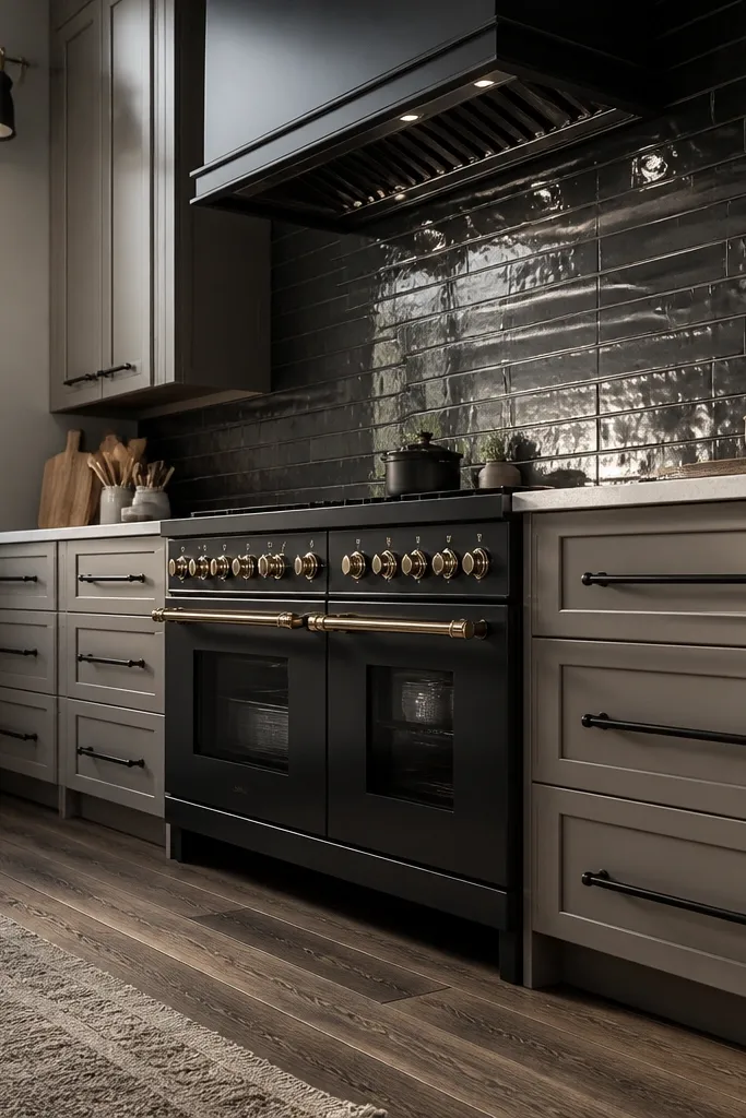
A single dark focal wall is the fastest way to get that designer, high-end vibe in Bloxburg kitchens. Use a black range or range wall treatment and surround it with a glossy subway tile backsplash so light bounces back toward the camera. Keep the cabinets around it either white or a soft greige so the black doesn’t swallow the room. This setup solves the “my kitchen looks flat” problem because the backsplash has visual texture and shine. It also creates a natural photo anchor, so your screenshots look styled even when the rest of the room is simple.
Step 1: Build your range wall first — place the range, then extend the backsplash area to at least the same width as the cabinet run on both sides. Step 2: Choose white cabinets for the perimeter and add black accents only where they frame the range (cabinet uppers near it or trim). Step 3: Put a small wall shelf or utensil rail above the counter to break up the backsplash without covering the texture.
Use grout-like spacing on the tile so the pattern stays readable; overly tiny tile patterns can blur at distance.
Don’t place matching dark everything — black range + black cabinets + dark countertops can feel heavy and cramped.
3. Butcher block counters with brass-toned fixtures
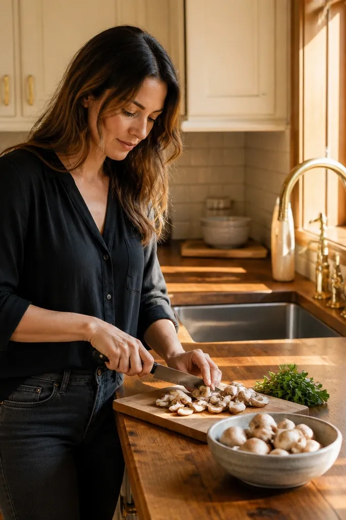
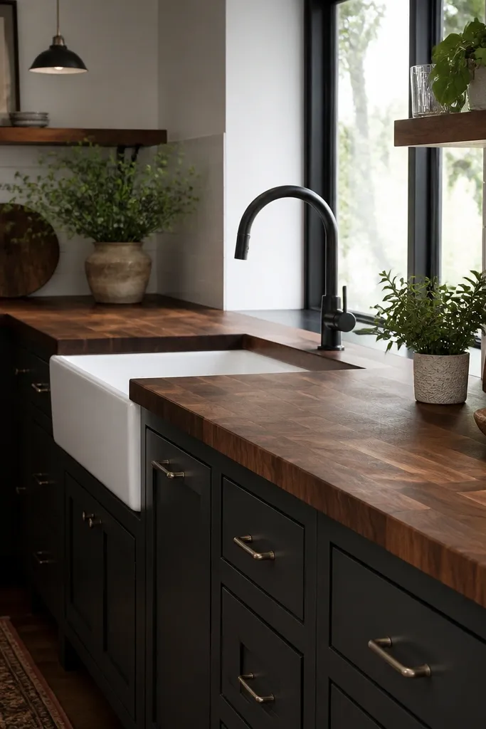
Butcher block is one of the most believable ways to make a Bloxburg kitchen look expensive because it reads as a real material. Pair warm wood counters with brass-toned fixtures to add a soft glow where the eye naturally lands: sink + faucet + nearby cabinet hardware. Keep the cabinets light so the wood doesn’t dominate the room. This idea is functional because wood-toned prep space makes the kitchen feel like a workspace, not just storage. It’s best for kitchens where you want cozy high-end bloxburg kitchen ideas rather than stark modern.
Step 1: Choose butcher block for the main counter run and place the sink directly within that run so the faucet sits visually centered. Step 2: Set brass-toned hardware on the faucet and cabinet pulls in the same area, then repeat brass in one small lighting detail like a pendant or wall sconce. Step 3: Keep the backsplash simple — small neutral tile or a single-tone panel — so the wood remains the star.
Match the undertone: if your wood looks honey-warm, keep your brass warm too, not cool-silver.
Skip busy patterned backsplash with wood counters — it fights for attention and makes the room feel cluttered.
4. Tall pantry wall with a built-in fridge column
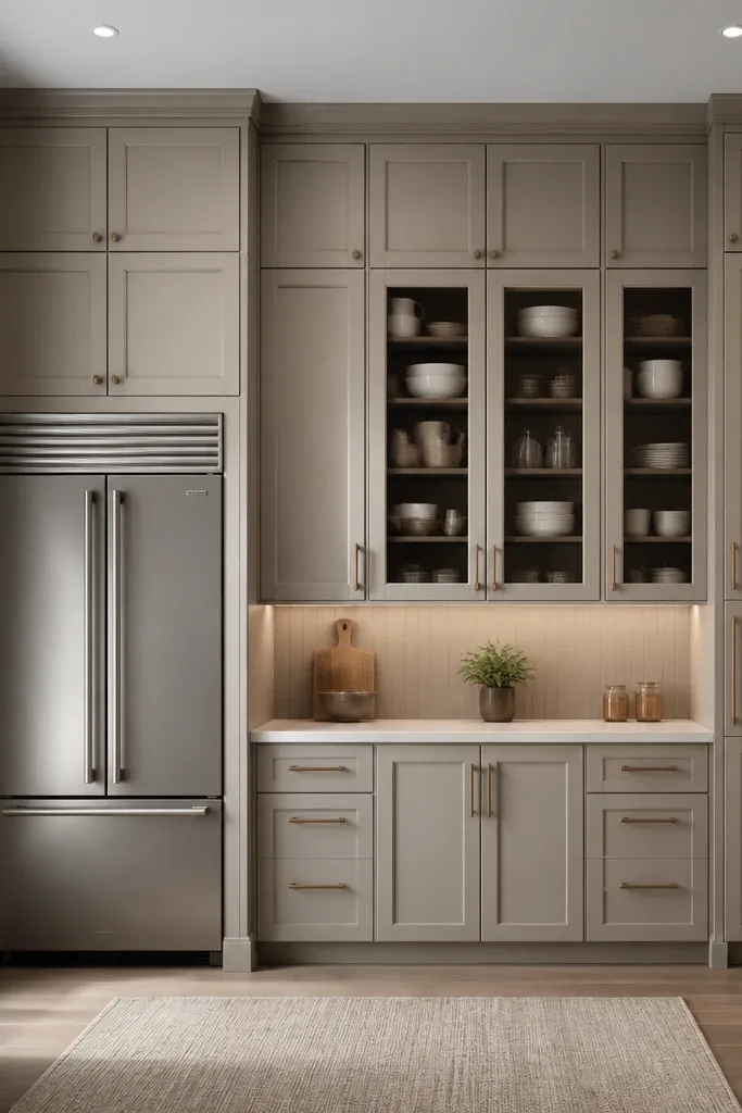
A tall pantry wall makes the kitchen look structured and custom, which is exactly what high-end bloxburg kitchen ideas need. When your fridge is framed by matching cabinets and the pantry reaches higher than the counters, your eye reads the space as designed, not assembled. This also fixes a layout annoyance: you stop scattering storage around the room because the pantry becomes the command center. Use a consistent door style across the column and pantry so it looks like one built-in unit. It works best when your kitchen has a wall long enough to stretch vertically without breaking the room’s flow.
Step 1: Place the fridge first, then build matching upper cabinets around it so the sides look flush and intentional. Step 2: Extend one side of that column into a tall pantry area with the same door finish, aiming for height above the counter line. Step 3: Add pull-out style storage pieces near the bottom section and keep the top shelves visually lighter with fewer stacked items.
Use one panel pattern across the whole column — even if the inside storage is different, the doors should match.
Don’t leave a gap between fridge and cabinets — it breaks the built-in illusion.
5. U-shaped kitchen with a centered dining drop zone
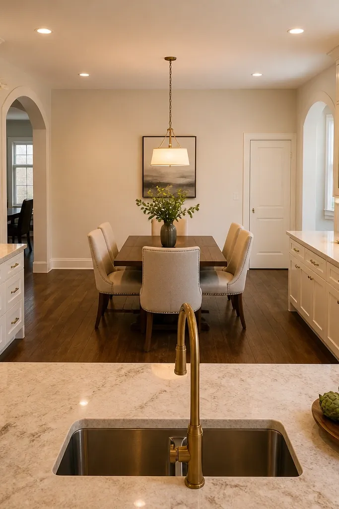
U-shaped layouts are forgiving and they photograph well because your camera naturally captures both counter runs. The trick for functionality is adding a centered dining drop zone so the room doesn’t feel like a hallway. Put a dining table or breakfast nook directly across from the main prep run, then keep the “corner zones” clutter-free so the U shape stays readable. This solves the common Bloxburg problem where kitchens look stylish but you can’t move without bumping into furniture. Choose this when you have a medium-width room where you can keep one clear path from entry to dining.
Step 1: Map your U shape first: two long counter runs plus the back wall, then leave a gap wide enough for one person to pass beside the dining seating. Step 2: Place dining so it faces the counter run, not the hallway — the visual lines should point into the kitchen. Step 3: Use matching chair backs or seat colors to tie dining to the kitchen palette, then keep the corners minimal with one plant or one small cart.
Keep the dining table smaller than you think — a slightly narrower table makes the U shape feel open.
Avoid pushing the dining table too close to the counter corners; it makes the room feel blocked.
6. Corner sink with a window sill and open shelving above
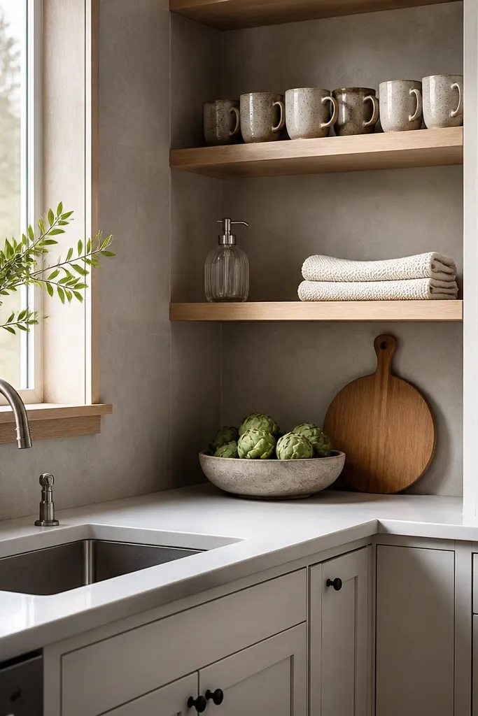
A corner sink is practical in Bloxburg and looks high-end when you frame it like a real kitchen moment. Put the sink under a window or window-like opening and add a slim window sill in a wood or light stone tone. Above it, use open shelving for everyday items like matching cups, a soap dispenser, and one folded towel. This creates a natural focal point and makes the kitchen feel lived-in without looking messy. It’s perfect for layouts where one corner wall is otherwise blank and you want a “reason to exist” for that space.
Step 1: Place the corner sink and align it so the faucet sits centered under the window opening. Step 2: Add open shelves directly above the sink area, then keep shelf items to one consistent color group (white mugs + wood trays works well). Step 3: Use closed cabinets on the adjacent walls so you can store cleaning supplies out of sight, which keeps the look polished.
Use one matching tray under the soap and sponge so the sink area looks styled, not random.
Skip clutter on open shelves — three items that match beats ten mismatched pieces.
7. Galley kitchen with mirrored backsplash panels
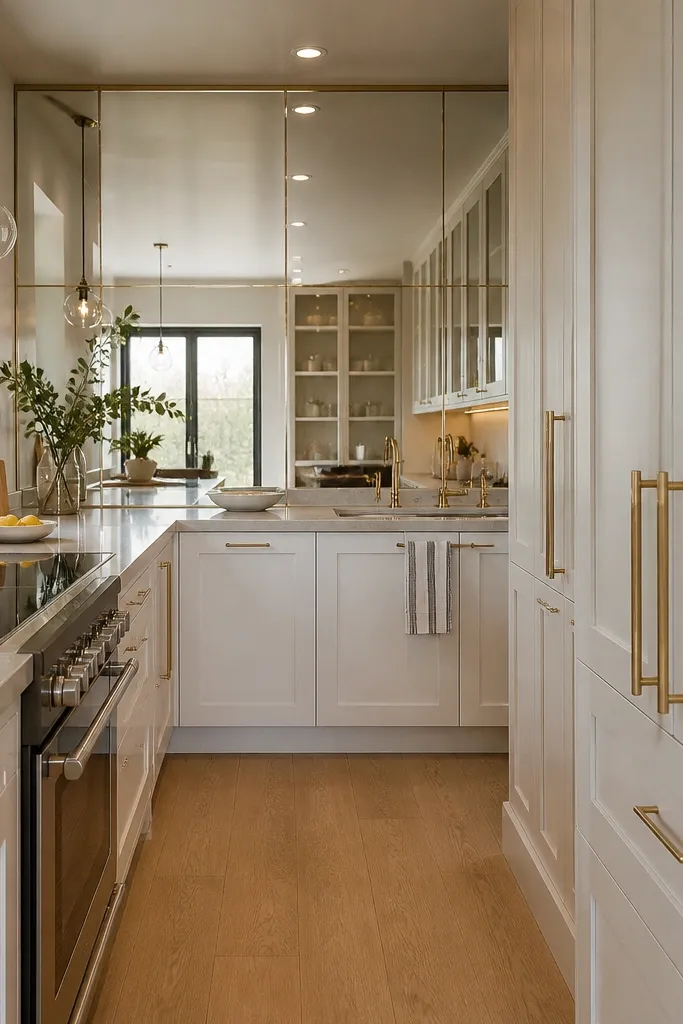
Galley kitchens can feel tight, but mirrored backsplash panels solve that by making the space feel longer and brighter. Keep your cabinetry light and your countertops simple, then add a reflective backsplash section behind the main counter run. The reflection helps your counters look deeper and more expensive because it doubles light and makes the wall feel dimensional. This idea is all about layout discipline: in a narrow room, you can’t afford visual noise, so the mirror does the heavy lifting. Choose it when you’re working with a long, thin kitchen where the eye needs help moving forward.
Step 1: Build your galley with clear clearance between counter edges so you aren’t stacking decor where you’ll walk. Step 2: Add mirrored or reflective backsplash panels along the primary sightline wall, ideally behind the stove and counter zone. Step 3: Use one repeating color for cabinets and add a single metal accent like a brushed faucet or cabinet pulls to keep the look cohesive.
Place your brightest light source so it hits the reflective backsplash — the mirror only looks “high-end” when it catches light.
Avoid placing open shelving on both sides of a galley — it makes the narrow space feel crowded.
8. Two-tone cabinets with a cream lower and white upper
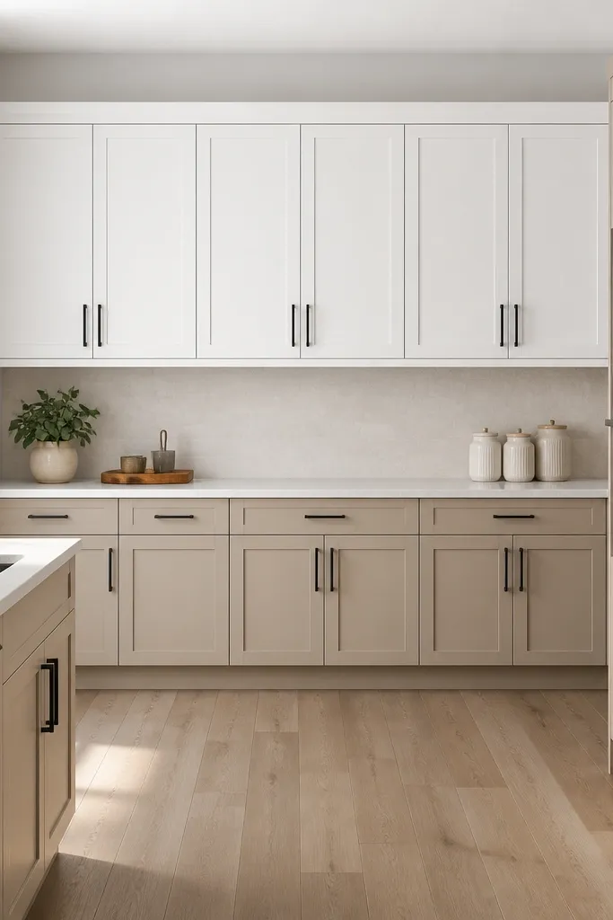
Step 1: Pick one warm cream shade for the lowers and one clean white for uppers, then keep both consistent across the entire perimeter run. Step 2: Add hardware in the same metal tone to connect both cabinet finishes, and keep the countertop light so it doesn’t clash. Step 3: Use a backsplash that is one color or very subtle texture, then add one accent piece like a runner or a single vase to avoid visual overload.
Two-tone cabinets look pricey because they add depth without adding clutter. Go with cream or warm off-white lowers and white uppers so the bottom grounds the room while the top stays airy. Add a light countertop and keep backsplash neutral so the cabinet color split reads clearly. This solves the “my kitchen looks flat” problem because the eye has a strong horizontal break at counter height. It also helps functional zoning: the lower cabinets feel like work storage, while the uppers feel like display and keep the room visually organized.
Watch outDon’t add a third cabinet color in the same room; two-tone is already doing the contrast work.
Pro tipKeep the cabinet rail height consistent across the kitchen — mismatched lines make two-tone look accidental.
9. Marble-look waterfall island with hidden storage
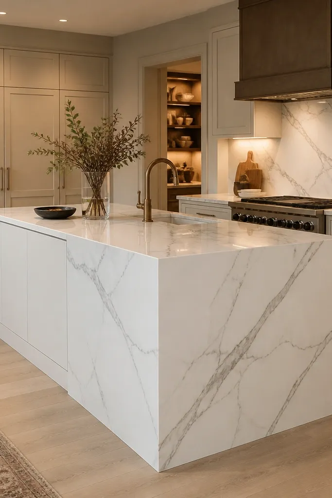
Step 1: Place the island so it visually centers your kitchen’s main sightline, then match its base color to your cabinet hardware tone. Step 2: Choose a marble-look surface and keep the veining tone subtle, not high-contrast; the goal is calm luxury. Step 3: Add seating on one long side and keep the other side clear for prep movement.
A waterfall island reads luxury in Bloxburg because the countertop edge looks continuous and expensive. Use a marble-look top (white base with soft grey veining) and extend it down the island face if your build options allow that visual edge. Keep the perimeter cabinets simple so the island is the hero. This idea is functional because an island with deeper visual mass feels like actual work territory, and you can hide storage below with the right island choice. It’s best for kitchens where you have space for an island that sits between counters rather than against a wall.
Watch outAvoid heavy pattern everywhere else; a waterfall island needs a calm perimeter to look high-end.
Pro tipAdd one small decorative tray on the island to break up the “empty stone” look, but keep it minimal.
10. Stove-to-hood copper trim with a clean hood line
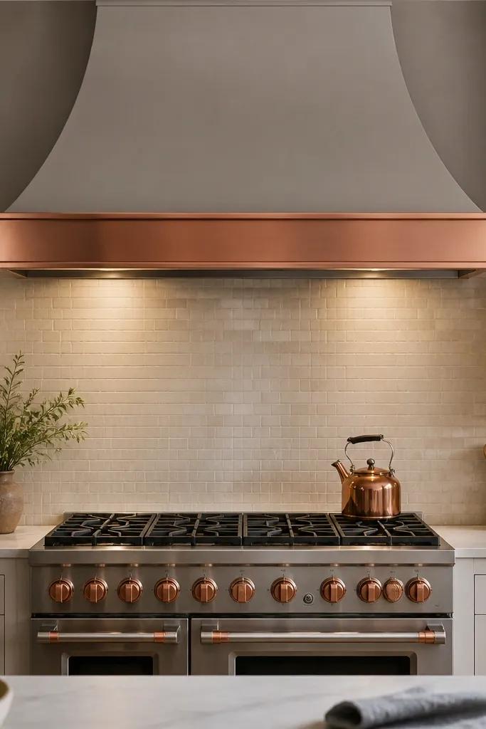
This is a modern-high-end move: a crisp hood line with copper trim gives you a strong vertical focal point. Place the stove in the center of a cabinet wall, then add a hood element that visually frames it. Use copper or warm metal accents around the hood area only, and keep the rest of the backsplash neutral so the trim looks intentional. The kitchen feels functional because the stove sits inside a dedicated cooking zone, with prep counters on both sides. It works best when your kitchen has enough wall width to center the stove and give the hood room to breathe.
Step 1: Center the stove on the main cabinet run and build cabinets on both sides at the same height so the hood line stays straight. Step 2: Add copper trim to the hood area and repeat copper once near the sink, like a faucet tone or a single cabinet pull. Step 3: Keep backsplash consistent across the stove and counter section so your cooking zone reads as one unit.
Make sure the hood line aligns with the cabinet uppers — a slightly off alignment makes it look like a random add-on.
11. Dining nook with a built-in bench and glass-front cabinet
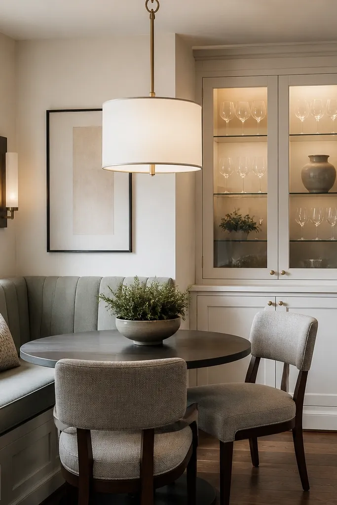
Step 1: Pick the nook wall first, then place the bench so it lines up with a cabinet run or window opening. Step 2: Add a glass-front cabinet on the nearby wall and only display matching dishware or one color group. Step 3: Keep the table top simple and light so it doesn’t compete with the cabinet display.
A dining nook that feels built-in looks expensive fast because it changes the space from “furniture placed” to “room designed.” Add a bench along one side and pair it with a small table that sits close enough to feel cozy but leaves room to stand up. Next to the nook, place glass-front cabinets to display a tight set of dishes. This gives you a photogenic corner and keeps the kitchen functional because seating and storage share the same wall plan. It’s ideal for kitchens that connect to a living area and need a clear transition spot.
Watch outDon’t oversize the dining table; an oversized table makes the bench look squeezed and ruins the cozy feel.
Pro tipUse a fabric-like bench color that matches your kitchen cabinet undertone to avoid clashing tones.
12. Open shelving run with matching canisters and a single vertical plant
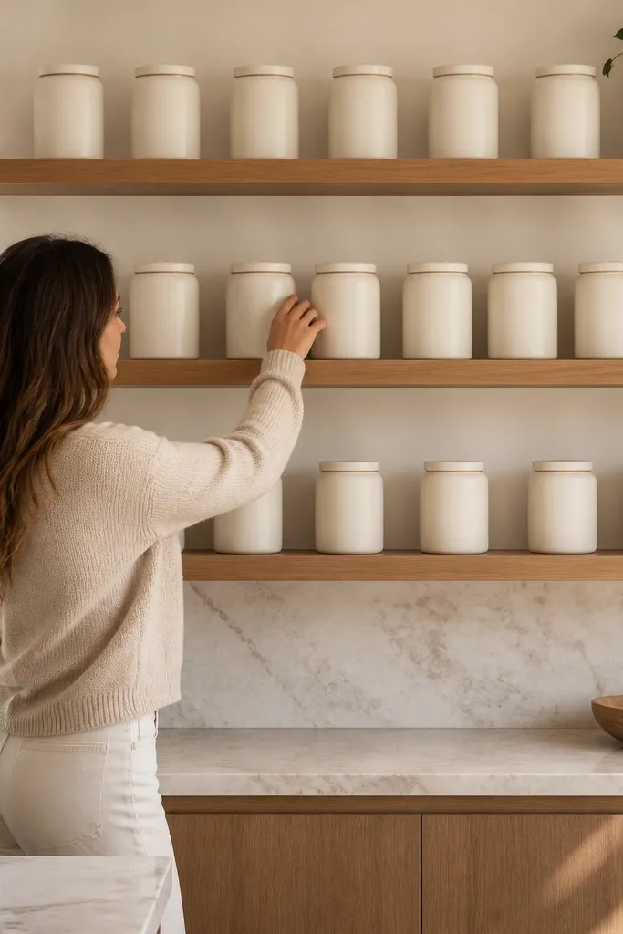
Step 1: Choose a shelf run length that matches one straight counter segment, then place shelves at a consistent height above the counter. Step 2: Style the shelves with 6-10 items max, all in one palette — white, cream, and warm wood works well. Step 3: Add one tall plant on the floor near the shelf end and keep everything else low so the shelf line stays clear.
Open shelving can look high-end or chaotic depending on how you style it. The high-end version is strict: matching canisters, one tray color, and a single vertical plant to add height without clutter. Put shelves on one wall only, ideally the wall you face from the kitchen doorway, so the display reads cleanly. Keep the rest of the kitchen closed with cabinets so storage stays hidden. This solves the “my open shelving looks messy” problem and gives you a photogenic wall that still feels functional for everyday items.
Watch outSkip mixing random decor objects with kitchen items on the same shelf — it breaks the intentional look.
Pro tipIf you’re using canisters, make sure their lids and shapes match; mismatched lids read like clutter even when colors match.
13. Corner coffee station with a closed drawer base and floating shelf
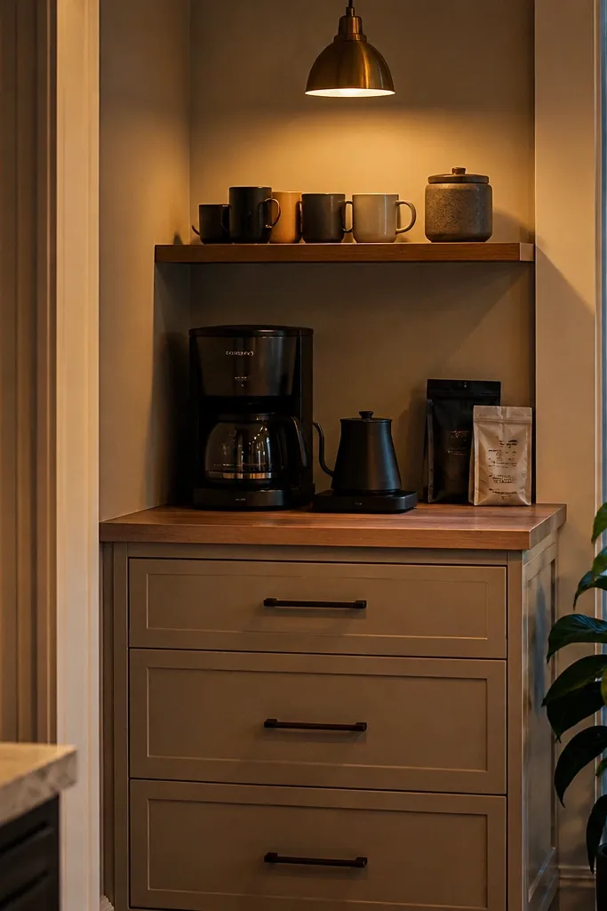
Step 1: Place the coffee station in a corner adjacent to your counter run, with drawers under a small countertop surface. Step 2: Add one floating shelf above for mugs and a single canister grouping, keeping items aligned left-to-right. Step 3: Keep the coffee station countertop clear except for one small tray, then store the rest inside the drawers.
A coffee station is a small kitchen win that looks styled on camera because it adds a second focal point besides the stove. Put it in a corner where you’d otherwise lose wall space, then use closed drawers for the messy stuff (filters, sugar, extra cups). Above, add a floating shelf for mugs and one tidy canister set so the station looks curated. This idea delivers functional flow because it keeps daily items near the sink or prep counter instead of scattered across the room. It’s best for compact kitchens where you need charm without taking away workspace.
Watch outDon’t put open storage with coffee supplies across the whole kitchen; one coffee wall is enough.
Pro tipUse mug colors that match your cabinet hardware tone — it ties the station into the rest of the kitchen.
14. Monochrome modern kitchen with light stone counters and matte black pulls
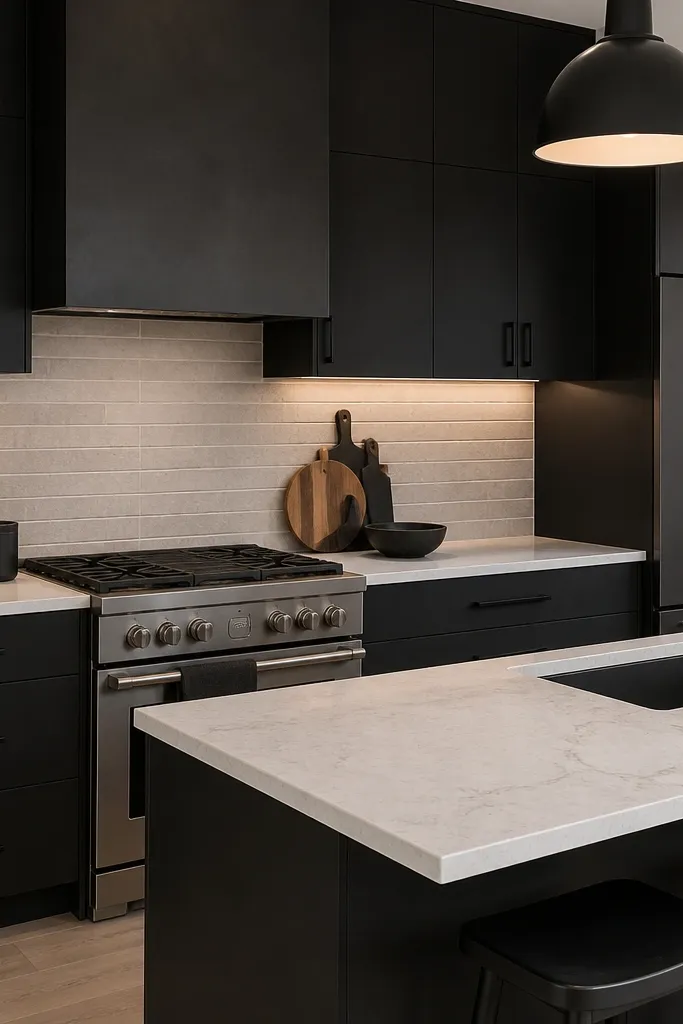
Monochrome kitchens look high-end when the textures do the variety. Use light stone-look counters, matte cabinet finishes, and matte black pulls so the room reads sleek without feeling empty. Keep appliances in one finish family, then let the counter texture and backsplash texture provide depth. This is functional because a monochrome palette makes it easier to keep clutter from visually multiplying — small items blend into the surfaces. It’s a great choice when your kitchen has awkward angles or multiple openings and you want the overall room to still read clean.
Step 1: Choose one base cabinet color (soft white, light grey, or greige) and apply it to all uppers and lowers, then set matte black pulls consistently. Step 2: Add a light stone-look countertop run across the perimeter and match it on the island if you have one. Step 3: Pick one backsplash texture only, like subtle tile or stone paneling, and avoid adding extra decor walls.
Use one metal finish for everything: if pulls are matte black, keep faucet and lighting in the same family.
Avoid glossy surfaces everywhere; too much shine in monochrome makes the kitchen look cheap-fast.