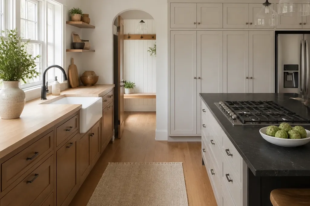
1. Warm shaker cabinets with a dark stone island
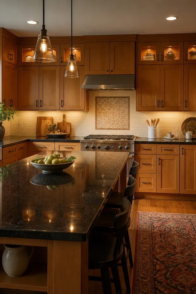
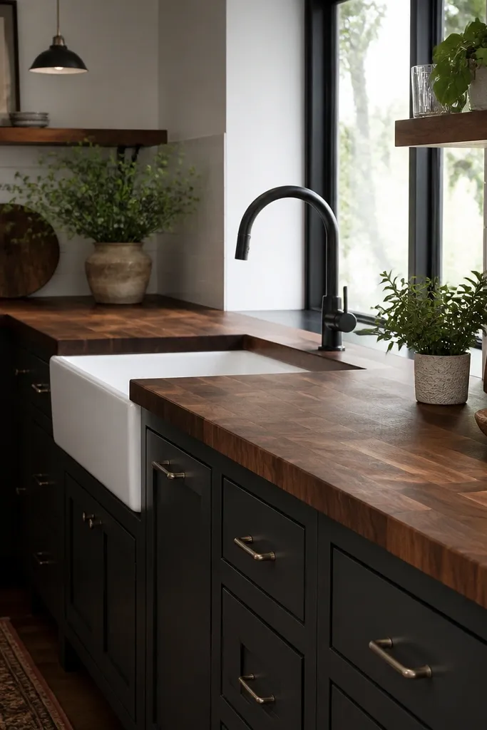
This look works because the cabinet color keeps the kitchen bright while the dark island hides the everyday mess that happens in Bloxburg. Shaker cabinets give you that “real house” structure without needing lots of extra decor. Go for warm wood tones on the base cabinets and a darker stone finish for the island top so the center looks grounded. Add two matching pendants over the island and keep the rest of the counters mostly empty; it reads styled even when you’re not constantly rearranging items.
Start by lining shaker cabinets along one main wall with a consistent wood tone on both upper and lower units. Then place an island perpendicular to that wall with a dark stone top; aim for an island width of about 3-4 blocks so it feels substantial. Finally, hang two pendants centered over the island and keep the island surface to one small bowl or cutting board max. The build effort is low because you’re using standard cabinet placement and simple lighting, not custom shapes.
Match your faucet and cabinet hardware to one metal tone (either black or brushed) so the kitchen looks intentional.
Don’t mix three different cabinet woods in one kitchen — it makes clutter look louder.
2. All-white cabinets with a charcoal backsplash strip
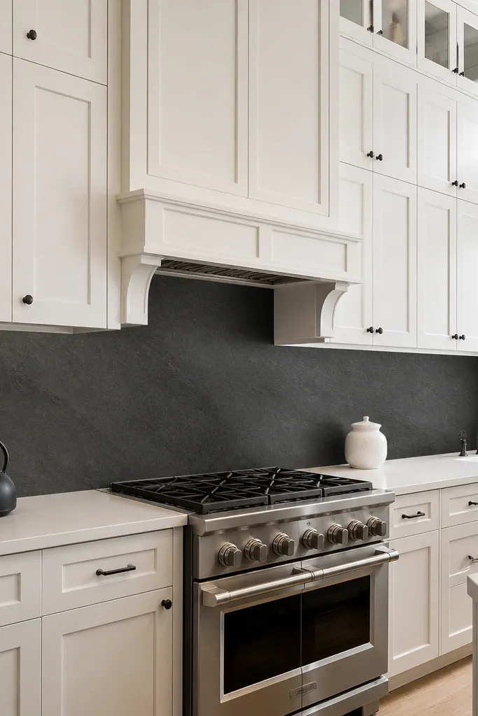
All-white cabinetry is the fastest way to make a Bloxburg kitchen feel clean, but it can look too plain if you leave everything white. A charcoal backsplash strip fixes that. Keep the backsplash as a single strong band behind the stove and sink so your eye has a focal point. White upper cabinets make the room feel taller, while the charcoal band adds contrast that photographs well. This setup is low-maintenance because white stays bright, and the darker backsplash hides small visual clutter from dishes and counters.
Place white cabinets across the main wall and keep the countertop a neutral like light gray or creamy white. Add a charcoal backsplash only behind the sink and stove area, about 2 blocks wide per appliance zone. Then install one under-cabinet light row or a single ceiling light that casts warm light. Finish by keeping the counter decor minimal: one neutral utensil holder and one cutting board.
Pro tipUse one wall outlet area as a visual anchor and keep your decor on the opposite side of the counter for balance.
Watch outSkip busy backsplash patterns if you want low-maintenance — they make clutter stand out.
3. Galley kitchen with matching shelves and closed cabinets
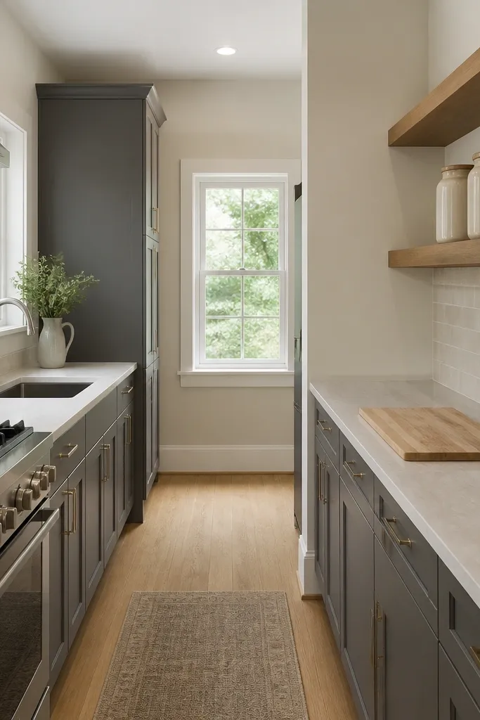
A galley layout is naturally tidy because everything lines up in one narrow corridor. The low-maintenance part is mixing closed cabinets for storage with a small set of matching open shelves for a controlled styling spot. Use closed cabinets on the bottom for clutter hiding, then put 2-3 identical shelf items on the top shelves so you’re not constantly changing what goes where. This also makes the kitchen look “designed” in screenshots because the lines guide the eye down the hall.
Build your kitchen in a straight corridor with cabinets on both sides; keep counter depth consistent so the space looks crisp. Put closed cabinets on the lower half everywhere, then add open shelves on one side only to avoid visual overload. Place the sink and stove on the same side and keep the fridge on the far end to complete the flow. If you want it to look polished fast, choose shelf items in one color family and limit them to three pieces total.
Keep the open shelf height consistent across blocks so the shelf line looks straight in screenshots.
Don’t put open shelves on both sides of a galley — it turns into a clutter display.
4. Two-tone cabinets with black handles and warm wood floors
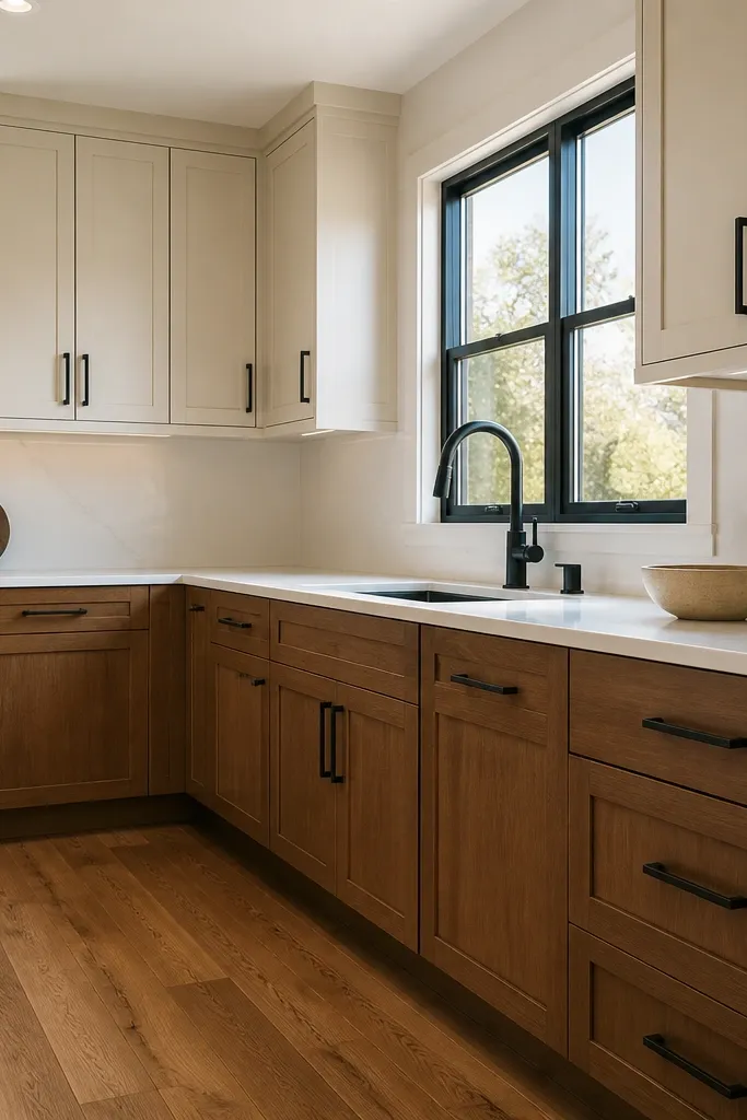
Two-tone cabinets look high-end without extra work because the contrast does the styling for you. Use warm wood for the lower cabinets and a creamy off-white for the uppers, then lock it in with black handles and a black faucet. The warm wood floor adds a cozy glow that makes the kitchen feel lived-in but still clean. This idea is low-maintenance because the darker hardware and deeper tones hide scuffs, and the color split keeps counters from looking flat.
Start with off-white uppers on the main wall and warm wood lowers beneath; keep the cabinet style consistent (shaker or slab) so the split looks intentional. Add black handles on every cabinet and a black faucet at the sink. Choose a countertop that matches the undertone — either warm gray or light beige — and place it across the full run. Finish by adding one runner or rug under the dining table, using a warm neutral so the floor and kitchen feel connected.
Pro tipUse one black accent area near the stove (a utensil rack or small appliance) so the hardware tone repeats.
Watch outDon’t mix black hardware with brushed metal accents — it creates a messy “almost match” look.
5. Matte green cabinets with beige stone counters
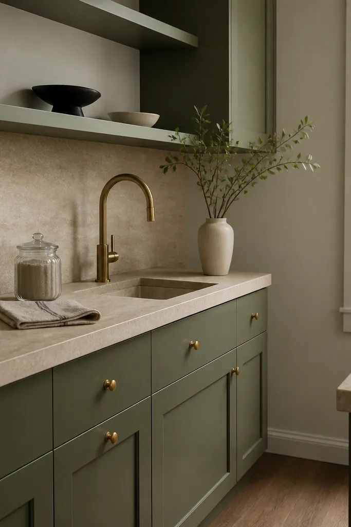
Matte green cabinets are the easiest way to make Bloxburg kitchens look styled without adding lots of decor. Green gives you color depth, and matte finishes don’t show glare the way shiny fronts do. Pair it with beige stone counters so the kitchen stays warm and doesn’t look cold. Add brass or warm gold accents sparingly — one pendant and one faucet is enough. This is low-maintenance because the darker cabinet tone hides minor countertop clutter while beige counters still read bright.
Place matte green cabinets on the main wall, keeping the cabinet style uniform. Add beige stone counters and keep the backsplash simple, like a light cream or neutral tile block behind the sink. Hang one or two warm pendants above the prep area and use a warm ceiling light to avoid green looking gray at night. On the counter, keep to one “functional decor” item like a utensil crock and a cutting board.
Pro tipChoose a backsplash that is one shade lighter than your cabinets so the color separation stays clean.
Watch outAvoid pairing green with cool gray floors — it makes the whole kitchen feel off.
6. Sleek slab cabinets with a stainless-look fridge wall
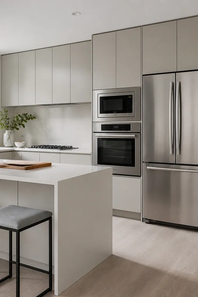
Sleek slab cabinets read modern fast, and the fridge wall creates a strong focal point without extra styling. Use slab fronts in light gray or off-white and place the fridge and wall cabinets together so the visual block looks intentional. Add a stainless-look fridge and match the oven and microwave tones so you don’t get random metal shades. This kitchen stays low-maintenance because the surfaces look clean by design — fewer panel lines means less visual clutter.
Build your kitchen with one long cabinet run of slab fronts, then group the fridge, oven, and microwave in a tight section at one end. Keep the counters a single neutral, like cool white or light gray, and keep the backsplash plain so the appliance wall stands out. Add two ceiling lights or one long track-style light above the counters so the slab fronts don’t look flat. For decor, place only one tray on the counter and keep the rest clear.
Pro tipAlign appliance doors and cabinet edges to the same grid line so it looks built, not placed.
Watch outDon’t add too many small appliances on the counters — slab kitchens show every mismatch.
7. Ceiling-height pantry wall with built-in dining nook
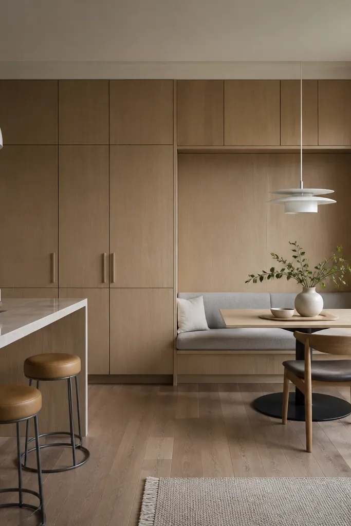
If your kitchen always looks messy, it’s usually because storage is too visible. A ceiling-height pantry wall fixes that by giving your eye one clean surface and hiding most of the “stuff” behind doors. Pair it with a built-in dining nook so you can stage dining decor without spilling it into the kitchen. This idea is low-maintenance because cabinets absorb the visual load — you don’t need to constantly tidy open shelves. The dining nook also helps photos look complete even if your kitchen counter is mostly clear.
Place a tall cabinet wall on the side of the kitchen, ideally spanning from near counter height up to the ceiling line you use in your build. Then place your dining table next to that wall with a bench or paired chairs and a simple pendant over the table. Keep the kitchen side counters minimal, and use the pantry doors for most storage. Finally, add one small rug under the dining nook to separate it from the kitchen floor without adding clutter.
Pro tipUse the same cabinet finish in both kitchen and pantry wall so the room feels one piece.
Watch outAvoid open shelving as your main storage in this layout — it makes the kitchen look busy fast.
8. Farmhouse sink wall with wood open shelves and a neutral runner
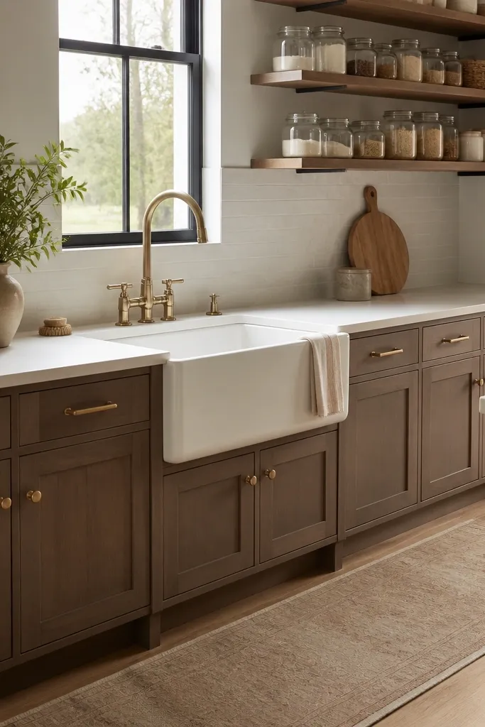
Farmhouse kitchens look good with very little effort because the sink wall becomes the star. Choose a backsplash that is simple and light, then add wood open shelves above the sink with matching jars or canisters. The neutral runner under the counter run ties the look together and makes the whole room feel warm. This is low-maintenance because open shelves are only on one wall, so your “styled” items stay curated while the rest of the kitchen stays behind closed doors.
Build a sink wall with a sink centered under a light backsplash area, then put wood open shelves above it in a straight line. Keep shelves limited to 3-5 items in one color family — white, cream, and light wood — and place them with consistent spacing. Add a neutral runner rug along the floor beneath the counter run. Finish by putting a single countertop tray near the stove side so the kitchen looks styled even when the sink area is the only decorated zone.
Pro tipUse canisters with matching lids so the shelf looks tidy even when you swap one item later.
Watch outDon’t use bright mixed colors on the sink shelves — it turns farmhouse into clutter.
9. Black-and-wood corner coffee station with upper cabinets
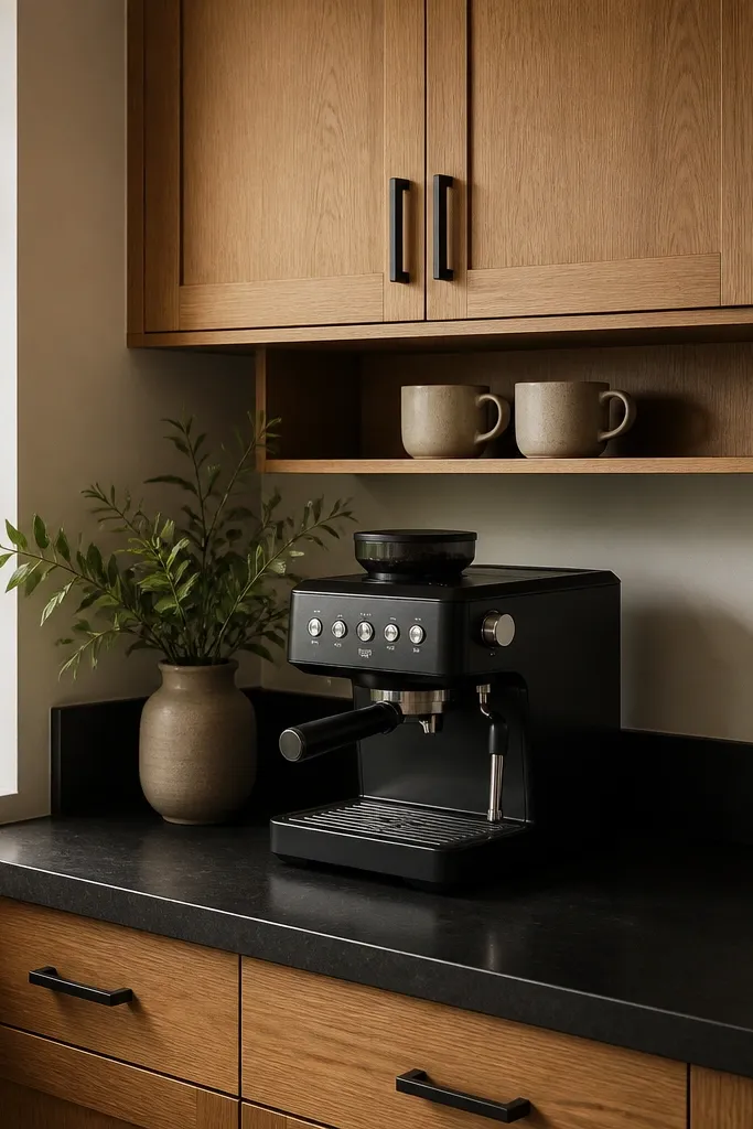
A corner coffee station looks intentional because corners naturally frame the setup. Use black accents for the counter top and small appliances, then add warm wood cabinets above to keep it from feeling dark. Upper cabinets hide the extra cups and supplies, so you don’t need to leave everything out. Add a small shelf or ledge only for a few matching mugs and a coffee jar. This stays low-maintenance because the coffee station is the only “busy” zone; everything else stays calm.
Place a corner counter run about 2-3 blocks wide on each wall, then choose a black countertop surface for that corner. Add upper cabinets above the coffee station and keep one open ledge for 3-4 mugs. Put a small tray on the countertop and keep the rest of the kitchen counters clear. Use one warm light source near the corner station so it reads as a feature in screenshots.
Pro tipKeep mug colors consistent (cream mugs with one dark accent) so the station looks styled without constant rearranging.
Watch outSkip extra open storage around the corner — corners fill up visually fast.
10. Cream cabinets with a textured tile backsplash and under-cabinet lights
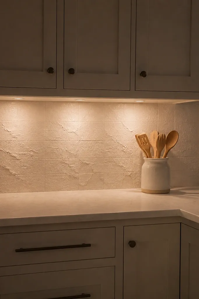
Textured tile backsplash is the cheat code for making a simple kitchen look detailed without adding clutter. Cream cabinets keep everything bright, while the texture creates visual interest even when your counters are mostly empty. Under-cabinet lights make the tile texture show up at night and in shadowed corners. Keep your countertop a simple solid color so the texture is the only pattern. This is low-maintenance because you don’t have to keep the counter “decorated” — the backsplash does the work.
Install cream cabinets along the main wall and choose a textured tile backsplash behind both sink and stove areas. Keep the backsplash coverage tight, about 2 blocks wide per zone, so it doesn’t dominate the room. Add warm under-cabinet lights directly under the upper cabinets and space them evenly. Keep the counter plain with one cutting board and one utensil container, then add a simple pendant over the dining side to balance the light.
If your kitchen feels flat in screenshots, add one extra under-cabinet light near the darker corner instead of adding more decor.
Don’t add patterned curtains or patterned rugs with a textured backsplash — too many patterns fight.
11. Compact U-shape kitchen with a narrow dining bar
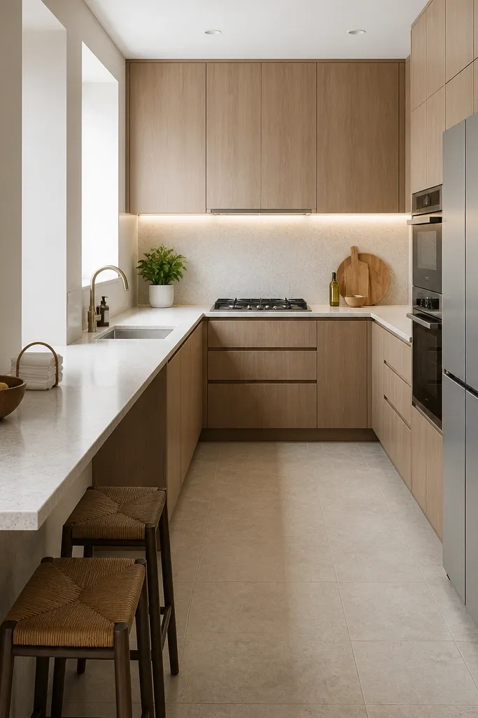
A compact U-shape kitchen keeps the workflow tight and makes tidying easier because nothing is far away. Add a narrow dining bar on one side and you get a styled dining moment without pulling attention from the kitchen counters. Use consistent cabinet finishes on all three sides, then keep the bar top the same material as the counters. This is low-maintenance because the dining items can live on the bar while the main prep surfaces stay clear and photogenic.
Build a U-shape with cabinets on two side walls and one back wall, leaving a small open gap in the center for movement. Place the stove on the back wall and the sink on one side wall so the layout reads clean. Add a narrow dining bar extending out from the side wall, about 2 blocks long, with two stools. Keep the bar decor minimal: a small vase or fruit bowl only, and let the stools and pendant do the styling.
Pro tipChoose stools that match the metal tone of your faucet so the bar looks like it belongs to the kitchen.
Watch outDon’t stretch the U-shape too wide — it breaks the tidy look and makes decor placement harder.
12. Open shelving only above a single counter run with matching jars
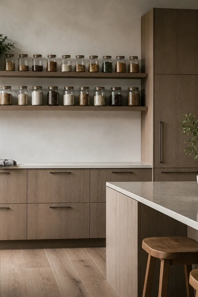
Open shelving can go wrong fast because it turns into a storage dump. The solution is simple: use open shelving above only one counter run, and keep every item the same visual language. Matching jars and canisters make the shelves look styled even when you haven’t changed anything in weeks. Pair that with closed cabinets on the other walls so the kitchen still reads calm. This is low-maintenance because the only area you need to keep “pretty” is one shelf strip, and it’s easy to maintain with a small set of items.
Pick the counter run you want as the feature — usually the wall with the stove or the wall opposite the dining. Install open shelves above that run and keep the shelf width aligned with the counter below. Use a tight set of matching jars and canisters, about 4-6 items total, and leave the rest of the shelf empty. Put closed cabinets on the remaining walls and keep the backsplash simple so the shelves aren’t competing. Add one warm overhead light so the jars look crisp at night.
Pro tipUse jar heights that step up or down in a consistent pattern so the shelf looks arranged, not randomly filled.
Watch outDon’t mix tall cookware and short jars on the same shelf — the line looks messy in screenshots.
13. Black-framed windows with light counters and a bright dining pendant

This idea is about using architecture to do the styling. Black-framed windows add contrast and make the kitchen look designed even when the counters are plain. Pair that with light counters and light cabinets so the space stays airy, then use a bright pendant over the dining table to pull the scene together. The kitchen stays low-maintenance because you’re not relying on constant decor changes — the window frames and pendant create visual interest. It’s also great when your Bloxburg lighting makes rooms look dull; the window contrast helps.
Place black-framed windows on the wall opposite your main counter run and keep the kitchen color palette light — cream or pale gray cabinets and light countertops. Add a dining pendant centered over the table so the dining area reads complete in photos. Keep the kitchen counters mostly empty, then add only one or two items that match the black frame tone (like a black tray or utensil holder). If you want extra depth, add one wall mirror near the dining side, but keep it simple and reflective.
Center your pendant exactly over the table so it looks intentional from every angle.
Avoid adding heavy dark cabinets everywhere — you’ll end up with a kitchen that feels smaller instead of styled.