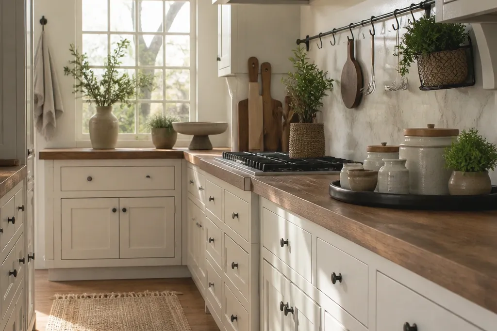
1. Cream Shaker + Black Hardware Work Bench
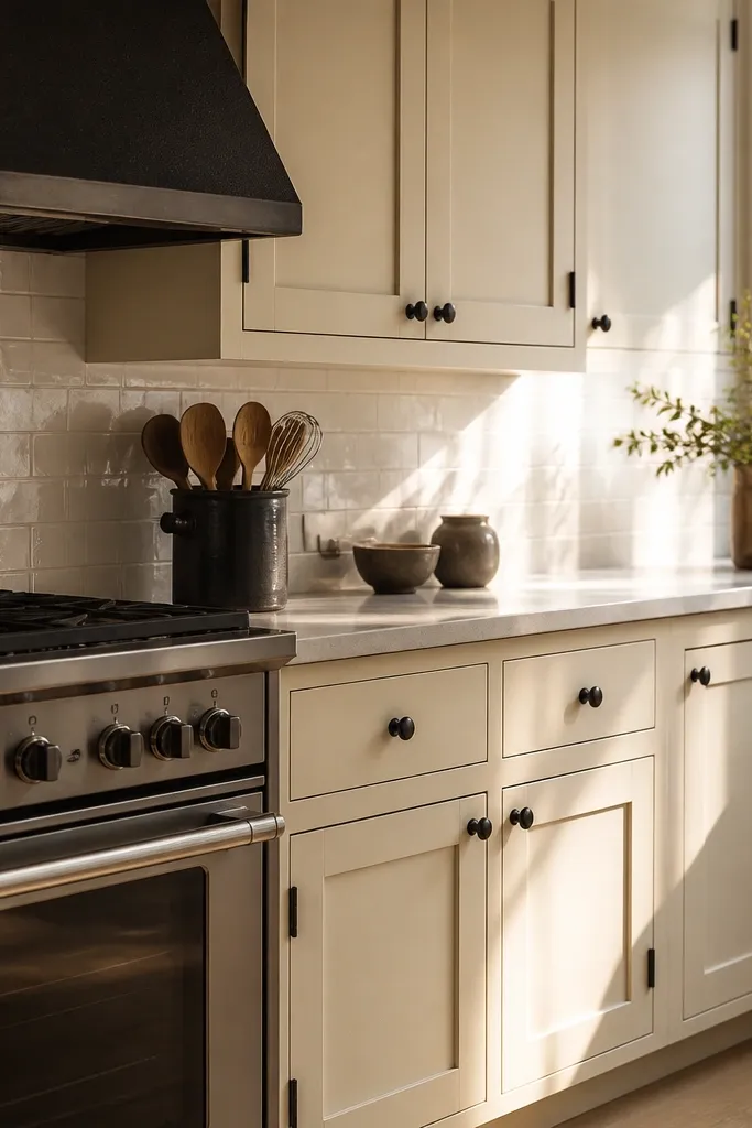
Start with cream shaker cabinets and keep the hardware dark. The contrast makes the room read clean even if your counters are simple, because the eye has a strong edge to follow. Use a light countertop that looks smooth and bright; it reflects screenshot light better than busy stone textures. Then anchor the stove area with black accents: choose a black oven or black stove look and add black utensils in a matching container. Finish with a single stacked cutting board set in warm wood so the prep zone feels real.
Place your stove directly under the main wall line, not floating in the middle of the room. Add a long tray or cutting board stack centered on the counter about 10-14 studs away from the stove edge. Finally, line up three small black items along the backsplash-side corner (utensil crock, salt/pepper set, and a folded towel) so the counter doesn’t look random. Keep the towel color in the same family as your hardware so it all ties together.
Use one “vertical” accent — a tall utensil crock — so the counter doesn’t look flat.
Don’t mix two different dark tones like matte black hardware and dark brown decor; pick one.
2. Sage Cabinets + Light Oak Countertop Trio
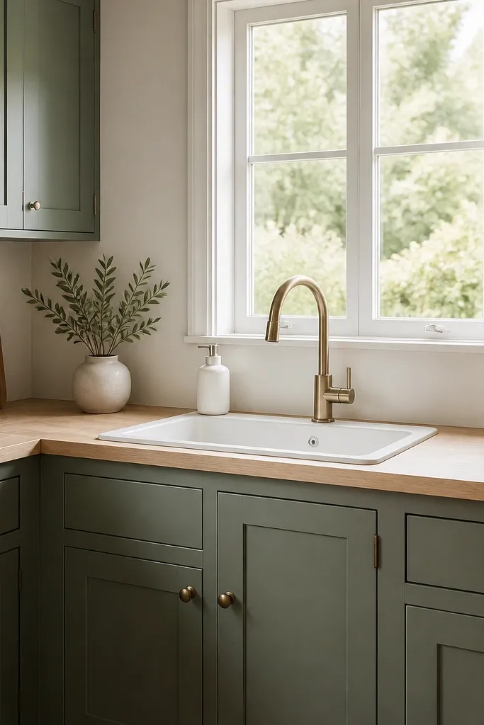
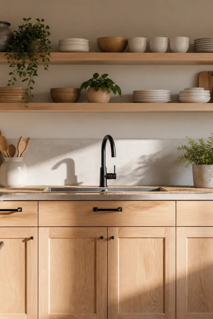
Sage cabinets are one of the fastest ways to make a kitchen feel softer without looking childish. Pair them with a light oak counter tone so the room stays bright and warm. Keep the sink area light: a white sink look plus a simple soap dispenser. The visual trick is a counter trio — one prep item, one display item, one plant — spaced across the counter instead of clustered. When the trio is aligned, the kitchen looks styled even if the rest is minimal.
Pro tipChoose plants with muted green leaves, not neon, so the sage reads calm on screen.
Put the sink on the wall with the most visible backsplash area, then place a soap dispenser and small sponge holder in matching white tones. On the counter, create three positions: left for a wooden cutting board, center for a ceramic bowl, right for a small potted plant. Keep the spacing even, roughly one hand-width between items. If you have a backsplash, align the trio so it sits under the cabinet line for a tidy look.
Watch outAvoid placing the plant directly next to the stove; it breaks the work-zone logic.
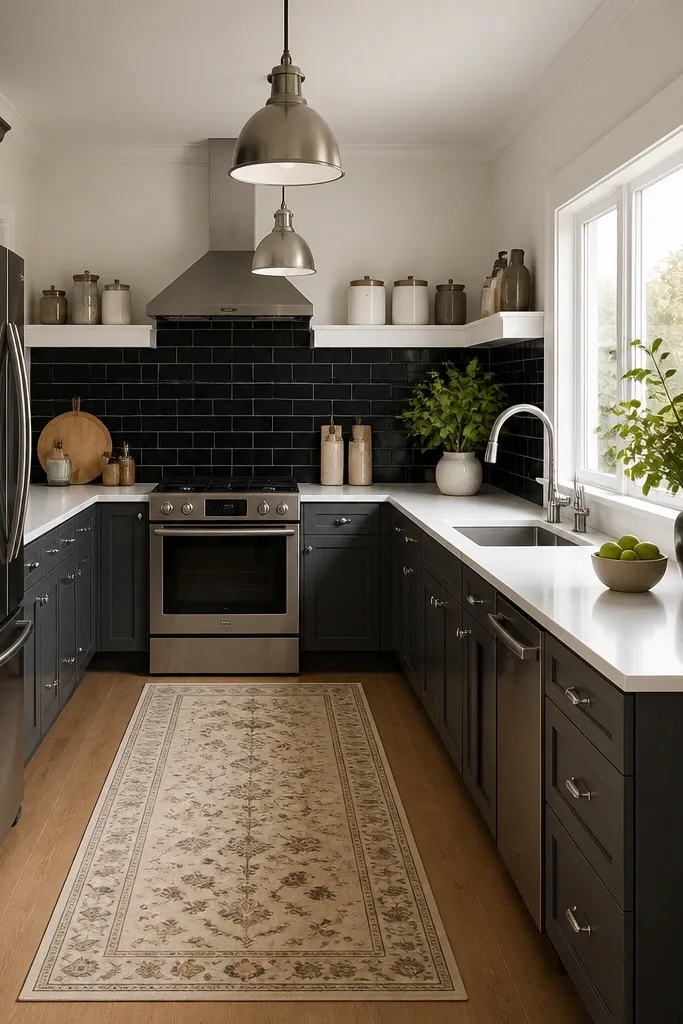
3. Galley Kitchen Runner + Matching Pendant Lights
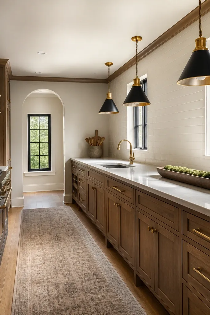
A galley kitchen looks best when you emphasize the length. Add a long runner under the counter line so the space feels intentional and not like two separate rooms. Then use matching pendant lights over the counter so the eye follows a straight path. Keep the countertop clutter low and place one long item like a tray or rail across the middle. This setup is photogenic because it creates strong lines: runner line, pendant spacing, and cabinet edge all point toward the back of the room.
Pro tipMatch pendant metal tone to your faucet or cabinet hardware for one consistent metal family.
Use a runner rug that runs from near the refrigerator side to just before the walkway end; keep it centered. Place two pendants above the main counter span, with equal spacing from the stove and sink areas. Finally, put one long tray centered between the stove and sink so the counter reads “styled” without stacking lots of small pieces. Keep wall decor minimal so the linework stays the focus.
Watch outDon’t put three pendants with uneven gaps; it makes the galley look lopsided.
4. White Marble Look + Gold Tray Centerpiece
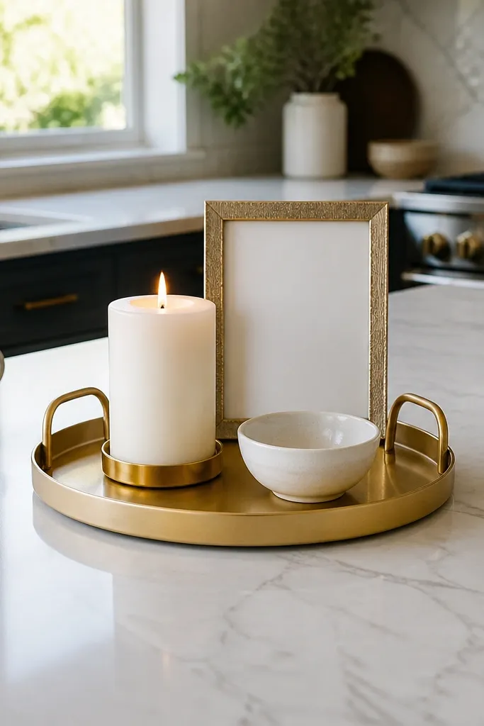
If your kitchen has a white or light-gray counter, lean into it with a gold centerpiece. The gold tray gives you a focal point that looks expensive in screenshots without needing special items. Use smooth, low-height decor on the tray: a white candle, a small framed sign look, and a tiny bowl. Keep the rest of the counter clear so the marble look can breathe. This idea solves the “too empty” problem and the “too cluttered” problem at the same time: one focal tray does the work.
Pro tipChoose tray decor with mostly white and cream tones so gold doesn’t feel loud.
Place the gold tray on the main counter section with the most camera visibility, usually the wall opposite the entrance. Put the candle in the back-left of the tray and the small bowl near the front-right. Add one small vertical decor piece behind the candle so the tray isn’t flat. Then keep your sink counter items minimal — soap and a single towel — so the tray stays the hero.
Watch outAvoid mixing gold with silver hardware; it reads messy fast.
5. Rustic Open Shelves + Stacked Ceramic Bowls
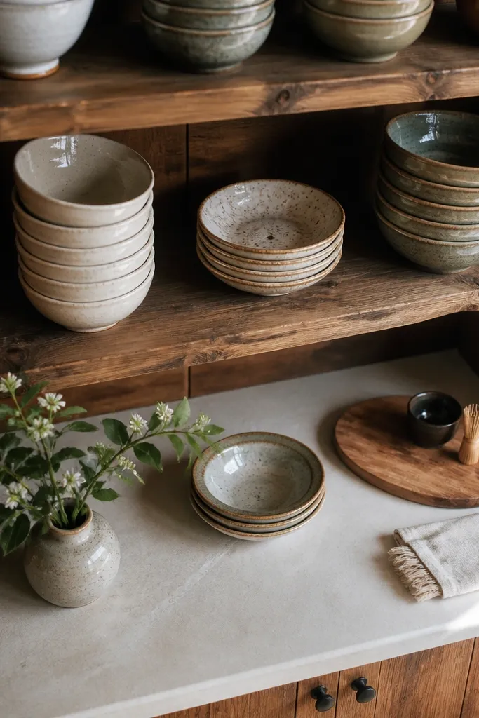
Open shelving makes kitchens look lived-in and detailed, but you need order. Use rustic wood shelves and style them with stacked ceramic bowls, not random single items. Stack heights matter: put the tallest pieces on the ends and keep the center lower so the shelf looks balanced. Pair the shelves with simple counters so the shelf detail becomes the texture. This is great for corners and narrow kitchens because shelves add depth without taking floor space.
Install shelves along one wall section where you can see them from the doorway. Stack ceramic bowls in three groups: tall on left, medium in center, small on right. Add a short row of spice jars or small containers along the front edge of the shelf. Keep the counter below mostly clear so the shelf doesn’t compete with counter clutter.
Use one bowl color family across all stacks (white, cream, or light terracotta) for a tidy shelf photo.
Don’t mix too many different patterns on bowls; pick one pattern or go solid.
6. Black Tile Backsplash + White Subway Decor Line
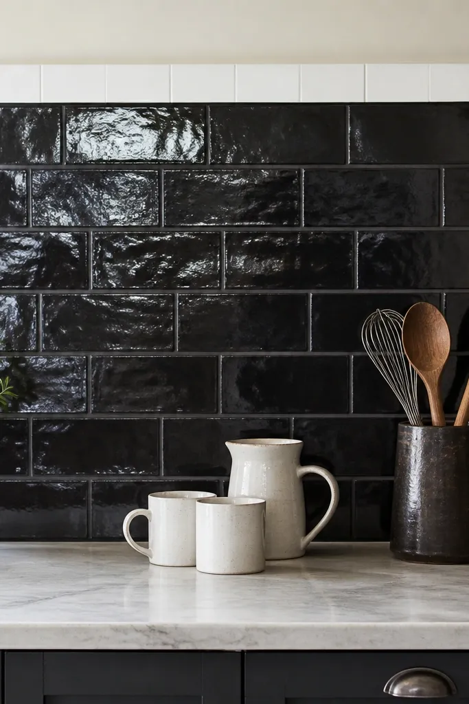
A black backsplash makes the whole kitchen look more designed because it frames everything. Put a clean line of white decor along the backsplash edge to create contrast and keep the eye moving. On the counter, add a mug set in white or cream and a small utensil holder in black or dark brown. This combo reads modern and styled, even if your cabinetry is basic. The visual win is the high-contrast border effect: dark wall plus light items equals instant definition.
Pro tipKeep the mug set and utensil holder the same “metal” tone family if your items include handles.
Choose a black backsplash look behind the sink and stove so it’s visible from the main camera angle. Place a row of white backsplash decor pieces along the center section, keeping spacing consistent. On the counter, put three mugs in a straight line near the backsplash, with a utensil holder to one side. Finish with one small plant or a single fruit bowl so it doesn’t look like all-white only.
Watch outAvoid placing bright neon items on the black backsplash; it turns the look chaotic.
7. Corner Breakfast Nook with Round Table + Soft Lamp
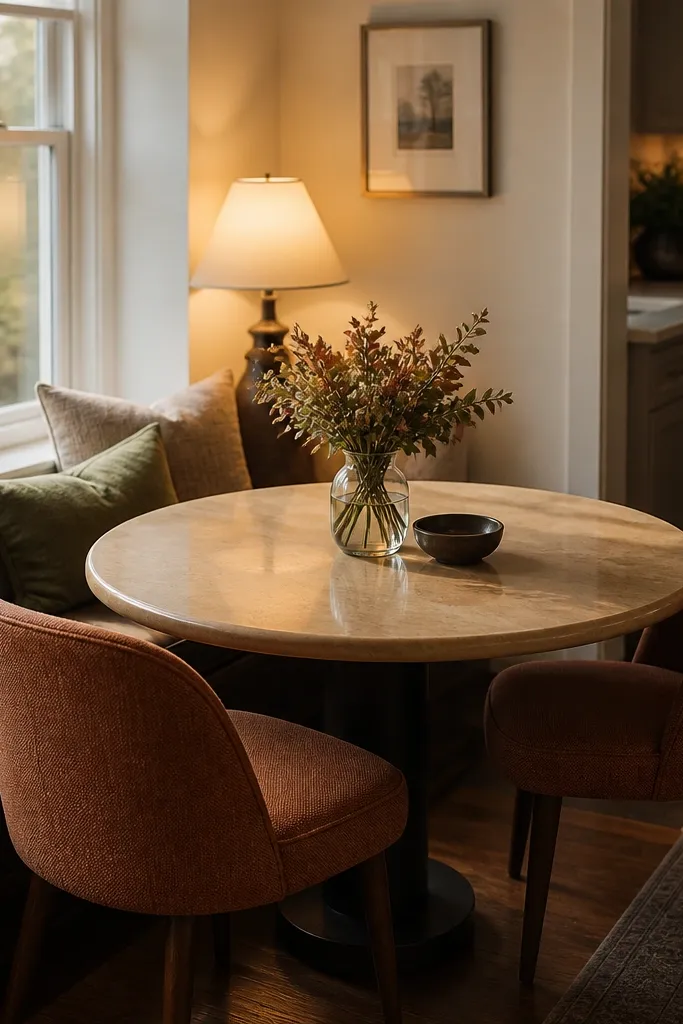
A kitchen corner can look blank unless you give it a purpose. A round table in the corner creates a cozy dining feel that still belongs in a kitchen screenshot. Use warm chairs and a small lamp beside the table so lighting makes the space feel inviting. Keep the table styling simple: one small centerpiece (a vase or fruit bowl) and a folded napkin look. This idea helps when your kitchen feels like only counters and no “life.”
Pro tipUse a rug with a similar tone to your chairs so the nook looks grounded.
Place the round table in the corner so one chair faces the main counter wall. Add the lamp on the side closest to the walkway so it lights the table area in screenshots. Style the table with a single centerpiece centered on the tabletop and keep plates minimal. If you have room, add a small rug under the table so the nook reads separate from the kitchen floor.
Watch outDon’t cram the nook too close to the counters; leave a clear path between chairs and walkway.
8. Under-Cabinet Look + Two-Tier Counter Organization
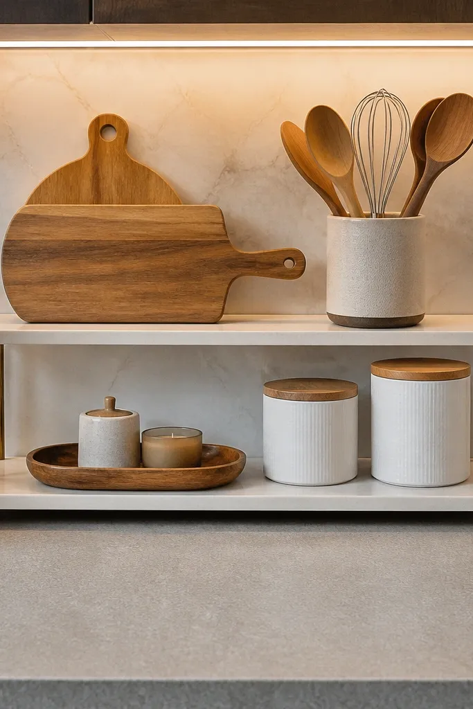
The easiest way to make a kitchen look “done” is to organize the counter into tiers. A two-tier setup gives you height and reduces the flat, empty feeling. Pair it with an under-cabinet lighting look (or the closest matching lighting you have) so the counter area glows in screenshots. Use one tier for functional items like cutting boards or a utensil crock, and the other tier for display like jars or a small candle. The result looks curated without needing expensive decor variety.
Pick one counter section where you want the focus, usually the stretch between sink and stove. Place a tall organizer or stackable containers on the back side of the counter and a second smaller organizer in front. Add cutting boards or a tray to the back tier and jars/candle to the front tier. Turn on or place the closest under-cabinet lighting so it lines up with the two-tier area.
Keep the front tier lower than the back so the eye doesn’t feel blocked.
Avoid scattering items across the whole counter; concentrate the organization in one spot.
9. Wood Slat Accent + Stove-Side Spice Row
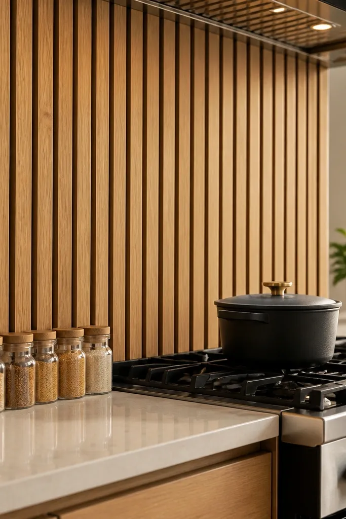
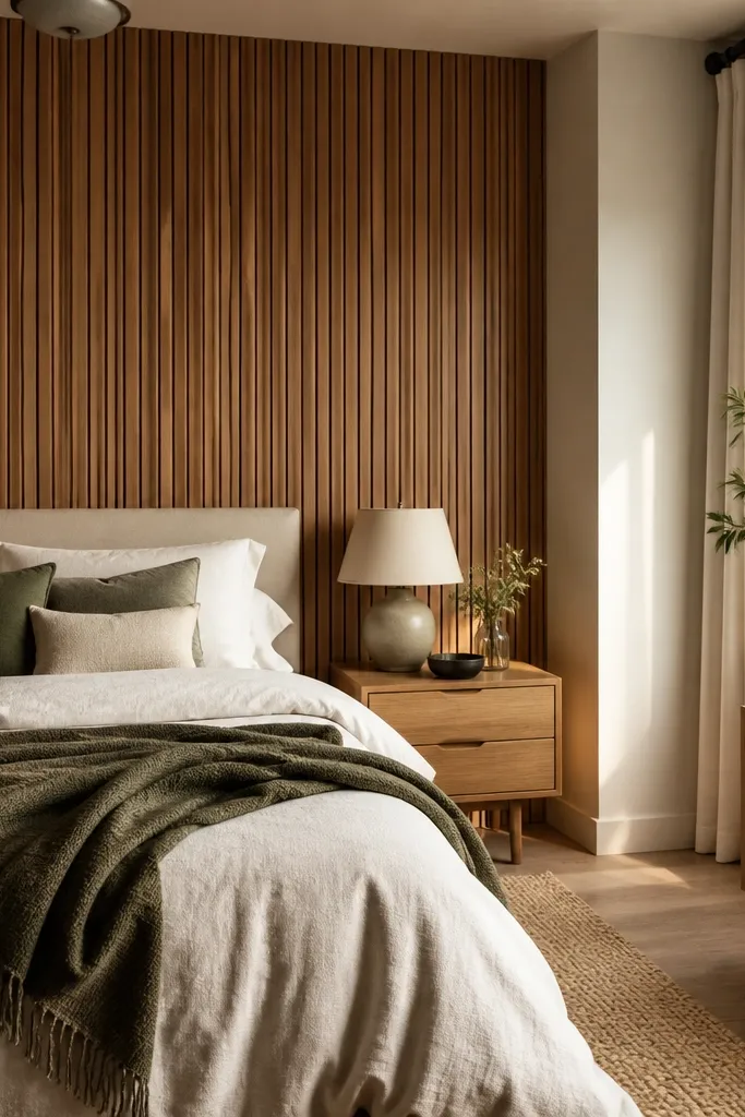
A wood slat accent wall behind the stove instantly adds warmth and structure. Then repeat the warmth with a stove-side spice row on the counter — small jars lined up in a straight line. This setup is good when your kitchen feels too plain because you’re adding texture without adding clutter. Keep your stove area clean: one jar row, one towel nearby, and one cutting board. The slats create depth, and the jar row creates order.
Pro tipUse jar colors that match your cabinet tone — don’t throw in bright mismatches.
Place the wood slat accent behind the stove wall section where it’s visible from the entrance. On the counter next to the slats, line up 4-6 spice jars evenly spaced along the backsplash edge. Add a folded towel in a matching tone near the jars and keep the rest of the counter empty. If you can, place a small utensil crock on the far end of the counter to balance the line.
Watch outDon’t put large decor on the stove counter if you already have slats; it competes with the texture.
10. Monochrome Kitchen with Chrome Pulls + Glass Canisters
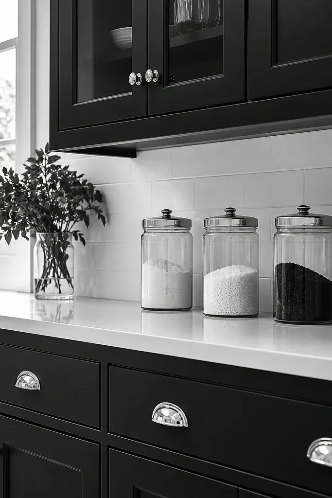
Monochrome works because it gives you a strict rule set. Use white counters and black or dark cabinets, then add chrome pulls or chrome-looking hardware. Glass canisters give you texture without pattern chaos because they show inside contents. Style the canisters in a line — flour, sugar, coffee — using light-colored items inside so the whole row looks bright. This kitchen reads modern and intentional in screenshots because everything matches and nothing fights.
Set your cabinet and counter tones first: choose white counter and dark cabinets. Place 3-4 glass canisters in a straight line along the counter section with the best camera view. Put the canisters above or near the backsplash so the line looks organized. Keep the sink counter minimal: soap, sponge holder, and one towel only.
Use one consistent canister height so the row looks like a designed shelf instead of random storage.
Avoid mixing multiple font styles on labels or decor; keep the row visually clean.
11. Farmhouse Sink Window Shelf with Hanging Towel
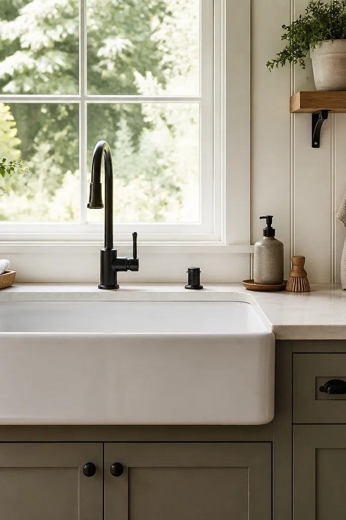
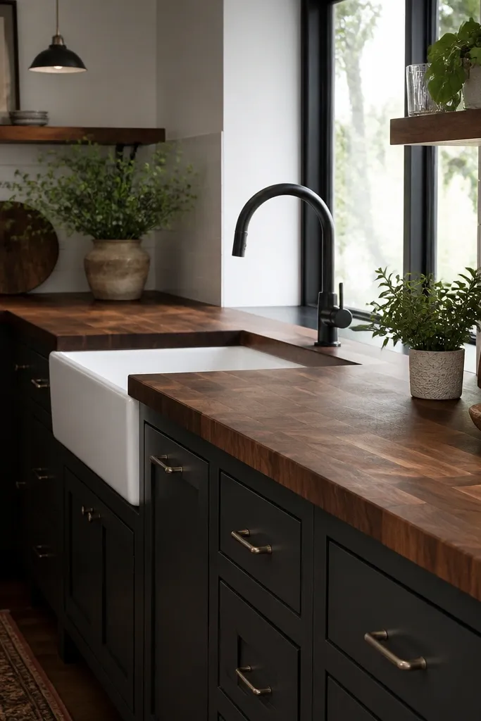
A sink under a window is already a strong composition. Add a small shelf above the window or directly beside the sink and style it with two items: a plant and a simple sign or jar. Then hang one towel on a hook next to the sink so the area looks used. The key is keeping the sink zone cohesive: matching colors on towel and shelf items, and no extra clutter on the counter. This is the fastest way to make a basic kitchen feel farmhouse without overdoing it.
Pro tipUse a towel color that matches your cabinet trim or hardware for a pulled-together look.
Place the sink under the window wall if you have a window available, then position a small shelf just above the counter line. Put a plant on one side of the shelf and a single jar or sign on the other. Hang the towel so it sits slightly above counter height, not dragging across the counter. Keep the counter items to soap plus one small tray if you want a landing spot for the jar.
Watch outSkip multiple towels or extra dish racks; one hanging towel looks intentional.
12. Dining Bar Extension with Three Stools and Fruit Bowl
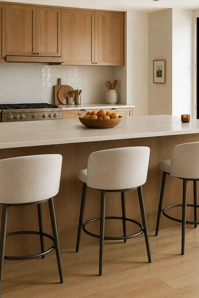
A bar extension makes a kitchen feel complete because it adds seating and a second focal point. Choose a counter extension with a clean edge and place three stools evenly spaced. Style the counter with one fruit bowl in warm tones and a small jar or candle at the far end. Keep the bar area uncluttered so it reads like a real breakfast spot, not a storage shelf. This idea is great if your kitchen feels like it lacks a dining moment even though you have space for it.
Extend your counter so it sticks out from the main cabinet line by a short, visible distance. Place three stools with equal gaps, aligned to the bar edge. Center a fruit bowl on the bar top and add one small decor item near the wall end, not in the middle. If you can add a rug, place a narrow rug under the stool legs so the bar area frames itself.
Pick one fruit color family (apples/red or oranges) so the bowl looks coordinated with your palette.
Don’t add a full table centerpiece and lots of small items on the bar; it ruins the clean bar line.
13. Tall Pantry Column with Matching Side Cabinet
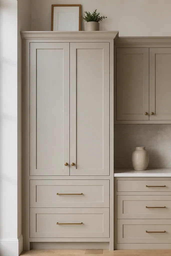
Vertical storage reads expensive in Bloxburg because it gives your kitchen a clear structure. Use a tall pantry column and match it to the side cabinet tone so the wall looks designed. Top the pantry with one framed decor piece or a small plant. The counter stays simple, but the wall has height and interest. This idea fixes the common issue where kitchens have cabinets everywhere but no strong “anchor” point.
Place the tall pantry column on the wall section you see first from the doorway. Add a side cabinet next to it using the same cabinet style and tone so the edges line up. Put one small decor item on top of the pantry, centered. Keep the counter in front of the pantry mostly clear so the column becomes the focus.
Align the pantry and cabinet edges to a single straight line; it’s the biggest difference between messy and styled.
Avoid placing three different cabinet styles side by side; choose one cabinet look for the whole wall.
14. Countertop Window Box Garden with Ceramic Pots
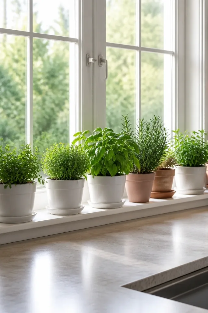
A window box garden adds softness and color without needing heavy decor. Use ceramic pots in a consistent tone, like white or light terracotta, and place a tidy herb-like row. Keep the countertop around it clear so the garden becomes the main texture. This works especially well when your kitchen has a window but you’ve left it empty. The result is cheerful and photogenic because the window gives natural framing for the plants.
Pro tipMatch pot color to your backsplash or cabinet trim so the whole kitchen feels connected.
Place the window box or ledge directly under or beside a window opening. Set 3-5 ceramic pots in a straight line, leaving small gaps between pots so it doesn’t look cramped. Add one larger pot in the center and smaller pots on the sides. Leave the rest of the counter for a single tray or cutting board so the garden doesn’t compete with items.
Watch outDon’t scatter plants across multiple surfaces; concentrate them at the window box.
15. Pastel Tile Accent + Pastel Canisters on Open Counter
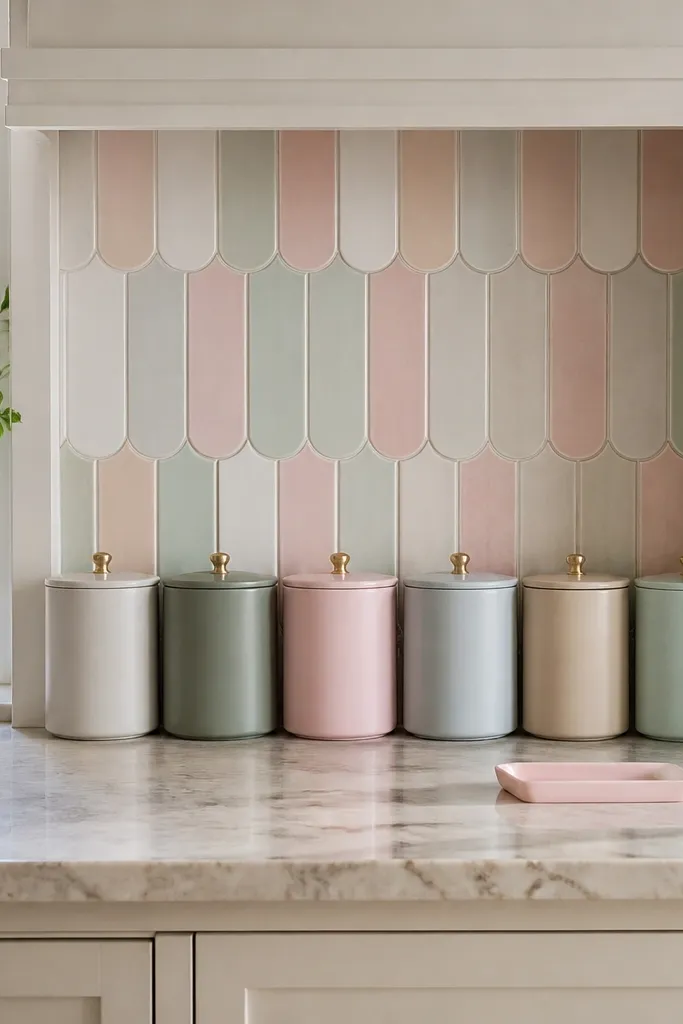
Pastel tile accents can look cute, but only if you keep the rest controlled. Use a pastel backsplash panel behind the counter and then repeat those pastel tones in canisters. Choose canisters that look clean and uniform, then line them up in a row so the pastel reads intentional instead of random. Add a small pastel tray on the counter for one candle or one mini decor item. This idea solves the “my kitchen is boring” problem without turning your counters into a clutter pile.
Add the pastel tile accent behind the sink or the stove section where it’s visible. Place 3 canisters along the counter under the accent, using matching pastel tones from the tile. Put the small pastel tray in the center section of the counter, not next to the canisters. Keep any other decor to a single towel or one plant so you don’t overload the pastel story.
Choose one pastel for most items and let the others act like tiny accents; it keeps the look clean.
Avoid using five different pastels at once; it turns into candy chaos on screen.