1. Cream tile backsplash with matte black stove wall
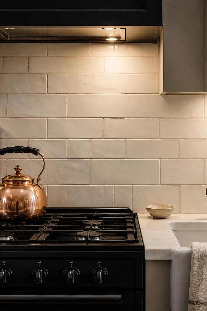
Start by picking one wall for the backsplash effect and align it behind the stove and sink, leaving a clean strip at the counter line. Then place a matte black kettle or small pan set on the counter edge and add one small hanging item above the stove (like a slim rack or wall hook). Finally, set a warm light source at chest height aimed toward that wall so the tile catches light and looks dimensional.
This look makes a renter-friendly kitchen feel finished because the backsplash and stove wall create a strong frame. Use a cream or off-white tile effect behind the stove and sink zone, then anchor it with matte black details around the stove — stove body, kettle, and any visible handles. Warm bulbs keep the cream from looking flat, so the whole wall reads soft instead of sterile. It’s a great choice for compact kitchens because it gives you a “real wall finish” vibe without needing cabinet replacement.
Watch outDon’t add multiple backsplash patterns across adjacent walls — it breaks the “one designed zone” look.
Pro tipKeep the counter items to 2-3 colors max: cream, black, and one warm wood tone.
2. Two-tone wood counter with a built-in cutting board stack
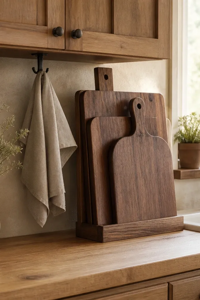
First, set your counter look to a light wood tone and reserve one corner near the sink for the board stack. Then place three cutting boards — big flat board on the bottom, two thinner boards angled on top — using consistent dark wood color. Finish by adding one small tray or dish cluster beside the boards so the area looks intentional rather than random.
Two-tone wood reads cozy and high-end, even when you’re only styling. Choose a lighter wood counter tone as your base, then add a darker wood board stack near the sink as your texture moment. The boards create vertical interest without cluttering the whole counter, and they make the space feel lived-in instead of empty. This works best in kitchens that already have plain cabinets, because the counter styling becomes your main design statement.
Watch outSkip piles of loose props across the whole counter — focus the texture in one spot.
Pro tipAngle the top boards so they overlap slightly; straight stacks look too “placed” in screenshots.
3. Fridge-to-window warm gallery with matching jars
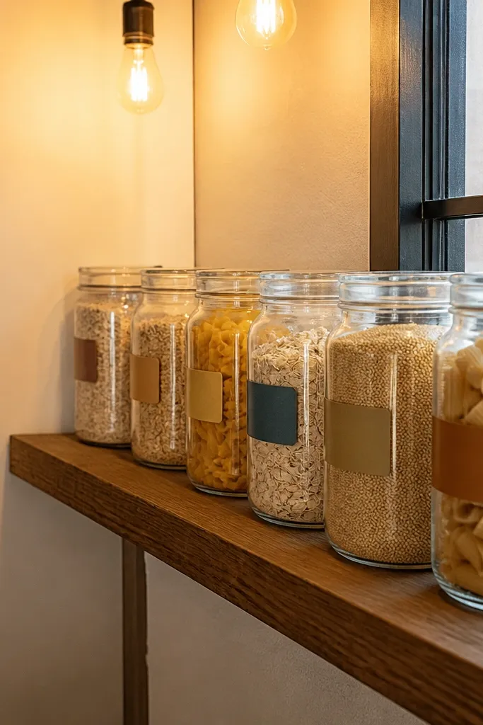
Choose a shelf line or ledge that visually connects fridge and window; keep it at about counter height for a natural look. Line up 4-6 jars in a gentle gradient — darker at the ends, lighter in the middle — and keep jar sizes mostly consistent. Add one small framed item or mini plant at the far edge, then use a warm light nearby to prevent the jars from looking washed out.
This is a renter-friendly trick: turn an awkward fridge wall into a styled gallery. Place matching glass jars (same shape, different labels/colors) on a shelf or counter ledge between the fridge and the window area. The repeated jar shapes create order, and the warm lighting makes them look like pantry storage instead of decor. It’s especially good if your kitchen has a blank stretch of wall that needs a focal point.
Watch outDon’t mix jar shapes wildly — variety is fine, but too many silhouettes makes the wall look messy.
Pro tipUse one label color family (like cream labels) so the jars look coordinated instead of random.
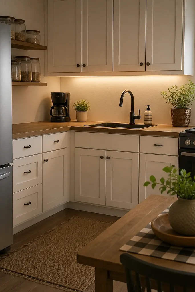
4. Under-cabinet light illusion with a slim runner zone
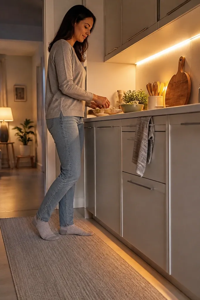
Place the runner rug along the main walkway zone between sink and stove, keeping it narrow so it doesn’t crowd. Then add a warm light strip under the cabinet front line on the same wall — aim it so it lights the countertop, not the floor. Finally, keep the counter styling low: one tray, one utensil holder, and one utensil set, so the light strip has a clean surface to reflect.
Under-cabinet lighting is one of the fastest ways to make a Bloxburg kitchen look designed. In a renter-friendly build, you recreate the effect with a slim, warm light strip placement under the cabinet line and a runner rug that visually anchors the workflow zone. The runner adds comfort and hides floor transitions, while the light strip gives the countertop a “real appliance area” feel. This is perfect for kitchens where the cabinets are already in place and you just need more depth and warmth.
Watch outDon’t place the runner too wide; wide rugs fight with the kitchen’s movement and look cluttered.
Pro tipMatch the runner color to your cabinet tone — even a slight match makes the lighting look more believable.
5. Black-and-white checker table setting with a wood centerpiece
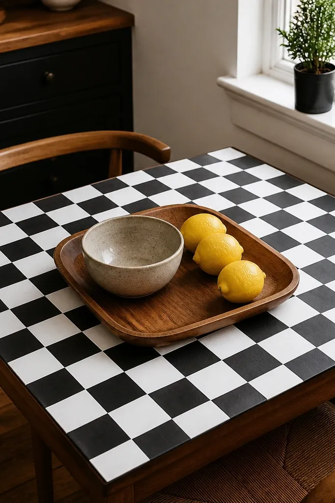
Start by choosing a dining table size that fits your space and place the checker placemat/tablecloth on top. Then set a wood centerpiece bowl in the center and add two smaller items at opposite sides (like a candle holder and a small fruit prop). Finally, add one chair accent — a folded napkin or small cloth in a matching black/white tone — so the set looks styled, not random.
Dining setups make kitchens feel complete, and this one photographs well because it has a clear pattern. Use a black-and-white checker placemat or tablecloth effect, then break the contrast with a wood centerpiece bowl or tray. The black-and-white pattern gives instant “designed” energy, while the wood softens it so the table doesn’t look like a game board. This works best in small dining corners where you need one strong focal point instead of lots of furniture.
Watch outDon’t add more than two patterned items (checker + another pattern) or the table turns loud.
Pro tipKeep the centerpiece height low so it stays visible in screenshots from above or at an angle.
6. Pastel spring breakfast nook with open shelving and a pastel tray
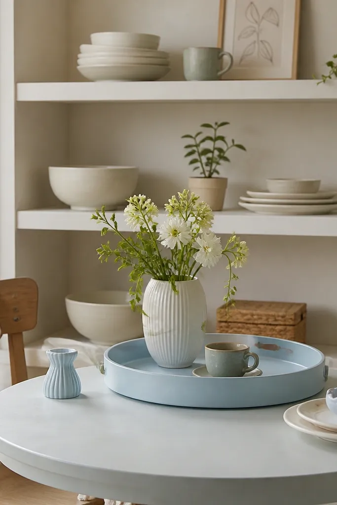
Place an open shelf or display ledge on the wall near your breakfast spot, keeping items grouped by height. Then set a pastel tray on the counter and arrange matching cups/dishes on it, using the tray as the color anchor. Finish with one pastel decorative item near the seating (like a small vase or mini decor piece) and keep the rest of the counter neutral.
A spring breakfast nook is renter-friendly because it’s mostly props: open shelves, pastel trays, and small dish sets. Pick one pastel accent color (sage, blush, or powder blue) and repeat it in three places: a tray, a dish stack, and a small decorative item near the seating. Open shelving keeps it airy, which matters in smaller kitchens. The result looks bright on screenshots without needing you to change the whole kitchen palette.
Watch outSkip heavy clutter on open shelves; 5-8 items max looks styled, 15 looks like storage.
Pro tipUse pastel accents on only one side of the kitchen — symmetry looks intentional, asymmetry looks accidental.
7. Moody espresso palette with brass handles look
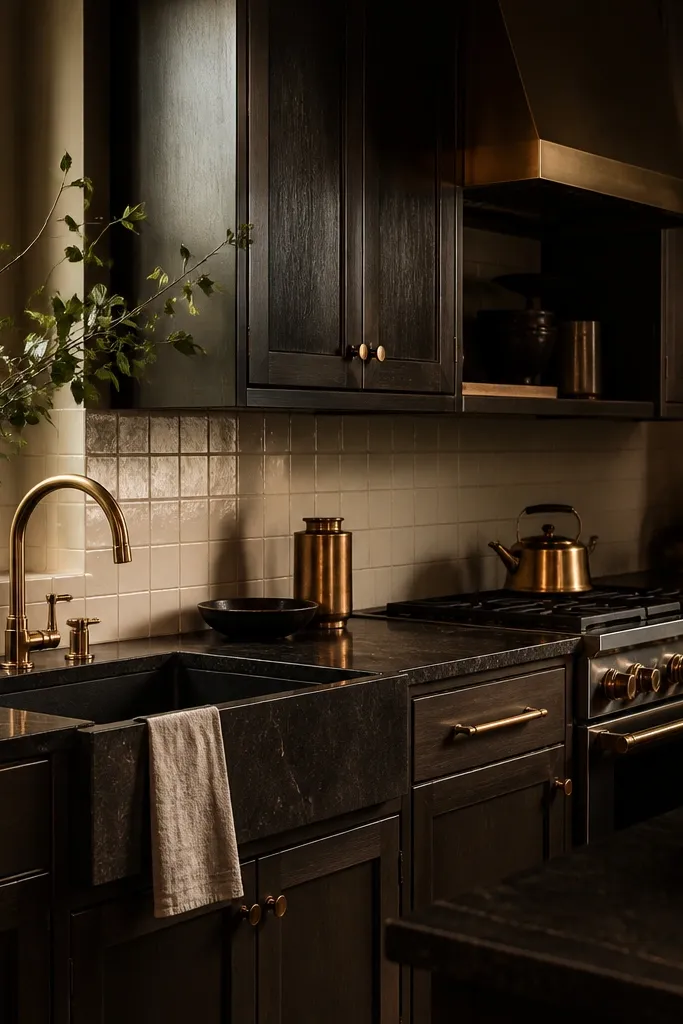
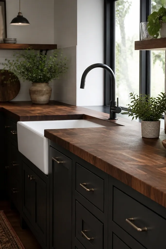
If your kitchen base is already modern, an espresso + warm brass look makes it feel like a boutique rental. Go dark on the counter and add warm metallic accents around the sink and stove area — think brass-toned handles, a warm kettle, or brass-toned light fixture. The key is contrast: dark counters need bright cream or light gray props so the space doesn’t look like a cave. This is a strong option for renters because you can get the vibe with lighting and prop color, not full cabinet replacement.
Set your main counter tone to espresso or dark wood and keep the backsplash simple in light gray or cream. Add warm brass-toned items near the sink line (kettle, utensil holder, or a small faucet detail if available) and keep the rest of the counter items fewer. Then place a warm pendant or wall light so the brass accents catch it and glow.
Use one light-colored towel or dish cloth in cream to break up the dark surfaces in photos.
Don’t mix cool silver and warm brass in the same zone — it reads like mismatched inventory.
8. Small-space L-shaped counter styling with a hanging plant rail
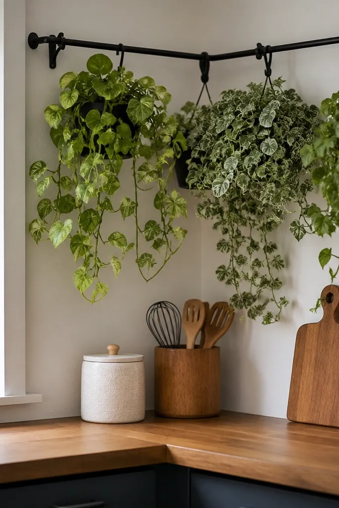
L-shaped counters can look chaotic because corners hide clutter. This setup fixes that by turning the corner into a display area and adding a hanging plant rail above the counter line. The hanging plant creates vertical balance, while grouped counter items keep the corner from becoming a junk shelf. It’s renter-friendly because you’re styling within the existing footprint and using light, removable-looking decor. Best for kitchens where the counter is long and you struggle to keep it looking clean.
Map your L-shape and choose the corner segment for a single “group”: a tray, a utensil holder, and one small decorative item. Then place a hanging plant rail along the inside corner wall line, with 2-3 small plants spaced evenly. Finally, keep the remaining counter clear except for one functional item near the main workspace so the plant rail becomes the visual separator.
Hang plants at slightly different heights; flat rows look like a checklist in screenshots.
Avoid putting tall items on both legs of the L — that creates visual blockage at the corner.
9. Gallery wall of framed prints above the dining corner
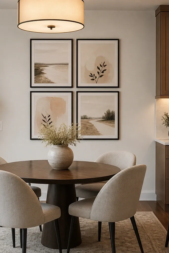
Choose the wall directly behind or above the dining table and measure the space by eye: leave about one frame-width margin on both sides. Place 3 frames first in a straight row, then add two more above the center to form a compact grid. Keep all frames the same color and add one small table centerpiece below the gallery so the top and bottom feel connected.
When your kitchen is open to the dining area, a wall gallery makes the whole zone look styled without touching cabinets. Use 3-5 framed prints in a tight grid above the dining table, keeping frames the same color (black or warm wood) for cohesion. This works because the eye has a clear stopping point, and the frames add texture even if your countertops are simple. It’s ideal for renters with neutral kitchen bases who want personality that doesn’t require remodeling.
Watch outDon’t mix frame colors and print tones — it turns the wall into clutter instead of a focal point.
Pro tipUse one consistent print tone (all cream backgrounds or all light gray) so the gallery looks curated.
10. Stove-side pot rack look with stacked cookware accents
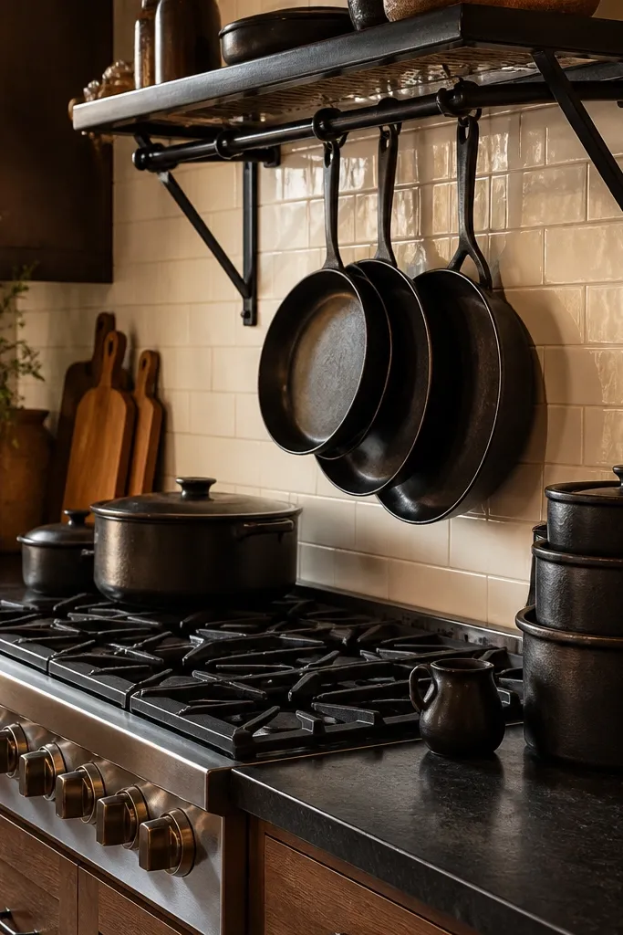
A pot rack look gives instant kitchen realism. It’s also renter-friendly because it uses props placed near the stove rather than changing the entire cooking wall. Hang or place a rack-style prop above the stove line, then add stacked cookware accents on the counter edge in matching tones. The visual payoff is strong because cookware shapes create depth — pans overlap, handles repeat, and the wall reads like a working kitchen. Great for kitchens where the stove wall is too blank and feels unfinished.
Place a rack prop above the stove zone, aligned so it sits centered over the cooking area. Then stack 3-4 cookware props on the counter next to the rack — keep them in one metal tone so they look like a set. Finish by adding one small utensil holder or ladle near the stove so the rack and counter feel connected.
Keep cookware stacks on one side of the stove wall; two-sided stacks look busy fast.
Skip random single cookware pieces spread across the counter — grouping looks intentional.
11. Rattan chair and linen runner dining combo for warm texture
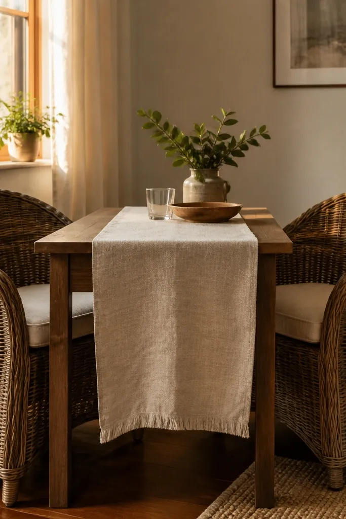
Pick a dining table that has a clean top surface, then place rattan-style chairs evenly around it with consistent spacing. Add a linen runner down the center lengthwise and keep the runner width narrow so it doesn’t swallow the table. Finally, place a single bowl or candle cluster in the middle and keep the rest of the table clear for a clean photo look.
Texture is the secret sauce for “aesthetic kitchen” builds, and this combo nails it. Use rattan-style chairs around your dining table and add a linen runner in a neutral tone like sand, oatmeal, or light beige. The contrast between woven texture and smooth table surfaces makes the dining area feel styled even with minimal decor. It’s renter-friendly because you’re swapping props, not kitchen structure. Perfect when your kitchen palette is cool or monochrome and you want it to feel warmer.
Watch outAvoid loud prints on the runner — texture beats pattern for a cleaner aesthetic.
Pro tipMatch the runner tone to your kitchen floor or cabinet tone by choosing one that’s within two shades of it.
12. Corner coffee bar with tiered tray and under-shelf mugs
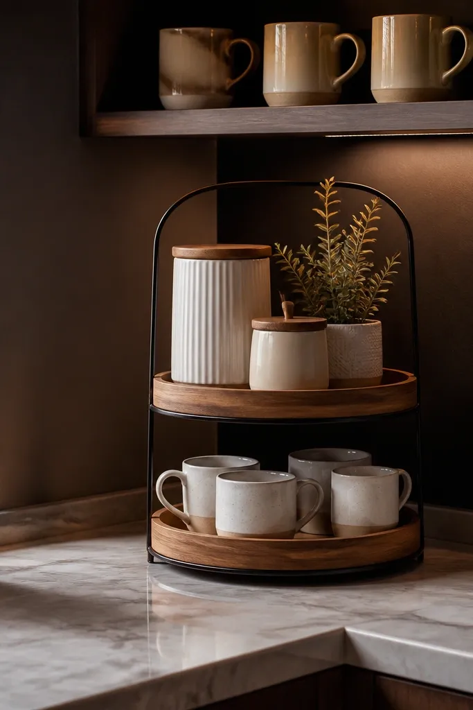
A coffee bar is the easiest renter-friendly kitchen idea because it looks like a real station. Build it into a corner so it doesn’t compete with your main prep space, then use a tiered tray to stack items and keep them photo-ready. Put mugs on an under-shelf display line or a small rack so the wall looks useful. The tiered layout makes the bar look curated without needing a ton of different props. It’s especially good for kitchens with limited counter space.
Choose a corner near the counter edge and place your tiered tray so the top tier is at about counter height. Set coffee-related props on the tiers in color order — light cream items on top, darker coffee tones below — and add a small sugar or creamer container near the front edge. Then mount or place a mug rack under a shelf line above the bar so mugs hang neatly and don’t clutter the counter.
Keep mug handle orientation consistent; it makes the whole corner look “designed.”
Don’t let the coffee bar spill into the main walkway; keep a clear path on the floor.