1. Cream shaker cabinets with a thin black backsplash stripe
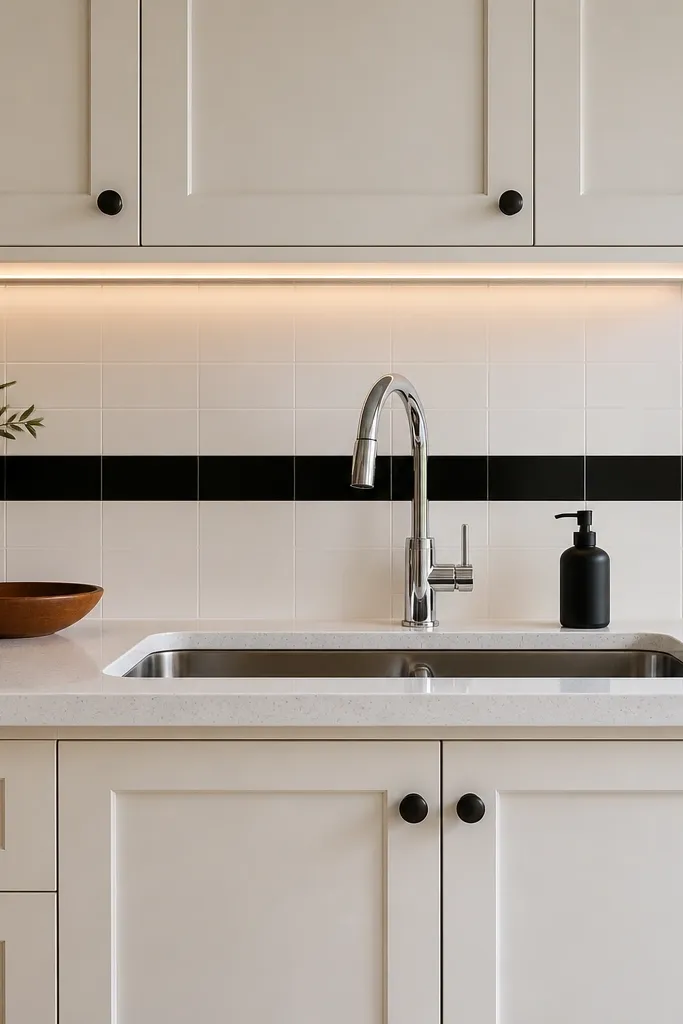
This look works because it gives you contrast without visual clutter. Cream shaker cabinets read bright in tight kitchens, and a thin black backsplash stripe adds definition right where the camera usually lands — above the counter and sink. Keep the countertop light (white or pale beige) so the black line doesn’t make the room feel heavy. Brass or brushed gold hardware ties the warm tones together and makes the kitchen feel “finished” even if it’s small. Place your sink under the stripe and add one small plant or utensil crock on the counter to keep the styling focused.
Pro tipHang two matching frames on the same wall above the counter line, not one — symmetry makes the tiny kitchen feel intentional.
Step 1: Build your cabinet run first — aim for a straight line around 6-10 blocks long, then use a corner cabinet or corner counter to turn the run. Set your backsplash as mostly light (white/cream), then add a single thin black stripe across the top third above the counter. Step 2: Choose shaker-style cabinet doors and match the hardware color across every cabinet handle and drawer pull. Step 3: Add a light countertop (solid pale stone look) and place the sink centered under the stripe so the stripe frames it. Effort is low because you’re mostly matching colors and adding one bold line.
Watch outAvoid mixing multiple backsplash patterns (like dots plus subway plus marble) in the same wall run.
2. Galley kitchen with tall fridge wall and floating shelf break
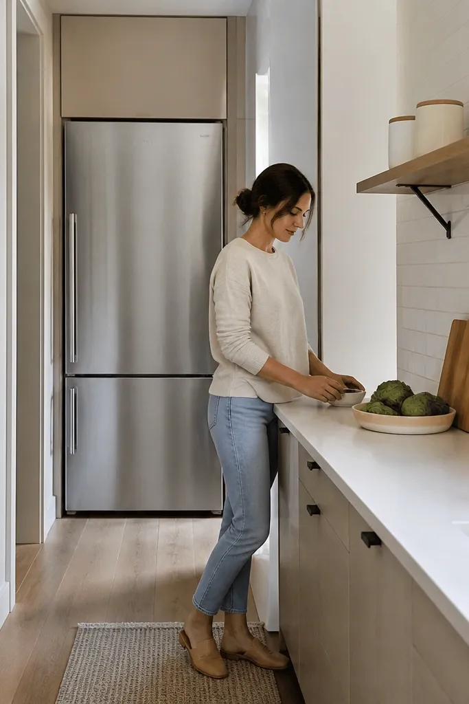
A galley layout is the best way to make a small-space kitchen feel navigable. Put the tall fridge on one end wall so it visually “anchors” the tight corridor, then keep the other side lighter so the space doesn’t feel like a tunnel. Add a single floating shelf or narrow open rack on the counter wall to create a break from solid cabinets. Use the shelf to display matching glass items or simple canisters, so it looks curated instead of cluttered. This style photographs well because you get a clean line of counters down the hallway view.
Pro tipUse the same countertop color on both sides; a mismatch makes the galley feel cramped.
Step 1: Plan a one-block-wide path between the two counter runs; keep both sides to about 4-6 blocks deep depending on your build. Place the fridge at the far end or along the same side as the sink so the corridor ends with a strong vertical shape. Step 2: Use lower cabinets on both sides, then add one narrow floating shelf where the camera catches it — typically above the coffee/utensil area. Step 3: Style only 3-5 items on the shelf, and match their color (clear glass + white ceramics looks clean). Keep your lighting overhead or under-cabinet style so you don’t get dark corners.
Watch outSkip heavy wall art in the corridor — it crowds the narrow view.
3. Corner L-counter with rounded breakfast nook bar
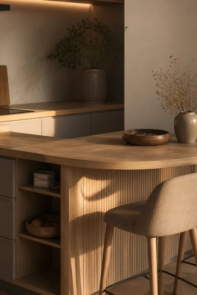
A corner L-counter gives you storage without eating the room’s center. The rounded breakfast nook bar softens the geometry, which matters in small kitchens where corners can feel harsh. Use light wood or light stone for the counter so the corner doesn’t look like a block. Then add two stools with warm upholstery or a simple wood finish to keep it cozy. This combo is photogenic from both the dining side and the kitchen entry because the rounded bar creates a “friendly” curve the camera loves.
Step 1: Build the L-counter: one run along the main wall and one run turning into the corner, with the corner cabinet or corner sink if you want the sink to be the focal point. Keep the bar depth around 1.5-2 blocks from the counter edge so it looks like a real seating ledge. Step 2: Place a rounded bar section (or a semi-circular counter piece) where the corner opens up, then add two stools aligned to the bar. Step 3: Add pendant lights directly above the bar line so the dining camera angle looks styled. Effort is medium because you’re shaping the bar, but the result is worth it.
Put one small pendant on each side of the bar, not a cluster — spacing makes the curve read premium.
Don’t place a full-size island in a small kitchen — it blocks the path and kills the flow.
4. Black matte cabinets with warm oak trim and white stone counter
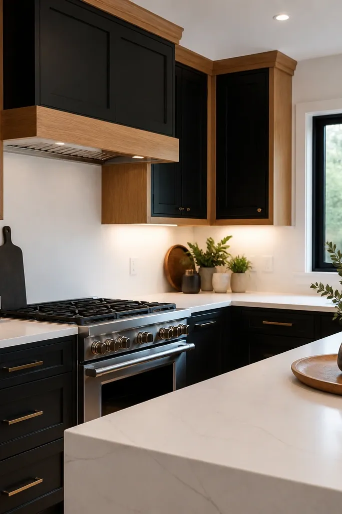
Dark cabinets can work in small spaces if you control the contrast. Matte black cabinets look sleek, but they need warm oak trim to prevent the room from feeling cold and boxy. Use a white stone countertop so the black doesn’t swallow the light, and keep the backsplash simple — plain white or very subtle veining. Add warm metal hardware (brass or gold) for a cohesive finish. This aesthetic is dramatic and clean, and it makes small kitchens look more “designed” even when the square footage is tiny.
Pro tipUse under-cabinet lighting or a bright counter lamp so black cabinets don’t look flat in screenshots.
Step 1: Choose one dark zone — place the black cabinets along the main counter wall, and keep the side wall lighter (painted wall blocks or light backsplash). Add oak trim only on cabinet edges or a trim panel line, not everywhere. Step 2: Install a white stone counter and match your sink bowl color to the countertop vibe (white or light gray). Step 3: Add a single statement pendant or two slim pendants over the counter corner, plus a small coffee station with 2-3 items. Cost is moderate in effort because you’re mostly swapping materials and lighting, not rebuilding the whole footprint.
Watch outAvoid pairing black cabinets with a busy patterned backsplash — it looks crowded fast.
5. White tile backsplash with spaced subway grout and open drying rack
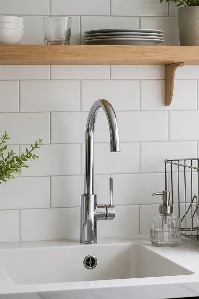
This is a classic kitchen look that still works when space is tight because it stays bright and structured. A white subway-style backsplash with visible grout lines adds texture without overwhelming the room. Put the sink centered on that backsplash so the grout lines frame it, and add an open drying rack on one side of the sink area. Keep the rest of the counters light and uncluttered. The drying rack gives you vertical visual interest, which makes the wall feel alive without adding wall clutter.
Step 1: Build your sink zone first: place the sink under your backsplash wall run and keep the backsplash height consistent across the counter section. Choose white backsplash tiles and add grout spacing so the texture shows in screenshots. Step 2: Place an open drying rack next to the sink and keep dishes minimal — 3-5 plates or utensils only. Step 3: Style the counter with one small cutting board and one utensil crock, both in matching tones (white + wood). This costs low because you’re leaning on tile and a simple rack rather than lots of decor.
Match the rack metal finish to your faucet finish so the sink area looks intentional.
Skip heavy decor above the sink when you have a textured backsplash — let the tile do the work.
6. Rustic wood shelves with matte white cabinets and a single hanging plant
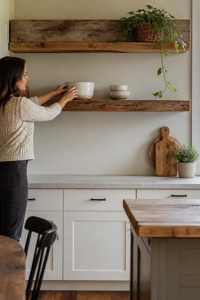
Rustic shelves make small kitchens feel warmer, but they can turn messy if you fill them too fast. Use matte white cabinets for the base so the room stays clean, then add rustic wood shelves only in one section of the kitchen — usually above the counter near the dining-facing wall. Put a single hanging plant near the shelf corner to add height and soften the hard lines. Keep shelf items uniform: white bowls, a wooden tray, and one small jar cluster. This look is photogenic because it has both texture (wood) and brightness (white cabinets) without competing patterns.
Pro tipUse a wooden tray as the shelf “base” — it makes random items look staged.
Step 1: Place white cabinets along your main wall and leave one section without upper cabinets. Install two narrow wood shelves in that open section, spaced so the items sit at eye level. Step 2: Add a hanging plant from a ceiling point near the shelf corner, not across the whole kitchen. Step 3: Place only 4-6 items on shelves and keep them in two colors. Effort is low because you’re using fewer pieces, but the shelf layout needs careful spacing.
Watch outDon’t mix wood shelf tones with dark floors if they clash — pick one warm wood direction.
7. Two-tone cabinets with navy lowers and white uppers
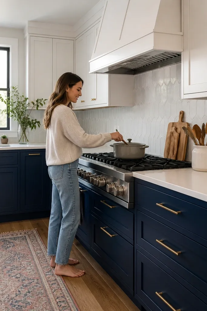
Two-tone cabinets create depth in small kitchens because the eye reads height separately from counter mass. White uppers brighten the top of the room, while navy lowers add grounding without going fully dark. Keep the countertop light — pale gray or creamy white — and choose a backsplash that bridges both tones, like a light neutral with tiny gray specks. Add hardware in brushed brass to tie the warm and cool colors together. This combo looks sharp in screenshots because it has a clear color block, not a scattered mix.
Step 1: Build your base run with navy lower cabinets and keep uppers white on the same wall. Keep the change between colors aligned — the line between upper and lower should be straight so it looks designed. Step 2: Choose a backsplash in a light neutral and keep it pattern-light. Step 3: Add a small runner rug in front of the sink area in navy or cream to repeat the palette and make the kitchen feel cohesive. Cost is moderate because you need two cabinet colors, but the structure stays simple.
Use the same navy for hardware accents like drawer pulls to keep the palette tight.
Avoid adding a third dominant color (like red accents) in a tiny kitchen — it breaks the clean block effect.
8. Sleek white kitchen with glass-front cabinet and single accent wall
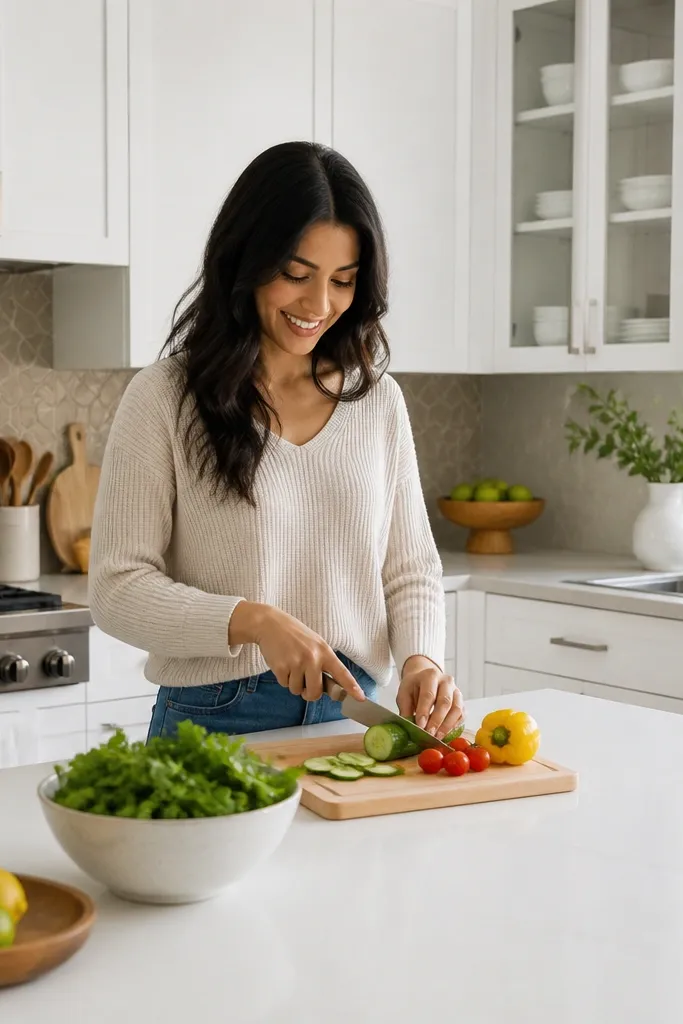
All-white kitchens can look sterile, so this idea uses one controlled moment of texture. Keep cabinets white, then add a glass-front section in one upper corner cabinet. Behind the counter, add a small accent wall panel in a subtle pattern or color, but only on the backsplash area so it doesn’t crowd the room. Style the glass cabinet with matching glass canisters so it reads as intentional storage. This works for small-space bloxburg kitchen ideas because it expands brightness while giving the eye something to lock onto.
Step 1: Build your cabinet wall in white and pick one upper cabinet to make glass-front. Keep the rest of the upper wall clean so the glass becomes the focal point. Step 2: Add an accent backsplash section behind the counter line — keep it limited to one wall run, not the whole room. Step 3: Fill the glass cabinet with 3-4 items only, in one palette like clear + white. Effort is low because the structure is already simple; you’re just swapping one cabinet and styling.
Place the glass cabinet near the dining-facing side so it catches light in screenshots.
Don’t fill glass cabinets with mismatched items — it looks cluttered instantly in small spaces.
9. Industrial kitchen with light concrete counters and black pipe shelf
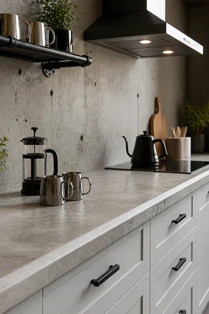
Industrial style can look amazing in compact kitchens because it’s mostly straight lines and purposeful storage. Use a concrete-look countertop in light gray, then add a black pipe shelf above one counter section. Keep cabinets either white or light gray so the black doesn’t swallow the room. Put a few metal mugs and glass jars on the pipe shelf — just enough to look lived-in without looking chaotic. This setup is photogenic because the shelf creates a strong vertical grid and the concrete tone keeps the kitchen modern.
Step 1: Choose one wall for the industrial shelf — place cabinets or open shelving beneath it so the shelf has a clean backdrop. Add black pipe style shelves above the counter, leaving 1-2 blocks of space from the ceiling. Step 2: Pair the shelf with light concrete-look counters and a simple backsplash in white. Step 3: Style only 6-8 items on the shelf and keep them in two finishes (glass and metal). Effort is medium because you’re building a shelf feature, but the color palette does the heavy lifting.
Put the sink under the simplest wall zone and use the shelf on the opposite side for balance.
Skip extra industrial decor everywhere — one shelf feature is enough.
10. Compact U-shape with a microwave drawer stack and corner sink
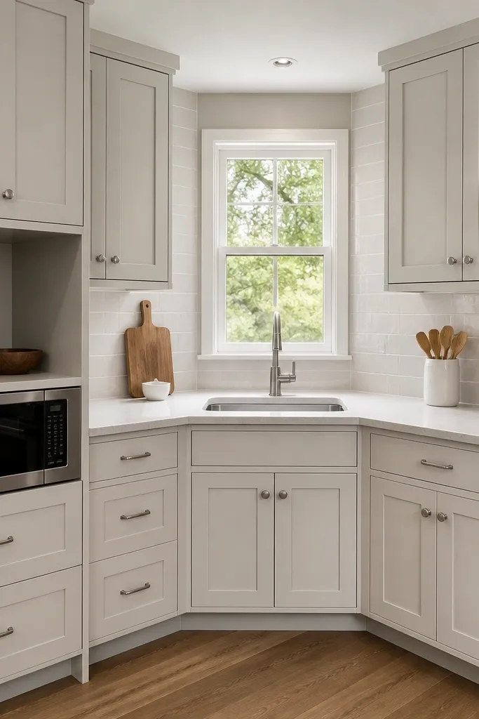
A compact U-shape makes small kitchens feel complete because it wraps storage around you. Corner sinks are the secret weapon here: they use the awkward corner and give the room a clear focal point. Add a microwave drawer stack on one side to keep counter space open, which matters for styling. Choose a light backsplash and a consistent cabinet color so the U-shape doesn’t feel like a maze. This is a strong option when your kitchen sits tight between walls and you still want a full counter run.
Pro tipUse matching cabinet doors throughout the U-shape so the curve reads intentional.
Step 1: Build a U-shape with two side runs and one base run; keep the gap between the runs narrow enough to fit a walkway visually (about 2-3 blocks). Put the sink in the corner section, centered so the backsplash lines up cleanly. Step 2: Place the microwave drawer stack on the side run near the corner, not in the middle, so the counter line stays uncluttered. Step 3: Add one small utensil station and one cutting board on the straight run, then keep the rest of the counter clear. Effort is higher because you’re placing more blocks, but the layout is clean.
Watch outDon’t place a big island in front of a U-shape — it blocks the visual wrap.
11. Small breakfast bar wall with pendant trio and white subway backsplash
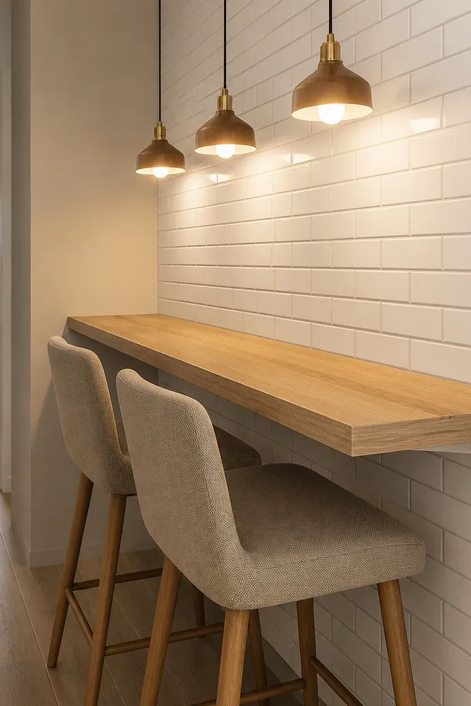
This idea looks great when your kitchen is narrow and you want seating without taking floor space. Put a breakfast bar along one wall and keep it shallow, then hang three pendants evenly spaced over the bar line. Use a white subway backsplash behind the bar so the wall looks bright and structured. Add two or three bar stools with simple backs in a warm wood or neutral fabric. The pendant trio draws the eye upward and makes the kitchen feel taller, which helps in small-space bloxburg kitchen ideas.
Step 1: Create the bar with a counter depth around 1.5 blocks and a length of 6-9 blocks. Place it along the wall where you’d otherwise have dead space. Step 2: Add three pendants centered along the bar length, spacing them so the gaps look even (each pendant should sit over a stool seat gap). Step 3: Style the wall with a white subway backsplash and keep the counter clutter to 2-4 items. Effort is low to medium since you’re focusing on lighting and backsplash rather than changing everything.
Use a small tray on the bar end with a coffee machine or kettle so the bar looks like a real work surface.
Don’t hang pendants too close together — it makes the ceiling feel crowded.
12. Monochrome gray kitchen with warm brass pulls and matte black accents
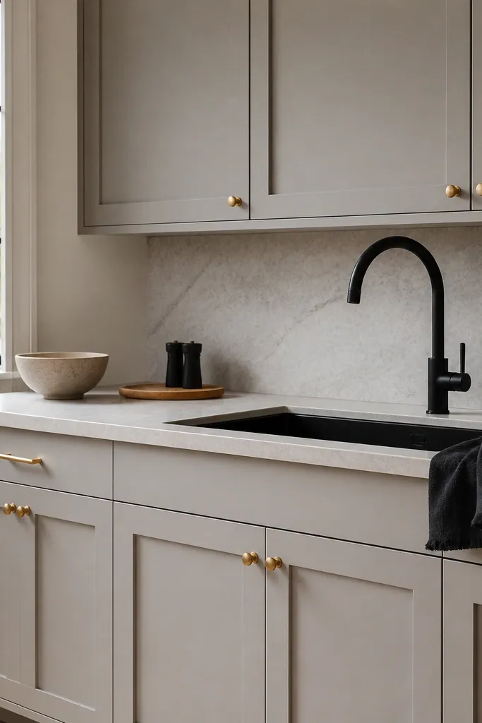
Monochrome gray works in small spaces because it keeps the eye from bouncing around. Use medium-light gray cabinets, then add warm brass pulls for contrast. Keep your backsplash as a soft gray or white with subtle texture so it doesn’t look flat. Add matte black accents in small doses — a black faucet, a black towel hook, or one black frame above the counter. This creates a modern, clean look that’s easy to photograph. The room feels cohesive because you’re limiting contrast to hardware and tiny accents.
Step 1: Pick one gray value for cabinets and one lighter gray for the backsplash. Keep the countertop either white stone or light gray so the scheme stays bright. Step 2: Choose brass pulls for every cabinet handle and drawer pull, then add one black element like a black faucet to create a controlled accent. Step 3: Add two matching frames above the counter zone in the same black finish. Effort is medium because you’re matching several finishes, but the styling is simple.
Keep towel colors neutral (cream or light gray) so the black accents look crisp, not busy.
Avoid mixing multiple metal colors (silver, brass, black) across different items — it looks chaotic in small rooms.
13. Farmhouse sink wall with gingham runner and open shelving above
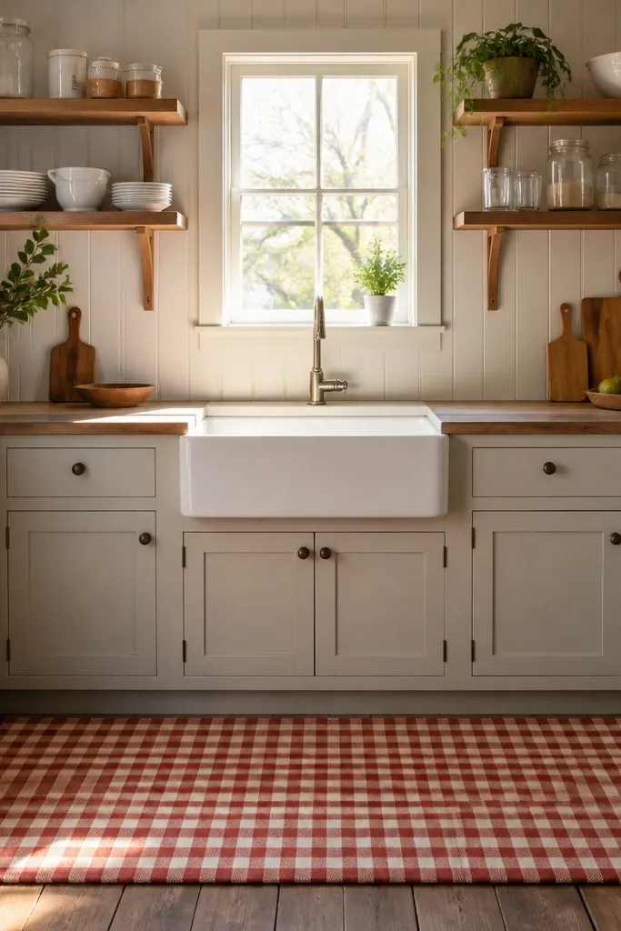
Farmhouse style can look charming in tiny kitchens if you keep the pattern controlled. Put your sink on a dedicated wall section with open shelving above it, then use a gingham runner on the floor facing the sink. The open shelves let you display a few white plates or jars, and the runner adds a soft pattern that reads cozy in photos. Choose a light wood floor tone and cream cabinets so the gingham doesn’t overpower the room. This works because it creates a clear “story” in one spot instead of scattering decor across every surface.
Pro tipUse one small framed print above the shelf instead of multiple — the runner already adds pattern.
Step 1: Build your sink wall run and install open shelving above the counter line, leaving the rest of the kitchen more solid (closed cabinets or simple walls). Step 2: Add a gingham runner in front of the sink area, placed so it sits centered to the camera view. Step 3: Style the open shelf with 4-6 items max and keep them white + wood tones. Effort is low because it’s mostly placement and styling rather than new furniture.
Watch outDon’t add more than one patterned item (gingham plus patterned backsplash) in a small kitchen.
14. Tidy coffee corner with tall cabinet, open mug rail, and light backsplash
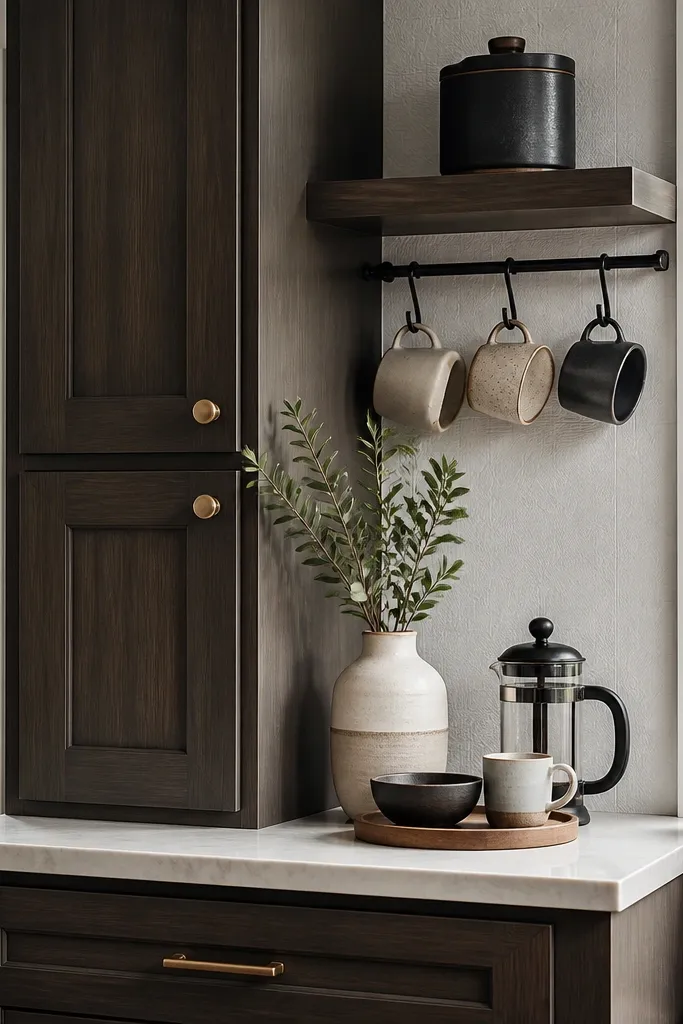
A coffee corner is a smart way to make a small kitchen look styled because it creates a single theme zone. Use a tall cabinet for coffee storage, then add an open mug rail or small hanging rack below the upper wall. Keep the backsplash light so the coffee items pop without looking cluttered. Style the counter with one coffee machine or kettle, one tray, and 3-5 neatly arranged cups. This gives you a “designed” look even when the rest of the kitchen is minimal. The mug rail adds vertical detail, which is exactly what small spaces need.
Pro tipMatch the mug color set (all white or all cream) so the rail looks intentional.
Step 1: Choose the corner of the kitchen that faces the dining table (that’s where your viewers will look). Place a tall cabinet there, then add an open mug rail under the upper wall line. Step 2: Add a small counter station — keep it to one tray width so it doesn’t spill into the rest of the counter. Step 3: Arrange mugs in two rows max and keep canisters aligned on the tray. Effort is low because you’re creating one high-impact zone instead of redecorating everything.
Watch outSkip random mug stacking — it looks messy and makes the kitchen feel smaller.
15. Narrow kitchen with vertical stripe wallpaper and slim open pantry
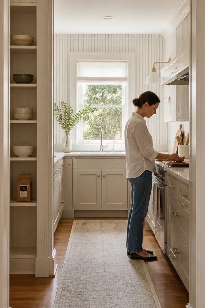
Vertical stripes trick the eye into reading height, which is the exact fix for narrow kitchens. Keep the cabinets simple and solid so the stripe wall is the main visual element. Add a slim open pantry shelf near the entry or end wall — it gives you storage and also creates a tidy vertical rhythm that matches the stripes. Use a light backsplash and light countertop so the stripe wall doesn’t make the kitchen feel dark. This look is very photogenic because the stripe wall frames the kitchen area and makes the narrow build look taller.
Step 1: Pick one wall for vertical stripes and keep the rest of the kitchen plain. Choose light stripes (cream and gray) so they don’t feel heavy. Step 2: Place a slim open pantry shelf 2-3 blocks wide near the stripe wall so it visually aligns with the stripe direction. Step 3: Keep pantry items minimal and aligned — 5-7 items total with consistent colors. Effort is medium because you’re adding a feature wall, but you’re not rebuilding layout.
Position the camera-facing corner so the stripes run behind the counter line — that’s where the height trick shows up.
Don’t stripe every wall — two walls max, or the room feels busy.