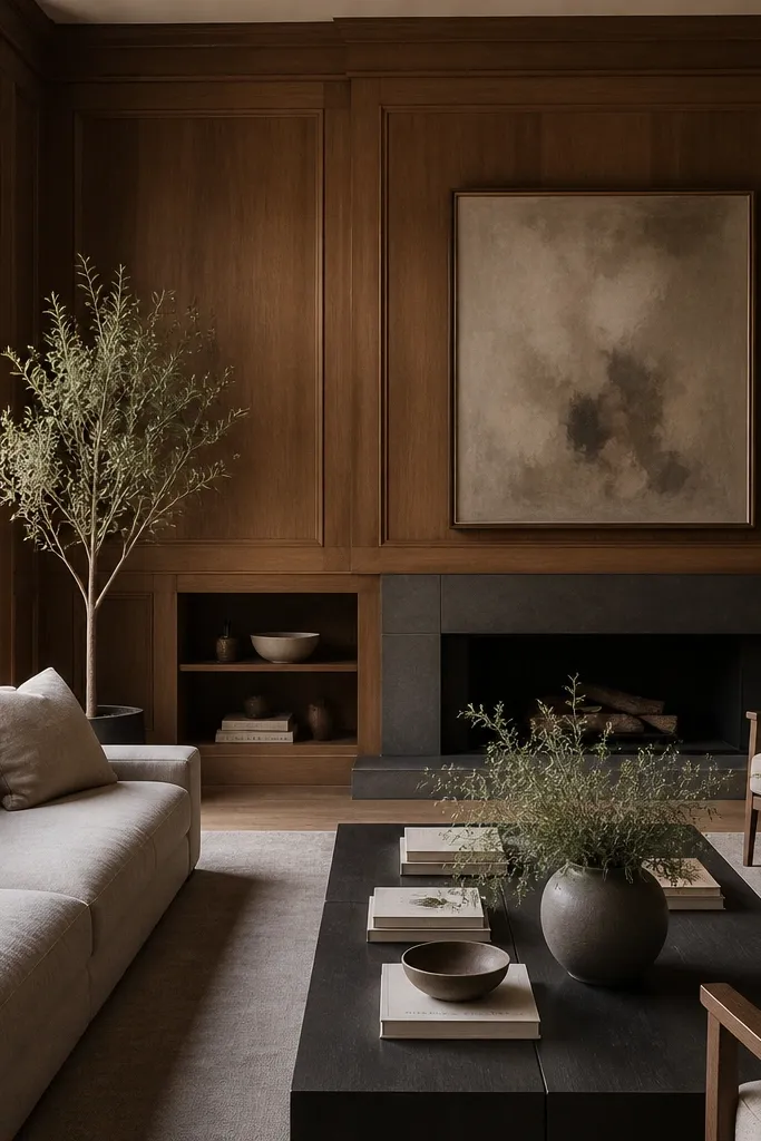
1. Warm white trim border with a cream sofa
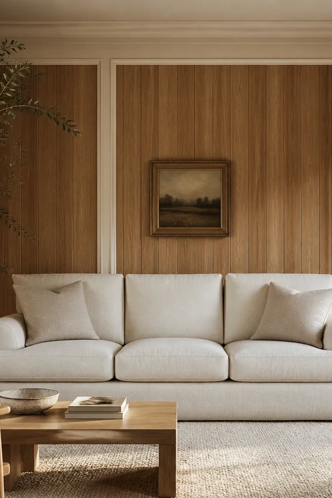
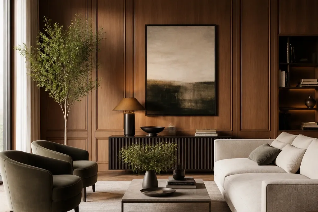
Add 1x2 or 1x3 trim around the panel wall perimeter. Paint the trim warm white with a satin finish, and keep the panel paint natural (no heavy stain changes). Place the sofa so the rug edge lands about 8-12 inches inside the panel wall line, not flush to it.
This works because the trim creates a hard edge that reads like architecture, not leftover wall. The warm oak stays the star, while cream upholstery softens the brightness. I like linen or textured cotton because it doesn’t look glossy against the wood grain. The whole room feels calm, and calm reads expensive.
Watch outDon’t paint the wood panels a different color than the trim — the mismatch makes it look like patchwork.
Pro tipHang art centered over the sofa with the bottom edge about 10-12 inches above the sofa back.
2. Charcoal gallery wall with wood as the frame
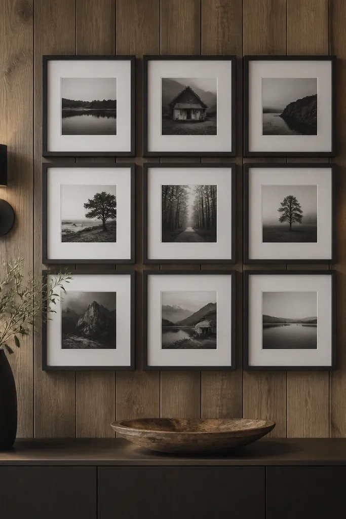
Use 2-3 frame sizes only, like 18x24, 16x20, and 11x14. Keep spacing around 2 inches between frames. Mount sconces at the same height as the top row of frames so the light and art feel aligned.
Wood panels already give you texture, so a charcoal frame palette makes the wall look styled instead of busy. Matte black or charcoal frames also hide minor wall imperfections. The key is consistent frame spacing and a limited set of artwork sizes. The wall reads like a curated gallery, not random hanging.
Watch outAvoid mixing frame colors and finishes — shiny gold next to matte black looks accidental.
Pro tipUse museum glass prints or matte paper — glare from paneling shows up fast with glossy photos.
3. Rug-led symmetry and a floating console
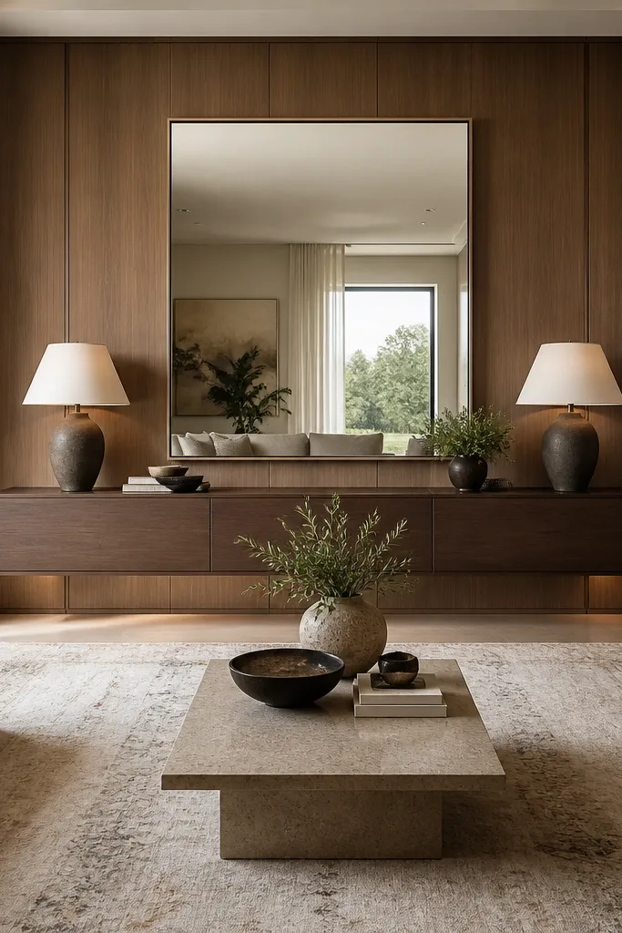
Choose a console depth around 10-12 inches. Set the top of the console about 36-38 inches from the floor. Place a large mirror centered above it, ideally 24-30 inches wide, with the mirror center at about 60 inches from the floor.
Symmetry makes the wood panel wall feel designed, not decorative. A floating console keeps lines clean and visually expensive — you don’t see bulky legs interrupting the panel texture. The large mirror bounces light into the grain, which makes the wood look richer without changing it. This layout also gives you a place for styling that won’t crowd the wall.
Watch outDon’t center a small rug — the rug should reach under the front legs of your sofa for the expensive symmetry effect.
Pro tipStyle the console with two items per side (a lamp + a ceramic) so it reads balanced from across the room.
4. Black TV surround with panel-matched trim
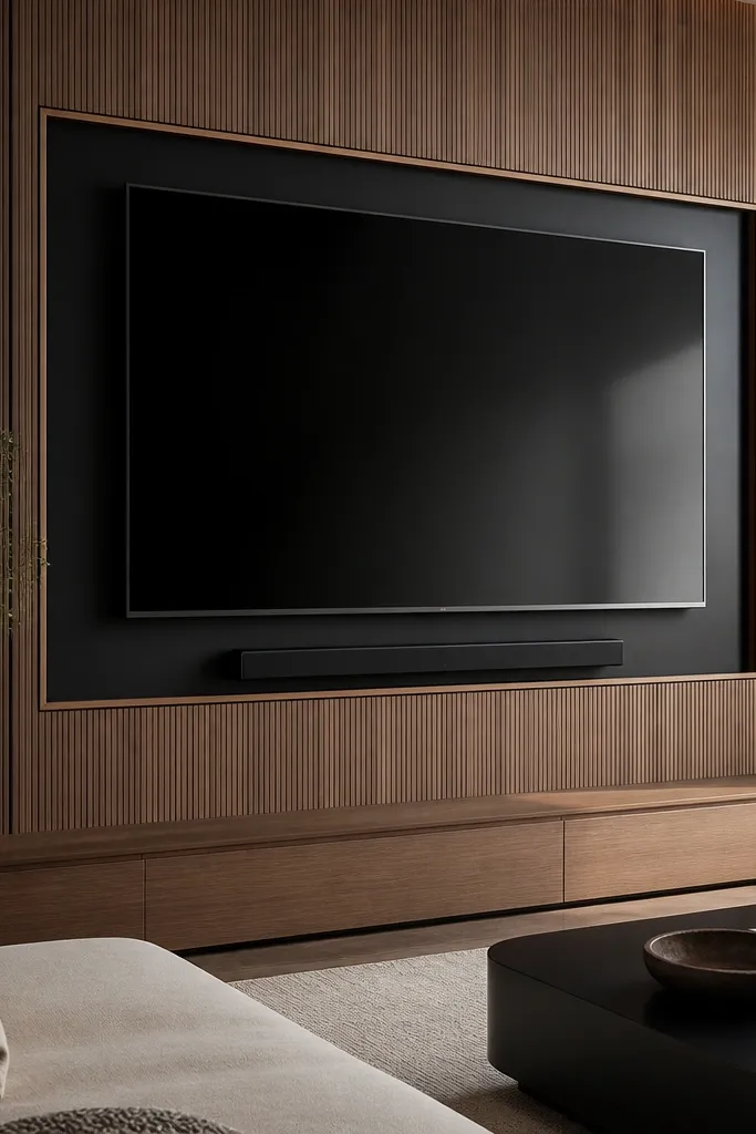
A TV on wood panels can look either intentional or like equipment stuck to the wall. The trick is a frame with thin, crisp edges, plus cable control. Black surround panels create contrast, and contrast makes the wood feel like backdrop design. When the soundbar and console line up, it looks built-in.
Use a black painted MDF or metal TV frame surround with a 1-2 inch border thickness. Keep the surround centered and leave about 2-3 inches of clearance around the TV. Mount the soundbar directly below the TV with the same center line, and run cables inside a cord channel painted the same warm white as your trim.
Set the TV height so the bottom edge of the screen lands around 34-40 inches from the floor for most seating.
Avoid a surround that’s too thick — chunky frames scream DIY.
5. Matte sage walls around the wood panels
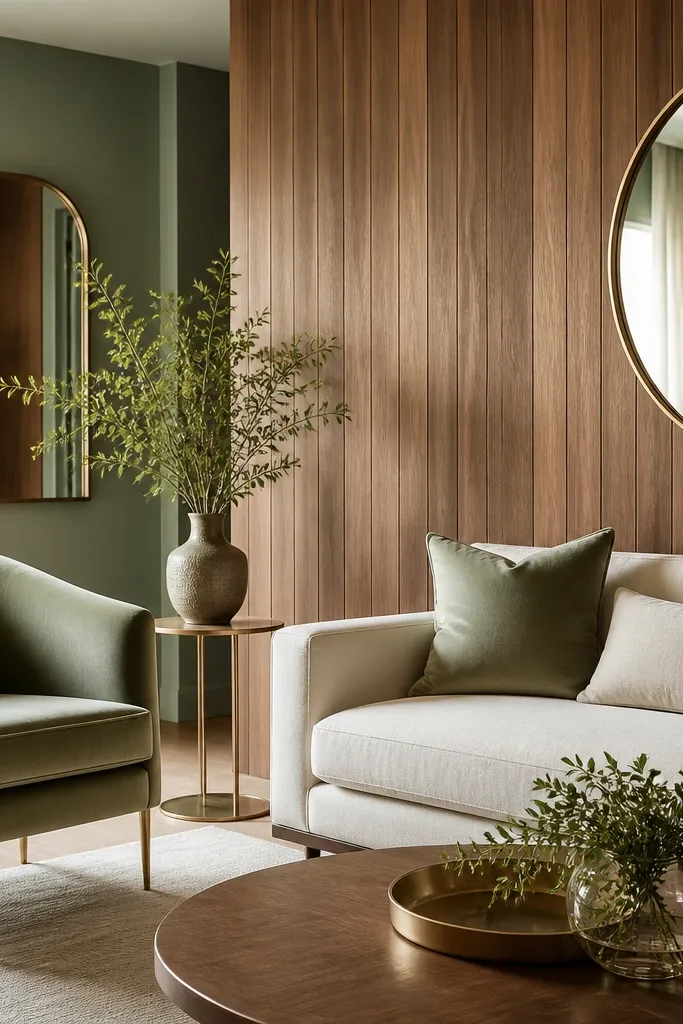
Paint the walls adjacent to the panel wall in a matte sage (think gray-green, not neon). Keep the panel wall unpainted or lightly clear-finished. Add a velvet sage chair and a cream rug with a low pile so the room stays grounded.
Sage is the color that makes warm wood look expensive without turning the room orange. Matte paint keeps it soft, so the panels keep the texture. Brass accents pick up the wood’s warmth, while cream textiles cool it down. This combination reads like a designer’s color plan, not a random paint choice.
Watch outDon’t use bright green or olive with honey oak — it skews yellow and cheap.
Pro tipUse brass frames and lamp bases together — mix only if you keep one finish dominant.
6. Linen drapes in front of panels for soft depth
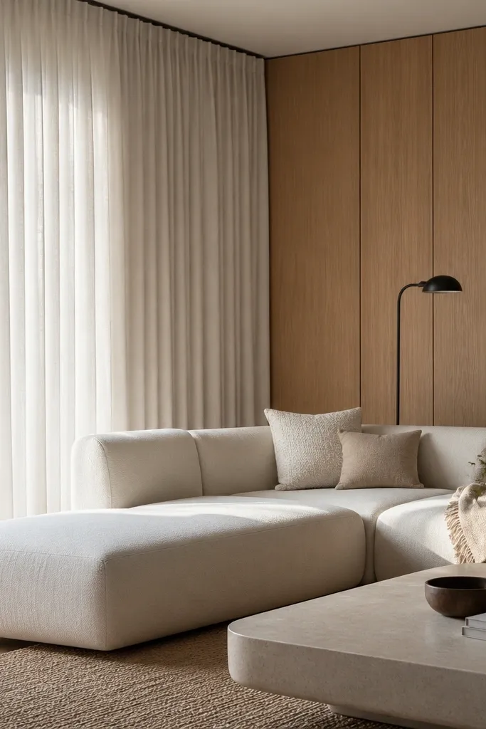
Hang curtains from a ceiling track or a rod placed 3-6 inches above the window trim. Use panels that are 2x the window width for fullness. Choose medium-weight linen in off-white or natural, with a slight slub texture.
When you let fabric overlap the wood texture, the room looks layered instead of flat. Linen also absorbs light, which makes the wood grain look warmer and deeper. The expensive effect is the height and fullness of the drapes — not the color alone. I’ve done this in rooms where the panel wall felt too busy by itself, and the fabric gave it breathing space.
Watch outAvoid short drapes that stop at the window sill height — that’s the fastest way to look cheap.
Pro tipPin the curtain folds so the fabric breaks in a consistent rhythm across the panel wall.
7. Oversized round mirror with a black frame
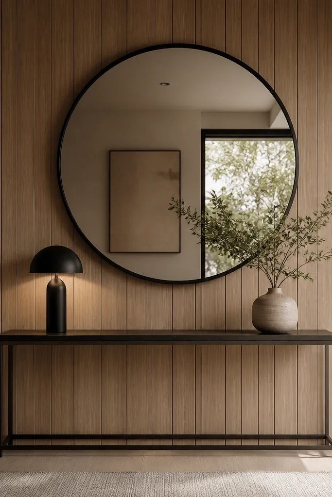
Pick a mirror 30-36 inches wide for most living rooms. Mount it so the mirror center sits around 60 inches from the floor. Use a console depth around 12 inches and keep objects low so the mirror stays the focal point.
A round mirror softens the vertical lines of wood panels. The black frame adds contrast and keeps the mirror from blending into the wall. I like this look because it makes the wall feel intentional even if you don’t want a full gallery. The mirror also increases perceived brightness, especially in rooms with only one overhead light.
Watch outDon’t choose a mirror frame that’s too thin and silver — it looks temporary.
Pro tipPlace a lamp on one side only and keep the other side styling minimal so the light source doesn’t compete with the mirror.
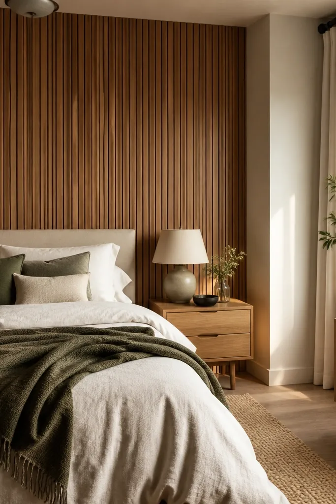
8. Vertical slat panel wall with warm oak and white ceiling
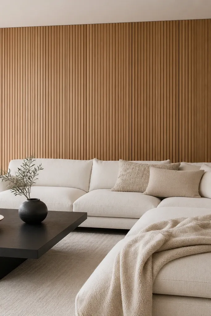
Use a white sectional in textured fabric (not shiny leather). Add a chunky wool throw and a textured cushion with a subtle pattern. Keep the coffee table in black metal with a light wood top or a matte black finish.
This is the clean, modern version of the expensive look. The white ceiling gives the wood a top “stop,” so the vertical lines feel designed rather than endless. Keep the furniture light and textured — white upholstery with chunky knit throws looks expensive against oak. Black accents like a coffee table or lamp add definition without adding color noise.
Watch outAvoid cool white bulbs (4000K) — they flatten wood grain and make it look dull.
Pro tipUse warm bulbs (2700K) so the wood reads golden instead of gray.
9. Leather cognac chair + neutral rug on wood panels
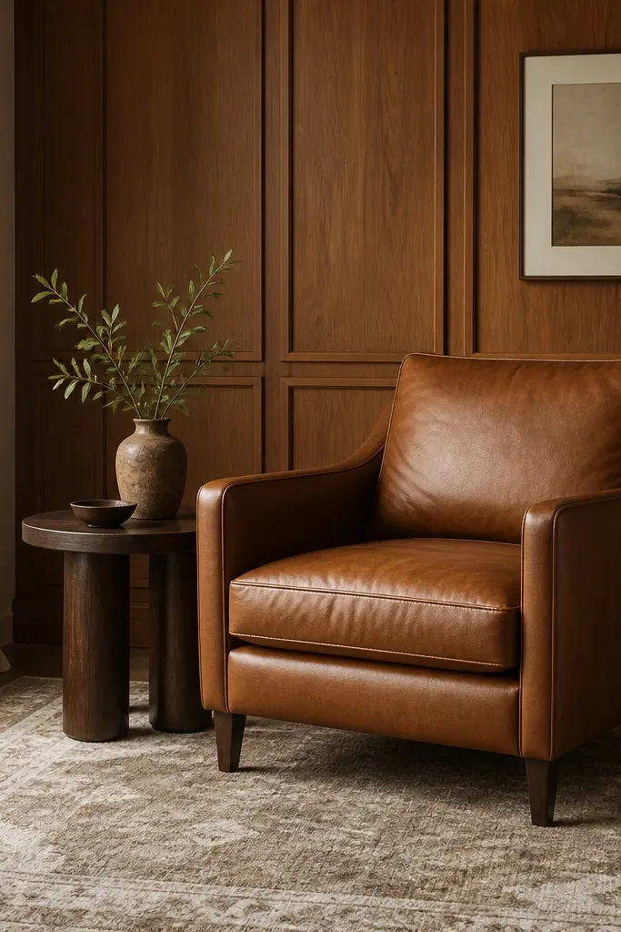
Cognac leather is basically a cheat code with warm wood because the undertones match. Then you keep the rest neutral so the room doesn’t look like a furniture store. The rug pattern should be subtle and low-contrast; it gives texture without stealing attention from the panels. This combo looks expensive even with minimal wall decor.
Choose a rug in beige, cream, and light tan with a flat weave or low pile. Keep the side table in dark wood or matte black so it ties into the leather. Place the chair so it’s angled slightly toward the seating area, not straight-on.
Add one throw pillow in a natural boucle or chunky knit to soften the leather texture.
Don’t pair cognac leather with bright red or hot pink accessories — it feels costume-y.
10. Wainscot-style trim rails at mid-height
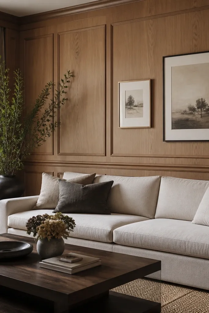
Install a 1x3 or 1x4 rail around 38-42 inches from the floor, then add matching trim verticals if needed. Paint the added trim warm white and keep the wood finish natural. Hang art so its bottom edge sits 6-8 inches above the rail.
Horizontal rails break up the vertical rhythm and make the wood feel like custom millwork. The effect is especially good if your panels are plain and you want more structure. When you add framed art above the rail, the wall becomes a clear composition. This is one of the fastest ways I’ve made panel walls look “built” instead of “installed.”
Watch outAvoid adding rails at random heights — it looks like someone measured wrong.
Pro tipUse two rail heights only if you want drama — otherwise stick to one rail so it stays classy.
11. Brass sconces with linen shade grazing the wood
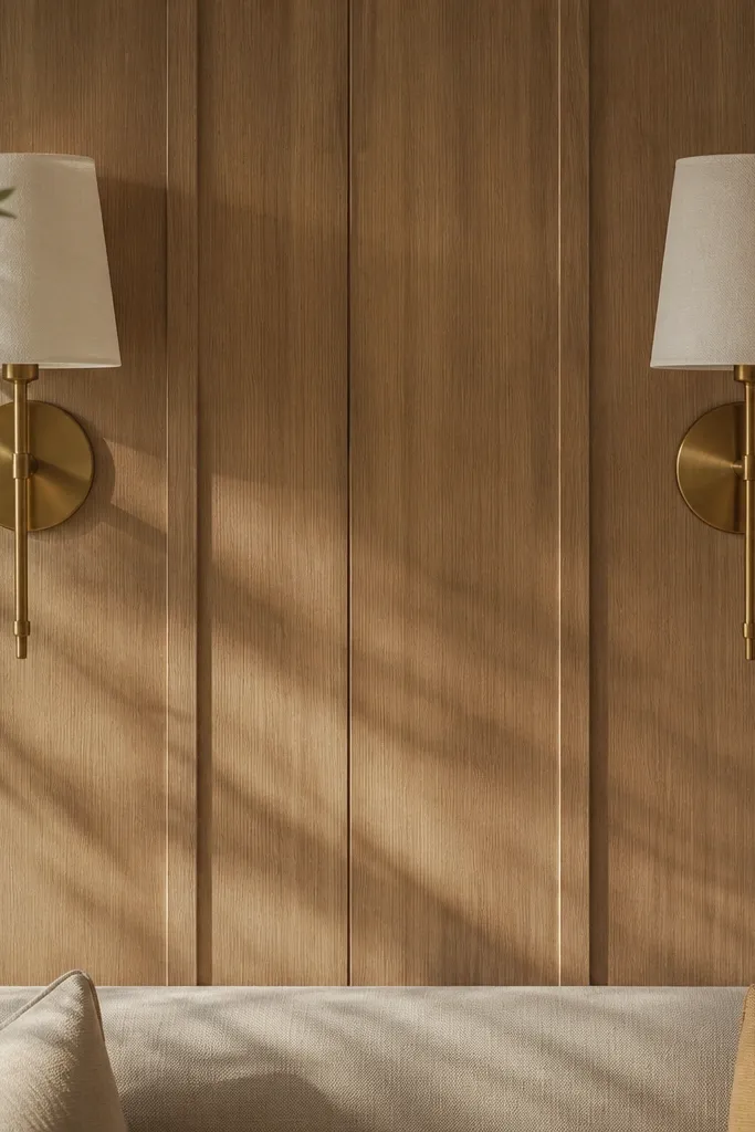
Lighting is where wood panel walls go expensive. Linen shades diffuse the light and make the wood grain glow instead of glare. When sconces aim slightly upward or angled toward the wall, you get a shadow line that makes the panels look deeper. Brass ties warmth together and looks more expensive than black when the wood is already warm.
Mount sconces about 60 inches from the floor to the center of the fixture. Use adjustable heads or angle the mounting plate so light grazes the panels, not the room. Keep the shade in off-white linen and pick bulbs around 2700K.
Dimmer switch helps a lot — the wood looks best when the room isn’t fully bright.
Avoid bare bulbs or glossy shades — they create harsh hot spots on the panels.
12. Textured wallpaper behind a console mirror
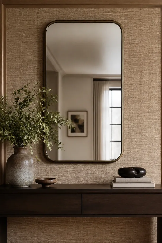
This is a targeted “wow” area that doesn’t require repainting all the panels. The texture behind the mirror adds depth and makes the mirror feel like a focal feature. Grasscloth or textured wallpaper looks expensive in close view, and it works with wood because both have natural texture. The trim frame keeps it from looking temporary.
Cut a rectangle frame using 1x2 trim painted warm white. Apply grasscloth or a textured peel-and-stick sheet inside the frame. Mount the mirror centered above the console, with the framed texture panel aligned to the mirror height.
Choose a wallpaper tone that matches the wood undertone — warm beige or sandy tan works better than cool gray.
Avoid a glossy wallpaper — it reflects light and makes the wall look cheap.