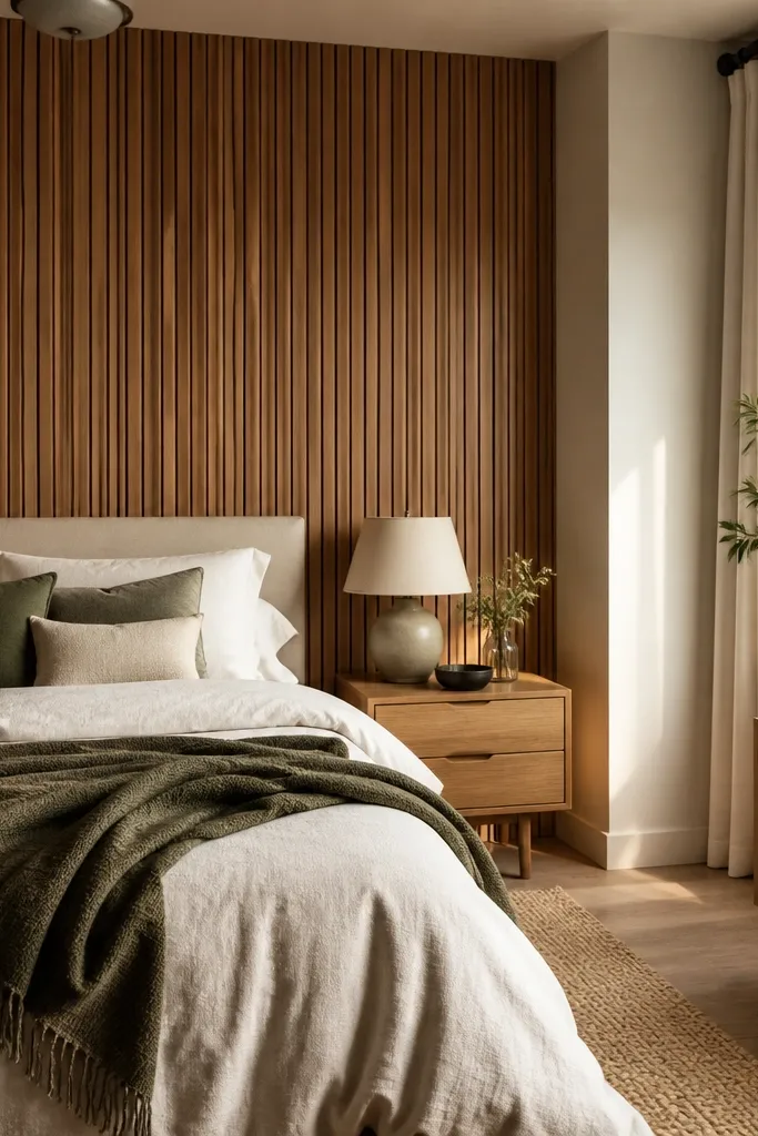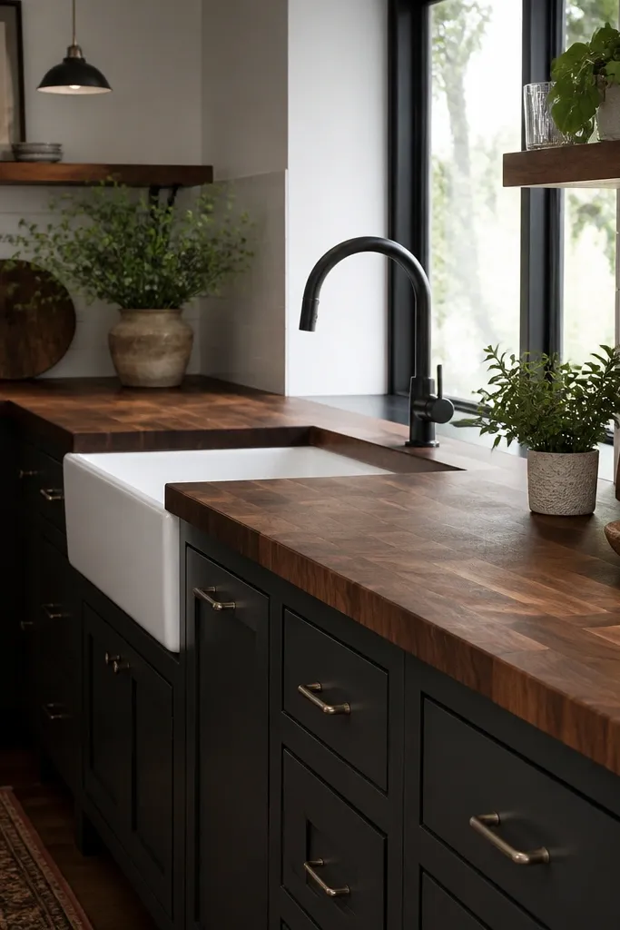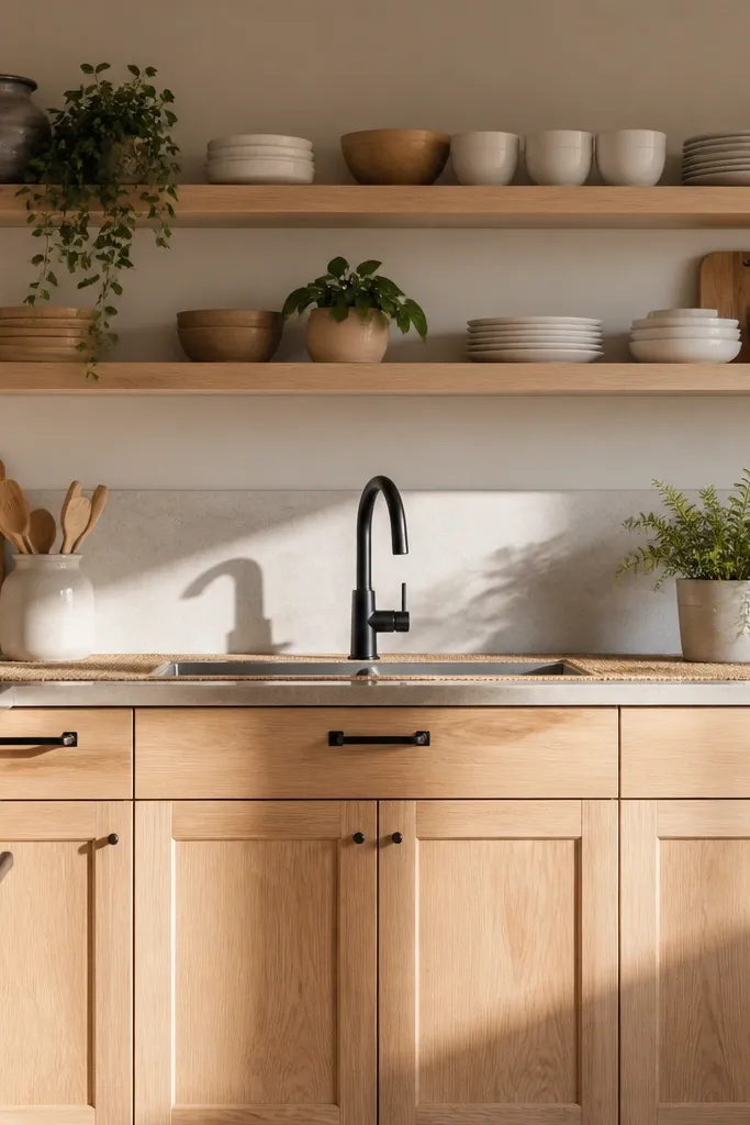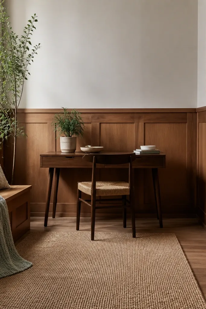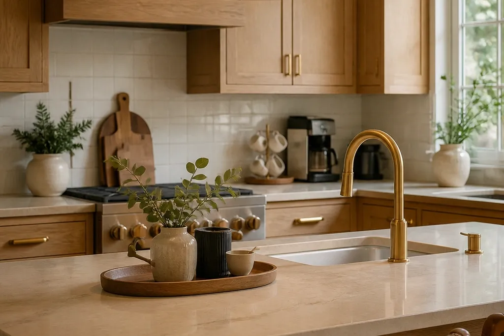

1. Warm Oak + Cream Countertop Coffee Nook
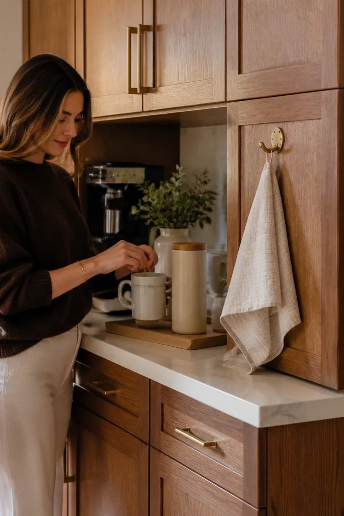
This look works because it keeps the kitchen’s “main character” warm and inviting all year. Use warm oak cabinetry tones with a cream or off-white countertop so your space reads cozy in winter and clean in summer. Add a small coffee nook on one wall with a compact tray, a mug stack, and one tall item like a canister or vase. The cream surface makes even simple decor look styled, and the warm wood tones prevent the room from feeling cold when you switch seasonal colors.
First, choose a warm wood cabinet color and pair it with a cream/off-white counter. Then place a narrow coffee station along a backsplash wall: leave about 1 block of breathing space around it so the vignette doesn’t look cramped. Finally, add 3 items only — a tray (base), a small mug set, and one height piece. Keep metals consistent by using one metal color for the tray or canister finish.
If your nook feels flat, add one woven element like a small basket under the tray so the texture shows in screenshots.
Don’t scatter coffee items across the whole counter; one tight vignette looks better than five mini piles.
2. Black Hardware + Marble-Look Backsplash Clean Minimal
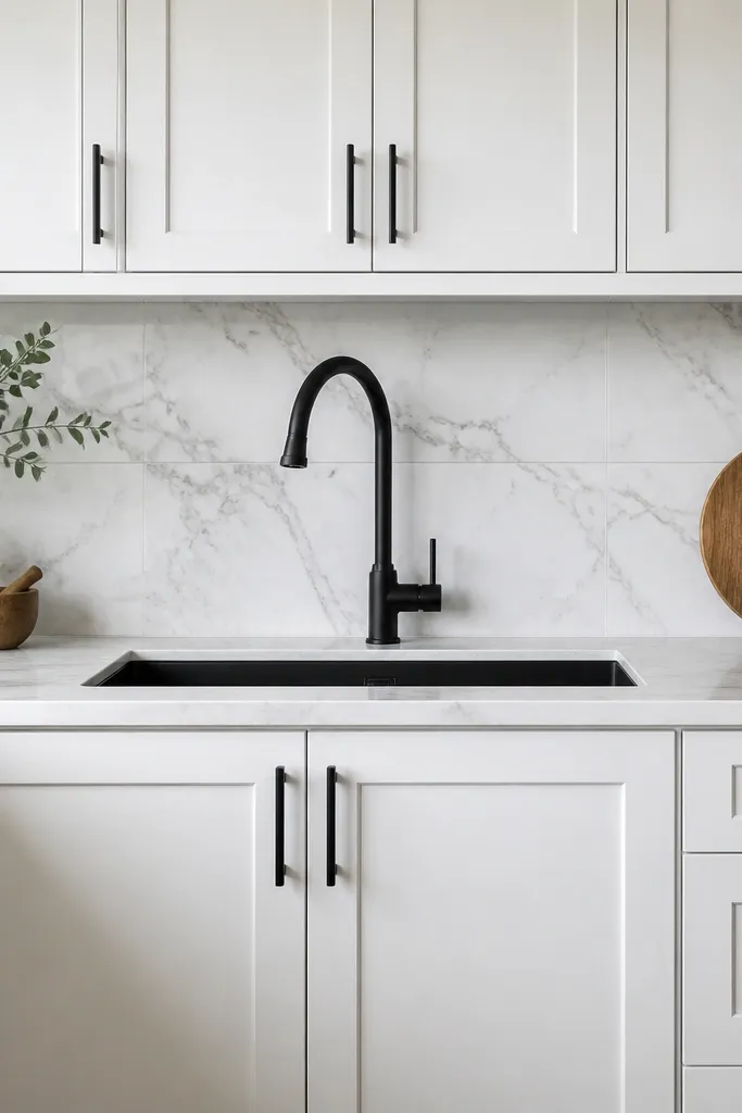
Minimal kitchens look best year-round when they have strong contrast and a consistent finish. White cabinetry plus a marble-look backsplash makes the room stay crisp even when you swap seasonal color accents. Black hardware ties everything together — faucet, cabinet pulls, and any rail or bar should match. This setup is photogenic because the backsplash pattern gives detail without clutter, so your kitchen still looks “finished” even with fewer decorations.
Start by setting cabinets to white or very light cream and add black hardware accents. Then pick a marble-look backsplash and place it as a full-height section behind the main prep area so the pattern reads clearly. Finally, keep the countertop mostly bare: use a single black tray and one small plant or ceramic bowl, and store everything else in cabinets. Use neutral dish colors so the backsplash stays the visual focus.
Add a single tall glass container near the sink; it gives height and makes the counter look styled without clutter.
Avoid mixing multiple metal finishes; chrome, gold, and black together makes the minimal look feel messy.
3. Terracotta + Linen Towels Rustic Mediterranean
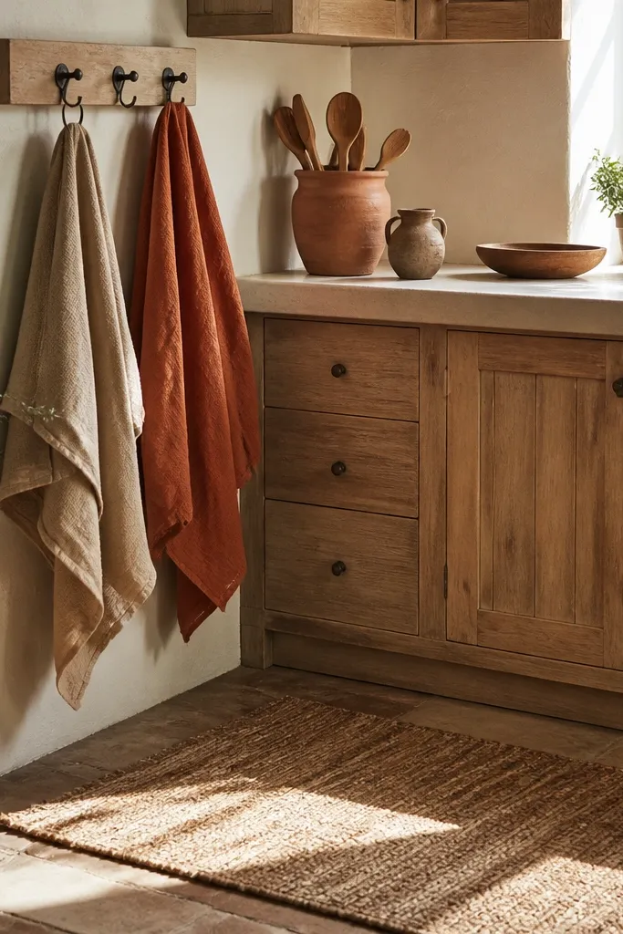
Terracotta and linen are the easiest year-round bloxburg kitchen ideas for warm, lived-in beauty. Choose terracotta or warm clay tones for small decor — a vase, a utensil crock, or a rug — then keep the base neutral with beige counters or light wood cabinets. Linen towels on open hooks add texture and a natural, non-seasonal feel. This style stays attractive across spring and fall because terracotta reads warm without being holiday-specific.
First, keep walls and cabinets in neutral tones (cream, light beige, or warm wood). Then add terracotta touches in three spots: one countertop item, one wall art piece, and one floor or rug accent. Place linen towels on hooks near the sink — aim for two towels, one folded and one rolled. Keep the rest of the counter minimal so the terracotta stays intentional.
Use one patterned terracotta piece only — the moment you add two busy prints, the look gets loud in screenshots.
Don’t go full orange everywhere; terracotta should be the accent, not the base for every surface.
4. Sage Green Cabinets + White Open Shelving
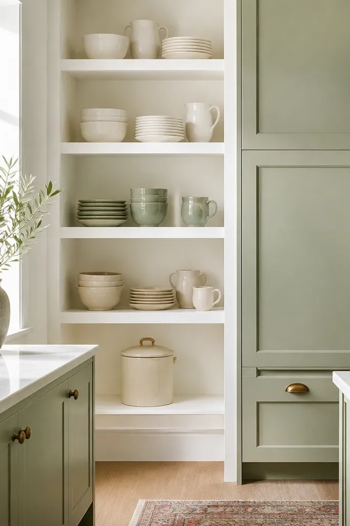
Sage green gives you a soft color that works in every season without looking dated. Pair it with white open shelving so the kitchen feels airy and bright, not heavy. Arrange dishes by color family: whites and creams on top, one muted green or beige set lower. Open shelving makes the room feel styled in photos, and because the shelf items are neutral, you can swap seasonal pieces without changing the foundation.
First, choose sage green cabinetry or a sage accent wall panel and keep counters light (white or pale stone look). Then build open shelving in one section only — usually above a coffee corner or next to the stove. Place 6-10 items total on the shelves so it looks curated, not crowded. Finally, add one seasonal swap item like a small wreath or a seasonal jar, but keep the rest of the dish layout unchanged.
If your shelves look too empty, add one vertical piece like a tall jar; it balances the shelf visually.
Don’t overload shelves with mismatched colors; keep 80% of items in white/cream so sage stays the star.
5. Navy Accent Wall + Brass Lantern Pendant
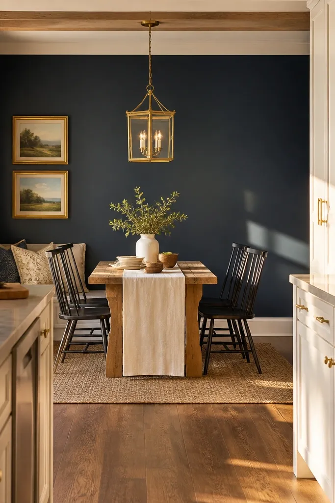
A deep navy accent wall gives dramatic contrast that stays beautiful year-round, especially in daylight-to-evening lighting. Pair it with warm brass lighting so the kitchen reads cozy instead of dark. This setup is ideal when your kitchen has a dining nook because the pendant becomes the focal point in photos. Keep everything else neutral: white or light wood cabinets, and a simple dining set. The navy wall gives you an easy seasonal palette too — swap in gold, cream, or muted berry decor.
Pro tipTurn on your kitchen lights for screenshots; brass looks richer under warm lighting than under cool whites.
First, apply navy as an accent wall or backsplash panel behind the dining area or stove zone. Then hang a brass lantern pendant directly centered over the table or counter-height island seating. Choose a dining table with a light top so navy doesn’t swallow the room. Finally, add two small items on the table: one tray centerpiece and one vase, both in cream or muted tones.
Watch outDon’t pair navy with icy grey floors; it makes the whole build feel colder than intended.
6. Charcoal + Warm Wood Dining Island Setup
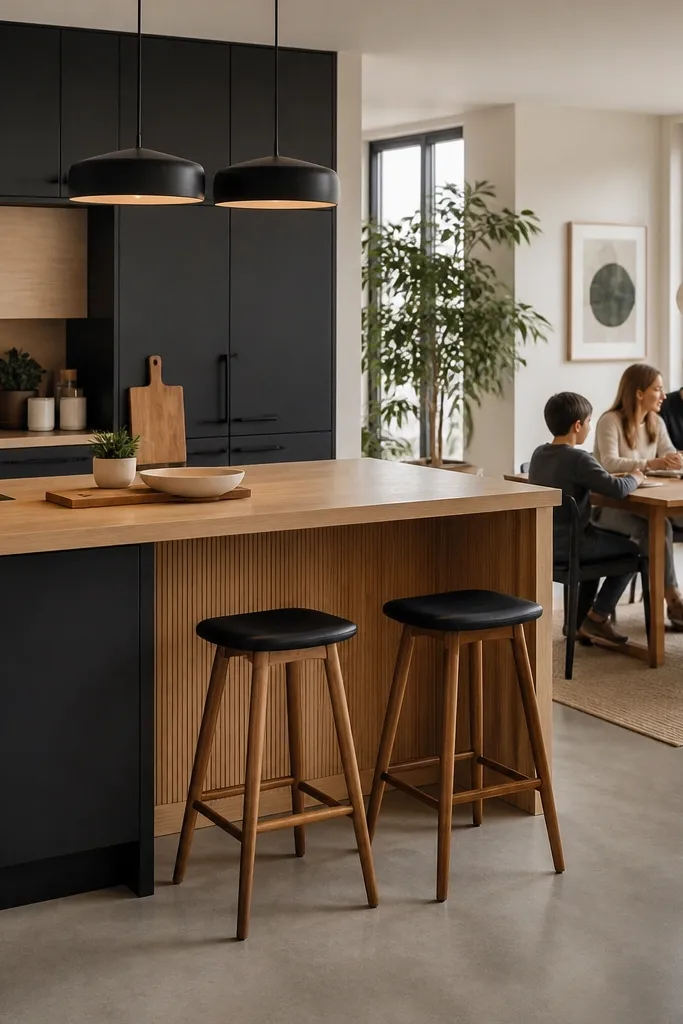
Charcoal cabinets and warm wood details create a “modern cabin” look that photographs well in every season. Charcoal gives you depth, but the warm wood keeps it from feeling too heavy. Put your dining or prep focus on an island with wood tones: it becomes the centerpiece and gives you a natural place for seasonal decor. This is a smart choice if you want year-round bloxburg kitchen ideas that still look stylish without changing half your build.
Pro tipKeep your seasonal color to one accent shade — like rust or cream — so charcoal stays the consistent base.
First, set your main cabinets to charcoal or dark grey and keep walls light. Then add a warm wood island top and match the wood color in at least one other spot like a cutting board or stool seats. Place a runner or mat on the dining side only, not across the entire floor. Add one island vignette: a bowl + small plant + folded cloth, arranged at the same height.
Watch outAvoid too many dark elements at once; if the floor is also dark, lighten with pale curtains or light dishware.
7. Pastel Spring Plates + Neutral Counter Base
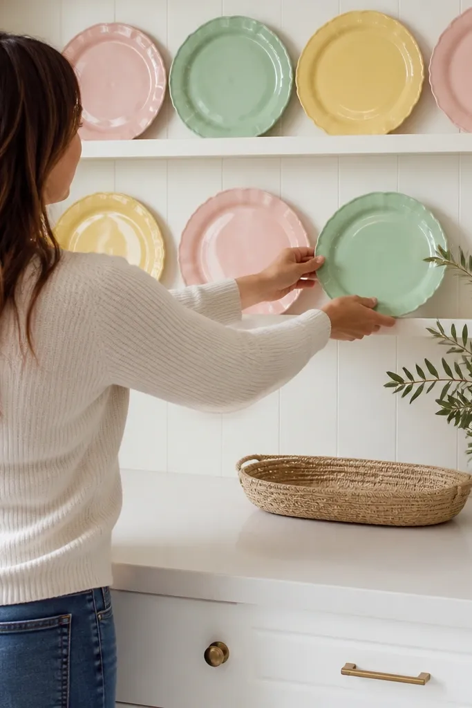
This look is for people who love color but hate seasonal overhauls. The trick is to keep the counter base neutral and let the plates do the talking. Use a light countertop, white cabinets, and one pastel set displayed in a way that looks intentional. In winter, swap the plate arrangement to deeper tones like cream with one muted berry or terracotta — the base stays the same. Your kitchen stays photogenic because the color is concentrated in one display area.
First, choose neutral base colors: white/cream cabinets and a light countertop. Then create a plate display on open shelving or a wall shelf near the dining zone. Use 8-12 plates max and keep them grouped by color family so it looks designed. Finally, rotate the plate colors by season while keeping the placement layout unchanged.
Add a simple plate stand or a small framed print under the shelf so the display has a “frame” in photos.
Don’t scatter plates across multiple surfaces; one display wall looks clean, two looks chaotic.
8. Black-and-White Tile Floor + Checker Backsplash Pop

High-contrast tile patterns make a kitchen look designed even when you keep decor minimal. If your build includes a black-and-white checker floor or you can add that vibe, keep the rest simple: white cabinets, clean countertops, and a small backsplash pattern that echoes the floor. This style is year-round because the pattern is graphic, not seasonal. It also makes the room look “styled” in screenshots because the eye has a strong structure to follow.
Pro tipUse black accents sparingly; repeating black in the faucet, handles, and crock is enough to tie the pattern together.
First, match the pattern scale: if your floor checks are small, choose a backsplash pattern that’s also small-scale. Then keep cabinetry and countertop in light neutrals so the pattern doesn’t fight for attention. Add one accent zone: a single checker backsplash section behind the stove or sink. Finish with minimal decor — a monochrome utensil crock and one plant in black or white.
Watch outAvoid adding bright colors in more than one spot; the checker pattern already adds visual punch.
9. Blush + Gold Small Dining Table Styling
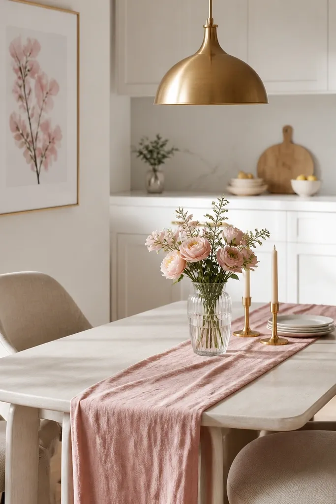
If your kitchen includes a dining table, a blush-and-gold theme makes it look soft and expensive without being themed to one holiday. Use blush as a runner or chair cushion accent, and keep the rest neutral so the kitchen still reads bright. Gold works best in small doses: one pendant, one picture frame, or a single candle holder. This look stays year-round because blush is gentle and gold is warm — both feel good in winter and spring photos.
Pro tipMatch the gold tone across at least two items; one gold pendant plus a gold tray looks intentional, even if the rest is plain.
First, pick a small dining table with a light wood or white top so blush shows clearly. Then add a blush runner across the center and place a gold centerpiece tray on top with one tall candle or vase. Keep plates and glassware in white/clear. Finally, add two seasonal swaps: a small fruit bowl in summer and a neutral seasonal jar in fall/winter.
Watch outDon’t add blush to cabinets; keep it to textiles and decor so the kitchen doesn’t feel too themed.
10. Monochrome Olive Kitchen Shelf Styling
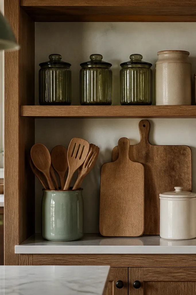
Olive is one of the most forgiving colors for year-round bloxburg kitchen ideas because it reads natural and doesn’t scream a season. Build the look around one shelf display: olive glass jars, cream ceramics, and neutral wood cutting boards. Monochrome doesn’t mean “all one shade” — it means you keep the same family so everything looks coordinated. This style looks good even when the rest of the kitchen is simple because the shelf becomes the photo focal point.
Pro tipUse labels or consistent jar shapes; even plain jars look more styled when they match in size and silhouette.
First, choose one shelf location and commit to an olive-and-neutral palette. Then stack jars by height: one tall jar, two medium, and the rest low, so the shelf has a clean silhouette. Use cream bowls or off-white plates as the base layer. Finally, add one greenery element like a small plant or faux sprig in a neutral pot to bring life to the palette.
Watch outDon’t mix too many jar colors; if you add black, blue, and red together, olive stops looking cohesive.
11. Red Accent Stove + White Shiplap Wall
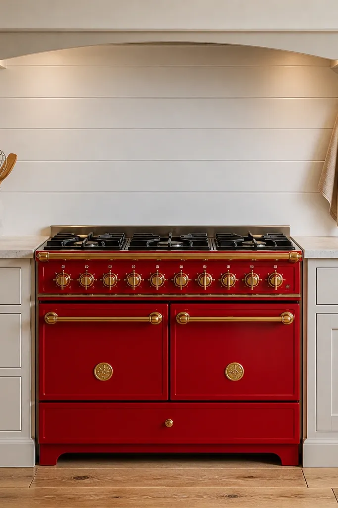
A red stove or red accent element gives you instant warmth, but only if the surrounding wall stays light. Use a white shiplap-style wall panel behind the stove or in the cooking zone. The contrast makes red pop in photos and keeps the kitchen feeling cozy without adding heavy holiday decor. This works year-round because you can keep the red as the anchor and rotate only small items — like a neutral utensil holder or seasonal fruit bowl.
First, keep the wall and cabinets white or light cream so the red anchor is readable. Then place the red stove or red appliance accent centered against the shiplap wall. Add a simple backsplash trim in a neutral tone to stop the wall from looking flat. Finally, style the counter near the stove with one red or neutral utensil crock and a single cutting board.
Add one small piece of wood near the stove zone; red and wood look good together in screenshots.
Don’t add multiple red decor items; one strong red anchor is enough.
12. Scandinavian White Kitchen with Natural Rattan Baskets
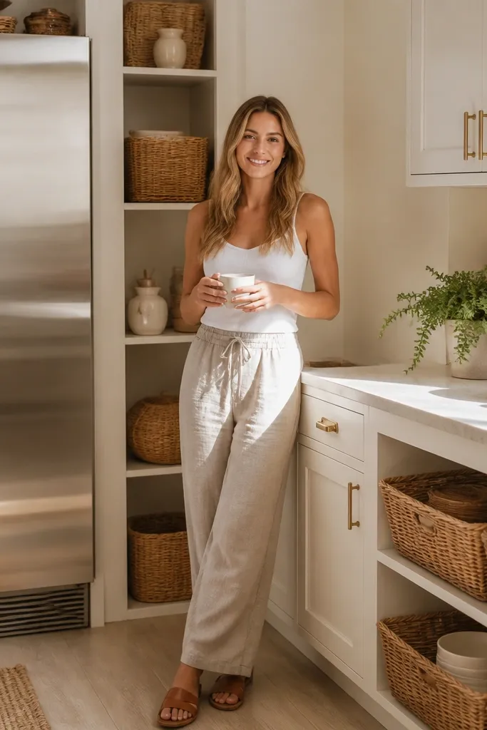
Scandinavian white looks clean in every season, but it can get boring without texture. Rattan baskets fix that fast. Use white cabinets, light counters, and add rattan baskets on open shelves or next to the fridge. The baskets bring a warm, woven texture that reads cozy in winter and fresh in summer. This kitchen style also makes it easy to rotate decor because baskets handle any color theme — they’re neutral and textured.
Pro tipChoose baskets with a similar weave thickness; mixed weaves look messy next to each other in Bloxburg screenshots.
First, set your base to white or near-white cabinets and keep countertops light. Then place rattan baskets in two spots: one for towels near the sink, and one on an open shelf for pantry items. Style the basket contents so you see texture — folded linen towels, wooden utensils, or neutral packaged goods. Finally, add one small plant in a light pot to finish the Scandinavian look.
Watch outAvoid bright patterned rugs in this setup; keep floors and textiles neutral so rattan stays the texture hero.
13. Warm Chrome Sink Faucet + Glass Cabinet Door Display
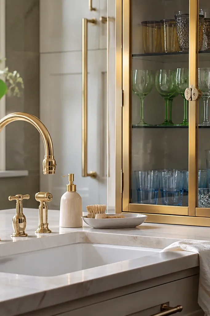
Glass cabinet doors make a kitchen feel styled because you can “show” your best pieces. Pair warm chrome or warm metal faucets with glass-front cabinets and keep the interior organized by color. This is especially good for year-round bloxburg kitchen ideas because glass looks good in any season — it catches light and makes the room feel brighter. Use a simple arrangement: clear glass, white ceramics, and one accent color like amber or sage.
Pro tipUse one accent color inside the glass cabinets only; it keeps the display from looking random when you rotate seasonal decor.
First, add glass-front cabinet doors to one section near the dining or coffee area. Then place 10-15 items inside, grouped by type: cups together, bowls together, and one small serving piece centered. Keep your countertop clean so the glass display becomes the main visual. Finally, add a small accent outside the cabinets — like a matching tray near the sink — to tie the metal and glass together.
Watch outDon’t overload glass cabinets with too many small items; it turns into visual noise fast.
14. Chocolate Brown Cabinets + Cream Pendant Over Dining
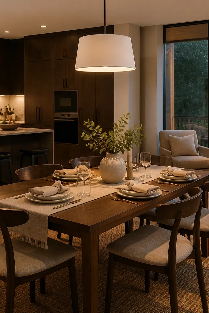
Chocolate brown cabinets create a grounded, cozy base that looks great in both bright and dim lighting. The key is to keep the dining lighting and textiles light so the room doesn’t feel heavy. A cream pendant over the dining table adds softness and gives you a clear photo focal point. This look is year-round because chocolate brown works with nearly every seasonal accent color — greenery, berries, or neutral spring florals all sit well against it.
Pro tipIf your kitchen lighting is cool, switch to warmer bulbs in your build settings so chocolate brown looks rich instead of muddy.
First, choose chocolate brown cabinetry and keep walls light to balance the depth. Then place a cream pendant directly centered over the dining table or island seating. Add a cream or light-beige runner and keep plates neutral. Finally, add a small seasonal centerpiece on the table: a simple vase with one color family item, not a full themed set.
Watch outDon’t add dark curtains and dark decor together; lighten at least one textile so the room still photographs bright.