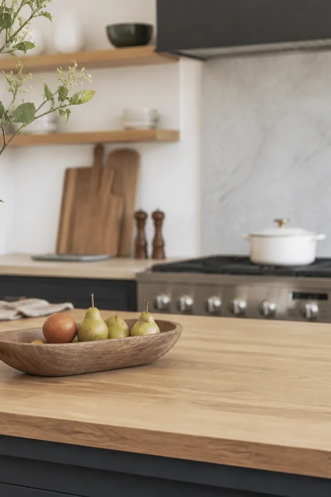
1. Maple butcher block with white shaker cabinets and a glossy subway backsplash
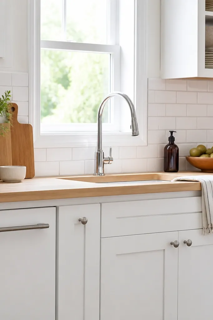
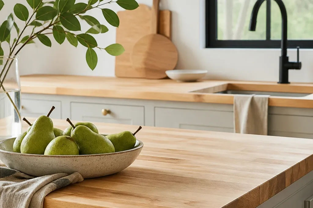
Aim for a finish that reads satin, not glassy. If you’re working with pre-finished butcher block, choose one labeled for food-contact or a kitchen-safe top coat. Pair chrome or brushed nickel hardware to keep the palette cool enough to avoid a yellow cast.
Maple keeps the countertop in the “airy” zone because its grain stays light and warm. The glossy subway tile adds reflectivity, so the countertop reads cleaner even when there’s a little everyday clutter. I like a white grout or very light gray because it makes the backsplash look crisp and keeps the whole wall from turning muddy. A simple eased edge makes the counter look intentional instead of chunky.
Watch outAvoid pairing maple with a matte black backsplash and very dark hardware — the contrast makes tiny scratches stand out.
Pro tipWipe any soap residue with a damp microfiber cloth the same day you notice it — it prevents the “film” look that makes light counters feel dull.
2. Birch butcher block with warm greige cabinets and brass accents
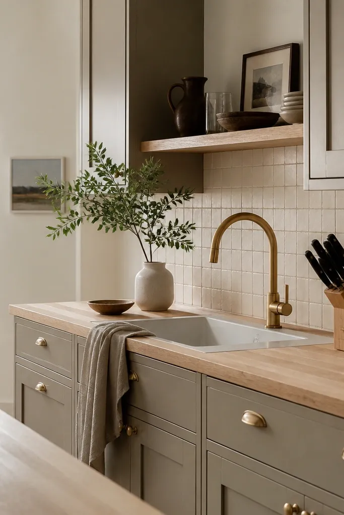
Choose a birch top with a pale stain-free or low-stain look. Keep the brass finish in the same family as your lighting (brushed brass works best with warm greige). Use a light gray or warm white grout so the backsplash doesn’t compete with the countertop tone.
Birch has a slightly cooler, straighter grain than maple, which keeps the surface from going too honey-colored. Warm greige cabinets soften the whole palette, while brass adds glow without making the wood look orange. The cream backsplash tile has texture — it hides tiny splatter better than flat glossy tile. This combo makes the kitchen feel lived-in but still bright.
Watch outAvoid using bright gold hardware with cool gray cabinets; the wood can look mismatched and the whole room feels off.
Pro tipPut a small tray under the faucet with a liner you can swap weekly; it keeps water spots from forming right where you notice them most.
3. Ash butcher block with pale blue walls and a light stone-look backsplash
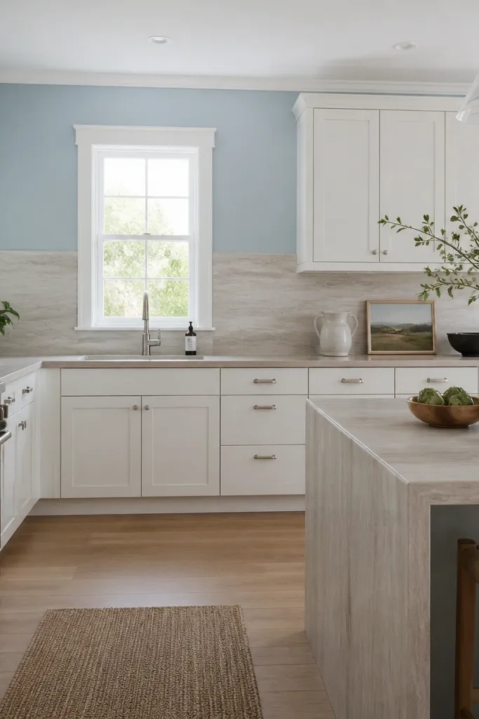
Ash reads lighter and slightly cooler, which pairs beautifully with pale blue paint. Stone-look porcelain gives you the airy feel of natural stone without the maintenance drama, and it doesn’t pull focus from the wood. A waterfall edge on the peninsula makes the countertop feel integrated, so the room looks more custom. The cool wall tone balances the wood’s warmth so it stays “clean light,” not yellow.
If you’re doing a waterfall, make sure the butcher block thickness and the under-mount sink cutouts are planned before install. Use a satin finish so the wood catches light but doesn’t glare. Keep your backsplash in the warm-white to light-beige range, not stark white, so it doesn’t clash with the blue.
Use a light-colored sponge right after spills; darker sponges can leave lint that shows on satin finishes.
Avoid pairing ash with a very white, glossy tile backsplash — the combo can make the wood look too gray.
4. Light butcher block topped bar area with white open shelving
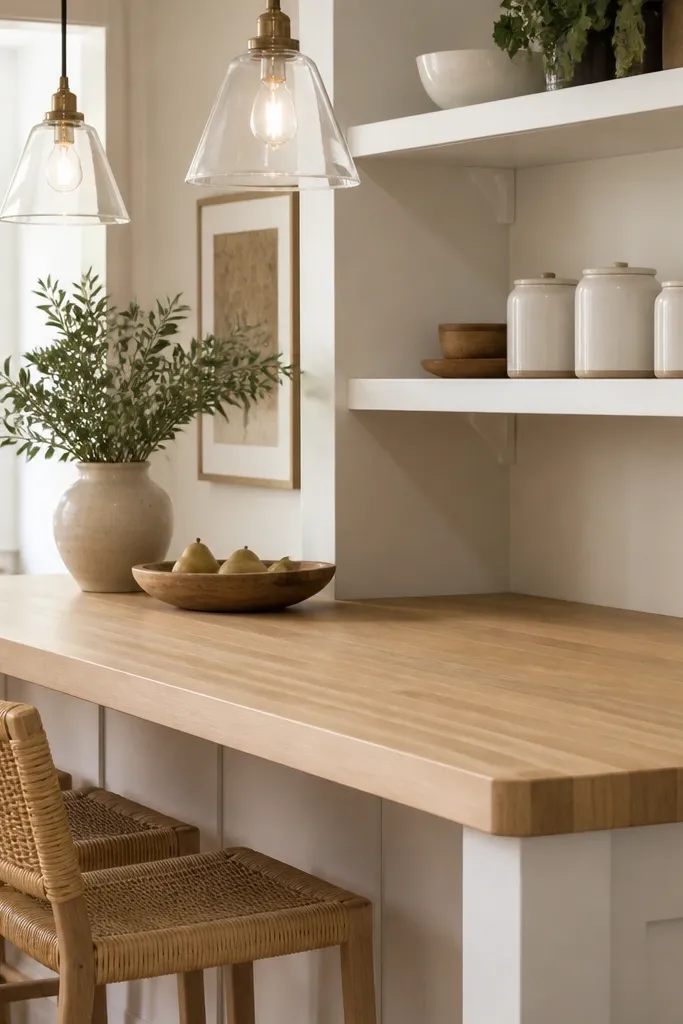
Match the bar finish to the main counter if you have one, or go one shade lighter for a brighter focal point. Use a small cutting board stand to keep prep tools off the surface when you’re not using them. Pendant lights with warm bulbs (2700K) make the wood look creamy, not washed out.
A butcher block bar is the quickest way to get that airy wood look without committing the whole kitchen. Open shelving keeps sightlines light, and the butcher block gives warmth so the space doesn’t feel like an office. When you keep the shelf items in a tight color range (white, cream, pale wood), the countertop looks intentional instead of cluttered. The eased edge makes the bar feel slim and modern.
Watch outAvoid mixing too many wood tones on open shelves; it breaks the airy look fast.
Pro tipSet your canisters slightly forward on the shelf so they reflect light; it makes the whole counter area feel brighter.
5. Butcher block with a pale oak cabinet frame and white panel doors
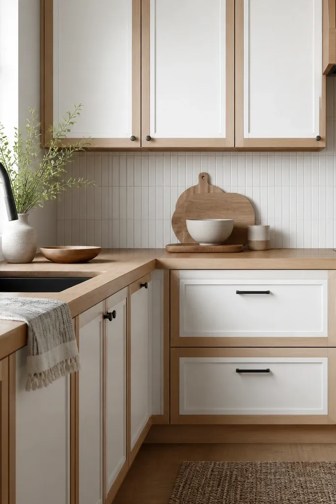
Pick a butcher block finish that matches the pale oak undertone — both should lean warm. Install the counter with a clean caulk line at the backsplash to keep the seam from looking messy. Use a black soap dispenser and a black canister set so the contrast looks planned.
This setup works because the wood tones are close, but the paint keeps the palette bright. The pale oak frame makes the butcher block look like it belongs there, and the white doors keep the room from feeling heavy. A subtle linear backsplash adds movement without darkening the space. Black faucet hardware gives contrast that doesn’t fight the light wood.
Watch outAvoid white-on-white with a cool gray backsplash; the wood can look like it’s turning yellow by comparison.
Pro tipUse a matte black tray under the sink instead of a clear one; it hides water spots better on light wood.
6. Single-panel butcher block with a light quartz backsplash and brushed nickel hardware
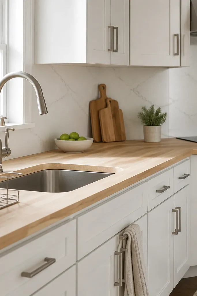
Choose a butcher block with a uniform seal; uneven seal shows as darker stripes when the light hits. Keep the quartz in a creamy white, not bright optic white. Use a dish rack with a light base so drips dry quickly and evenly.
When you pair butcher block with a quartz backsplash, you get the airy look without the porous trouble. The brushed nickel keeps reflections soft, which helps light wood look even and not patchy. This combo is also great for busy households because quartz wipes clean fast, so you’re not scrubbing around the counter. The bevel edge reads tidy and doesn’t visually thicken the counter.
Watch outAvoid high-gloss chrome right next to satin wood; it creates a harsh shine line that makes wear look worse.
Pro tipDry the sink area right after dinner — the backsplash is forgiving, but the counter edge is where rings start.
7. Butcher block with a pale green tile backsplash and white farmhouse sink
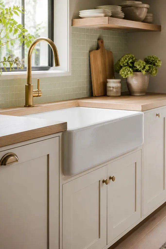
Use a butcher block finish that leans warm but not honey. Light green tile with a white or cream grout keeps the backsplash airy. Center a small soap tray on the counter edge to catch drips and prevent tiny rings from forming near the sink.
Pale green tiles add color without darkening the room, and they make the wood look warmer in a good way. The white farmhouse sink brightens the sink zone, so the countertop around it looks cleaner too. Brass in this setup feels vintage-fresh, not heavy, because the tile color is light. The key is keeping the green muted and the grout light.
Watch outAvoid dark green backsplash tile with warm honey butcher block; it turns the wood orange and makes scratches show.
Pro tipIf you use bar soap, cut it in half and keep it on a draining soap dish — water pooling is the #1 cause of dull spots on light wood.
8. Butcher block with a light linen runner and open rattan accents
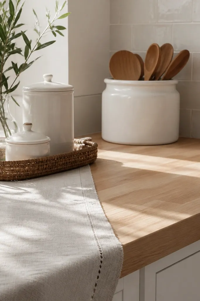
This is the “airy, lived-in” look that still stays practical. Linen and rattan soften the visual edges of the wood, so small nicks and hairline scratches don’t look like damage. The runner also protects the surface where you set hot mugs or rest your hands while cooking. Light cream and off-white keep the wood from looking too yellow.
Use a runner that is machine-washable and sized so it doesn’t touch the sink area. Leave 6-8 inches of clear counter space around it so crumbs don’t collect under fabric. Choose rattan trays with a light finish so they don’t darken under indoor lighting.
Shake crumbs off the runner into a trash can, then spot-wash with a little dish soap — don’t soak it and leave it dripping on the counter.
Avoid placing a permanently damp cloth or dishtowel on the wood — that’s how you get dark blotches.
9. Corner workstation with light butcher block and a built-in utensil rail
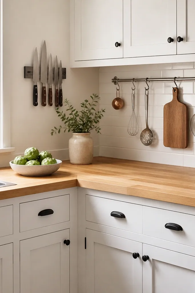
Install a rail with enough clearance so long-handled tools don’t bump the backsplash. Place the knife magnet away from the sink splash zone. For the butcher block, choose an edge profile that doesn’t catch crumbs at the corner seam.
A corner workstation makes the wood feel intentional because everything is organized around it. The utensil rail keeps tools off the counter, which means you’re not dragging cutting boards and utensils across a light surface. Knife storage on the wall or near the corner reduces the chance of accidental drops. This setup keeps the counter looking clean even when you’re actively cooking.
Watch outAvoid storing wet dish brushes on the counter edge; it creates a dark band right where the splash hits.
Pro tipUse a small corner cutting board that fits the space — it keeps you from using the whole counter as a cutting surface.
10. Light butcher block with a patterned tile backsplash in warm white and tan
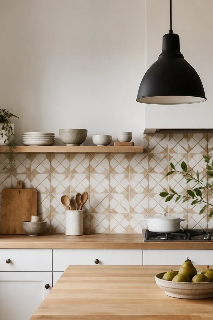
Pick a butcher block finish that matches the tan undertone, not the brightest white in the tile. Use a seal that resists staining from sauces because patterned backsplashes often get splatter. Keep your countertop accessories in white, cream, or natural wood so the pattern doesn’t clash.
Patterned tile adds personality, and the butcher block keeps it from feeling too sharp. Warm white and tan in the tile repeat the wood’s tone, so the countertop looks like it belongs. Matte black lighting gives contrast without darkening the whole room. The result feels airy because the tile uses lighter colors and the counter stays pale.
Watch outAvoid a cool gray patterned backsplash with warm maple; the mismatch shows as a yellow-green tint.
Pro tipSeal the backsplash grout and keep a small bottle of grout cleaner — dirty grout makes light kitchens look dingy fast.
11. Butcher block around a farmhouse sink with a small backsplash shelf and greenery
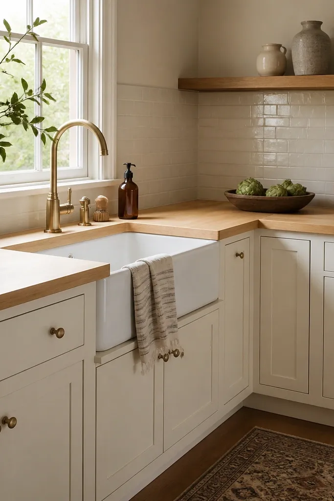
Choose ceramic planters in white, cream, or pale terracotta. Put a small tray under the faucet to catch water, since sink zones are where rings start. Use a soft matte finish on the butcher block so the shelf shadows don’t create glare bands.
A small shelf makes the sink wall feel finished, and it draws the eye up so the counter looks cleaner. Greenery in ceramic pots adds softness, and light butcher block keeps the palette warm. This works best when you keep the shelf styling minimal — two or three items, not a full collection. The counter looks airy because the visual weight is higher than the surface.
Watch outAvoid placing plants directly on the counter; soil moisture and drips are the fastest way to ruin a light finish.
Pro tipMist the greenery outside and wipe the leaf surfaces dry before bringing it in; water droplets can stain light wood if they land and sit.
12. Butcher block with a light gray glaze cabinet and brass cup pulls
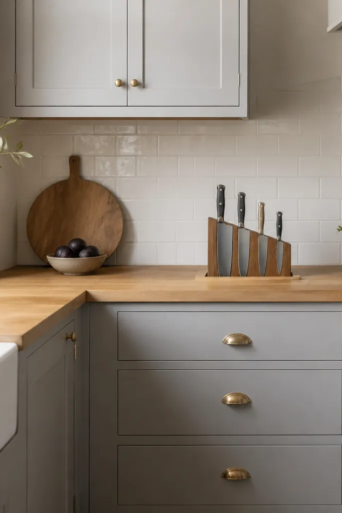
Light gray glaze cabinets add depth without turning the room dark, and the butcher block warms it back up. Brass cup pulls look good against both gray and pale wood, and they add gentle shine that matches the light surface. A simple white tile backsplash keeps focus on the wood and hardware. The countertop stays airy because the gray is light enough to reflect daylight.
Pick a butcher block with a smooth finish — glaze cabinets show texture through shadows. Keep brass hardware consistent across faucet, pulls, and lighting fixtures. Use a light-colored fruit bowl so it doesn’t stain from condensation.
Keep a roll of paper towels next to the sink and dry the counter right after wiping it — light finishes show water spots when you let them air-dry too long.
Avoid dark gray cabinetry with a very warm butcher block; it reads muddy under normal kitchen lighting.