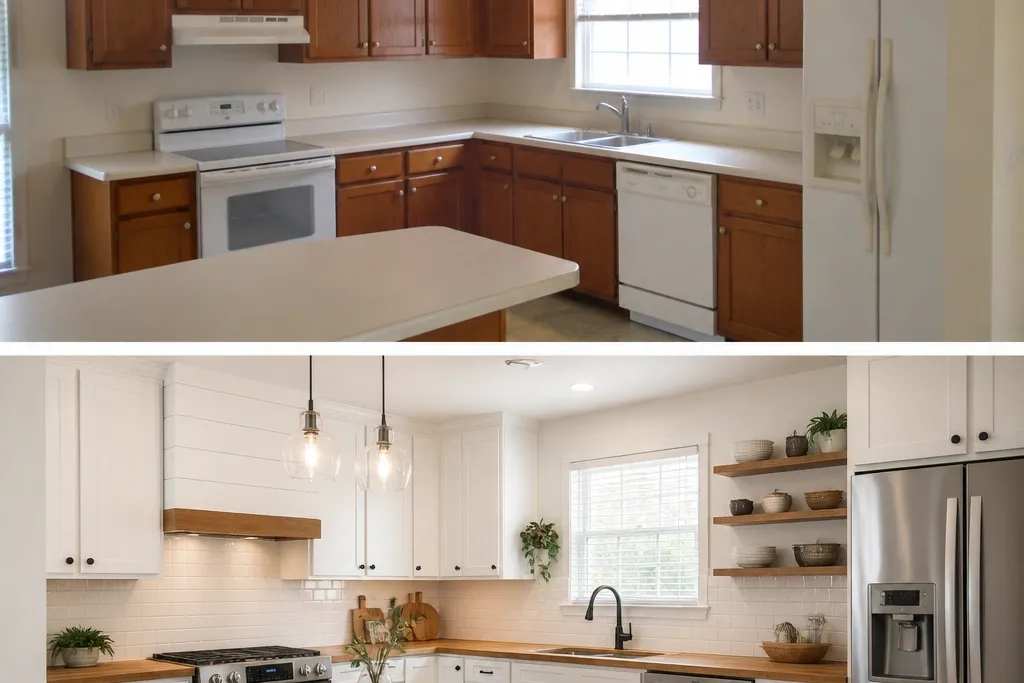
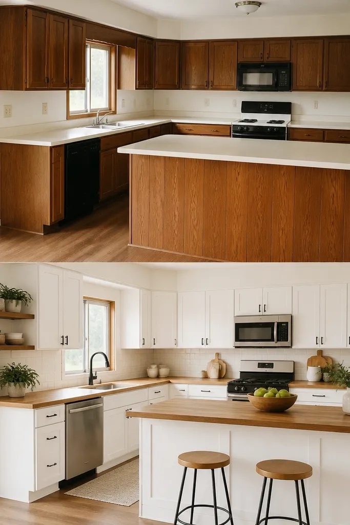
1. Warm-white shaker cabinets with golden butcher block + brushed brass pulls
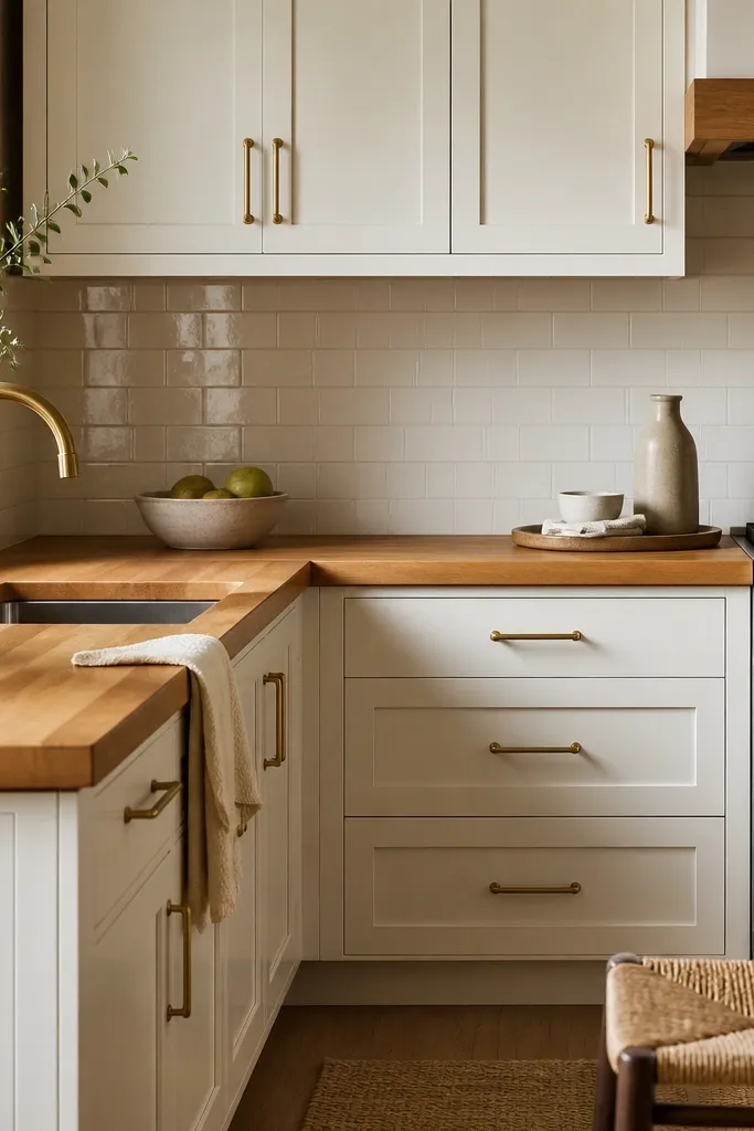
This combo works because warm-white shaker cabinets give you a clean frame while the butcher block adds real color depth. Brushed brass ties the wood’s golden tones to the rest of the room without making it look shiny or flashy. The off-white tile backsplash keeps the focus on the counter and hardware instead of competing with it. It reads cozy because the wood grain is visible, not hidden under a heavy stain.
Use a butcher block finish that looks like honey or golden oak, not gray. Keep hardware in one metal family — brushed brass — and match your faucet. If your cabinets have a matte paint, use a butcher block oil finish that stays satin, not glassy.
Pro tipBring a cabinet paint swatch and a sample of the butcher block under the same light — morning sun and evening bulbs change how “golden” shows up.
Watch outAvoid pairing golden butcher block with very cool chrome hardware — it makes the wood look warmer than the cabinets and turns the whole kitchen mismatched.
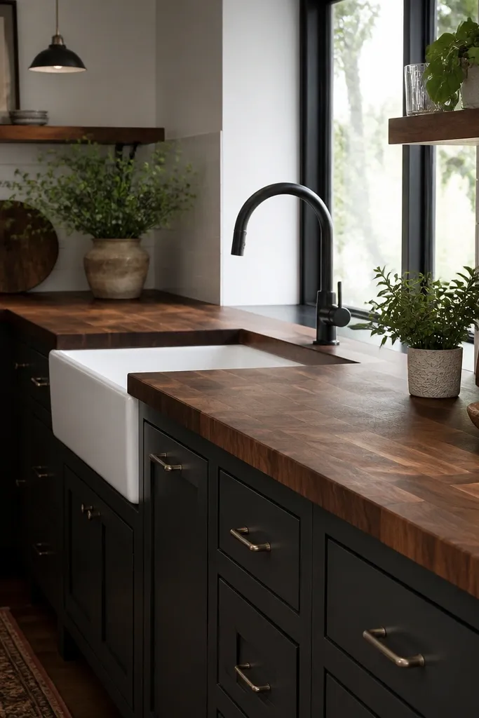
2. Gray-blue cabinets with walnut-toned butcher block + matte black hardware
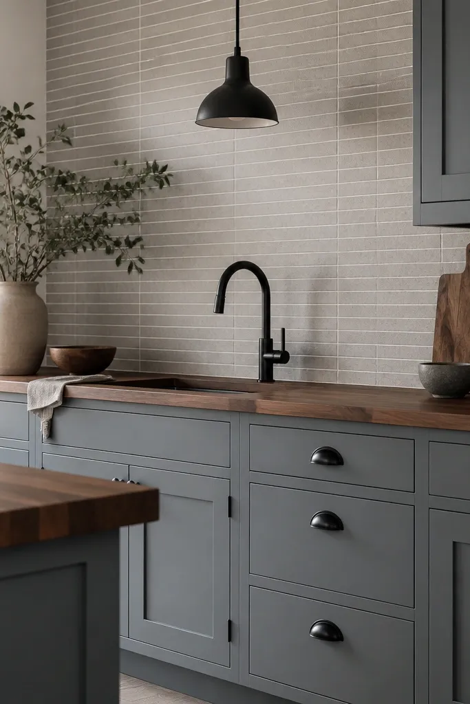
Walnut-toned butcher block adds depth without going orange. The gray-blue cabinet color gives you a slightly moody base, and matte black hardware sharpens it. The result feels cozy but controlled — like a modern farmhouse that doesn’t scream. The wood grain is the warmth, while black keeps it crisp.
Pick a butcher block stain that reads walnut, not reddish mahogany. Keep the black hardware consistent: pulls, faucet, and even a towel bar if you have one. Use grout that is light, so the backsplash doesn’t darken the whole wall.
Pro tipIf your cabinets look a little green in daylight, choose a warmer walnut stain and test a small corner of the counter before finishing the whole thing.
Watch outAvoid using glossy butcher block sealer in a gray-blue space — it can look plasticky under cool lighting.
3. Natural butcher block with white cabinets + stainless faucet + open shelving accents
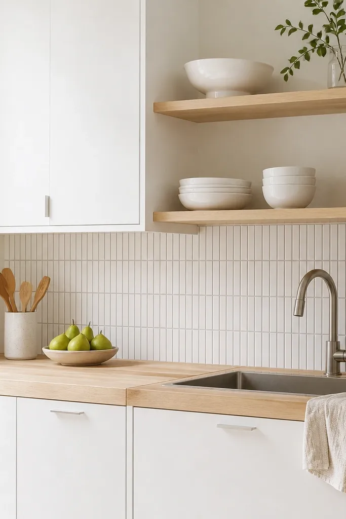
Natural butcher block keeps the kitchen light while still adding warmth through texture. Stainless doesn’t fight the wood here because the wood tone is pale and neutral. Open shelving helps the wood read intentional since you repeat it with a cutting board or wooden utensil crock. This is a good choice for small kitchens because you get warmth without making the counter look heavy.
Choose a lighter butcher block — think pale oak or “natural” with minimal stain. Use simple pulls or even small knobs that don’t add extra visual weight. Add one wood accessory on the shelf, like a 12-inch cutting board leaned upright.
Pro tipPlace a neutral runner (cream with light gray stitching) so the counter edge feels connected to the floor even when the room is mostly white.
Watch outAvoid over-staining the block darker than your cabinet undertone — it can turn the whole kitchen into one big “brown” blob.
4. Two-tone look: white uppers, warm wood lowers + butcher block on the counter
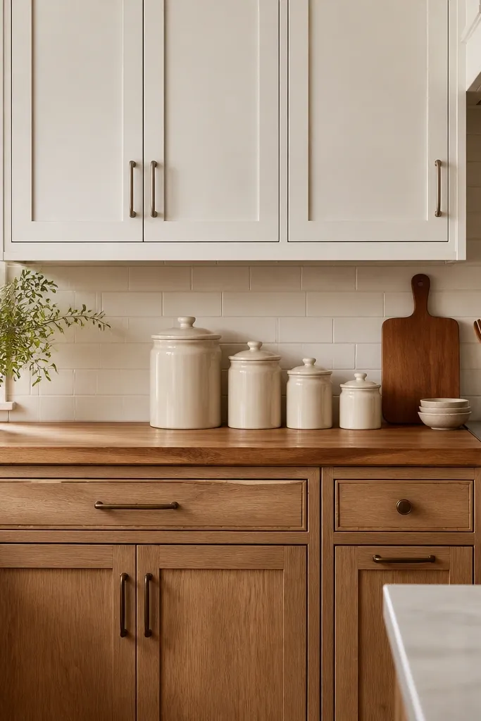
Two-tone cabinets make the butcher block feel like part of the design plan instead of a random upgrade. Warm lower cabinets echo the wood tone, so the countertop looks like it belongs. The trick is keeping the uppers bright so the kitchen doesn’t get heavy. When you repeat the wood tone in the lower cabinets, the room feels layered and cozy.
If you’re working with existing cabinets, paint uppers a true warm white and keep lowers in a warm beige or light walnut stain. Match hardware metal families by cabinet level, not by random pieces. Use a butcher block finish that sits between the two tones — not as dark as the lowers.
Use the same color on cabinet interiors if you can. Even a quick paint job inside the doors makes the whole room look more finished.
Avoid mixing too many metals — two is fine, three turns into a jumble fast.
5. Matte sage cabinets with light butcher block + brass knobs
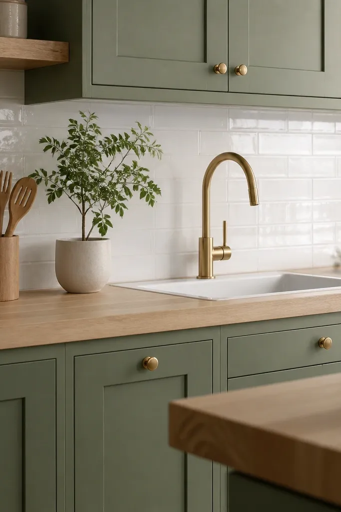
Sage is a quiet color that makes wood look even more natural. With a light butcher block, you get freshness instead of gloom. Brass knobs pull the whole thing together because brass has that warm undertone that wood shares. This look feels cozy because it blends a calming cabinet color with tactile wood grain.
Pick a sage with a gray undertone, not bright green. Choose a butcher block that stays light — you want the grain to show clearly. Keep brass consistent across knobs and faucet so the room reads intentional.
Pro tipAdd a cream countertop cloth or placemat with subtle sage lines so the colors repeat without adding clutter.
Watch outAvoid pairing sage with very dark smoked wood — it can make the kitchen feel older than it needs to.
6. Classic white cabinets with butcher block + black-and-white patterned runner
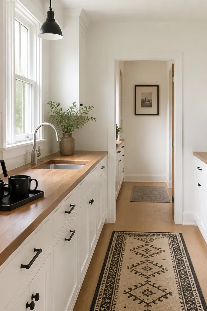
This look uses the counter as the warm anchor while the black details add contrast. The patterned runner gives visual energy that keeps the room from feeling flat, and it ties into the black hardware. Butcher block stays the main texture because the runner pattern doesn’t touch the counter directly. It reads cozy because the room has contrast without being dark all over.
Use a satin-finish butcher block so it doesn’t glare. Keep hardware matte black and choose a black faucet or at least black accessories. If you have a window, use a simple curtain in off-white so the counter stays the star.
Pro tipPlace the runner so it lines up with the stove edge — the symmetry makes the upgrade look planned.
Watch outAvoid using a high-contrast runner pattern that is too large for the kitchen — it can overpower the wood and cabinets.
7. Stained cabinets with grayish butcher block + brushed nickel pulls
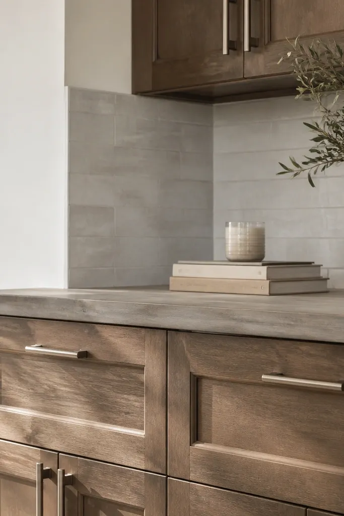
If your cabinets are already stained, you can still get a cozy look by matching the wood temperature. A slightly grayish butcher block helps when your cabinet stain is neutral and doesn’t go red. Brushed nickel keeps it modern without stealing focus. The cozy comes from grain texture, not from making everything golden.
Test the butcher block color next to your cabinet doors before you commit. If the two tones clash, adjust by picking a different stain or switching hardware metal. Keep backsplash grout light so the gray tones don’t sink the room.
Take a photo in both morning and evening light. If the counter looks redder in the evening, you picked too warm a block.
Avoid going gray on a cabinet stain that is clearly warm honey — you’ll get an obvious color mismatch.
8. Cream cabinets with butcher block + farmhouse sink + towel rail
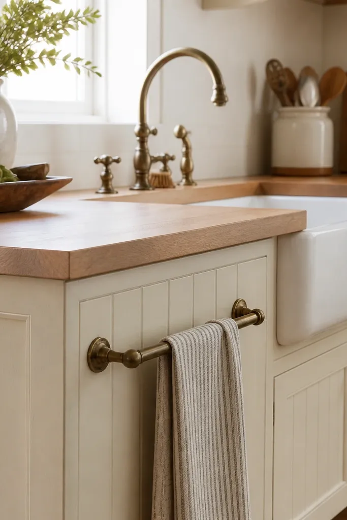
A farmhouse sink makes the butcher block feel like it was always part of the plan. Cream cabinets keep the look soft, and aged bronze hardware adds warmth. The towel rail is small but it gives you a lived-in rhythm — you see it every day, so it makes the kitchen feel cozy. Wood plus ceramic reads warm even without fancy decor.
Choose a butcher block edge that looks hand-finished, like a slightly eased edge. Keep the apron sink size proportional — don’t go tiny if your counter run is wide. Install the towel rail where you’ll actually reach it while cooking.
Use one matching wood accessory — a 9x12 cutting board or a wooden soap tray — so the sink and counter feel connected.
Avoid adding too many farmhouse textures at once. If you have beadboard, keep the backsplash plain.
9. Shaker cabinets with brass corner shelf + butcher block coffee station
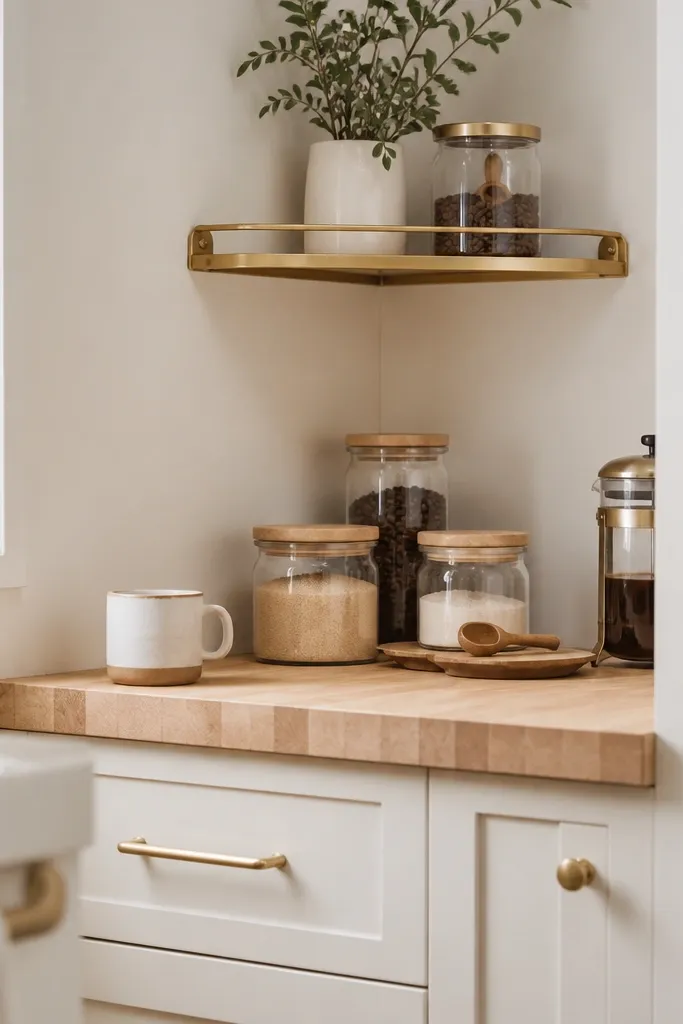
This setup uses the countertop as a functional display, not just a surface. Butcher block brings warmth to the coffee station, and the brass shelf repeats the metal tones you already have in the hardware. Glass jars keep the station airy; the wood scoop ties back to the counter. It feels cozy because it’s used — you can see it working.
Leave a 6-inch clear zone near the sink so the counter doesn’t look crowded. Keep jars within a single height range so the visual stack looks neat. Use a simple tray with a lip to corral items when guests come over.
Measure the shelf depth before you buy — a 6-inch shelf holds jars without crowding the backsplash line.
Avoid placing the coffee station directly against a sink backsplash. Water splash zones make everything look messy fast.
10. Dark navy cabinets + butcher block + white penny tile backsplash
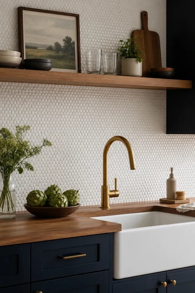
Dark navy makes wood look richer and more expensive. The white penny tile brightens the wall so the room doesn’t feel heavy. Brass accents keep the warm tone consistent, and the tiny tile gives texture that matches the wood grain vibe. This look is cozy because it has warmth in the counter and warmth in the metals, while the backsplash stays light.
Pick a butcher block finish that reads medium — not super dark. Penny tile grout should stay light so it doesn’t gray out the backsplash. Use brass faucet and maybe one cabinet pull per run, not ten random brass pieces.
Pro tipIf your navy paint has a purple undertone, choose a butcher block that leans honey to avoid a muddy combo.
Watch outAvoid pairing dark cabinets with a dark backsplash. You’ll lose contrast and the countertop won’t stand out.
11. Matte black cabinets + butcher block + white countertops accessories
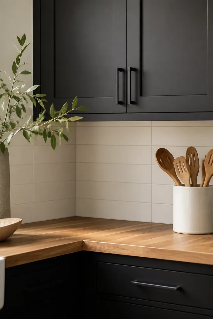
Black cabinets can look cold, and butcher block is the antidote. Keep the butcher block satin so it doesn’t glare against the black. White accessories — crock, canisters, or a dish towel — add contrast and stop the counter from feeling too dark. This is cozy because the wood brings warmth to the whole work zone.
Use a medium-dark butcher block so it reads intentional against black. Choose a backsplash in bright white and keep grout clean. If your faucet is chrome, swap it for brushed nickel or a warm metal to keep the wood from clashing.
Pro tipUse a white cutting board or white ceramic tray on the counter so the black doesn’t visually swallow everything.
Watch outAvoid leaving the counter bare. Black cabinets make empty space look stark instead of modern.
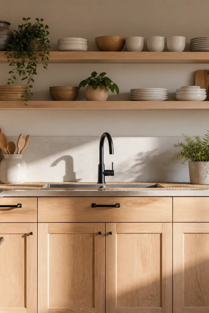
12. Light oak cabinets + butcher block + matching oak floating shelves
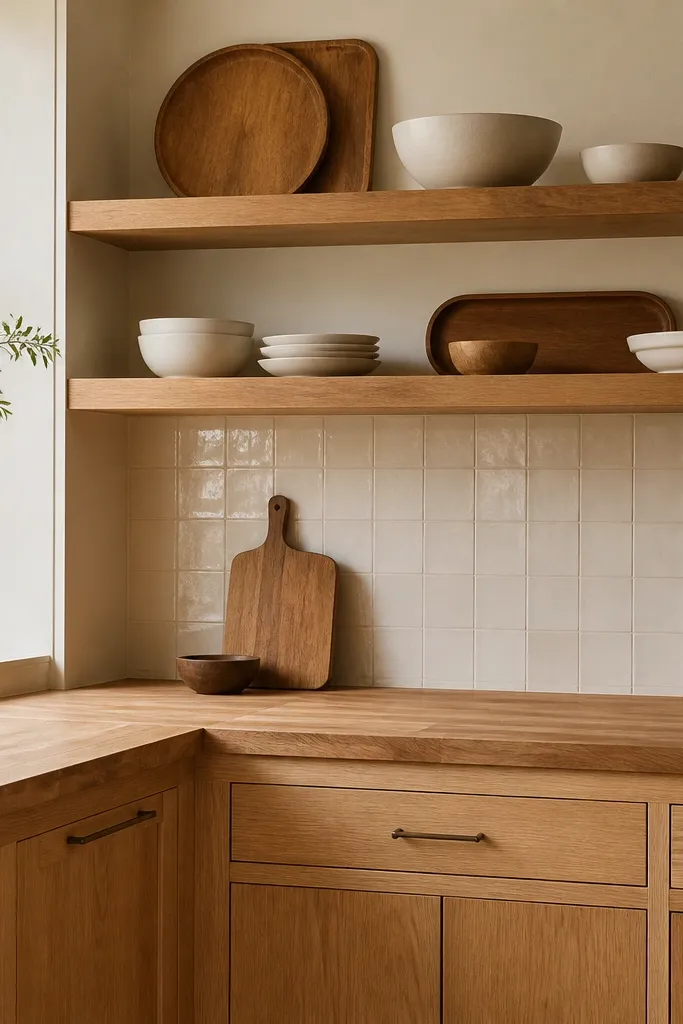
When wood already exists in the cabinets, the butcher block becomes a continuation instead of a contrast. Matching oak shelves echo that warmth and make the whole area feel like one built-in unit. Keep the shelves simple — one tray, one row of bowls — so the wood doesn’t look like it’s repeating for no reason. It’s cozy because the room has consistent warmth from cabinet to counter to shelf.
Aim for a butcher block that matches the cabinet tone, not just the color family. If your cabinets have visible grain, choose butcher block with a similar grain pattern visibility. Keep metal accents minimal — brushed nickel or a muted bronze works well.
Pro tipStagger items on the shelf by height: a tray on the lower edge and a taller bowl in back.
Watch outAvoid mixing two different oak shades. One will look like it belongs, the other will look like a mistake.