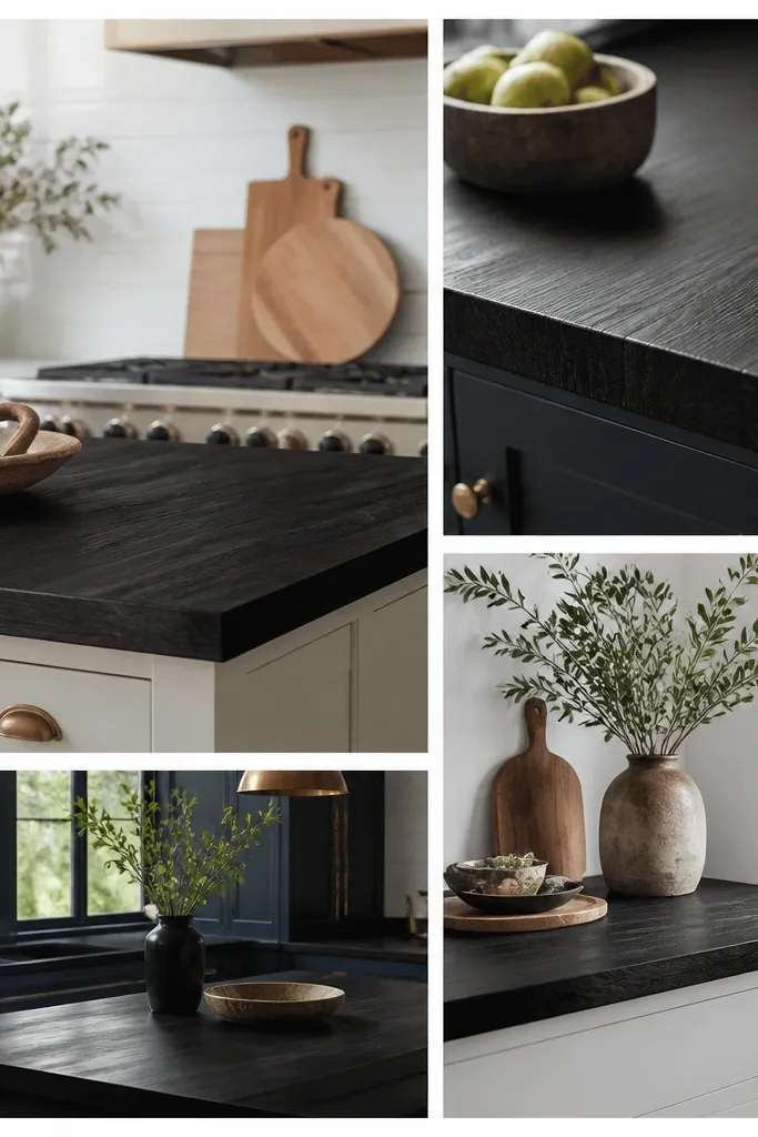
1. Ink-Black Maple With a Soft Eased Edge
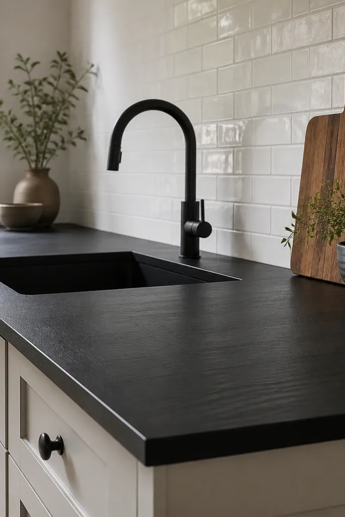
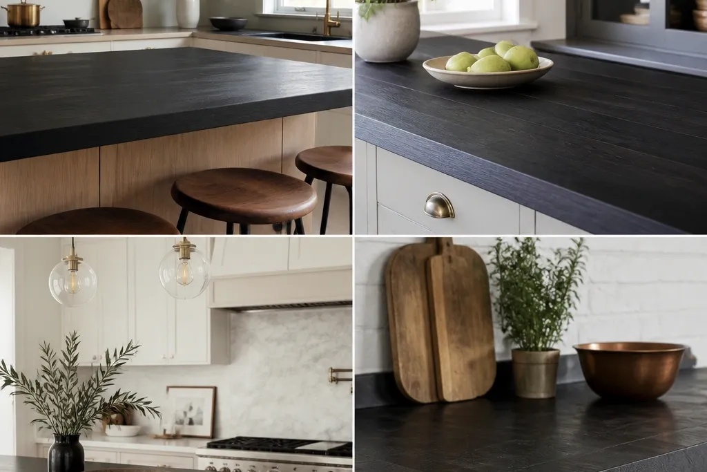
This look is the cleanest visual jump from “normal kitchen” to “designed.” Maple takes stain evenly, so the surface reads smooth and uniform, and the eased edge keeps it modern. The matte finish hides tiny water spots better than high-gloss oils. Pairing it with light tile makes the counter look deeper instead of flat.
Pro tipWhen you wipe it down, use a microfiber cloth that’s damp, not wet, then dry immediately. The surface stays even and you avoid dull patches.
Aim for a 1.5-inch thickness and a simple 1/4-inch eased edge so it doesn’t look bulky. Use matte black hardware and a black faucet with a similar sheen level (not shiny chrome). This fits best with white cabinets, light greige walls, and any backsplash that has clean grout lines.
Watch outAvoid a glossy clear coat on stained black if you want it to look expensive — the shine makes wear spots obvious.
2. Smoked Black Oak With Visible Pore Grain
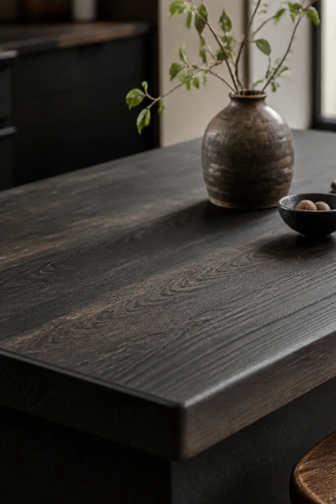
Oak has pores, and black stain on oak shows a smoky grain pattern that looks handcrafted. If you want the counter to look warm instead of harsh, this is the direction. In daylight it looks dimensional, and in warm lighting it reads cozy. The thicker, rounded edge makes the wood feel like furniture, not a sheet of material.
Pro tipBefore final installation, rub a tiny area with mineral oil on a hidden corner. If the undertone goes too brown, you’ll know you need a different stain depth.
Choose a top with a noticeably thicker edge profile, around 2 inches total thickness, and keep the edge rounded at least a little. Style it with brass or brushed nickel — the warm metal tones balance the black without making it feel cold. Works great with creamy cabinets and earthy stone-look backsplashes.
Watch outDon’t pair smoked oak with icy white cabinets and chrome — the whole kitchen can feel like a warehouse.
3. Black Walnut Butcher Block With Deep Brown Undertones
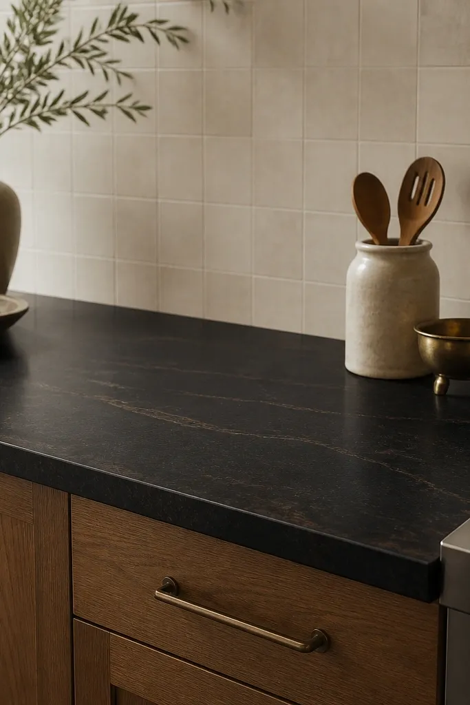
Walnut under black stain gives you a layered look — black on the surface, hints of chocolate brown in the grain. It photographs beautifully because the streaks catch light instead of flattening. This is the style I reach for when a client wants bold but not “painted.” The grain movement makes the counter feel alive even when the kitchen is simple.
Pro tipUse a warm grout color in the backsplash (soft sand or light taupe). It prevents the brown undertone from clashing.
Look for board grain that shows streaks, not uniform pinstripes. Keep edges slightly rounded so the wood grain looks continuous. Use warm lighting (2700K bulbs) so the undertones don’t turn gray.
Watch outSkip cool blue-gray cabinets with walnut undertones — the counter can start looking muddy.
4. Two-Tone Black: Charcoal Stain on Maple With Natural Edge Detail
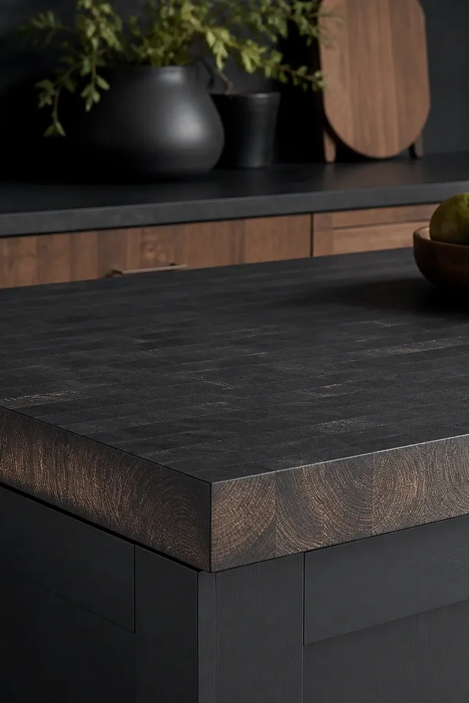
This is for people who want black but still want the wood to show. Charcoal stain sits between black and gray, and leaving some edge tone visible makes the counter look custom and intentional. The natural edge detail draws the eye to the joinery. It also hides scratches because the color variation breaks up scuffs.
Ask for a finish that lets end-grain read slightly lighter, often achieved by partial stain and a consistent topcoat. Pair with white cabinets and a backsplash that has texture, like handmade ceramic with irregular edges. Keep the hardware in black or warm bronze.
If you’re doing a waterfall front, keep the waterfall face the same charcoal tone — don’t let it go fully black or you lose the two-tone effect.
Don’t over-sand after staining — you can erase the edge variation that makes this look work.
5. Matte Black Butcher Block With a Thick 2-Inch Face
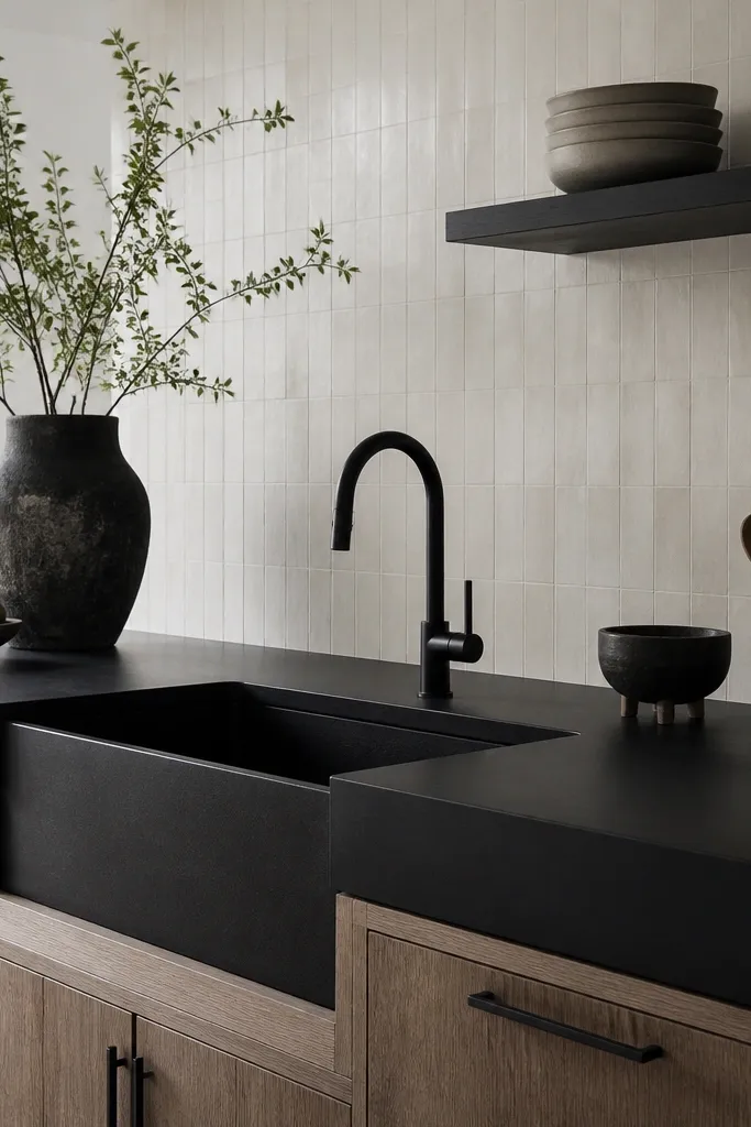
Chunky counters change the whole kitchen proportion. When the face is thick, the room looks grounded, and matte black keeps it from looking heavy. I’ve used this look in small kitchens and it actually makes the space feel bigger because the contrast is strong but clean. The undermount farmhouse sink helps it read intentional instead of “DIY countertop.”
Choose a top that’s genuinely thick, not just a thin board with a faux edge. Keep the edge simple, like a gentle chamfer, so the chunk reads modern. Pair with white shaker cabinets and a plain slab backsplash for a clean, bold look.
Use a sink grid and dry the corners after rinsing — thick tops show water trails on the edge if you let it sit.
Avoid fancy crown molding with a thick matte black top unless you want a traditional-meets-modern mashup.
6. Black Butcher Block With Brass Accent Line
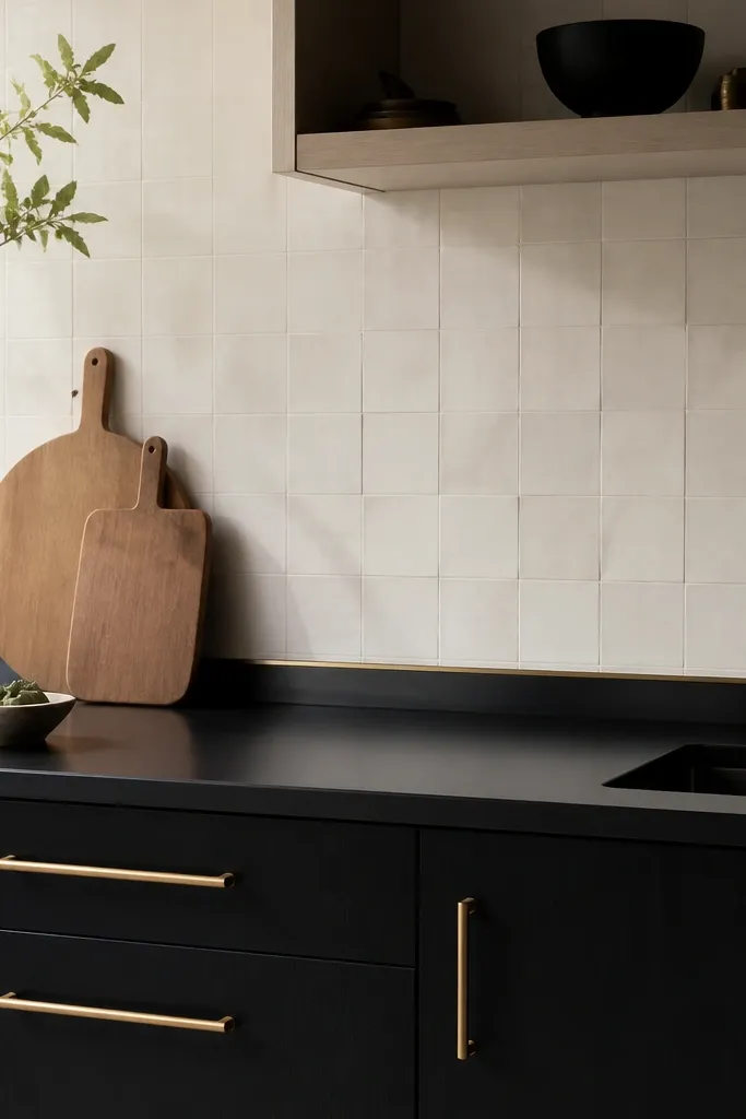
A thin brass accent line makes black butcher block look like custom millwork. The counter stays the star, but the brass gives the eye a “clean stop” at the backsplash height. This is a trick I like when you have a plain tile backsplash that would otherwise look too simple. Brass also warms black so it doesn’t feel sterile.
Install a 1/4-inch brass trim strip at the top edge of the backsplash tile line, centered and straight. Match cabinet pulls to the brass finish and keep other metals minimal. Off-white walls and warm white under-cabinet lights make the brass look rich without going orange.
Hold a straightedge against the tile before trimming — even a 1/16-inch drift shows up fast with a metallic line.
Don’t mix brass with cool-gray countertops in the same kitchen — it makes the brass look dull.
7. Black Butcher Block With White Quartz Backsplash Contrast
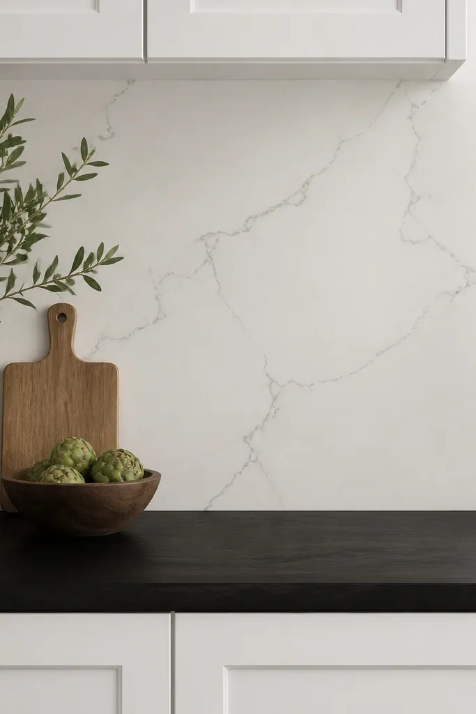
This combo makes black butcher block look crisp instead of dark and heavy. Quartz adds a bright, hard surface behind the wood, so the wood grain stays readable. It’s also practical: you get a clean wipeable backsplash while the counter handles food prep. The contrast is strong, so keep the rest of the kitchen simple.
Pro tipChoose under-cabinet lights with a diffuser so you don’t get harsh shadows on the butcher block grain.
Use quartz with minimal movement, like soft gray veining rather than dramatic patterns. Stick with matte black faucets and simple bar pulls. If you have open shelving, keep it to one shelf line so the eye doesn’t bounce around.
Watch outSkip busy backsplash patterns with this look — the kitchen starts feeling visually loud.
8. Black Butcher Block Around a Stainless Farm Sink
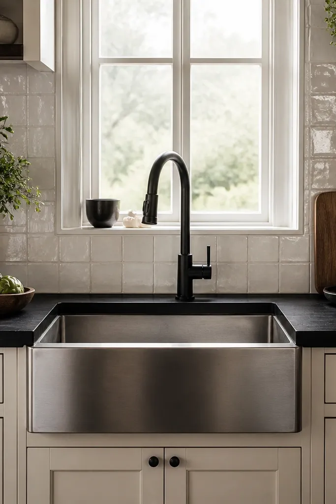
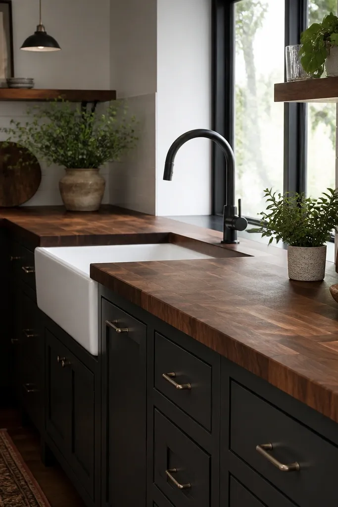
Stainless and black is a dependable pairing because the steel reflects light while the wood stays matte and warm. The sink becomes the focal point without fighting the countertop. I’ve installed this in kitchens where the homeowner wanted bold but still wanted “real work surfaces,” and it always looks practical. The black faucet ties the whole area together.
Pro tipRinse the sink then wipe the counter edge dry after messy prep — the area around the apron gets water trails first.
Use an undermount or apron-front farmhouse sink with clean lines and a black gooseneck faucet. Keep the backsplash grout light so it doesn’t pull gray. If you want extra cohesion, match the sink drain strainer to the faucet finish.
Watch outAvoid a highly polished faucet if your counter finish is matte — the shine makes the wood look dull.
9. Black Butcher Block With a Light Gray Grout Backsplash
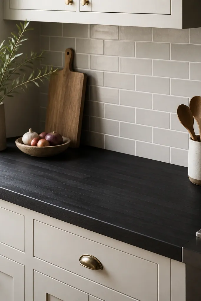
Light gray grout gives you a bridge between black wood and white cabinetry. It stops the backsplash from looking stark, and it makes the counter look smoother in tone. This is the look I pick when the homeowner wants black but doesn’t want the kitchen to feel too contrasty. The grout lines also create a neat grid that frames the counter edges.
Pro tipWhen grouting, aim for a uniform finish — sandy grout texture can make the black counter look blotchy.
Use subway tile with a consistent size, like 3x6, and keep grout thin and even. Pair with brushed nickel or matte black pulls depending on the faucet finish. Off-white cabinets work better than bright white because the undertone stays warm.
Watch outDon’t use dark charcoal grout with a smoky black top unless the whole kitchen is already very dark.
10. Black Butcher Block With a White Ceramic Tile Herringbone
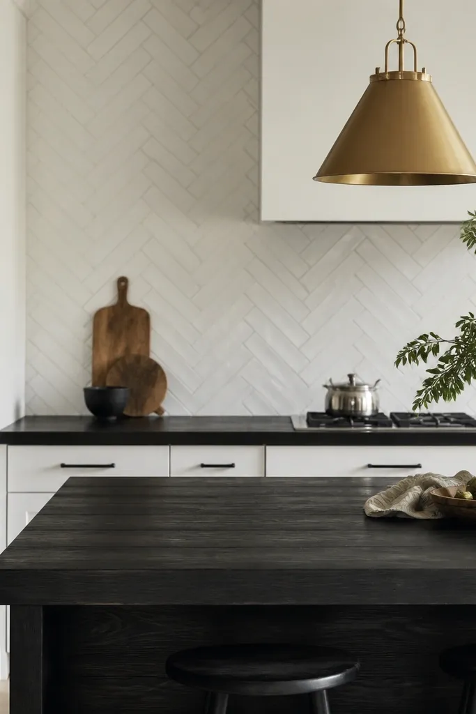
Herringbone adds movement behind black wood, and the counter keeps the palette grounded. The angled tile pattern makes the kitchen feel styled even if you keep cabinets plain. I like it because it makes the butcher block grain look intentional instead of accidental. The brass pendant warms the scene and keeps it from feeling too stark.
Keep the backsplash grout light (soft white or warm gray) so it doesn’t compete with the counter. Use a black faucet and black hardware to keep the focal point tight. If the island has an overhang, keep the overhang at about 10 to 12 inches so the look feels balanced with the tile pattern.
Dry-fit one tile row and mark the center line on the counter edge before you commit to the backsplash layout.
Avoid oversized herringbone tiles with a chunky black top — the proportions can feel off.
11. Black Butcher Block With a White Shaker Cabinet and Black Shelf Rail
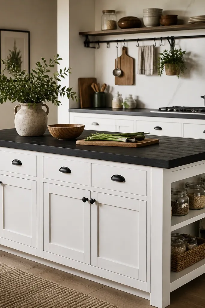
This look is about structure: black counter plus black rail creates a frame around the kitchen work zone. White shaker keeps everything crisp, and the open shelf adds personality without cluttering the counter. The butcher block stays bold, while the rail line makes the room feel organized. It’s a great pick if you want black but don’t want to go heavy on stone or metal.
Install a black metal shelf rail directly under the shelf line, not too low. Use small matching jars and keep labels minimal so the counter stays visually dominant. Stick to one accent metal finish, either black or warm metal.
Use felt pads on jar lids — they keep the open shelf from looking scuffed, which otherwise clashes with matte black wood.
Skip random mismatched jar colors; they fight the strong black counter.
12. Black Butcher Block With a Vertical Grain Finish on a Narrow Bar
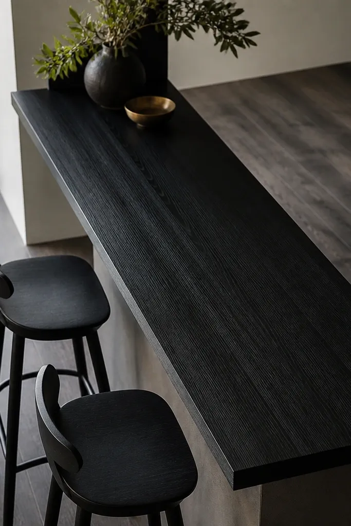
Vertical grain changes the whole mood. On a narrow bar, it reads like a custom bar top, and it makes the black look less flat. The vertical lines also help the bar feel taller and more purposeful. I’ve used this in small dining spaces where a horizontal counter makes the room feel too wide.
Ask for the butcher block boards oriented vertically and keep the bar depth around 16 to 18 inches. Use a bar-height counter finish with the same matte sheen as your kitchen counters. Pair with dark flooring and keep wall paint warm off-white.
Use a bar mat at the exact spot where you set glasses — repeated rings can show on black wood around high-contact areas.
Don’t choose a high-gloss finish for a bar — it shows fingerprints and wipes unevenly.