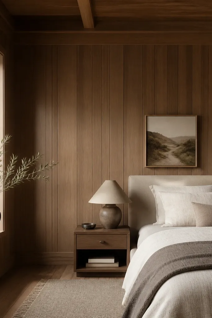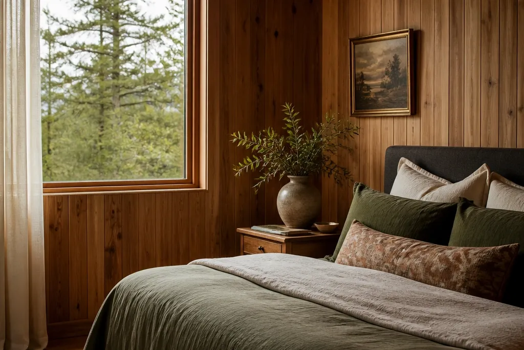
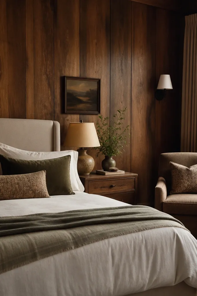
1. Ivory duvet with a whitewashed wood headboard vibe
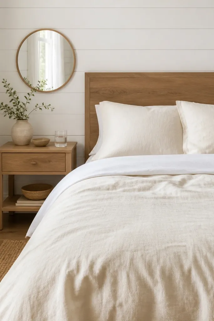
This look works because the walls and textiles share the same warm family. Ivory reads softer than pure white against painted panels, so the room feels lived-in instead of showroom-clean. The light wood headboard and nightstand keep the warmth from disappearing into the white walls. A round mirror adds a curved shape that calms the vertical paneling.
Use an ivory duvet cover with a matte weave (cotton-linen blend works well). Keep pillow sizes consistent: 20x26 inches for standard pillows, plus one 18-inch square accent pillow. Place the nightstand within 2-4 inches of the bed frame edge so the composition looks intentional. Hang the mirror so its center is about 60 inches from the floor.
Choose a duvet cover with visible slubs or a subtle texture so it catches light without looking glossy.
Avoid pure bright white bedding against warm-toned panels — it can look washed out and gray.
2. Matte white walls, oatmeal knit throw, and brass bedside lamps
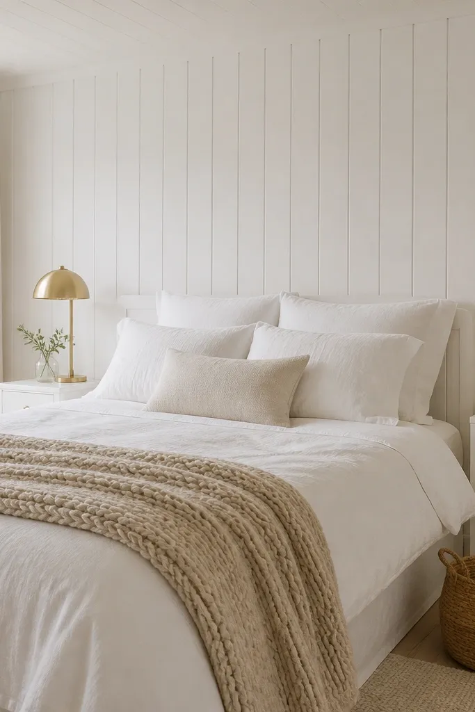
Brass warmth is the easiest fix for white panel walls that feel cool. The oatmeal knit throw adds chunky texture, which softens the wall’s straight lines. Slim white nightstands keep the look bright, while the lamps introduce a second warm tone so your eye has something “cozy” to land on. Woven baskets bring in fiber texture that doesn’t compete with the panels.
Pick brass lamps with frosted glass or an off-white shade so the light spreads gently. Drape the knit throw so it hangs 10-14 inches over the foot of the bed. Add one woven basket with a flat lid or open weave near the nightstands to repeat the fiber look. Use 2700K bulbs in both lamps.
If your lamps look too yellow, swap to bulbs that are still warm but less intense, like 2400-2700K range depending on your fixture.
Don’t use shiny satin throws — they reflect the panel light and make the room feel colder.
3. White panel walls with a taupe headboard and layered pillows
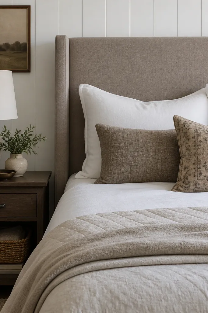
A taupe headboard gives the eye a “buffer” between the painted panels and your bedding. Upholstery also absorbs light, which makes the room feel softer at night. Layered pillows in two neutrals plus one muted pattern add depth without turning the room busy. Dark wood on the nightstand anchors the white walls so the space doesn’t float.
Choose a headboard with a matte fabric like linen-look or tightly woven performance fabric. Use three pillow types: two standard pillows in white, two smaller lumbar pillows in taupe, and one patterned accent. Keep the patterned pillow restrained — muted lines, tiny florals, or a subtle geometric in beige-brown.
Pro tipMatch the underside of your lampshade to your taupe tone so the light looks warmer against the white panels.
Watch outSkip high-contrast black-and-white pillow patterns — they make panel walls feel harsh.
4. All-white bedding with a charcoal runner and warm wood accents
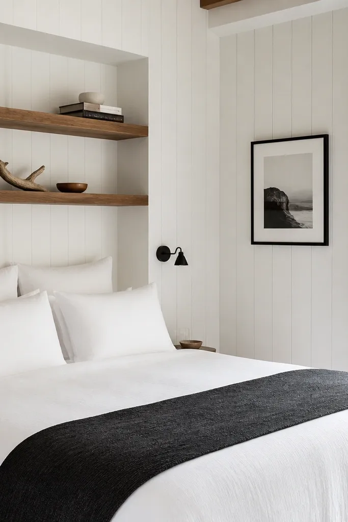
Charcoal adds grounding without darkening the whole room. The runner is a targeted way to bring contrast to panel walls because it stays in the bed zone instead of spreading across the walls. Warm wood shelves keep the contrast from feeling cold. This combo reads bright at a glance, but cozy up close.
Use a white duvet with a slightly textured cover (waffle or slub). Add a charcoal runner about 18-22 inches wide, centered at the foot. Install two floating shelves above the bed and style them with one ceramic vase and one book stack. Keep the frame color to black or dark brown, not both.
Pro tipIf you want it cozier, switch the runner fabric to wool felt or heavy cotton canvas instead of a thin woven.
Watch outDon’t add too many dark items at once — one runner plus one dark frame looks intentional.
5. Boucle pillows and a cream shag bedside rug
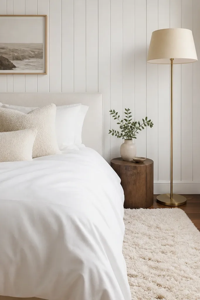
Boucle and shag are my go-to when white panel walls start to feel “too straight.” The bed looks soft and touchable, and the rug adds a cozy landing zone right where your feet go in the morning. A tall floor lamp gives side lighting, which makes the wood grain look warm instead of flat. Beige shades keep the light from turning bluish.
Choose boucle pillows in cream or warm oatmeal, not stark white. Place a rug that’s at least 30x48 inches next to the bed so you step onto it fully. Use a floor lamp with a wide drum shade and position it so it casts light toward the wall, not just onto the bed.
Turn the lamp slightly toward the panel wall so the grain catches light — it’s the fastest “cozy” upgrade I’ve done.
Skip thin shag rugs that shed — they look patchy after a few months.
6. White panel walls with a linen canopy and sheer drapes
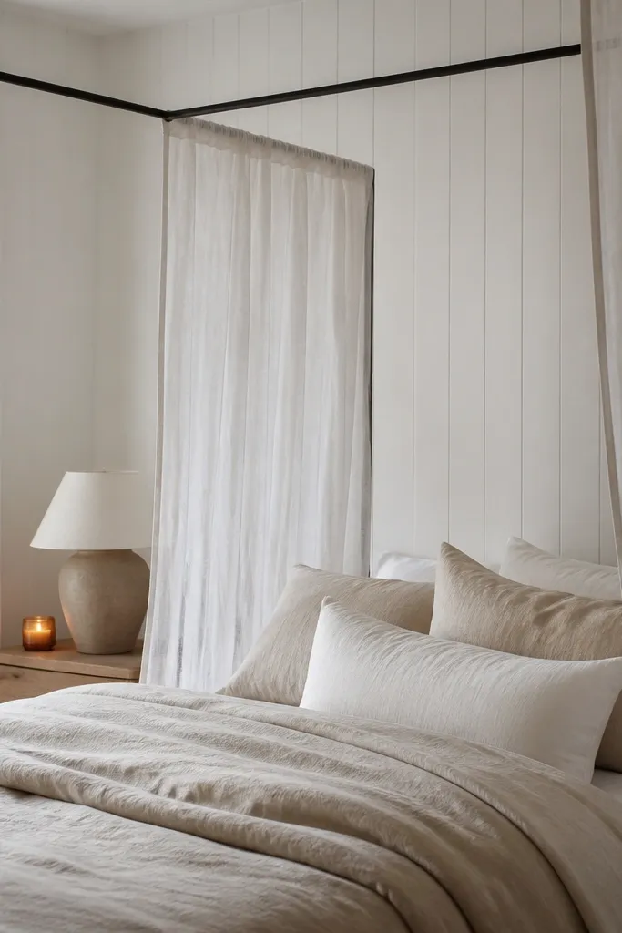
A canopy introduces gentle curves and horizontal lines, balancing the panel’s vertical rhythm. Sheer drapes soften the whole scene, especially in the evening when warm lamps glow through the fabric. Linen keeps it from looking like a costume — it reads grounded and breathable. This is one of the prettiest ways to make a bright room feel romantic without adding color everywhere.
Use a simple metal or wood canopy frame with a light finish. Choose sheer drapes in off-white with a soft weave so you can see the folds. Let the sheers reach 1-2 inches above the floor if the bed is low; for taller beds, keep them 2-3 inches above the rug.
Pro tipSteam the sheers before hanging; wrinkled sheers look sloppy against clean panel lines.
Watch outDon’t use thick blackout curtains as sheers — they kill the glow that makes this idea work.
7. Gallery wall in warm frames with white matting
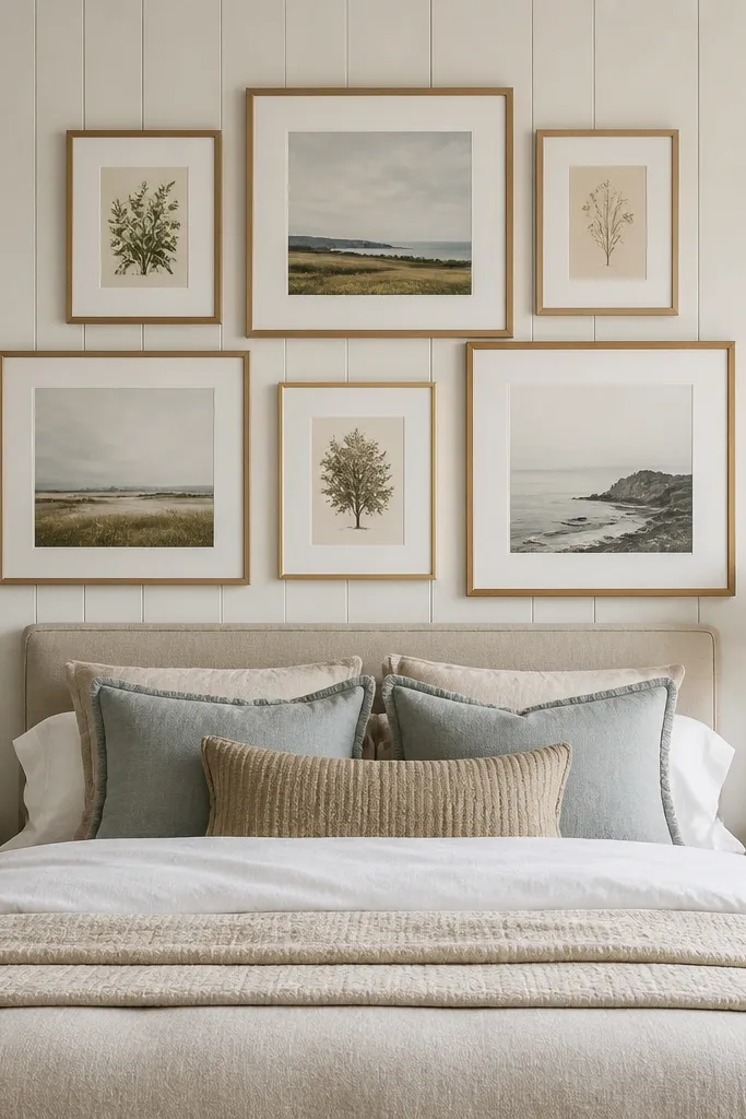
White matting keeps the gallery airy, and warm frames tie it back to wood. This works because panel walls already have texture — your art needs breathing room. By using similar frame widths and consistent mat sizes, the gallery looks intentional instead of random. The result is bright without feeling empty.
Pick frames that match in width, like 1-1.5 inches, then vary art sizes. Use white or slightly creamy mats, about 1.5-2 inches wide. Arrange the gallery so the bottom row sits around 64 inches from the floor and the top row doesn’t go above 86 inches.
Pro tipUse a level and measure from the center of the bed, not from the wall — it keeps the symmetry looking professional.
Watch outAvoid mixed frame metals in the same row; it makes panel texture look busier.
8. Textured wall art with 3D wood rounds behind the bed
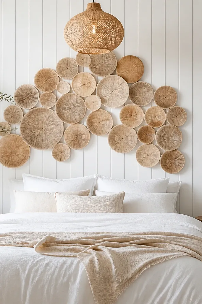
This adds depth without adding color. The 3D wood rounds catch light differently than flat art, so your bedroom changes as the sun moves. It also gives your eye something to focus on at head height, which makes white panel walls feel styled rather than blank. Warm pendant light makes the wood pieces glow on the wall.
Mount the piece directly behind the headboard area so it lines up with the bed center. Keep the installation width roughly equal to the headboard width plus 4-8 inches total. Use a pendant shade in warm off-white, not bright white, and set it so the bottom is about 72 inches from the floor.
Pro tipDust the 3D pieces gently with a microfiber cloth — texture traps lint and makes it look dull fast.
Watch outSkip glossy 3D decor; it creates glare and looks cheap next to painted panels.
9. Navy accents with a cream duvet and white panel softness
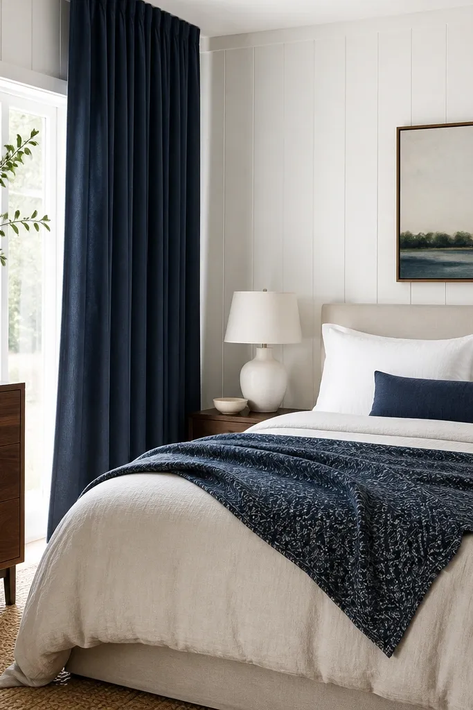
Navy sounds like it would make the room dark, but it works when you keep the base bedding light. Navy gives definition to the bed area and looks crisp against white panel walls. The key is using navy sparingly in textiles so the room stays bright. Walnut and cream keep the contrast warm instead of icy.
Choose navy curtains in a medium weight linen or cotton — avoid thin sheers if you want the room to feel cozy at night. Use one patterned throw with navy in it, not multiple patterns. Add a walnut dresser or a wood nightstand so the navy doesn’t feel like it’s floating.
Pro tipMatch curtain color to your pillow accent, not to the frame color on the art — it’s the fastest way to keep the palette tight.
Watch outDon’t add black everywhere with navy; it makes the panel walls look more stark.
10. White panel walls with a warm gray duvet and blush throw
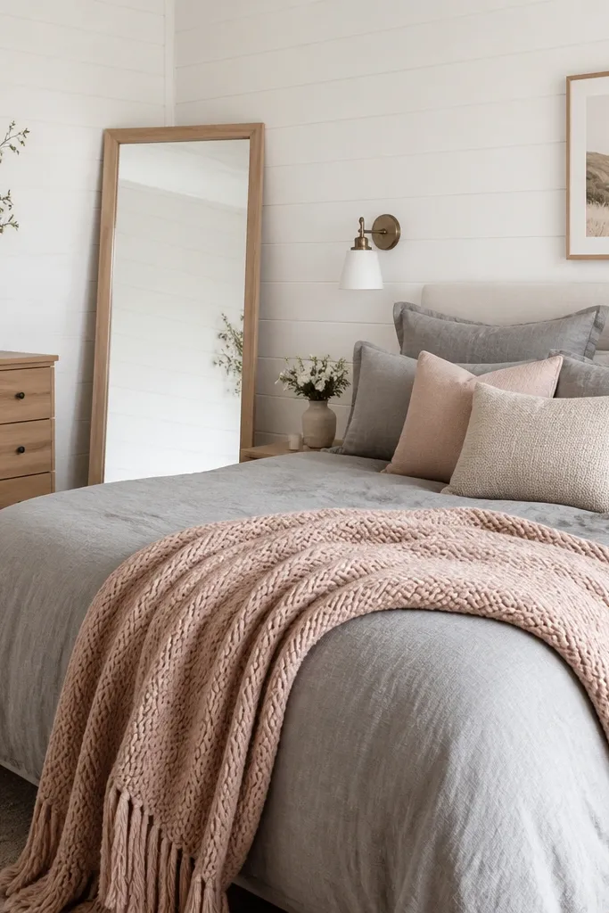
Warm gray is the bridge color that keeps white panel walls cozy. Add blush in a knit throw for softness without turning the room into a pink theme. This is a gentle contrast that looks good in photos because it isn’t high contrast. A leaning mirror makes the room feel bigger and adds warmth through its wood frame.
Pick a warm gray duvet that leans beige (look for “greige” tones). Use a blush throw with visible knit loops so it reads cozy from across the room. Place the leaning mirror 6-10 inches away from the wall so it doesn’t look stuck flat.
Pro tipUse one blush item only — usually the throw — then keep everything else in warm neutrals.
Watch outAvoid dusty lavender throws; they look gray against white panel walls.
11. Striped duvet with calm stripes and solid curtains
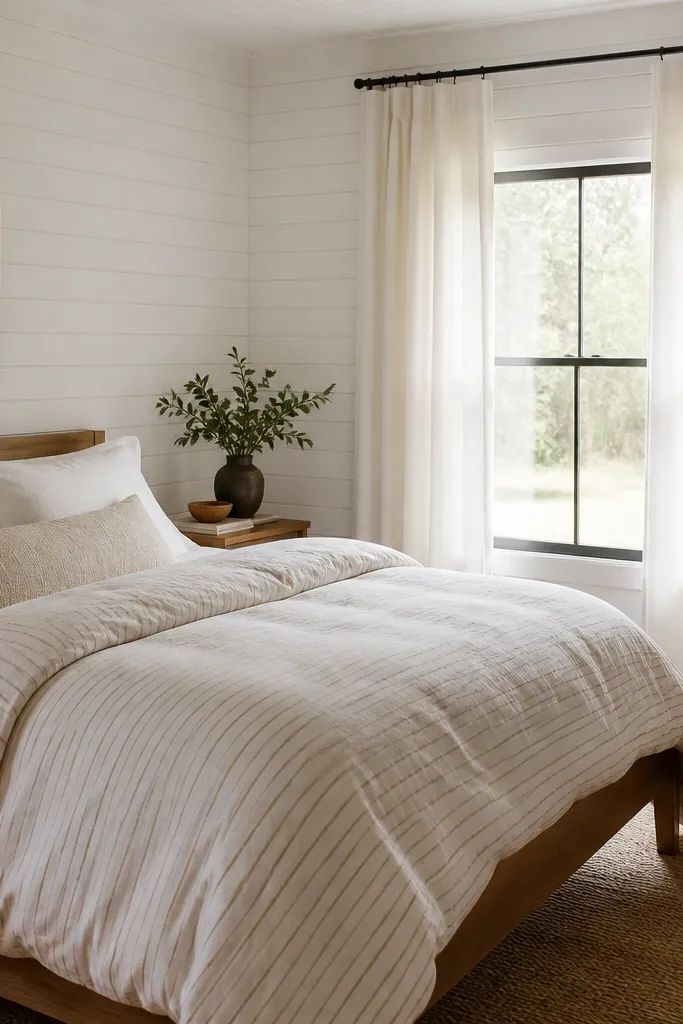
Stripes help the room feel designed without adding loud color. Keep stripes thin and warm so they don’t fight the panel’s texture. Solid curtains calm the background and let the bed be the focus. Woven baskets and wood frames bring back warmth when the bedding is mostly white.
Choose a striped duvet where the stripe width is under 1 inch, and the color is oatmeal or tan, not brown-black. Hang solid curtains 6-8 inches above the trim and let them pool slightly if you have space. Add a woven basket to one side of the bed to echo the natural fibers.
If your stripes feel too busy, add plain pillow covers in the stripe’s main color.
Skip bold wide stripes; they clash with vertical panel lines.
12. Walnut nightstands and a white bed skirt for crisp lines
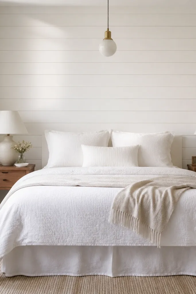
Walnut nightstands add warmth and weight, which keeps white panel walls from feeling airy to the point of empty. A white bed skirt cleans up the lower edge — that matters because panel walls draw your eye upward, and the bed frame should stay neat. Subtle texture in the bedding keeps it from looking flat. The throw in light beige adds that cozy softness without changing the palette.
Use a bed skirt that fits snugly at the corners, not one that floats far from the mattress. Keep the skirt length just grazing the top of the rug or stopping 1 inch above it. Place lamps so the shades align with the top third of the headboard height.
If the bed skirt looks wrinkly, steam it and pin the corners while it dries.
Avoid bed skirts that are too short; they show the frame and make the bed look unfinished.