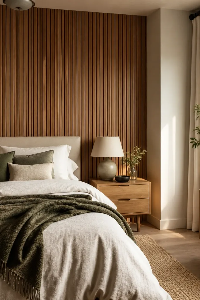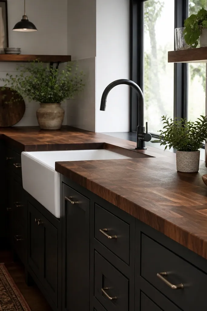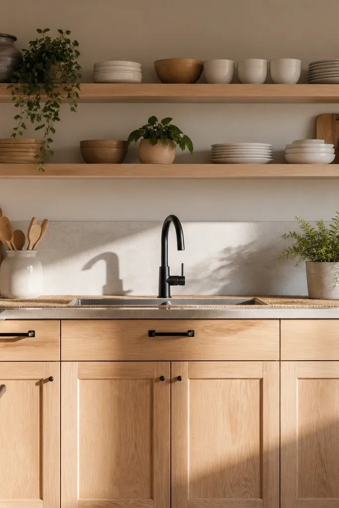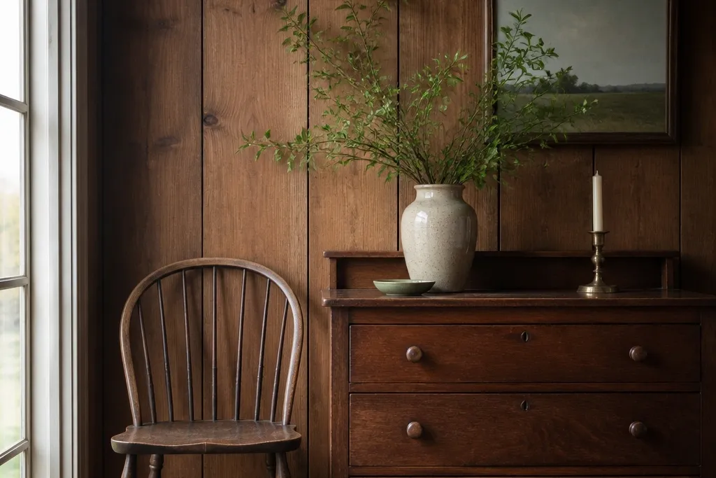
1. Linen runner + brass candle rail on a single panel seam
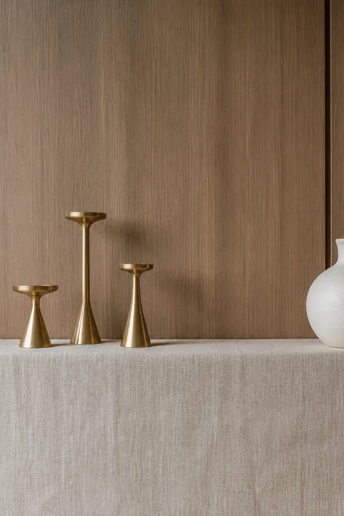
This look turns the panel’s vertical lines into a clean “stage.” The linen runner is matte and light, so it softens the wood’s shine, and the brass gives you a warm highlight without making the whole wall darker. I like three candle heights because it reads balanced next to the panel’s rhythm. Off-white ceramics keep the color temperature calmer, especially in evening light.
Use a runner that’s about 12-16 inches deep and long enough to span at least two panel sections. Choose raw or washed linen in oatmeal, not stark white. Place the brass candle rail or a small brass tray on the runner, then set one ceramic vase and two or three candle jars. This works best for a bedroom wall behind a dresser or console.
Season swap is easy: swap candle color (ivory in winter, light sand in summer) and change the vase insert to a single stem bunch.
Don’t use a shiny satin runner — it reflects panel shine and makes the wall look greasy.
2. Mirror framed in the same wood tone, then dressed with a paper-leaf garland
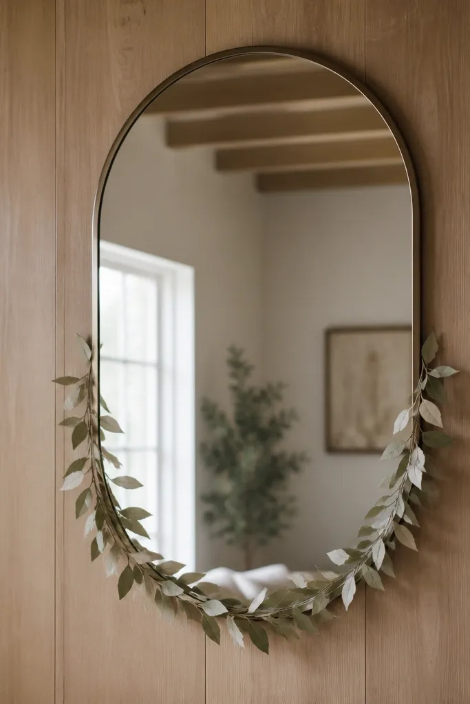
A mirror on paneling is a cheat code for making the wall feel wider and brighter. Matching the frame tone to the existing wood keeps it from looking like an add-on. The paper-leaf garland adds a seasonal layer without adding bulk, and muted greens keep the wall from leaning too orange. It reads like “intentional styling” instead of flat decorating.
Pick an arched mirror with a thin frame, around 24-30 inches wide and 60-66 inches tall. Mount the center at about 64 inches from the floor. Drape a light garland only along the bottom third of the mirror so it doesn’t compete with the panel texture. Use cream and sage paper leaves for spring/summer, then switch to dried-branch picks for fall.
Use removable command strips rated for mirrors, and add a small felt pad on the mirror frame where it touches the wall for micro-movement control.
Avoid oversized mirrors with thick dark frames — they swallow the wall and make the wood look heavier.
3. Two photo frames with a pale mat and one "hidden" season swap insert
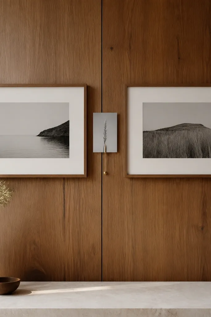
Old wood paneling loves a light mat. The pale border acts like a buffer between the frames and the panels, so the whole wall looks cleaner. Two frames are enough to create a rhythm; you don’t need a gallery wall to make it feel styled. The hidden insert lets you change the “season message” without changing the frames.
Pro tipKeep your mat color the same year-round. Only swap the photo content or the small insert so the room stays cohesive.
Use two frames with cream mats, each about 16x20 inches. Keep the photos monochrome or muted (charcoal, fog gray, soft sand). Add a small clip or mini stand behind the center so you can swap a card with seasonal text or a pressed leaf image. This works great above a bed headboard in a bedroom.
Watch outSkip glossy photo prints — they mirror the panel shine and look cheap under bedside lamps.
4. Wreath with a linen bow layered over a simple wood shelf
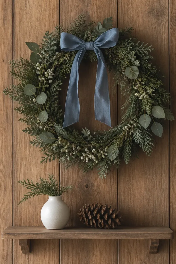
This setup gives you a clear focal point and still leaves space to style around it. The wreath is your seasonal switch, but the shelf is your constant. Linen ties (dusty blue or stone) add softness that matches the grain texture. The shelf items are minimal so the panels stay the star.
Hang a wreath about 4-6 inches above where you want it to “sit” visually; on panel walls, I find slightly higher placements look cleaner. Use a shelf around 36-40 inches above the floor. Keep shelf decor to one vase plus one small seasonal cluster so you don’t clutter the wood. For summer, swap pinecones for dried grasses; for winter, add a faux fur ribbon or evergreen sprig.
Tie the linen bow so the ends fall to the wreath’s bottom edge, not past it. That keeps the look refined.
Don’t stack heavy ornaments on both the wreath and the shelf — it makes the wall feel crowded and dark.
5. Painted "breathing space" panel - one board section in chalky white
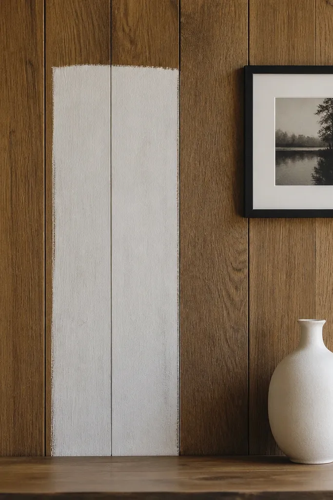
If your paneling is too orange or too dark, one painted section changes the whole room’s mood. Chalky white (not glossy) reflects light softly and creates a visual pause. You can treat it like an art backdrop and keep the rest of the wall warm. This is the fastest way I’ve seen to make wood panel walls year round decor feel modern without covering everything.
Pro tipDo a test patch in the room — under lamp light, some whites turn pink. Choose the one that looks neutral on your wall.
Mask a rectangle that is about 2-3 panels wide and 2 panels tall. Use a chalky matte paint like a matte wall paint in warm white, and apply two thin coats. Keep the painted area centered behind your main art piece. Style with black or dark walnut frames so the white section feels intentional.
Watch outDon’t paint the whole wall if you only need relief. One section looks designed; full coverage often looks “flat” and dated.
6. Bed wall trio - slim sconces, one long art piece, one fabric panel behind it
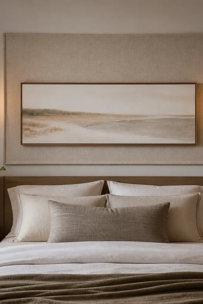
This is the bedroom makeover that makes paneling feel planned. The fabric panel behind the art adds a soft layer that reduces the wood’s hardness. Slim sconces give you vertical light lines that match the panel seams, so the wall looks cohesive. The long art piece keeps the eye moving horizontally, which counters the wall’s tall grain.
Pro tipPick frames with a matte finish and a thin profile. Thick glossy frames fight the wood texture.
Hang a fabric panel with a tension rod or command clips so it sits 1-2 inches behind the frame line. Choose oatmeal or light taupe linen-canvas. Install two slim sconces at about 62-64 inches from the floor to the center of the light. Use a long frame around 30-40 inches wide so it spans the bed width without crowding the panels.
Watch outDon’t place art too high — with paneling, high art makes the wall feel chopped.
7. Seasonal slipcover wall baskets in two sizes
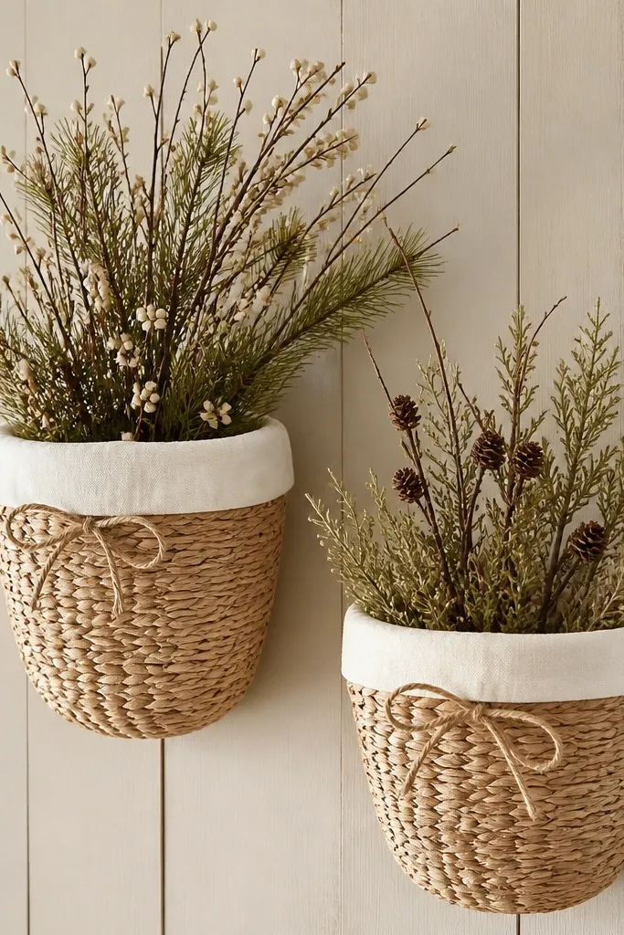
Baskets add texture that wood can’t do by itself. With slipcovers, you get a consistent color base all year and only change what’s inside. The woven shape breaks up the flat panel look, and the cream fabric keeps the wall bright. It’s also practical — you can swap contents without touching the mounts.
Pro tipKeep the basket contents to one height — either low stems or one tall stem. Mixing heights inside the basket looks busy fast.
Mount baskets using hooks or a rail system so the basket rim sits flush. Choose one larger basket (around 14-16 inches across) and one smaller (9-11 inches). Use slipcovers in cream or light oatmeal, and tie them with thin twine. For spring, fill with faux ranunculus stems; for fall, use dried eucalyptus and a few faux berries.
Watch outSkip black slipcovers. They make paneling look darker and tighten the room visually.
8. Oversized fabric headboard look - pinned cotton canvas on the wall
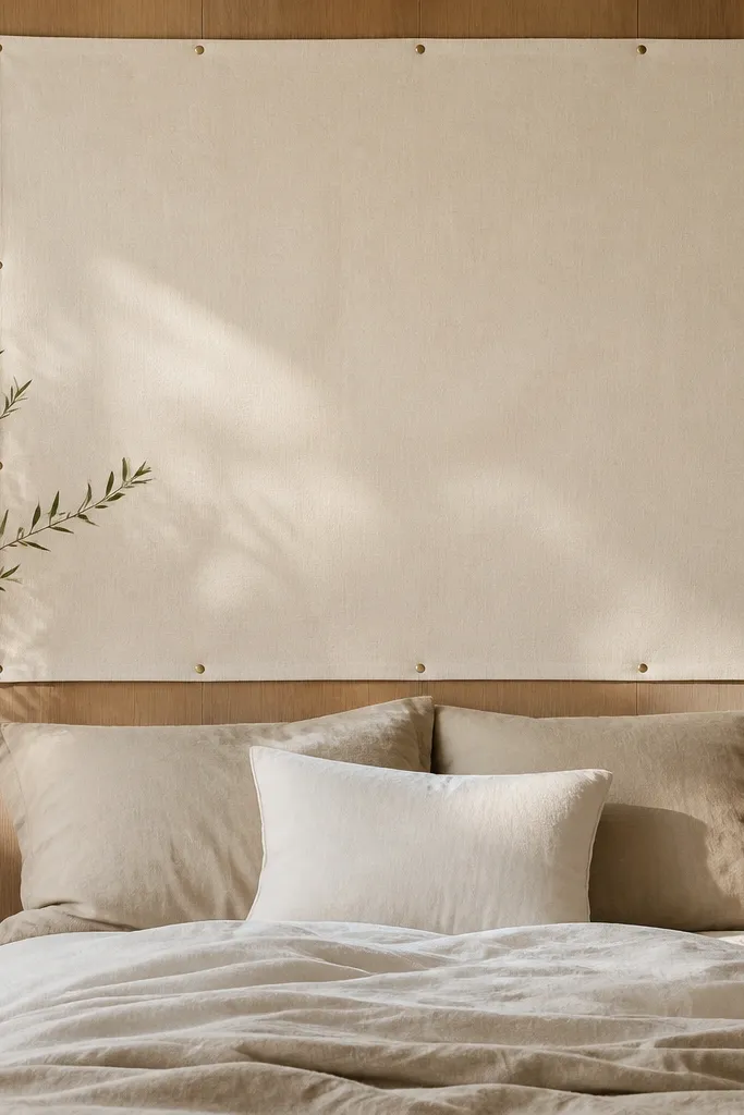
This is the easiest “new wall” effect. A large fabric rectangle creates a soft boundary so the wood panels stop dominating. Cotton canvas in warm ivory reads clean in daylight and cozy at night. The brass tacks add a tailored edge and keep the fabric from sagging.
Pro tipSteam the fabric before pinning. Wrinkles on canvas show up against wood grain.
Cut or order a cotton canvas panel roughly the width of your bed plus 6-10 inches on each side, and hang it with panel clips or a simple French cleat behind. Pull the fabric tight at the corners so it looks flat. Add brass tacks or decorative nails along the perimeter spaced about 6-8 inches apart. Style with two matching pillows and a single throw in a muted stripe.
Watch outDon’t use thin polyester sheers. They look wrinkly and cheap next to textured wood.
9. Floating shelf with rotated jars - same shelf, four seasons
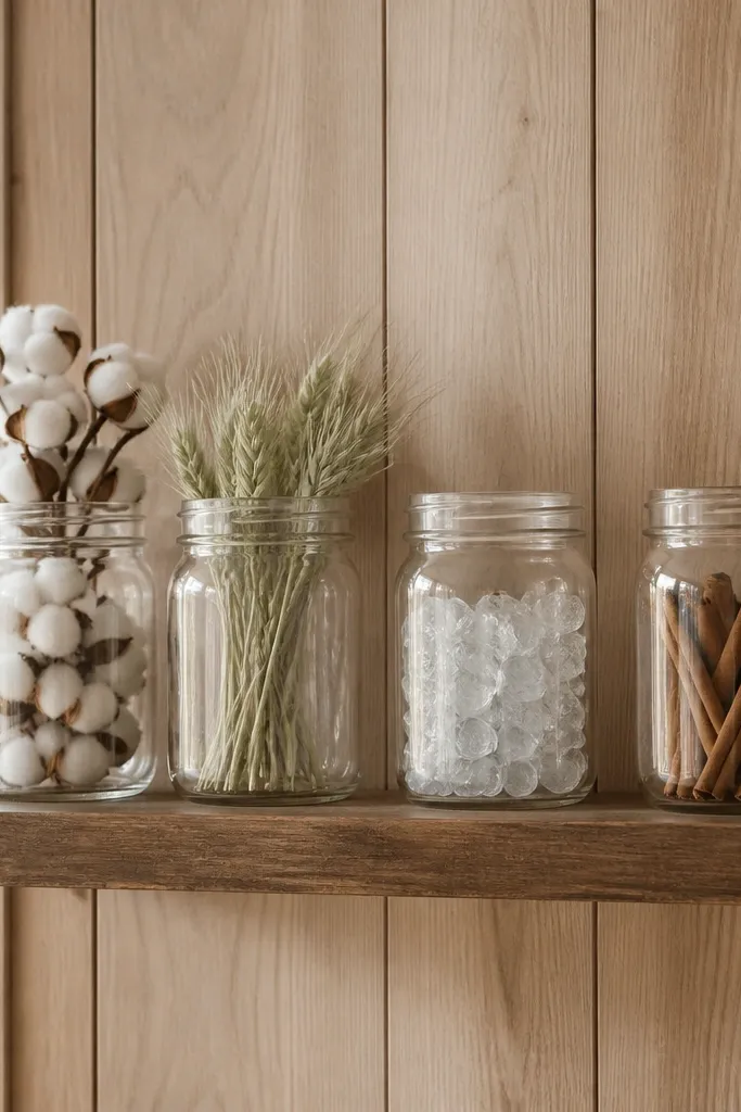
A floating shelf makes the panel wall functional instead of decorative. The jars are your repeatable units, and you rotate the contents season to season. Glass jars let light pass through, so the wall doesn’t feel heavy. Keeping the jar heights similar keeps the shelf from looking cluttered.
Install a shelf about 42 inches above the floor so it lands around eye level when standing. Use 3-5 matching jars in clear or frosted glass. Add one low tray or wood platform under the jars for a tidy base. For winter, use cotton stems or faux snow in a jar; for summer, use clear stones and one pale green sprig.
Label the underside of each jar with painter’s tape and a date. It saves you time when you switch seasons.
Don’t put different jar shapes in a tight line — it looks random against the straight panel lines.
10. Two-tone styling - sage textiles against warm wood
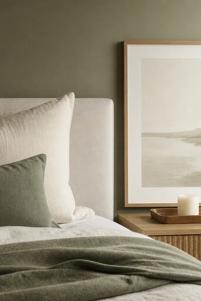
Sage green is one of the few colors that makes warm wood feel calmer instead of louder. When you add sage textiles and keep frames in off-white or light oak, the room feels balanced. I like using one sage item only, so it reads intentional rather than themed. The warm panels stay warm; the room stays light.
Pro tipTest sage by holding the fabric against the wall at night with your lamp on. If it turns dull, swap for a slightly cooler mint.
Pick one sage textile piece like a throw cover or a small wall hanging, and keep everything else off-white. Choose framed art with a light mat so the sage doesn’t fight the wood stain. Place a single candle tray between the art and the furniture so the wall styling has a “resting spot.”
Watch outAvoid olive green. It usually makes honey-brown paneling look dirty.
11. Gallery strip of narrow frames with one bold color mat
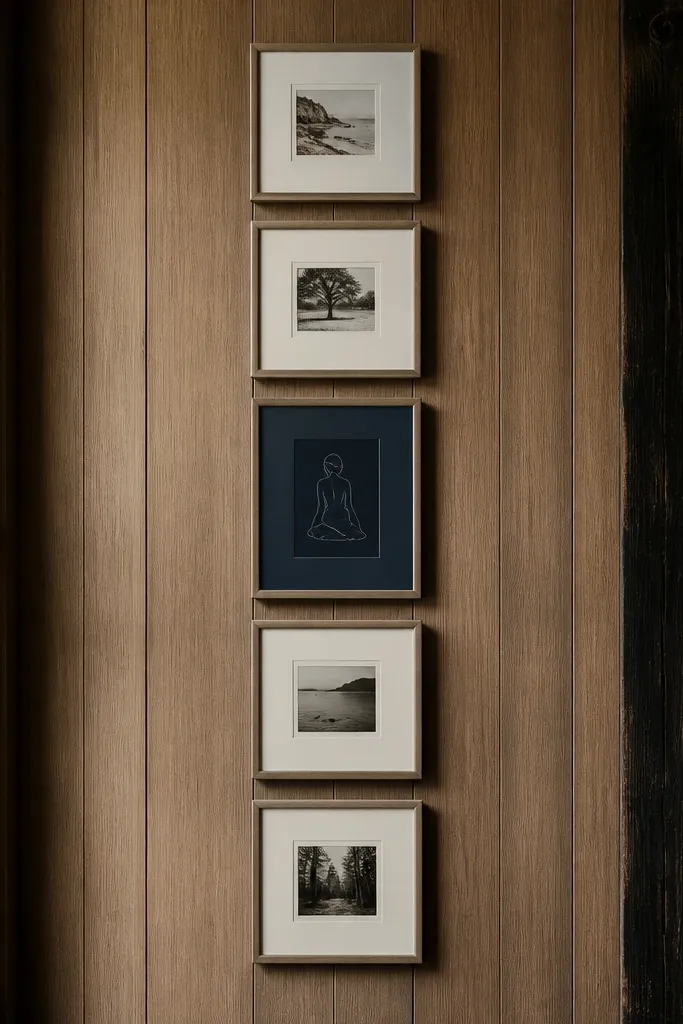
A vertical strip uses the panel wall’s height, but it doesn’t look like a cluttered gallery. The bold navy mat gives you one strong accent that keeps the wood from running the show. Narrow frames look cleaner than chunky ones when you have already-textured panels. The cream mats keep the whole strip readable.
Pro tipUse the same print style across frames — simple line art, not mixed photography. Panel walls already add texture; you want visual calm.
Use 4-6 narrow frames, each about 8x10 or 9x12. Keep spacing tight, around 2-3 inches between frames. Choose one navy mat frame and keep the rest cream. Hang the strip so the center aligns with the room’s main focal point (dresser or bed).
Watch outDon’t mix frame finishes like black and chrome together. It looks random against wood.
12. Woven wall panel in front of wood panels - layered texture without covering
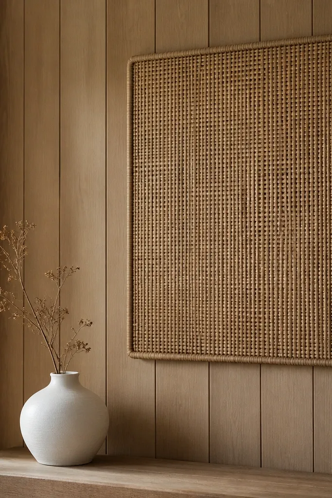
Layering a woven panel makes the wood feel softer and more intentional. You still see the wood, but the weave introduces a lighter texture that reads airy. I like rattan-style weaves in natural tan with a light finish because they blend instead of fighting. The result feels “designed” without covering the whole wall.
Choose a woven panel that’s 24-36 inches wide and mount it with a hidden bracket so it sits flat. Place it slightly off-center to avoid looking like a patch. Keep decor below minimal — one vase and one small tray. This is great for a bedroom corner where you want calm texture.
If your woven panel has a darker underside, flip it or choose a lighter weave. The darker side will make the wall look uneven.
Skip thick, dark macrame. It reads heavy against dark paneling.