1. Oversized linen art above the bed
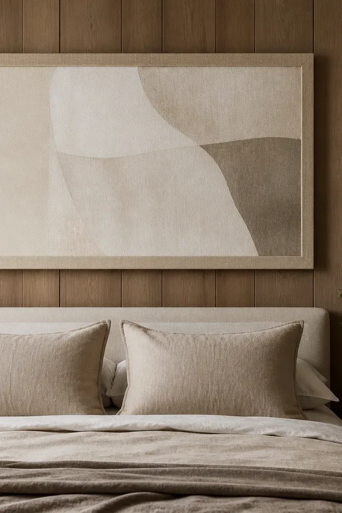
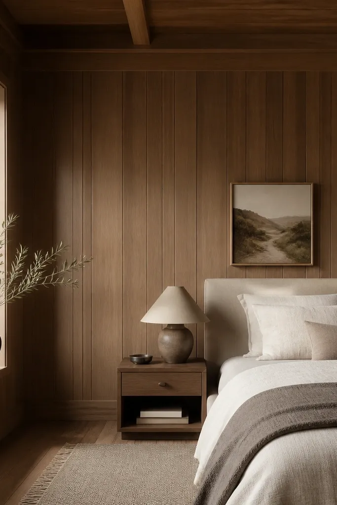
Wood panels already create strong vertical lines, so a big, soft, textile-like piece calms the eye. Linen art works because it looks matte even when the panels are glossy. Pick a frame in brushed brass, warm oak, or matte black — avoid shiny chrome against honey tones. Keep the palette to warm whites and sand so the wood reads as part of the decor instead of a separate thing.
Hang the art so its bottom edge sits about 8-12 inches above the mattress top, then center it to the bed width. Use a frame depth that doesn’t touch the panel — 1/4 inch clearance is enough. Pair it with a headboard that is also soft, like upholstered in oatmeal or warm greige linen.
If your panels are orange-honey, choose art that leans slightly cooler (oatmeal, warm gray, soft taupe). It neutralizes the orange without painting the wall.
Don’t hang small prints — they get swallowed by the panel lines and make the wall look unfinished.
2. A gallery wall with equal spacing and matte frames
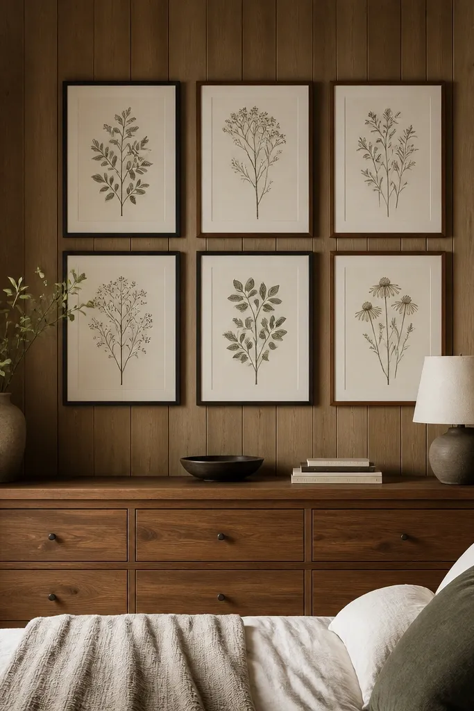
A gallery wall works on paneling when the frames repeat the same finish and the spacing is consistent. Matte black frames look sharp against wood without reflecting light like glossy frames. Choose prints with light backgrounds so the wall remains the “texture,” and the art adds calm. Keep line art minimal — thick, busy patterns compete with the panel rhythm.
Use a layout template on painter’s tape first. Aim for 2-3 inches between frame edges so the panel lines still show. Hang the gallery so the top frame sits about 6 inches below the highest panel end, not at the ceiling.
Use the same frame thickness across all pieces. I’ve seen “mixed frame sets” look messy on wood panel walls because the reflection hits at different angles.
Avoid mixing glossy finishes or random frame sizes — the wall will look like a last-minute collage.
3. Painted panel contrast with a full-width headboard
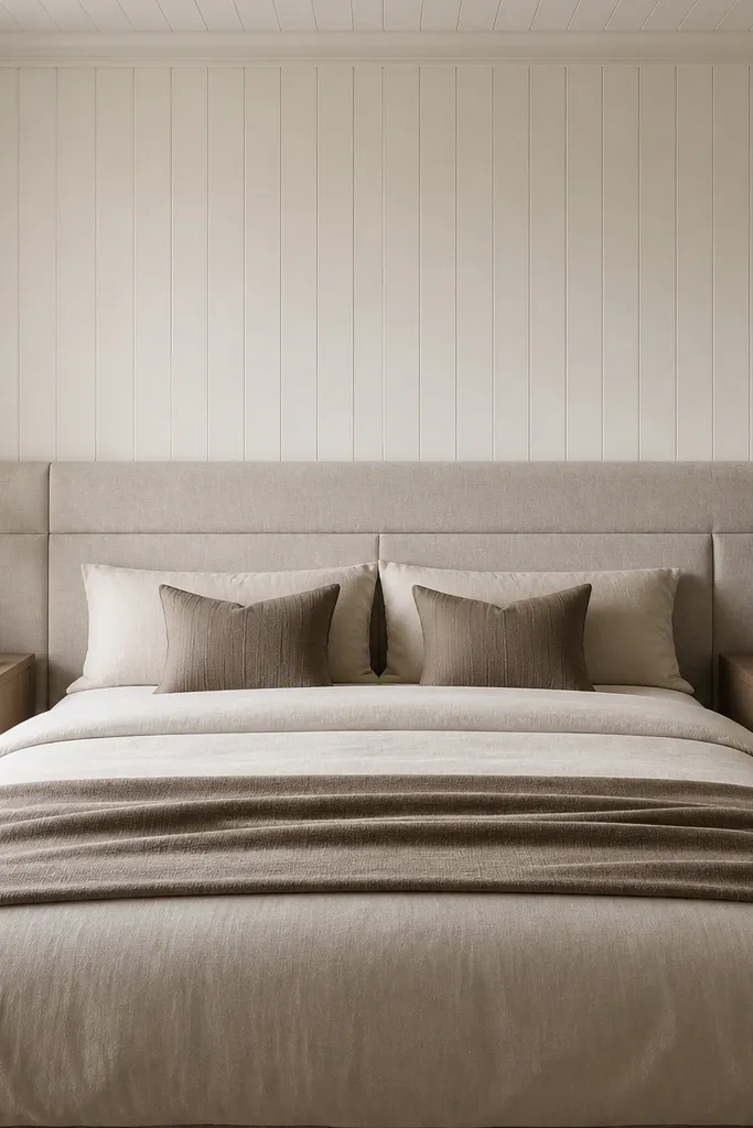
If the wood is very dark or very orange, painting the panel wall changes everything. I like a warm white that still has a hint of cream so it doesn’t look sterile. Then the headboard becomes the focal point — upholstered and soft against the smooth paint. This combo makes the room feel finished even with simple decor.
Pro tipAdd a thin strip of painter’s caulk or foam weatherstrip behind the headboard contact points so it doesn’t scratch the wall or shift.
Tape off trim and edges carefully and use a bonding primer if the panel finish is glossy. Two coats of paint is the usual sweet spot; let each coat dry fully and lightly sand between coats. Choose a headboard that spans 60-70% of the bed width and sits 2-4 inches above the mattress top.
Watch outDon’t paint over glossy panels with no primer — it chips and peels at the corners.
4. Vertical fabric drapes that echo the panel lines
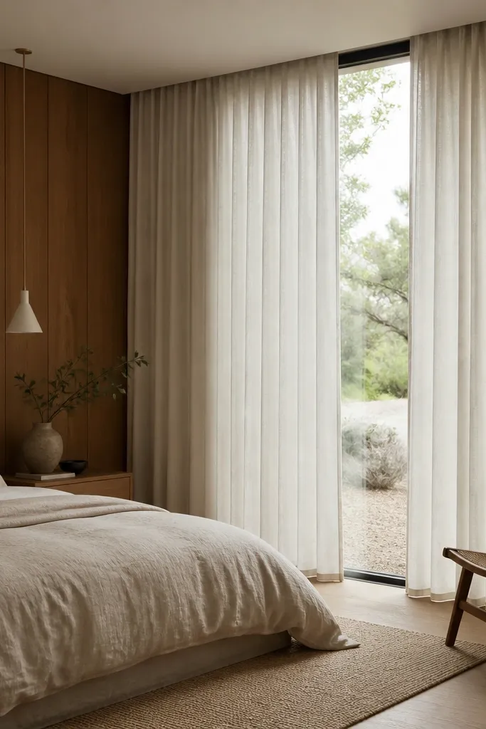
Panels create vertical lines. Curtains that hang from the ceiling with long, straight folds make the whole wall feel taller and calmer. Linen is key because it has a natural matte texture that doesn’t compete with the wood grain. Keep the curtain color close to warm white or oatmeal, then add one darker accent like a charcoal throw.
Pro tipSteam the curtains before hanging. The first week matters — creases settle differently on wood panel bedrooms.
Hang curtains 2-4 inches above the window casing and let them extend 3-6 inches beyond each side of the window. For fullness, use 2 to 2.5 times the window width in fabric. If your panels are dark, skip pure bright white and go for warm off-white.
Watch outAvoid short curtains that stop at the sill — they make the wall feel chopped up.
5. A floor-to-ceiling mirror framed in warm wood
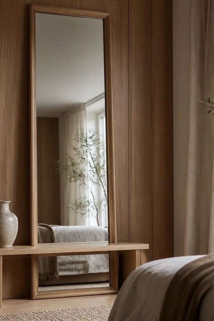
Mirrors work on panel walls because they reflect light and reduce the visual weight of the wood. A warm wood frame keeps it tied to the wall instead of looking like a separate object. Place it where it catches your lamp light at night — that reflection makes the paneling feel less heavy. Keep the mirror tall and narrow or tall and wide depending on your wall width, but avoid tiny mirrors.
Pro tipIf your panels are orange, choose a mirror frame with a slightly cooler oak tone. It balances the warmth without painting.
Aim for a mirror height that covers at least 70% of the wall run. Center it between panel seams if you want it to look “built in.” Use felt pads under the frame corners to prevent scuffs.
Watch outDon’t use a silver or chrome frame — it clashes with most wood panel finishes.
6. Bedside wall sconces with fabric shades
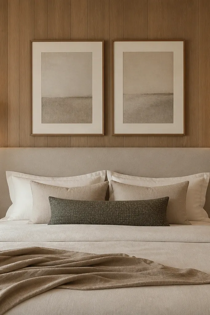
Lighting changes how wood looks. Fabric shades soften the highlights and stop the panels from looking glossy or harsh. With matching sconces, you create symmetry even if the panel pattern isn’t perfect. Warm bulbs (2700K) make the wood tone look intentional instead of orange.
Pro tipTest bulb color before you commit. One 3000K bulb can make honey oak look too orange.
Mount sconces so the bottom of each shade is about level with the top of your head when lying down. Use a dimmer switch if you can — it’s the easiest way to make the bedroom feel like a hotel. Keep cords hidden by running them through the wall or using a clean cord cover painted to match the panel.
Watch outAvoid bare bulbs or clear glass shades — they create harsh reflections on the panel grooves.
7. Oversized woven rug to calm the panel lines
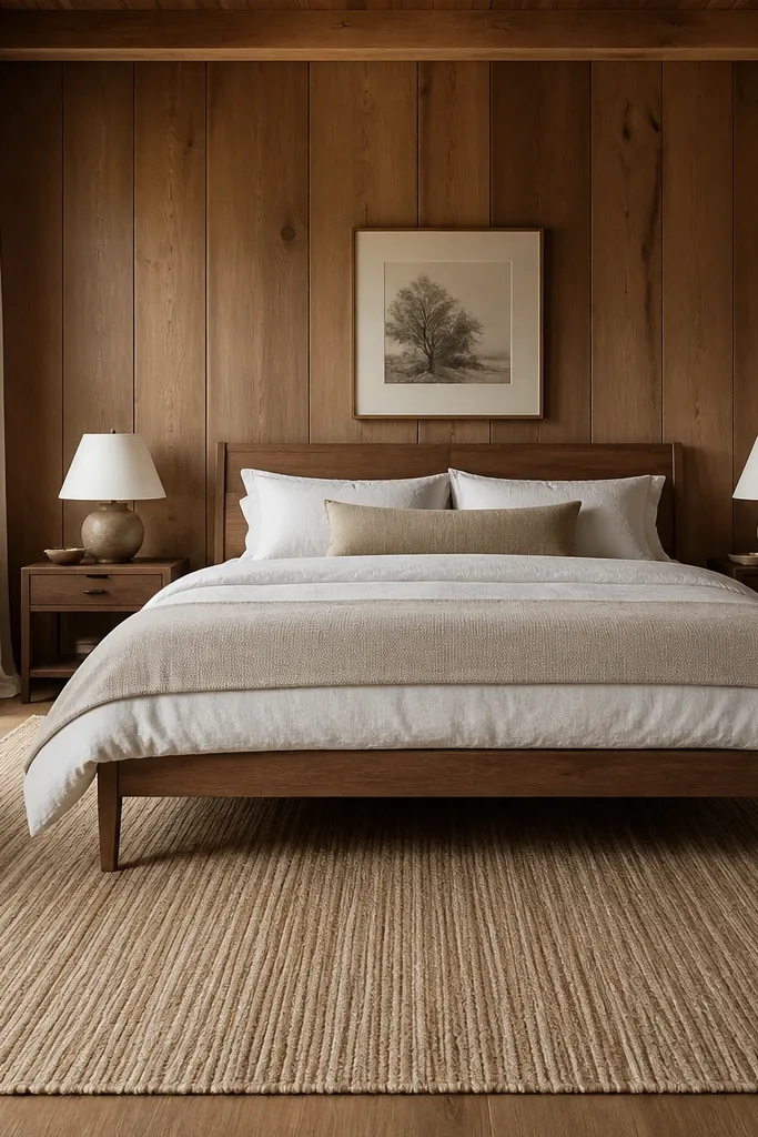
Panels give you hard lines and a strong pattern. A woven rug adds texture without loud graphics, and it anchors the bed so the wall doesn’t feel like the only design element. Natural fibers look good against wood because they share warmth but stay matte. Choose a rug with a low pile so it doesn’t fight the room’s vertical emphasis.
Make sure the rug extends 12-18 inches beyond the sides of the bed. If you have a long narrow room, choose a runner-style rug only if it still reaches under the bed frame — otherwise it looks accidental. Pair with a neutral bedding set and one patterned pillow.
If you’re using jute, add a soft underlay pad. It stops the rug from sliding and makes it feel better on bare feet.
Avoid high-contrast rugs with big geometric patterns — they compete with the panel texture.
8. Floating shelves with a tight, intentional styling formula
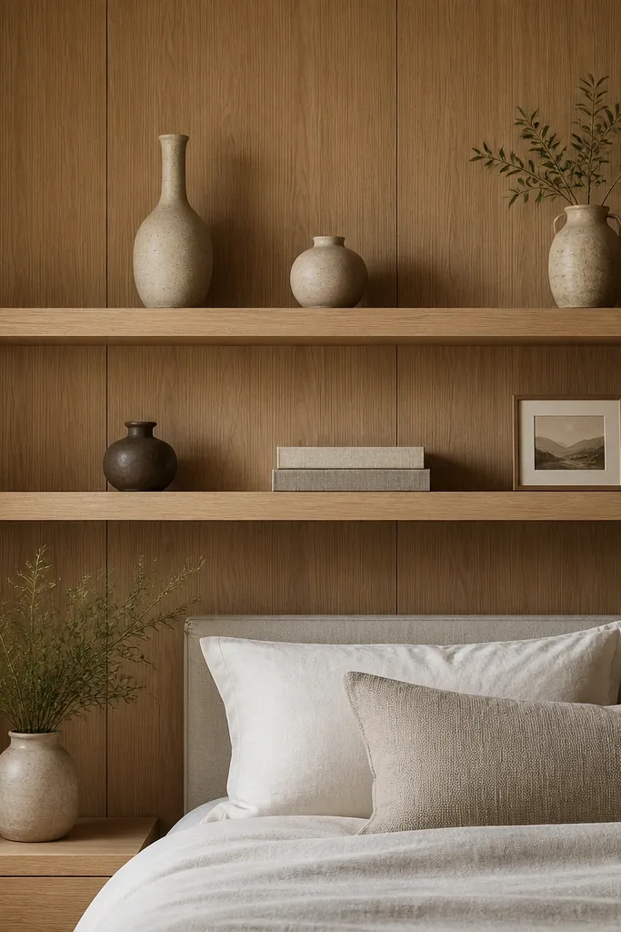
Floating shelves let you use the panel wall without cluttering it. When you style with a strict formula, the wood lines stay the background and your decor becomes the foreground. I like mixing three materials: matte ceramic, linen books, and one metal element like a brass tray. Keep color limited — cream, sand, and one muted green looks calm next to wood.
Pro tipStyle in sets of odd numbers: 3 or 5 items per shelf. Even numbers tend to look too balanced and stiff on panel walls.
Use shelves that are 8-10 inches deep so items don’t look buried. Space shelves about 10-12 inches apart so the wall doesn’t feel crowded. Put taller items at the ends and keep the center lower for a clean silhouette.
Watch outAvoid filling every inch with decor. A blank strip between objects is what keeps it looking designed.
9. Wallpaper stripe panel illusion behind a headboard
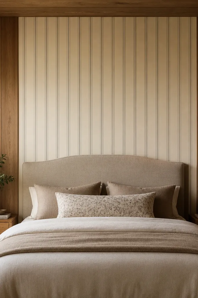
You can keep the wood and still add a “framed” look. A narrow vertical stripe wallpaper section behind the bed interrupts the paneling rhythm and makes the headboard area feel like a designed feature. Choose thin stripes in warm cream and gray, not bold navy or high-contrast black. The stripe lines echo the panels so the whole wall reads as one composition.
Pro tipIf your panels are glossy, wipe them with a degreaser cloth before wallpapering to improve adhesion.
Cover only the area behind the headboard, not the whole wall. Use a width that’s about 70-80% of the bed width, centered. Apply wallpaper with a smoothing tool and keep seams tight — any gap shows up immediately against wood grooves.
Watch outDon’t use thick, raised wallpaper — it catches light and makes the wall look uneven.
10. A wood panel wall painted with a single matte color wash
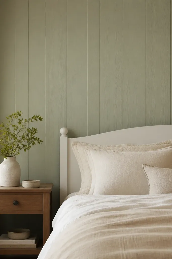
If you don’t want the full commitment of painting over everything, a matte color wash lets the grain show while shifting the tone. Sage, warm clay, or muted terracotta works because they harmonize with wood rather than fighting it. This is the option when your wood is nice but the color is too strong for your bedding palette. Matte finish keeps it from looking like a glossy coating.
Use a translucent glaze or watered-down paint method with a wide brush and a rag to control streaks. Do test swatches in a corner first and let it dry fully — wet color always lies. Seal with a matte topcoat after it cures if you expect frequent cleaning.
Pick a wash color from your bedding. If your duvet is oatmeal, go sage or warm gray-green, not bright green.
Avoid heavy coats that hide the grain — you end up with a patchy look that doesn’t feel intentional.
11. Dark trim framing using painter's tape lines
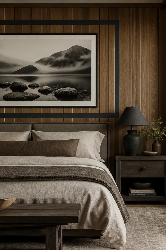
A painted frame makes panel walls feel architectural. You’re basically drawing a “window” around the decor, which helps when the wood pattern feels distracting. Matte charcoal or deep espresso looks great because it adds shadow depth without going too bright. Keep the interior decor light so it doesn’t blend into the frame.
Pro tipAlign the frame edges with the panel seams. That alignment is what makes it look built-in rather than DIY chaos.
Use painter’s tape to map two or three rectangles around the bed wall. Keep the frame thickness about 1.5-2 inches so it reads from across the room. Use a matte interior paint, and remove tape while paint is still slightly tacky for cleaner edges.
Watch outAvoid freehand lines. If your edges wander, the whole wall looks sloppy next to the straight panels.
12. Textured wall panels with rattan headboard layering
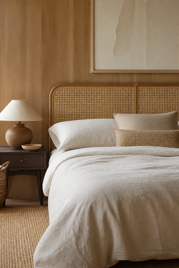
When the wall already has texture, you want another texture that looks natural, not loud. Rattan or cane headboards blend with wood grain and add a softer, airy pattern. This look feels warm and lived-in, but it still looks planned because the materials match. Keep bedding in cream, sand, or warm taupe so the headboard texture is the star.
Pro tipIf your wood panels are very dark, pick a lighter rattan headboard. Contrast keeps the room from feeling like one big brown block.
Choose a headboard height that reaches 6-10 inches above the top of your pillows. Place it centered and leave a small gap from the wall if the bed frame allows, so light can move around it. Add one woven basket on the floor and one cane or rattan lamp base to tie the textures together.
Watch outAvoid mixing too many patterns at once. Rattan plus striped curtains plus patterned bedding makes the wall feel busy.