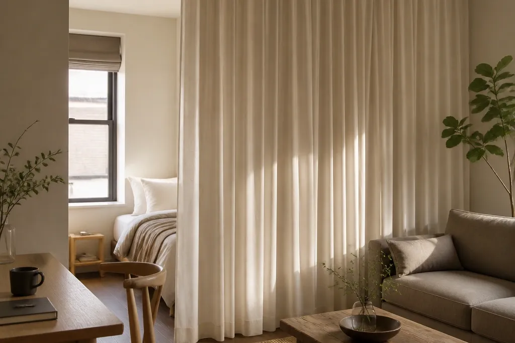

1. Ceiling Track Linen Curtain Wall
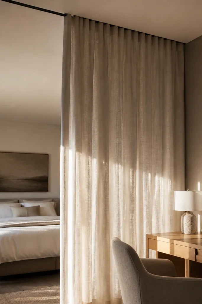
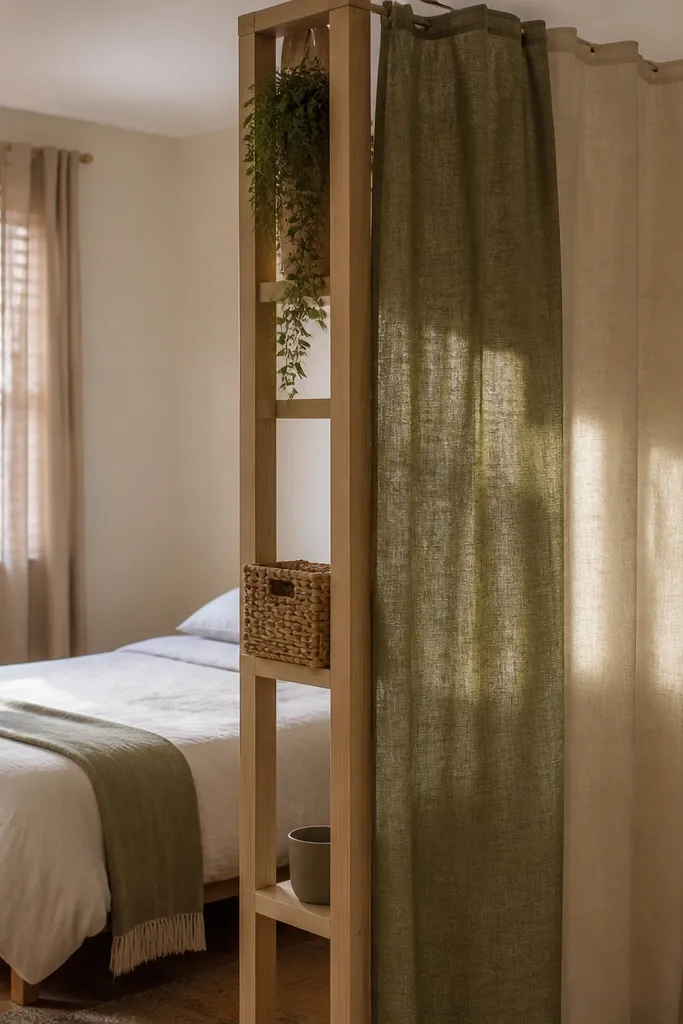
Start by measuring from floor to ceiling and adding 2-3 inches for puddling. Install a ceiling track (or multiple parallel tracks if you want the curtain to stack both directions) so the curtain line sits 2-4 inches away from the wall edge of your zone. Hang linen panels with a slight overlap: aim for the closed curtain to cover about 80-100% of the divider width. If your ceiling is low, pick 2 panels per side to keep the folds thick and the boundary readable.
A ceiling track linen curtain gives you the cleanest zoning look in a studio because it creates a full-height boundary without bulky hardware in the room. Choose a medium-weight linen in warm white, oatmeal, or greige so it drapes in soft folds instead of clinging. When the curtain is closed, your bed or desk reads as a separate zone; when it’s open, the space feels one piece again. This works especially well when you have a narrow footprint and need a divider that can disappear during the day.
Watch outDon’t hang the curtain from a wall-mounted rod — it leaves a gap at the top and ruins the “separate zone” look.
Pro tipChoose linen with a visible weave and a matte finish; shiny curtains look cheap and flatten the whole effect.
2. Freestanding Slat Screen with Leaning Angle
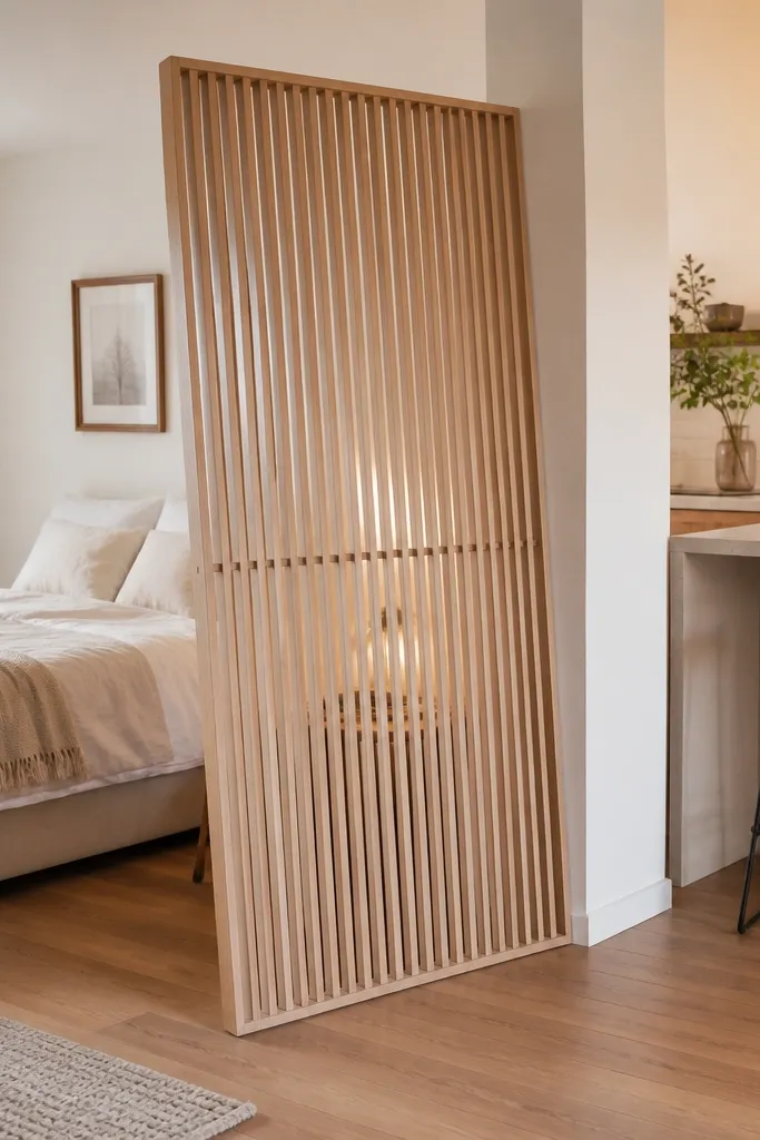
A freestanding slat screen creates separation while letting light pass through the gaps, which is exactly what a small studio needs. Go for light oak, ash, or birch with a warm matte finish so it looks airy rather than heavy. The key aesthetic move is a slight angle, not a straight wall — it frames the zones like a photo set and keeps the room feeling dynamic. Use this when you want a boundary between couch and bed without making the studio feel boxed in.
Start by placing the screen so its edge lines up with the corner of your “living zone” furniture, usually the sofa arm or the edge of a rug. Keep the walkway clear: measure and leave 30 inches minimum between screen and the opposite side. Choose a screen height around 72-84 inches so it reads as a true divider, then angle it 10-20 degrees so it doesn’t feel like a barrier wall. Add a small base-weight or anti-tip strap if your screen is tall.
Pair the screen with a coordinating floor mat or rug edge so the slats visually “continue” the room’s geometry.
Don’t choose dark glossy slats; they absorb light and make the studio look smaller.
3. Bookcase Divider Filled to the Edge
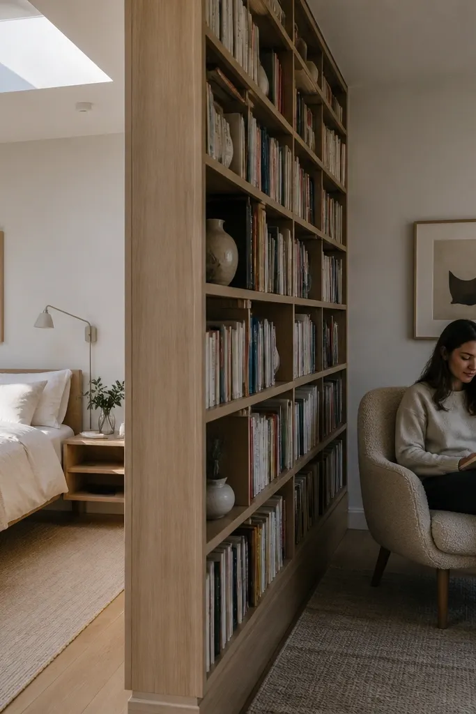
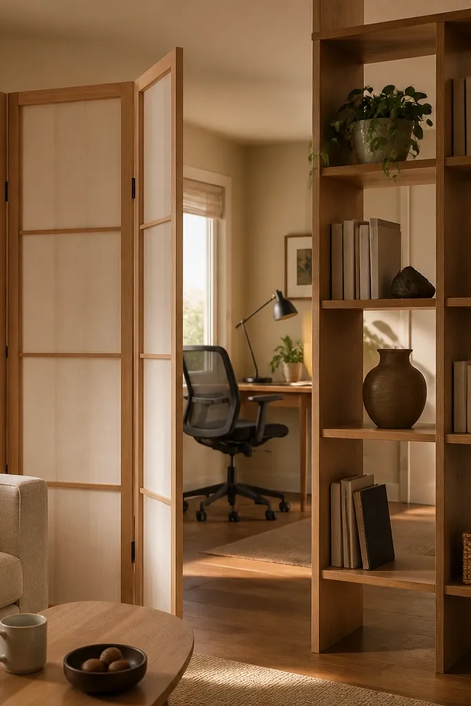
A bookcase divider works when you want actual privacy and some sound dampening, not just a visual split. The trick is filling it deeply so you don’t end up with an empty skeleton that still feels open. Use a narrow bookcase (about 12-16 inches deep) in white oak, walnut, or painted matte off-white, and fill it with books plus a few flat objects so the shelf face looks intentional. Place it between bed and living space to make the sleeping zone feel separate without needing curtains.
Start by choosing a bookcase height of 68-84 inches, then check your ceiling height so it doesn’t leave an awkward gap. Position it so the bookcase edge sits at the back corner of the bed or desk zone, not dead-center in the room. Fill shelves from bottom to top first with books that match the color mood you want (think warm neutrals or muted tones). Finish with small bookends and one or two boxes; avoid scattering tall decor that breaks the clean line.
If you want a crisp look, keep spines mostly horizontal and use a few “color blocks” with consistent covers.
Don’t leave shelves half-empty — the visual openness kills the zoning effect.
4. Cane and Rattan Room Divider for Warm Light
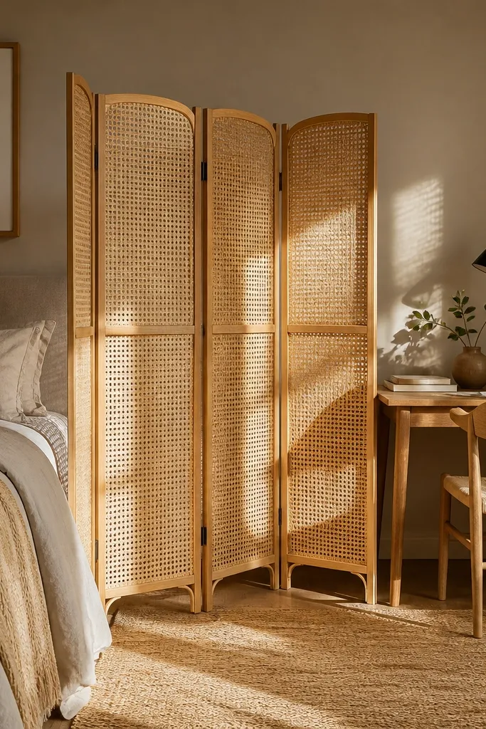
Cane and rattan dividers bring texture without making a studio feel heavy. The woven pattern diffuses light and creates a soft, almost gallery-like separation between zones. Pick a divider in natural cane with a light stain or honey finish; it reads warm and friendly next to most bedding and wood desks. This is a great choice for studio room divider ideas when you want separation that looks intentional in photos and doesn’t crush your daylight.
Start by choosing a divider width that matches your zone boundary, usually 36-60 inches for a couch-to-bed split. Place it so it covers the visual line from your entry point to the bed or desk area. Keep the divider height around 68-80 inches for zoning, then anchor it with a rug or a side table so it doesn’t look temporary. Style the nearest surface with one repeating material: a rattan tray, cane lamp shade, or woven basket.
Match the divider tone to your light fixtures or wood trim so the whole room looks like it belongs together.
Don’t pick a divider with a busy pattern if your room already has strong prints — keep it to one main texture.
5. Tall Plant Wall on Rolling Base
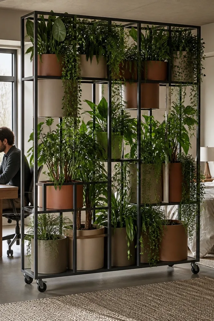
Start by picking a base size that fits your walkway, usually 24-36 inches wide. Place the plant wall so it blocks the direct line to the bed or desk corner from where you sit most. Use a mix of upright plants (like faux or real tall grasses) and trailing ones, but keep pot colors in a tight palette. If you go with real plants, set planters on trays so watering doesn’t make a mess along the boundary.
A plant wall divider gives you separation that feels alive and softens the hard lines of a studio. Use a freestanding frame with multiple planters or a tall modular rack, then group plants at two heights so the boundary looks full from floor to near eye level. For a photogenic look, choose matte pots in clay, sand, or black and keep leaves consistent — trailing greens plus upright plants reads clean. This is ideal for zoning when you want your desk area to feel calm and your bed area to feel tucked away.
Watch outDon’t stack too many different pot styles; it turns the divider into clutter.
Pro tipRotate the tallest plant slightly toward the “public” side so the divider looks sculpted, not random.
6. Wall-Mounted Sliding Shiplap Half-Wall
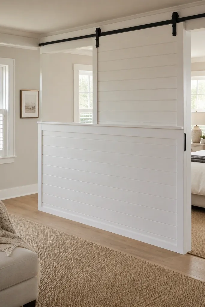
Start by measuring the gap where the panel will slide and leave enough clearance for the track. Install a ceiling or top track with a rail that supports the panel weight; shiplap panels need solid hardware. Mount the panel so it can slide to cover about 40-60% of the boundary width between zones. Paint or seal the panel edges so it looks finished even when open.
A half-wall that slides is a smart way to get a stronger boundary without fully blocking the room. Shiplap in crisp white or soft warm white makes the divider read architectural, not temporary. Because it’s only partial height, it keeps sightlines open and keeps the studio from feeling like two tiny rooms. This works well when you want a more built-in look for separating a kitchen-adjacent living area from a bed zone.
Watch outDon’t make it too tall; a full-height wall defeats the small-studio goal.
Pro tipKeep the half-wall height around 48-56 inches so it blocks the bed silhouette but still allows light to travel.
7. Fold-Out Murphy Screen with Fabric Panels

A fold-out screen that stores away is great when you need zoning at certain times. Fabric panels soften the look and help it blend with bedding and rugs, so the divider looks like part of the room, not an obstacle. Choose a neutral fabric with a subtle texture (matte woven) and frame it in light wood or black metal for contrast. This is one of the best studio room divider ideas for small spaces where you don’t want a divider living in the room all day.
Start by selecting a fold-out unit width that matches your zone boundary, typically 48-72 inches. Place it where it can pivot or unfold between the bed and living area without blocking door swings. When open, align the screen edge with the back corner of the bed or the front edge of the desk chair. Style the surrounding surfaces with one fabric tone from the screen so the boundary feels intentional.
Use the screen only for the zone you need most, like mornings for bed privacy and evenings for desk focus.
Don’t choose glossy fabric panels — they catch light and look like temporary partitions.
8. Pegboard Divider with Hanging Baskets
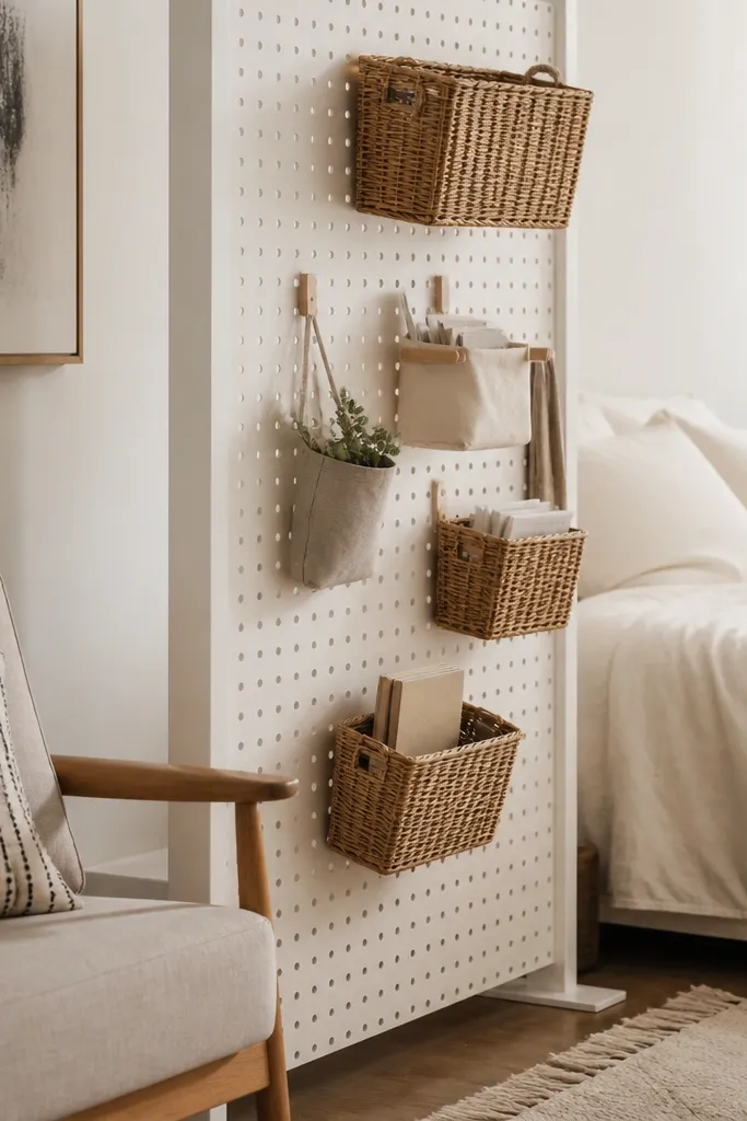
Start by choosing a pegboard panel width around 36-48 inches and mount it on a freestanding base or sturdy wall bracket. Position it so it sits behind your desk chair line or at the edge of your lounge rug. Hang baskets at two heights: one for daily items at about 36 inches off the floor and one higher for less-used storage. Add a few hooks for a bag or headphones so the divider stays functional.
A pegboard divider is a practical, good-looking way to separate zones and keep the studio tidy. The perforations let light through, while the hanging baskets create a clear visual boundary with useful storage. Paint the pegboard matte white or soft gray so it looks crisp, then add baskets in woven or canvas for texture. This works when your studio needs both zoning and daily organization, especially for small kitchens or entry-adjacent desks.
Watch outDon’t hang heavy items on the top edge only; center the weight so the panel stays straight.
Pro tipKeep basket colors to two tones max, like natural + black, so the divider looks styled instead of chaotic.
9. Folded Screen with Fabric Panels and Tiebacks
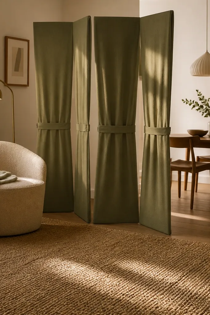
Start by choosing a screen height around 68-72 inches so it blocks the visual line but doesn’t feel towering. Place it with the hinge centered on the boundary between zones, typically behind the bed headboard or beside the couch back. Use tiebacks to pull panels inward during the day, leaving a thinner opening for light. Add a floor rug under the screen edge so it looks anchored, not hovering.
A fabric folding screen is an easy, moveable divider that still looks designed. Use tiebacks so you can gather panels at the sides and keep the room open when you want flow. Pick a fabric color that matches your largest textile in the studio — usually the rug or bedding — and keep it matte. This divider is best for studios where you want quick separation for sleeping, reading, or dressing without committing to permanent construction.
Watch outDon’t use a screen with too-bright patterns if your studio already has prints in the bedding or art.
Pro tipMatch the screen fabric to your curtain tone if you already have curtains — it makes the zoning look like a system.
10. Perforated Metal Panel Divider with Black Feet
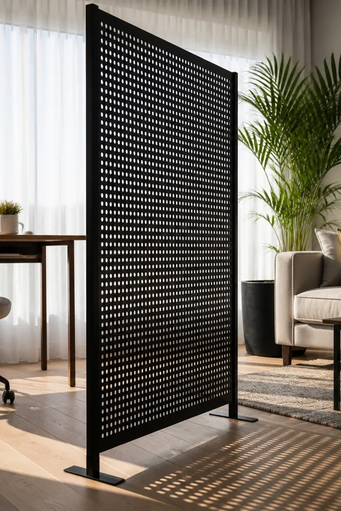
Perforated metal panels separate zones with a graphic look and keep the studio feeling airy because air and light pass through the holes. The aesthetic is crisp and modern, and it photographs well because the shadows from the perforations create depth. Choose a matte black finish with black feet for contrast against light walls and pale floors. Use this divider when you want clean separation for a desk-to-lounge split without fabric heaviness.
Start by selecting a panel height around 72-84 inches and a width that matches your boundary, usually 30-48 inches per panel. Place it so the desk side faces the panel, making the desk feel “framed” rather than exposed. Keep a 2-3 inch gap from the wall so the shadows and airflow look intentional. Secure with anti-tip hardware if the panel is tall, and ground the look with black accents like a lamp base or frame.
Position the panel so daylight hits it at an angle; the hole pattern will cast a subtle grid on the wall.
Don’t pick a shiny metal finish; it reflects harsh light and makes small rooms feel cluttered.
11. Rug-Lined Divider with Low Back Bench + Backdrop
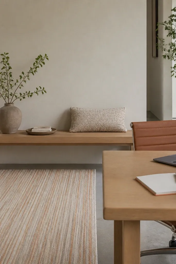
This is the divider approach for studios that can’t handle tall furniture. Instead of a wall, you create separation using the floor and a low visual boundary. A low back bench placed perpendicular to your layout, paired with a rug that changes direction, marks where one zone ends and another begins. Add a backdrop behind it like a tall mirror or a simple curtain panel to complete the “room within a room” effect. This works for budget-friendly studio room divider ideas because it uses pieces you can move and upgrade later.
Start by choosing two rugs or one rug with a clear pattern change, then place the bench so it sits at the boundary line between zones. Keep the bench height low, around 16-22 inches, so it doesn’t block sightlines. Add a backdrop on the far side — either a curtain panel on a rod or a tall mirror with a simple frame. Measure so you still keep a 30-36 inch walkway through the room.
Use a rug with a defined edge (border or darker band) so the boundary line looks intentional on day one.
Don’t rely on a single small rug — the boundary needs enough area to read from the room entrance.
12. Modular Fabric Room Dividers in Two-Tone Panels
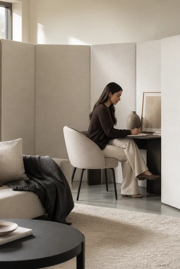
Modular fabric room dividers give you the look of a semi-architectural wall without the permanence. Two-tone panels add depth and make the divider look designed instead of generic — think warm white panels on the outside and a soft taupe or light charcoal on the inside edge facing your zone. Fabric also absorbs some sound and softens footsteps, which is helpful if your studio layout is tight and noisy. Use this when you want zoning that still feels soft and cozy.
Start by selecting modular panels that can stack or connect, aiming for a final height around 68-84 inches. Place the divider so it’s aligned with the edge of your bed or couch so the boundary looks straight. Choose two-tone fabric so one color faces outward and the other faces inward — it makes the divider feel dimensional. Add a floor mat or rug that echoes one of the panel colors so the divider blends in.
Keep the color difference subtle; high contrast makes small studios feel chopped up.
Don’t create an uneven zigzag arrangement; straight lines read cleaner for zoning.
13. Acrylic and Wood Partition with Rounded Corners
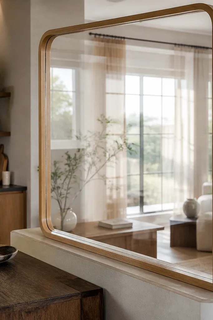
Start by measuring the boundary width you need and choose a panel height around 60-78 inches so it still blocks the line of sight. Install the wood frame with anchors or place it in a weighted base if it’s freestanding. Position it so it sits behind the bed headboard or along the desk edge, not in the middle of circulation. Add a light-colored curtain behind it if you need privacy at night; the acrylic keeps the day look airy.
A clear acrylic partition with a wood frame is the cleanest option when you want zoning but zero light loss. Rounded corners make it feel friendly instead of harsh, and the wood frame keeps it from looking like a temporary barrier. This divider is best for studios with good daylight and light-colored interiors, where you want your bed and desk to feel separated without losing the open plan. It also photographs well because it disappears visually, leaving the room feeling bigger.
Watch outDon’t place it in a dark room — clear acrylic in low light can look like nothing and still block your space.
Pro tipUse anti-glare acrylic if you can; it reduces glare spots that ruin photos and make the partition look cloudy.
14. Wood Slat Half-Wall with Built-In Shelf Lip
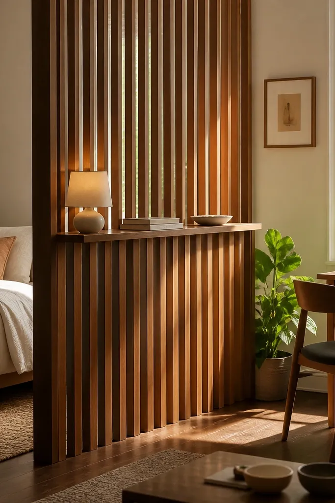
Start by choosing a half-wall height around 42-56 inches and a slat spacing that isn’t too tight — you want light to pass. Place it along the boundary line behind the bed or couch so it frames the zone. Style the shelf with two heights: one tall object (like a slim vase) and one low object (like a tray) so it looks intentional. If you’re not building, buy a ready-made slat panel and add a matching shelf board on top.
A wood slat half-wall gives you a boundary that feels built-in and stylish, with the added benefit of a place to style objects. The slats keep light moving, and the half height keeps the studio from shrinking visually. Add a shelf lip along the top so you can place a small lamp, a book stack, or a tray — styling turns the divider into a focal point rather than a barrier. This works best when you want to separate a bed nook from a living area and still keep the whole studio feeling airy.
Watch outDon’t overcrowd the shelf — too many items read cluttered through the slats.
Pro tipUse warm wood and keep the shelf items in matte finishes; glossy decor reflects light and looks messy behind slats.
15. Vintage Arched Panel Screen for a Soft Bedroom Nook
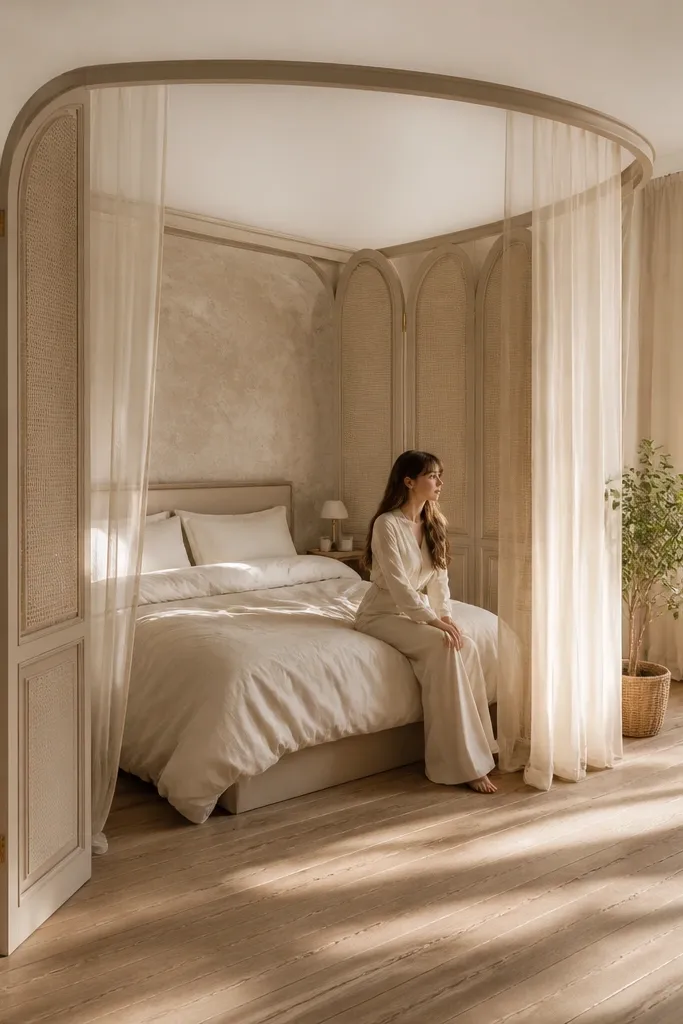
An arched folding screen creates a softer, more romantic zone boundary than a straight rectangle. The curve visually “wraps” the sleeping area, which is why it feels better than a flat wall in tight studios. Look for neutral panels in off-white, stone, or warm beige — anything too gray makes the studio feel cold. This is one of the most photogenic studio room divider ideas because the arch adds shape, and shape reads clearly in photos even when the room is small.
Start by measuring the distance from the bed headboard to the edge of the living zone, then pick a screen width that covers that area. Place the screen so it sits slightly behind the headboard line, creating a nook effect. Keep the screen height around 70-78 inches so it blocks sightlines from the doorway. Add a matching throw or cushion in the same neutral tone as the screen panel to tie the zone together.
Angle the screen a few degrees so the arch frames the bed instead of looking like a flat barrier.
Don’t use a bright floral screen if your bedding already has pattern — it competes and makes the nook feel busy.